Description
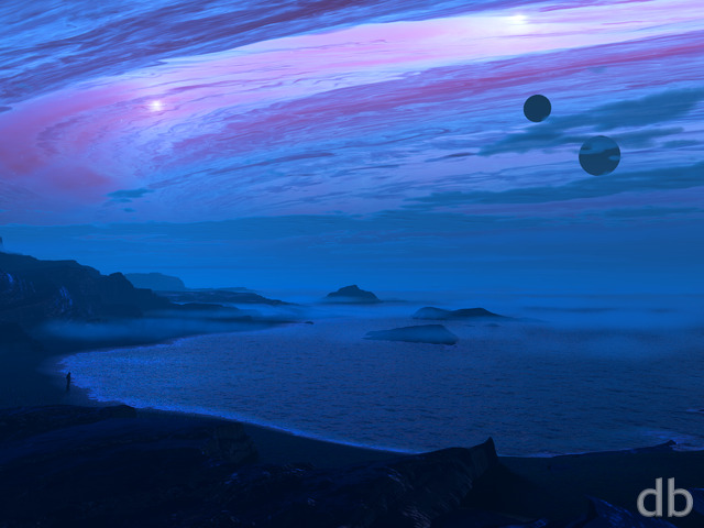
Glad to finally be able to post this one! The Vue scene took so long to render that I feared that Shadowfax had hung more than once. It actually did crash one time and I had to restart the whole thing. Regardless, I persisted and I’m happy to be able to share it with you. I used Lightwave 2018’s new texturing model for the background planet. Hopefully it was worth the wait.
The scene will need a major rework if I am going to be able to produce multiscreen versions however. The whole thing is set up for 360 rendering but we shall see.


Sylvia
Amazing!! Like always, woooo woooo! This is my Favorite…..I think…lol
Jess [basicmember]
Really like this one, it’s very clear and a good choice of colors! Keep up the fine work!
LanceX [basicmember]
Hey Ryan,
Love the planet! Awesome colors. The waves…. not so much.
The premise is there for sure. Like it overall.
rik [lifer]
sorry dude..but this is bad. The waves are terrible! The rocks in the front look like they come out of a game from 2001.The background planet is the only thing that is pretty good.
Tom Mortley [basicmember]
Wonderful image, I would also like to see a lighter iteration of this one.
Susan [nonmonthly]
I love it all. The colours, the way the waves are crashing on the rocks, the looming rocks in teh backgroung that you can just see through the low cloud/mist.
jimbo [basicmember]
I like the journeys the eyes can make looking at the scene.
The sharp angled light playing on the breaking waves on the shore
The offshore rocks look like tall sailing ships almost floating in the sea mist.
The rings on the planet – the view seems to be from one of its satellites.
I don’t know why planet’s rings have such different colours- perhaps these are reflections of the planet’s own colours.
The aurora playing on the pole in view complete the journey
Michale [plusmember]
This is probably one of my fave renders that you’ve put together. Every detail is just completely on point and it has that wonderful sense of nostalgia.
Could you possibly add renders for the larger sized Android phones in the future? I have a Galaxy Note 8 and the backgrounds don’t quite fit properly. Thanks and keep up the awesome work!
ChrisW [basicmember]
I just looked it up: Erebus means “deep darkness,” or “place of darkness between Earth and Hades.” This image really works with either definition. Well done.
Brian [nonmonthly]
Simple isn’t a bad thing. There are times I go back in the library when I’m in the mood for simple. Thanks you!
Sanalith [basicmember]
Agree with so many others that this has such a classic feel. Your early planetscapes were what convinced me to become a member, and images like this are why I will always remain one. Well done!!
Bob Steele [liferplus]
Erebus is a GREAT render, Ryan! You excel yourself – and, admittedly, the bar is already set pretty high! Mid you, you did it!
Jerry Waters [lifer]
Enchanting!
Craig [basicmember]
Outstanding! Amazing work. Love the triple screen render.
Jonathan [plusmember]
This reminds me of your classic work. It has a great feeling to it. I love it.
Rodewaryer [basicmember]
Always have relished the idea of a planetrise like this, love it.
Tyler [lifer]
Ryan we need the multi on this ASAP. This is absolutely the reason I’m a lifetime member. The concept and execution are top notch well done sir.
Eyal [lifer]
It’s a wonderful scene. Shame it won’t be done for multi-screen..
Alisha [basicmember]
Planet scapes are my favorite. I love this one! I first saw it on my phone and just audibly uttered, “Wow!” Great job!
SylvieStarr [basicmember]
Together in one beautiful, haunting scene. This is terrific, Ryan.
BobC [lifer]
This harks back to some of your early images (which I like so much) but done with pizazz, using your current level of skill. Bravo!
Travis [lifer]
Definitely one of your best planetscapes yet. Your sci-fi-ish rendering are always my favorites, and I like that this one has a darker, almost foreboding atmosphere to it. A new feel for a planetscape scene, and I like it!
Paul [liferplus]
I’ve missed your Planetscapes… always some of my favorites! This is a great one, love the colors – feels almost ominous.
Littlemom [liferplus]
Wow!!! This is simply amazing Ryan!!! Well worth the wait!!! Can we possibly get a day time version as well?
Dysan [nonmonthly]
Pretty nice dark touch, Planets, Shore – man, nothing more to say.
Peace out
Afya [lifer]
This is a really stunning scene – I completely love the mist. Only gripe, maybe it’s my screen brightness but I can barely see the islands (the most unique and exciting part of this scene) because they are so dark against the brightness of the waves. Still a beautiful world, scored it 9. I hope you do tweak it for multiscreen because it really deserves multiscreen glory.
Keith-E [nonmonthly]
As usual, really looking forward to the tri-screen.
Lurve the restrained use of color to make the point.
Ozaawaagosh [basicmember]
Simply Beautiful World, love the colours and how so realistic it appers, this is one of my favorite Planet-Scape, Great Job Ryan
ObsidiaRazor [basicmember]
What’s the name of the travel agent to this beautiful world?
Tom [basicmember]
I think anything, except another planet with rings in the background, would have been better.
Luke [basicmember]
I can see why this would take so long. I can’t wait to see the daytime render.
Omar Calderon [basicmember]
Ok this one is gorgeous!!!
DarthSync [liferplus]
I most definitely love the planetscapes, and, for mine, this one ranks as one of the better ones. The dark greys of the entire scene just make the colours stand out.