Description
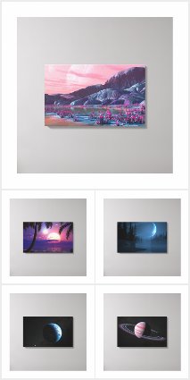
This one started out as a revisit of “Planitia” (which turns 10 years old this year!) using some of my custom-designed Plant Factory models. The plants used some of the techniques I learned creating “Dreams of Avarice“.
It took an unholy long time to render on Shadowfax due to the all the SSS and refractive globes. Somewhere about 2/3rds of the way through the render it occurred to me that perhaps the bottom of the screen was a bit on the busy side, but I let it finish rather than start over.
Let me know what you think!




Isaac [nonmonthly]
This reminds me of something I’ve seen in a show/movie/game but I can’t place exactly what or where and it’s kinda driving me crazy. Anyway I think the ground would look empty and a little weird if it weren’t so ‘busy’. I like it like this.
Ben K [nonmonthly]
Worth it to me for another shot at a great crystal / planet-scape background 🙂 This “theme” is possibly my favorite… maybe 2nd to your abstracts.
BobC [lifer]
This has been my favorite of your recent work!! It evokes the dreamy atmosphere of the original. I like the ringed planet, the green lighting, and the weird wetland plants. As “amateur art critic” I advise revising the composition however you see fit. I would love it!
Ryan
PS: Any revision would probably still take between 3-7 days of render time.
Ryan
Would you guys be interested in me trying one more version of this or should I just move on?
Ben K [nonmonthly]
Trim out some of the shrubbery and you got a really sick background here. It’s just too busy. The globes and crystals in the trees look SICK but there’s just too many to make a pleasing background. Make it a focal point, rather than a smothering. Enhance the size of the crystals and the globes and really make that the focus I think???? Would be sweet.
horcruxhp [basicmember]
As always, Ryan, you’ve outdone yourself again. I love this! Any chance of a dual monitor version anytime soon?
Donna [liferplus]
This really interested me, then I saw the globes. They look as though they could start to float upwards. So cool! I can imagine it at night, maybe a little more lush foliage (those “crystal points” blooming), and those globes. I’ll leave the rest up to you!
Shelly K. [liferplus]
This reminds me of what one might find playing “No Man’s Sky.”
Mike [lifer]
I like the design and I loooove what it’s trying to be. I keep coming back to this over and over and I get lost in the picture, but my eyes keep telling me to find the sharpness slider 🙁
Thank you for making this and thank you for making me struggle over it!
tecbuddy1 [plusmember]
The only reason I don’t rate your art is because I just don’t like the subject matter of the print. That doesn’t mean the quality isn’t great! As usual your artwork has gotten so much better since you first started this website. I’ve only been a member for a few years but have watched your work for at least a decade.
Hoverwolf1 [lifer]
I like the idea of revisiting older renders, provided they stay true to the original spirit or theme of the work. But, this misses the mark, because (with Planitia) part of the theme was a sense of solitude: how far away from Earth the viewer is and near lifeless the planet. The sense of a real struggle to stay alive is apparent in Planitia, because it looks barren. Also, the tree thing blocking the view of the planet and mountains doesn’t help.
Dustin S [nonmonthly]
Very fun idea. I love the color and “other worldly” feeling.
Rodewaryer [basicmember]
Very creative and unexpected, I like it.
Holly [basicmember]
original and excellent
Kristen [lifer]
Your ringed planets are my favorites. Don’t listen to that sass.
youngrama15 [basicmember]
Yes it’s busy, but who said busy has to be bad? I do like it very much. So much to see, so little time to do it in! Keep up the good work Ryan, I come to this site just to look and revisit some of the renderings and daydream!
Ozaawaagosh [basicmember]
I simply love the off worldliness of this one, your planetscapes are bloody Awesome
Davin [basicmember]
My first reaction is that this belongs somewhere in Alice in Wonderland. I absolutely love it, though the planet in the sky could be left out.
Nick [lifer]
I like how unique this one is – the more I look at it the more I like it!
Simon [lifer]
Nope, this doesn’t work for me at all. i can cope with the busyness of it, but the whole look of it seems very dated, as though it was rendered 5 or 10 years ago. And yet another ringed planet?
Pouncytaur [nonmonthly]
As the others say, don’t change it, there are those that enjoy the busyness. It’s not my favorite cup of tea though. I think it’s kinda cool to have the bubbles being held by the tree, and it might be cool to have a background made of a closeup of a singular bubble, with a couple of the other branches being viewed through it.. but only two or three, in the spirit of a minimalistic picture. (Haiku and Mushrooms sort of basic)
Tairdelbach [basicmember]
Actually, there are those of us who prefer busy to simple, simple gets boring after awhile. I thought of the bubbles as water bubbles with a thin see through skin. It is another planet, so of course both “fruit” should exist on the same plant. I like the color scheme also. It’s different. Sometimes visions are much more interesting than “art.”
DarthSync [liferplus]
Is it a bit busy? Yes, it is. But still an awesome picture.
Dan [liferplus]
What if the spheres and crystals were separate plant ‘species’? They could intertwine but wouldn’t coexist on the main tree, I’d also love to see the crystals as hanging fruit. A path (game trail) or even some rocks could unclutter the foreground. Something about the lighting seems off, too much darkness on the right/foreground. I do love the concept.
BobC [lifer]
I especially like this one!! I really think this is a proper update to the “Planitia” original, with a similar mixture of a sort of surrealism and space art that you seem to “get” better than anyone else. I quite like the “busy” foreground–evokes a really weird version of a semiarid desert. If there’s a composition problem, its how the shrub thing dominates the planet.
Doug Attig [liferplus]
Great one! One of those where you keep looking at it and always find something new. Thanks!
Doug Attig [liferplus]
Great one! One of those you keep looking at and always find something new. Thanks!
Nick [lifer]
Could you do a closeup of the tree, but fill the bulbs with galaxies in them? Kinda like the marble bag at the end of Men in Black, but in tree form?
George [nonmonthly]
I particularly like the “crystal ball flowers” and the creeper vine-like tree roots. I like the distortion of the background through the globes. However, like others have said, the yellow and orange crystals seem a little “off”. Too pastel, maybe.
orvenn [basicmember]
This one is a piece of splendor!
Ryan
They aren’t exactly crystals.
Ryan
Sorry about the lack of multiscreens lately. The “True North” multiscreen is rendering on Shadowfax now that it’s free. The “Hyperborea” multiscreen will take quite a bit of work to produce because Vue mangled the scene file.
Mike [basicmember]
Love it but more of the wallpapers seem to be single screen only. Where are the multiscreen versions?
CHSpera [donormemberlifer]
I’m just sayin’… not to be crass or anything, but those don’t exactly look like crystals when viewing the graphic on a 1680×1050 display.
Kristen [lifer]
I love the idea of the “glass bubble” plants. It reminds me of Labyrinth! However, I’m not a huge fan of the orange and yellow crystals. Maybe just a version with the bubbles?
someone31988 [lifer]
I agree, the bottom is a bit busy for a wallpaper, so I’m curious what a next version would look like. However, I set it at the wallpaper on my third screen that doesn’t get used much and doesn’t have any icons, and it looks great there!
Littlemom [liferplus]
Wow I so don’t like this render from the colors to the candle things, to how incredibly busy it is, but I do look forward to your next render.
kody [basicmember]
its an awesome ok piece Ryan! i do kinda have to agree though. The bottom is a bit busy. I think the best part of planitia was that it was simple in the foreground to allow more focus on the planet. but thats just my opinion 🙂