Description
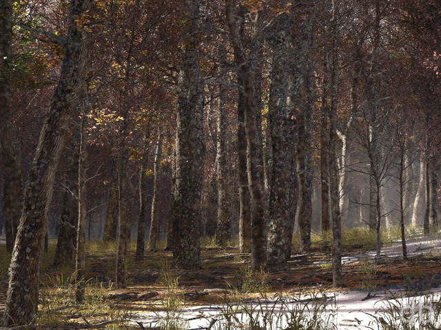
A few days ago I opened the scene file for Red and Gold (created way back in 2008 using Vue 6) on Rochallor with the idea of a minor update. I ended up completely redesigning the tree in Plant Factory (the first was pretty but was a horrible hack) and adding all new foliage in the pasture (based on the autumn wildflowers in my neighborhood actually). I also brought a tiny bit of color to the sky 🙂
Not really an update but not totally new either. Not just “red and gold” anymore either hence the new title 🙂
Plant Factory gives me a lot more control over where the the foliage so I can do a lot more with this scene than I could with the original. I hope you enjoy it!


 The Fall Spectrum: fallspectrumfog1
 The Fall Spectrum: fallspectrumcomp1
Russ [patronmember]
Ryan, “the sum of all is greater”, and you nailed it!! I took your initial versions (low light, dense fog) and renamed it “early dawn”. Now with the rest, I have 7 fabulous scenes that, every hour, will change to the next spectrum of the day/night. On my triple-screen at work, I can say it brings a welcome break from the chaos, when I glimpse the change…then pause and enjoy the beauty. I think you still need to work on LWP’s for phones. It is an untapped avenue for you art. And as another has commented, try your hand at animating some of the background. Some slight movements in the field, to a few leaves falling off the tree. If it is not your area of specialty or you simply lack the time, maybe find one of the LWP creator’s at the Google Play Store and see if one would collaborate and bring this fruition.
Either way, keep up the great work!!
Chris [liferplus]
Thanks, Ryan I have a specific folder for this wallpaper along with the Red & Gold variations which is nice and relaxing, Thanks again.
Mark A. [liferplus]
Ryan, since you did a winter version of green & gold (for the pickle jar), I’m thinking we’ll need a winter version of this one! 😉
Eric [liferplus]
make the double screen 7680 x 2160 (xuhd) for pickle jar images?
Just wishing.
Ozaawaagosh [plusmember]
I love all the versions of this one, one of my favorites, awesome colours, and so very calming, thanks Ryan
Hadrianel [lifer]
I ALWAYS loved the original from ’08 and came back for it many many times 🙂 one of my favorites!
nice to see a colourful update to it. Thanks four your work
Littlemom [liferplus]
I absolutely love the fog on pickle jar version of updated version of “Red and Gold”.
Littlemom [liferplus]
I like the brighter colors on this one!!!
Afya [lifer]
‘Red and Gold’ is in my top 5 of all time, but this new one is too overwhelming and bright for me. The flowers and green grass are pretty but distracting – two things I love about ‘Red and Gold’ are the bleakness of the rest of the scene, and the way the wheat reflects the gold colour, and those are kind of lost here. The leaves also look unnaturally bright to my eye, especially the red ones, which are more of a dazzling pink to my eye; compare with the burnt orange of ‘Red and Gold’.
There’s a lot to love here, but for me the original is a shining example of ‘Less is More’.
Peter [basicmember]
Fantastic job on this one! A couple of things I love about it: the tree going through it’s metamorphosis from summer to fall (love the green to show that summer is ending), and the blue-jacket hyacinths gives me even more to visually absorb without losing focus on the tree.
PI [lifer]
To me the colors from the flowers in the field detract from how interesting the tree is. Pulls my eyes away from it.
Red & Gold is one of my all time favorites – I’ve had that as my background on my game rig for years.
DK-Nebraska [liferplus]
Your new render is gorgeous, and different enough from your 2008 version to be its own piece of art. I still love the old one, it reminds me of some fields here in NE, where one lone huge cottonwood stands in the middle of a field or pasture. Thank you!
Joe [nonmonthly]
Beautiful work here, these are my favorite bright, vibrant Fall colors. Thank you!
Ryan
They are a hybrid aster of my own design 😀
JCT [basicmember]
You’ve captured the fall spectrum beautifully! Still trying to work out what the purple flowers in the foreground are… they don’t look like asters or mist flowers (the purples we have here in NC alongside golden rod). I really love the glowing gold spots on the top of the tree… the glowing gold that some trees get is my favorite part of fall (I especially love they way they light up gray, drizzly days!)
ChrisW [basicmember]
Love this. I always liked it when you showed a scene in different seasons (summer, fall, winter), and this is like that; it’s spring, summer, and fall all together!
But not winter, too; that would be…weird.
Ryan
Just testing the comments here. Let me know what you think of the new render guys 🙂