Description
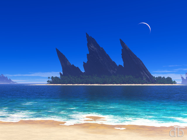
This project went through many different twists and turns over the course of Nov/Dec 2010. Perhaps I will post those renders in the Pickle Jar in the weeks ahead. I’d hoped that it would be my last project of 2010, but the render went long and it is my first offering of 2011.


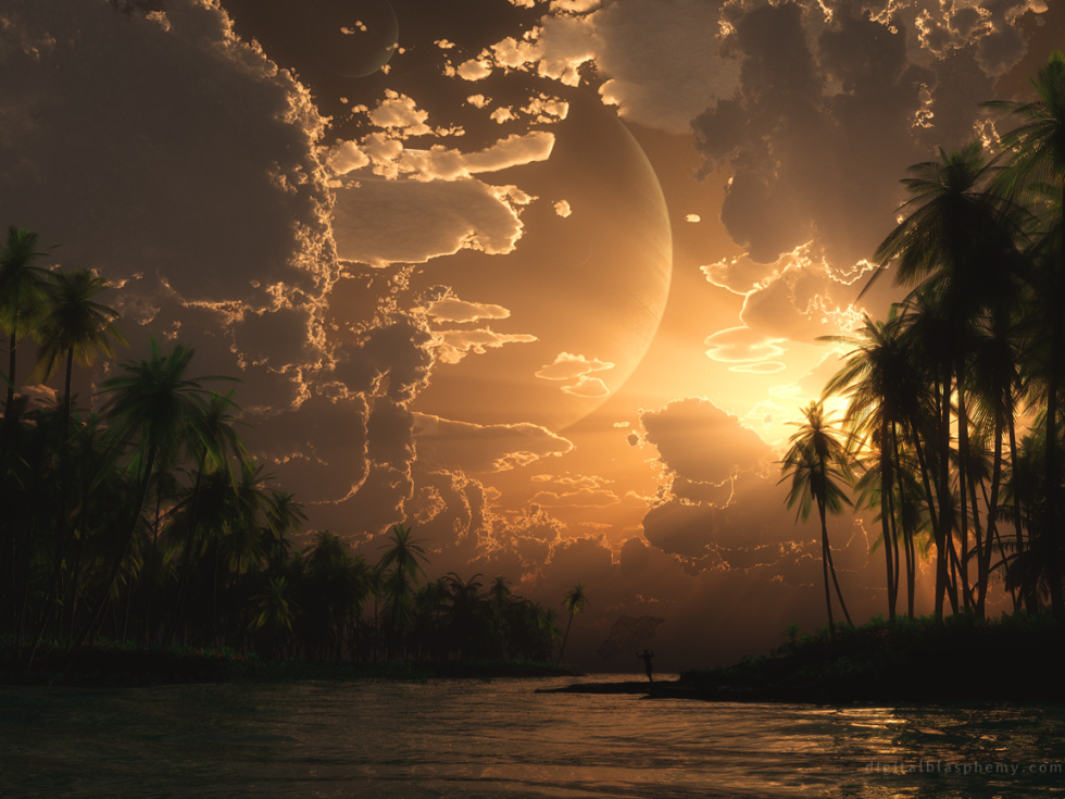
 The Fisherman: fisherman1a
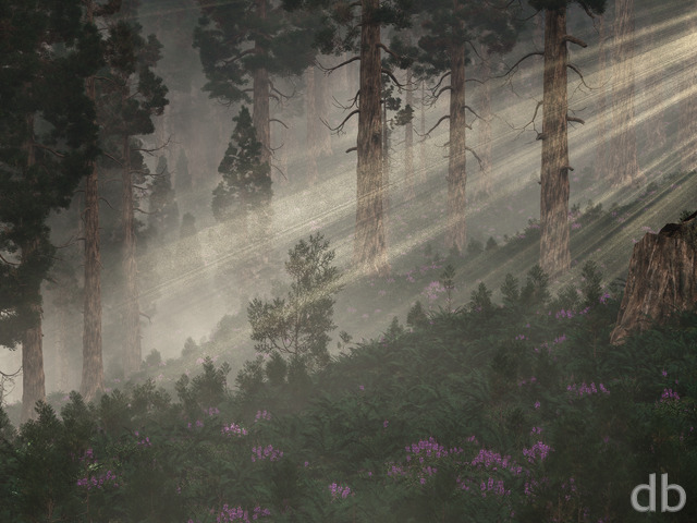
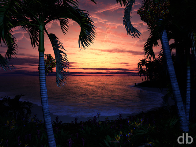
 The Fisherman: fisherman1a1920
 The Fisherman: fisherman1b
Ryan R. [basicmember]
This has to be my favorite image in your gallery. I have used it as my background more than any other and you know what? Here I am again.
Michael [lifer]
I like this one; I’ve been a member for awhile but hadn’t seen this before. There seems to be a problem with the source file for the single screen 1920×1080 image: I’ve tried from different browsers, and it always downloads as 1920×960…
Ryan
Sometimes the creative process is a linear path, sometimes it gets twisty 🙂
Ali
Why is there no lossless version of this?
Tyrin Pric
This is definitely one of my favorites… up there with Before the Storm.
Karl Shaw
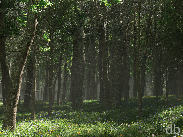
You have to look twice on this wallpaper to see that it’s computer generated. The trees look very realistic.
Cindy
This has to be my FAVORITE of all of your work so far. Stunning!
Mike
can’t believe i missed this one! absolutely stunning…
Joel
Transcendingly Simple, for a greater appreciation of earthly majesty but also with an overtone of another galaxy’s mystery…
Kaz
Hey Ryan
This is a beautiful image, but as a Vue user I can offer some insight to the render time. It’s Vue. It truly is a sluggish render engine, and unfortuantely I can’t even say that the end result justifies the time. I’ve done no direct comparisons with other engines as I am a hobbyist and lack time and will to learn the other software, but my impression is Vue’s rendering is 5 or 6 times greater than competitors for ok results. I think you will find that a new machine with a massive RAM injection will not necessarily make this better. I run mine on 8GB, and a 1920×1080 test render done on “Final” quality took 72 hours to complete. Granted both my RAM and PCU are not exactly cutting edge, but they are adequate for such tasks. I dread the full-size render of that scene. I think the A1 size will take something like 1 or 2 months.
It might be worth it for you to look into Vue’s cross stream products, so you can develop in Vue and then render in another package. But I am not certain how well that process works. Just some thoughts though.
Thanks!
Kaz
Gemini
this really is amazing, its among the pinnacle of all art online.
Mike R
Great job. This will be one of my favorites
Jenanne
I love the abstracts, too. Thank you, Ryan, for continuing to render them, and thanks Lidia for the abstract support!
RoninStorm
Just to echo a few other comments on the first pickle jar version of Fisherman. Really like the bright, sunny feel to that. Any chance of a dual-screen render for that? It’d go some way to dispelling my chilly European winter!
Randy Race
It is beautiful, but the 3360×1050 has the wrong dimensions. It is 5040×1050.
Eric
Just set my 2 work monitors with the 3840×1200. I can’t wait to get home and see how the tri-screen looks. I love that the spacing between the islands is off center to the right; it works great! Also something about the sun reflecting off of the clouds just brings everything home.
darthwhat
I’d love to download this image but it’s not the right size, welp?!
LisaB
I don’t have use for multiscreen renders right now, but this one is making me begin to wonder if maybe 2 monitors isn’t such a bad idea 🙂
Chris B
This multiscreen is nice, it doesn’t have everything sort of bent in towards the center. Did you do anything differently?
Foz
This is one of the times that I find the multi-screen far better than the single screen.
I’m wanting a third screen now…
Scott
I’m so excited that the dual and triple screen renders are now available. I noticed, however, that the dual 3360×1050 actually points to the triple 5040×1050 render. No biggie. I just downloaded the next higher resolution. My system can shrink it for me.
Scott
I’m so excited that the dual and triple screen renders are now available. I noticed, however, that the dual 3360×1050 actually points to the triple 5040×1050 render. No biggie. I just downloaded the next higher resolution. My system can shrink it for me.
Lidia
Yay for abstracts! I love your abstracts. I will be looking forward to it! I feel the need to say this because so many people seem to complain about them. I want you to know that some of us really appreciate them!
Peter
Finally 5120×1600 up for grabs.
Thanks Ryan.
oblivion
One of your best. The starlight on the clouds is beautiful. Tropical env is fantastic.
Nice job.
jbrannon
It seems that the 3360×1050 (dual 16:10) is linking to the 5040×1050 (triple 16:10) image – do you have the correct image for that size?
Deac0n
Did this remind anyone of the latest season of Survivor? Net fishing from a sandbar on a river leading into the sea…. This figure could very easily be Jane
Gregor
Once again, the Pickle Jar versions are fantastic as well! I have to agree with Jenanne, 1a is a very good picture! Reminds me of a island from Magic: The Gathering… 😉
Travis
EPIC multi-screen version.
Jenanne
I love this picklejar! I’m not as crazy about 1b, but the first picklejar image (fisherman1a) is really wonderful!
Walo
The picle jar version were early concept works so these were not final renders. Think of these as “sketches”.
Dennis M.
The pickle jar versions are very different and I was wondering, how difficult is it for you to change the point of view? Are these three dimensional?
James
The pickle jar versions look great too with the exception of the clouds. They don’t look right. The rest of the images remind me of Atoll which looks great considering it is around 8 ears old now.
James
The pickle jar versions look great too with the exception of the clouds. They don’t look right. The rest of the images remind me of Atoll which looks great considering it is around 8 ears old now.
Tyler
Personally I like this better than the “final version.” With the right touches it could easily become a top 10 wallpaper. I second Brian’s post on revisiting it sooner than later.
Brian
I think it is very cool that you showed us the different versions on this one, considering how different the final “production” model came out. Amazing.
I encourage you to follow though on your desire to play with the earlier version(s).
Ryan
Thanks! I’m afraid it may be a while before I can get this one added to Zazzle. For some reason it takes forever to render, even at desktop resolution. I’m a bit afraid of how long it will take to render it again 4 times larger. Certainly longer than a month I would imagine (since it will be rendering on my alternate box). I really need more machines!
Angelique
Breathtaking! Are you going to add this one to Zazzle?
Brandi
The lighting and sky in this is so perfect. Very warm and inviting. Love the posing of the fisherman. This one is a new favorite!
Patrick
Personally, I like the pickled versions better.
joederek
Can you make it Dual Screen? Awesome pic!!!
Tom
I have a dual-monitor setup in my apartment, one 23″ 1080P monitor and a 18.5″ 1360×768. If I set this picture as my background centered with the 1080 resolution, it looks almost perfectly dual-screen on the edge accounting for the bezel widths! What a happy coincidence! 😛
James King
the colors ….. the colors… Excellent!
Nick A
Looking forward to the dual-screen version…tell that machine to process quicker ;).
Rich A
I always thought that Atoll (2002) could be developed into something more. Maybe the Fisherman pickle-jar images are the start.
Lee
I believe the link to the 1b 1680 x 1050 leads to the 1a version
Chris B
is awesome with just a little touch up & it’s nice to see the dolphin pod make another appearance!
Lidia
Nice pickles! But how did you get from those to the final image? They are very different! I look forward to seeing you come back to these later; they are certainly worth developing.
Chris
hmmm I do love this piece, especially the sky. In my native 1900×1200 resolution I have some what of a difficult time seeing the fisherman at fisherman at the full screen. Although I can’t find any other problems with it!!
Walo
the pickle jar versions look interesting especially the one with the “Archipelago” perspective. The perspective from “a” and the flowers from “b” would make for a great “Archipelago” remake. Anyway I wonder how the idea went from “a” to the final render as these are very different lol.
Mordred
Been with you for 15 years. Someone showed my your site 14 or 15 years ago and have been following it ever since.
Patrick
Yes, please develop the aerial archipelago idea for later in 2011. I agree with Walo, the ‘a’ shot would be good to work on as a starting point. Having said that, the current version is very classy, and I look forward to the multiscreens.
Ryan, a cracking first image for 2011. Nice one.
Jenanne
I love the sky and the planets. They’re my favorite parts of this render. Perhaps the big planet is really, really big and the little one passing in front is very small (notice my incredible grasp of scientific language here). But I agree it’s more likely to be a moon of the big planet. Did you also notice the planet above the really big one? The level of detail is WONDERFUL in this image. Ryan’s skill increases with every render.
Ryan, didn’t you say something about a picklejar for all the twists and turn versions this image went through? I’d love to see those. Anyone else? Raise of hands for yes? 🙂
Alex
Really like this piece, everything seems just right, can’t suggest a single thing to change. Something about the combination of all the layers of scenery give it an amazing sense of depth.
Mark: I hadn’t noticed that, I would suggest that maybe it’s a moon, either of this planet or the one in the sky, or maybe a crater? Either way, the level of detail never ceases to amaze me.
Mark
This is really nice⦠although is that a smaller planet that I spot in the larger one? That shouldn’t be happening? Are my eyes tricking me??
Matty
Another awesome landscape! I dont think this one is going to be leaving my desktop for awhile. The colors used to infer the time of day were perfect! Very tommy kinkade-like. Thank you Ryan!
Firefly
Love the perspective, the blends of the palm trees with the clouds and the luminous sun. Really looking forward to the dual screen.
Magnificent start to the new year.
kody
hey ryan, so ive been a fan of yours for years now, and i have to say this is magnificent!!! truly mesmerizing! if possible it would be cool to see a point of view from the actual character where he’s standing, you know like putting us in his shoes lookin out over the sea as that storm in the back blows in with the treeline to the left, it would be totally awesome.
Hawk
The sun blaring through the clouds, the planets, the green, the water… ALL GOOD!
Keep it up!
Pat
Not a fan of the planet in the background. Usually I like the your planets but this one just dominates the scene for no reason. Also some of the clouds in front of the planet look a little funky, especially compared to the magnificent clouds surrounding them. I like the fisherman though.
Andrew
Very nice, Ryan. One of my favorites. This reminds me of “Oasis”, of which I actually have a print on my wall. Similar color scheme and general feel to the scene. The planets add depth, but I’m even more impressed with the cloud detail and their shadows cast in the low sun. Thanks for all the great work!
Eloise
Ryan, I really like how the water is looking — I know doing water is a bit challenging. In this one, I can feel the warm evening air, and I’d like to wade in the water.
Jenanne
Thank you, Noel, for the correction. Just goes to show how little I know about net fishing, and fishing in general. I’ve only fished with poles, and that was some years ago. So, Ryan, please clear this up for us, if you would be so kind. Freshwater river or saltwater waterway or bay/ocean? Thank you for your wonderful renders — yes, even the ones with palm trees. The details on the palm tree leaves ARE very fine. 🙂
Noel
Hi Jenanne,
I have seen river fishermen using nets.
Jenanne
David W, LOL! Yes, the fishing net is what made me think this is a salt water bay or the ocean — a freshwater river fisherman would be more likely to use a pole (IMHO). Oh, and BTW, thank you very much, Ryan, for not naming this render “The Fisherperson.” 😉
David W
looks like the person in this one is doing the “I am the great cornholio. I need TP for my bung hole” with their arms like that how bevis does it. haha
JohnHodges
Where’s the fisherman? I’m looking at the 1600×1200, don’t see it. Possibly some shadows bottom center, on the spur of land… needs imagination to get a human silhouette out of that.
Given the size of the planet in the background, this doesn’t look like Earth. So maybe it’s not a human silhouette, anyway….
Steve
i havn’t really been into the last 3, this is a return to form imo 😀
Coincident
I can’t help but spending countless minutes examining small portions of this oeuvre, let alone the full piece.
The detail of the sun on the leaves and on the clouds simply blows me away.
What a great way to start 2011.
Happy new year all.
Jenanne
Was your second comment directed at me? If so, a little snarky, don’t you think? You have the right to comment, of course, and so do I.
Jenanne
After a closer look, it could be a bay or the ocean. But does every part of the ocean have palms? I’ll shut up now (about palms, anyway).
Phillip D
Looking at it again, looks like the details are very fine especially the palm tree leaves..your render settings must be on crisp and highest settings as the details are very smooth and accurate.
Phillip D
this is just a wonderful render, I cant take my eyes off of it…I am glad you put a warm scene while it is cold where I live with snow on the ground…the render is high quality . With this type of atmosphere, I bet it took quite a bit of time to renderThanks.
Jenanne
I love this, I really do, but what’s with all the palm trees? So many of your images feature palms, which I’m not fond of (but I bet you’ve figured that out already). Too, this seems to be a river, not a bay or the ocean. OTOH, I don’t know much about palms, not being fond of them. Perhaps it has something to do with living in California, where palms are so abundant. And, as I’ve said often before, I don’t care if your images are realistic. I prefer when they’re not. Anyway, you are the artist, and can put palms wherever you like. 🙂
John
Ryan, I have been a long time member and fan of your website. You are truly one of the most amazing artists I have ever seen. Congrats on the 15 year mark 🙂
Ryan
The dual and triple-screen versions are almost ready to go. I should be able to start them rendering this afternoon!
Randy
I love it. How about dual screen? Plz….
Littlemom
Very pretty overall, but the net the fisherman is throwing looks like a swarm of flies or something and in my opinion seems out of place in the overall render. Otherwise it’s a very pretty wallpaper, and will be added to my collection. Thanks Ryan for all the work you do, congrats on 15 years of great artwork.
Tadzmatrix
Cant download Pickle Jar images, Even when logged in as a member all pickle jar images send you to the sign up page
Miguell026
AWESOME RYAN! VERY WARMISH WALLPAPEL INDEED!
of course you can tweak it here or there.. but it is a beautifull wallpaper!
Keep it up! HAPPY 2011 FOR ALL!
Chirs B
It would be a great one for some night fishing too 🙂
Hunter
I like this one a lot, but as with all of your wallpapers featuring moving water, it just doesn’t come out quite right in my opinion. It doesn’t really capture the power of water.
The only way I can think of to capture water’s movement is to put a waterfall in there somewhere. Or some rocks sticking out of the river creating some rapids… I know that this would be hard to do for this wallpaper, but perhaps bare that in mind for the future.
Other than that, I still love the wallpaper, and it more than deserves a place on my desktop (as soon as the multi-screen is done).
Andy
Lol. Just noticed the net!(was looking for a fishing rod XD) Great wallpaper as always & congratulations for being online so long, & look forward to some awesome wallpapers this year!
Darklogic
Wonderful work as always. Any chances I could interest you in making a storm version: with vicious wind, thrashing rain, dark ominous clouds, lightning, gray choppy rough surf.
Dale
My new laptop (and alot of the new laptops and displays) has a resolution of 1600×900. Is there any way you can start including this resolution please?
Dale
i wasn’t expecting to see anything new so soon, but lo and behold here is an excellent image to start the new year! Very nice!
ryan
it’s really inconvenient having a larger-than average 16:9 display…
Brian
I love the way this scene is rendered. Very crisp. Looks almost indistinguishable from a photograph. Nice job, Ryan!
tedder77
I love this one! My only issue with it, as with some other pieces in the past, is the inclusion of the fisherman. I think the work would be much better without the distracting figure. Just my 2 cents. Maybe a fisherman-less version will end up in the pickle jar. As always, keep up the excellent work!
Bob
Stunning! 2560×1440?
Wraith
Perfect way to start the year. Really suitable since I’ve had frozen snow sitting outside for about a week now.
William
This would probably have been my second or third top pick of the year if it had come out in 2010! I think the figure in the piece is necessary for a sense of scale and “action”. Whenever I download Pickle Jar versions of scenes without the figures, they seem to lose part of their realism…
Tyler
Perhaps the most inspiring piece you’ve ever created Ryan. I tip my hat to you sir. Regardless of the version, the concept here is profound thank you.
Nicola
This is just the kind of thing I want right now. I just took down my Christmas wallpaper and put up “Temple of the leaf” for a warm, light and open feeling. Can’t wait for the the dualscreen render.
anna_writr
I like the small figures off in the distance, to give you scale. This one is awesome! (and I’m not usually a fan of the tropical scenes). Amazing rendering.
Josh
The 1920 x 1080 render appears to be a little on the borked side 🙁
Noel
This image reminds me of my four day trip down the Mekong River at the end of 2009. Out of all the places I went in my two weeks in Vietnam, travelling down the Mekong was my favourite part. This images brings all the feelings back. Nice one Ryan!
Jeff R.E.
Great start to the new year. This sight certainly helps to conquer those winter blues. Yet another triumph here, Ryan! Well done.
Travis L.
The heavy rains in California have had me in the mood for a warm, beach scene. I had actually put up the revised version of Tropic of Cancer yesterday. This new image will do nicely in replacing it! Bravo!
Joe
I know some people don’t like it when you put figures in, but I like this one. Thanks!
dmackoy
certainly a nice break from the winter scenes, thank you.
-only note, large white cloud over the big planet is a bit distracting/odd.
Chandler
your software has really improved. i don’t see any more lines in the large dark spaces/shadows in the new render.
i like the colors in this one
Gerrit
The 1920X1080 is good now, thank’s
Ben
Two thumbs up. The figures never bothered me, he’s small enough that he doesn’t interfere, but big enough that you know why it’s called what it is called. Me likey.
Josh
Looks great now. Thanks!
Gerrit
I just downloaded the 1920X1080 copy of this background and it seems to have a problem. The top of the picture looks fine and the bottom half is blue. I have no problem with any other size. I really like the picture.
Ryan
I’ve reuploaded the 1080p…
Walo
Great way to start the year.
On a side note, why the hate to the poor fisherman? It seems that every time a human silhouette is present in an image no matter how small or big it is there is at least one person asking for it to get removed. Sometimes a little bit of humanity is a nice touch to an image.
James
Look to the right of the palm tree that is leaning right near the bottom middle. It shouldn’t be to hard to make out the human. The odd looking thing above him/her is the fishing net being tossed into the water.
daniel
I was wondering if there was a page of just the pickle jar versions, it be nice if you had a page with the original versions along side the pickle jar versions…your work is amazing as always
David
this must be what paradise looks like…
Rich
This is truly peaceful…
V
LOL the pickle jar variations look nothing like the gallery version!