= Add to your a la carte shopping cart.
= No watermark version, for Plus members only. NOTE: On this page, this icon is a link by itself.

= Add to your a la carte shopping cart.
= No watermark version, for Plus members only. NOTE: On this page, this icon is a link by itself.
Other Versions:
Jamie Williams
I first saw this one quite some time ago, and was instantly struck by it: subject, form, colour, lighting totally amazing. Even now all these years later it’s one I keep on coming back to…still love it.
Gregor
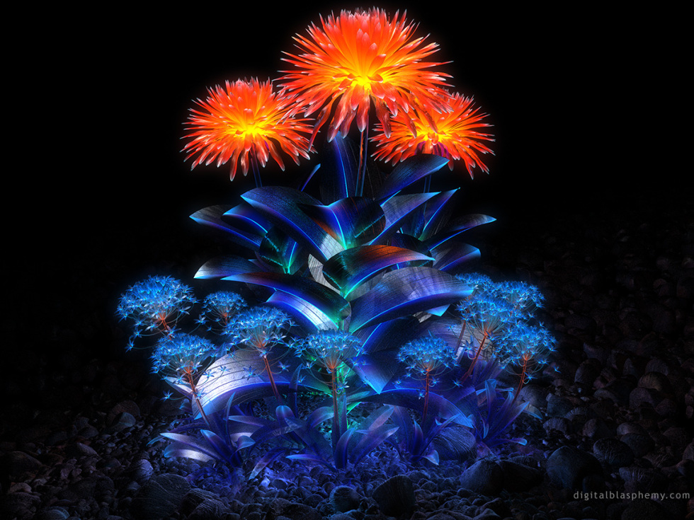
I just stumbled upon this picture, and since it isn’t the most recent one I was surprised to find out that it is available in 1280×800. It went straight to my wallpaper rotation folder (one of many advantages on a Mac :D), and I just wanted to tell you how beautiful this image is. The colors are amazing, and the sharp leaves make it look very alien-like. Thank you, Ryan!
Dean
This pic at 3360×1050 has a bad extension match on the left side. It was very noticeable on my monitor.
Crimmy
Ryan. Could you please fix the Flora 06 the left side is off on the 3360×1050 dual screen.
Thanks
Kevin
Tan
Fantastic picture, looks wonderful on my glossy wide screen. I love many of the more traditional abstracts too. I’m glad you continue to do them, even if they don’t receive the most accolades in general.
Tyler
Dear Ryan,
I agree with Tril, this image is spectacular. How it didn’t rate higher is far beyond me. Red fluorescence aside, this is far superior to the regular blue shrooms that receive such high accolade from the community.
Dan
Beautiful wallpaper, but the 3840×1200 version seems messed up. If you look towards the left, there’s a visible “seam” and a bit of what looks like a different resolution render. I’d really love to use this wallpaper, could you perhaps rerender this size?
Geezer
Absolutely stunning. One can only get it this right once in a life-time! Well Done.
Tom
I took one glance at this one and lost my breath. Its amazing contrast and perfect balance would have made me sign up years ago had I seen it.
This is why I keep coming back: I always find something to love!
Dave
This was actually the first picture I had ever seen from your site when a friend showed me it. I had from that point on checked the smaller versions of your pictures in hope that I could one day subscribe…which I did! Now I can view this and all your other amazing work at full size.
But to be more objective-
This one stands out to me, as with many other people, by the way the deep blue contrasts with the black in the background, which I love. The first glance effect of this picture is probably the most memorable over any other picture I’ve seen on this site(not to say the others don’t stand out-quite the contrary). The range of colors and radiance packed together makes for an awesome spectacle–Awesome job!
kellzilla
I was dinking around and I don’t even know how I ended up at this page! 😀 This has shot immediately right up to my favorite wallpaper you’ve ever done. It’s just STUNNING!
Alyssa
So creative! I really love this one.
Michelle
I currently am using this one on my new LCD monitor at work, and my co-workers love it! One of them asked me to show her where I got it from and I showed her this site, and she started using one of your wallpapers from the free gallery.
Tril
IMHO, this is the best abstract (if abstract it can be called) you’ve ever done. Perhaps it’s not rated higher because it’s kind of a “high maintenance” picture: Like Fluorescence, it works best on a monitor that can do justice to black (i.e. a glossy LCD), so that one can fully appreciate the radiance of the flowers. High contrast is also required so that the very dim rocky surface isn’t lost to the eye. The texture and shadowing of the pebbles works really well.
Like most of your recent works this is best viewed at widescreen–there, instead of dominating the picture to the point of being a little claustrophobic, the flowers are like an island of light.
Anyway, I’m completely in love with it, even though I find it too distracting to use as a wallpaper.
Bob
This is other-worldly, but not abstract. Think you’ve grouped this in the wrong bin 😉 If all your abstracts were like this, I’d like your abstracts a lot more!!
However, you should do what you like and not chain yourself creatively. I’ve just become aclimated to the occasional abstract, though I never use them as wallpapers. This image is a rare exception. Nice work!