= Add to your a la carte shopping cart.
Single Screen
- Lossless Master plus
- 1024x768 (4:3)
- 1152x864 (4:3)
- 1280x800 (16:10)
- 1280x1024 (5:4)
- 1366x768 (16:9)
- 1440x900 (16:10)
- 1600x1200 (4:3)
- 1600x900 (16:9)
- 1680x1050 (16:10)
- 1920x1200 (16:10)
- 1920x1080 (16:9)
- 2160x1440 (3:2)
- 2560x1600 (16:10)
- 2560x1440 (16:9)
- 2880x1800 (16:10)
- 3456x2234 (MBP)
- 3840x1600 (21:9)
- 3840x2160 (16:9)
- 4096x2304 (16:9)
- 5120x2880 (5K)
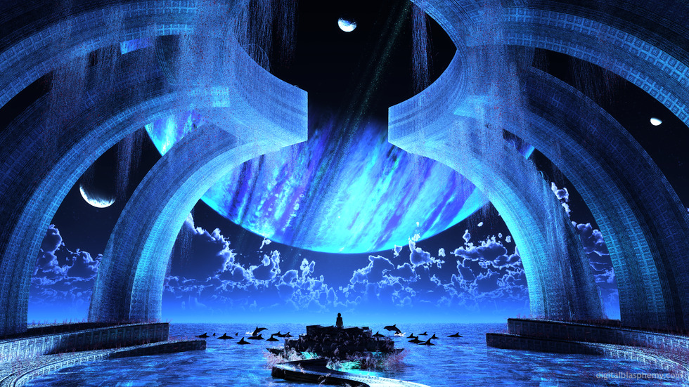
 Gazebo (2013): gazebo2k134
 Gazebo (2013): gazebo2k132
 Gazebo (2013): gazebo2k133
 Gazebo (2013): gazebo2k131
Orlando [nonmonthly]
This is the kind of presentation and artistry that I have come to know you by. Having been a member for a number of years now, my collection of your wall papers is extensive. When anyone who visits me sees them scrolling by on my computer screen, they are amazed and pretty much immediately want to know where I got them from. I do give them your URL and inform them that the cost is not only reasonable but well worth it. It is nice to come by every once and awhile and just visit the museum. Thank you Ryan for the wonderfully colorful experiences you give us.
Evan
The minecraft contest makes me wonder if I could combine this with Arcana somehow…
Anyway, a very beautiful image.
Buddercup
I wish I was in this place. Sincerely.
Chris
I really like the final rendition. The first few I felt were missing… something. But I’m satisfied with the latest one! Keep up the good work!
Ryan
I promise I will make a multiscreen version of Gazebo eventually. People are begging for a Halloween wallpaper right and I only have one Bucephalus…
Derek
I am a huge fan of the Space/Futuristic ones. It would be so cool if you could “expand” on this one and make a Dual wallpaper out of it. Please? LOL!!
Bob
Dual screen perhaps?
Evil
Makes for a great terminal background— use a greyish font with a hint of red for best results
Kenny
Like the main planet and the clouds. Love the water, dolphins, path, and center platform.
BUT, the moons seem a bit weak in almost-pure white, and the blue pillars are a big problem for me. I don’t love their texture either, but they REALLY need to be something OTHER than blue, with absolutely EVERYTHING ELSE being blue in the scene.
I’m also a bit confused by the sunlight / mist / rain / hanging bead strings / whatever they are. The dark red version of these in the 3rd Pickle are WAY better.
Romarch
Sweeeet! You’ve toned down the lighting, which was my only real issue with the early versions of the piece. And I did not know I was going to like the translucent columns as much as I do! The vegetation is softer and looks like it’s being slightly stirred by the wind in a direction that kind of blends in with the cloud-bands of the big blue planet…I don’t know if that was intentional, but it is a very nice touch. The composition as a whole gives me that spacious feeling that the very, very first one did back in the 90s: “On a clear day, you can sit at the edge of the world and see forever.”
Awesome est!
John B
Gazebo has been a favorite of mine since 2003. I used the 2003 version for 2 straight years before switching it. This update is a very fitting one. It brings it into the modern age. But it just looks like the “model” in this is too far away from camera and it takes away some of the depth for me. I don’t feel as if I am the one thats gazing out over the ocean like i did before.
Also as a personal preference. I would absolutely LOVE to see this imagine remixed. For example: Age the setting 100 years. Make everything look crumbly and overgrown as if no one has sit foot there in decades. With the great Gazebo architecture so prominent it would look amazing decaying and falling apart.
Just a personal preference though..haha
Peter N.
I’ve always loved your space abstracts. This one made me think of where the dolphins went when they left Earth in Douglas Adams ‘The Hitchhiker’s Guide to the Galaxy’.
Max
I would love to see a version of it without the vegetation at all. Like others have said, the vegetation just takes away from the gazebo and water all together.
Both the marble and the transparent gazebo look decent along with the planet, either big or smaller, but just cannot get over the distraction of the vegetation.
John N.
Too grainy! I have to agree with ThaProphet. Even the water doesn’t look like ‘real’ water compared to the 2003 version. Does the new render program make water and foreground subjects grainy? Only the clouds and sky background have the best resolution.
Jenanne
I really like what you’ve done with the plants at the bottom, Ryan; it’s the best of the five versions. I’m not as crazy about the tops of the semi-transparent columns; like cmmnoble I like parts of the previous renders rather than one in particular. However, I completely agree with you that it’s time to move onto another project. Something for autumn or Halloween, or both? 🙂
cmmnoble
Looks great. The light through the columns and fewer plants at the water line give this a cleaner, more spacious feel. But I can’t choose a favorite version, because I like different little bits of each one–grabbed them all from the pickle jar. 🙂
Ryan
For the final render I’ve made the gazebo transparent and added some subsurface scattering to give it some backglow. I’ve also scaled back the vegetation at the bottom of the scene. Let me know what you think!The Pickle Jar images should be available shortly…
Sharon
I LOVE this! There was a wow moment when I came onto the site this morning. The planet seems truly a part of the image in this one. Like it’s the boss of this little moon. Love it!
Adamtrons
I have to be honest that I prefer the original spacious look of gazebo2k131 or alternate gazebo2k133 over this one. I agree with Phil S. that with the huge planet so close, it feels very enclosed. Also, the planet ring kind of blends in and is lost. The medium planet on the left has a stretched oval shape to it, which looks odd to me. Itâs so interesting the variety of comments and opinions that this one is generating. I guess that is the sign of great art.
ThaProphet
I love the backgrounds for all the versions, but everything seems really grainy to me… is it just me?
Adam
I think this is a really cool one. I do agree that there seem to be a little bit too many of the red “weeds” at the bottom. I also think that there are almost too many dolphins. I feel like the dolphins pull my eyes away from the grandiosity of the planet on the horizon. I do like the original planet positioning better. It almost seems like there is more to admire.
Perhaps skyline and water of version 1 combined with arches of newest version?
Otherwise, very awesome!
Jenanne
The best so far; the night view is lovely. But I still think the red weeds at bottom detract from the beauty of the image.
Jenanne
The best so far; the night view is lovely. But I still think the red weeds at bottom detract from the beauty of the image.
Deanna
This one is spot on. Love it!
Simon
The pickle jar images aren’t appearing…
betsey
perfection!!!! now you’ve got it!!!!
Elliot
One of your best pieces ever Ryan. Is there going to be a Facebook Timeline version?
Jenanne
The best of the three. I like the gazebo columns and the hanging vines at the top. The sky and the rising planet are both terrific. I’m not wild about the new plants at sea level except for their coloring; they’re too scraggy and not very attractive. Otherwise, this render is almost there.
Phil S.
Hey Ryan,
While I like this piece, it feels more like a different concept than an update.
I have been staring at the original and this one side by side for a while now.
What I like about the original is the feeling of awe – a lone figure staring at the vastness of space, with a minimalistic and elegant structure and a wide, clean field of view.
The new version’s structure seems overpowered, dominating and limits the view, almost making me feel enclosed and claustrophobic.
Maybe the view is too zoomed out? Maybe if it was zoomed in to the last/inner pair of columns so that we can see the view that this person is seeing? I dunno. I know its called Gazebo, so it has to have one in here somewhere. 🙂
I also liked the originals water a bit more. I am not sure if its the new software, but a lot of your works lately have had a “grainy” look, especially on water and lighting effects.
Of all the versions, I prefer version 1, without the dolphins and less busy/intrusive plant life. Although I do agree with previous posts that its a bit too blue.
My 2 cents.
Keep up the great work!
Ann
Don’t like this one as much as the first two, the columns look too… uniform. they looked better with some clutter or aging.
oldsailor
Preferred the pickle jar version without vegetation or dolphins.
Scott
Ryan, this version is a definite improvement. Its softer and more refined. I think some green color to the moss above would help to offset the overpowering “Blue”. Also, I know that you like to feature the ringed planets in your pieces, but what about a view of Earth rising? It might make it stand out more. (Just food for thought.)
Ryan
I’ve added a 3rd version of “Gazebo” to the gallery this morning. I had tried making the structure entirely crystalline (transparent) with v.2 but it didn’t work out too well. I’ve gone back to the marble gazebo and removed the crawling alien vegetation in favor of a more “stalky” plant.
Jenanne
That should be “chubby.” Not “cubby.”
Jenanne
Not much better than version one. I do like the dolphins, the darker blue of the sky and columns, and the red flowers. However, I preferred the version one vines and plants even though they needed more color variation. Also, the weathering removed most of the decorative pattern from the columns, but the pattern is intact elsewhere. If you’re going for a neglected appearance (an idea I rather like), I’d expect the path, foundation, and dais to be weathered as well, and probably deteriorating because they’d have more contact with the water. And, okay, the little cubby guy still needs some work; the shadowing makes his belly look overly bulbous. Perhaps if he was facing the other way. 🙂
Gary
Too much blue… something about it just says too much.
Maybe if the arches were green from the algae from the sea, but to me there just too much blue.
CHSpera
Great update. When will you have dual screen versions available?
Ross S.
Stunningly beautiful, wonderful piece, keep up the solid and great work.
dogchops
Awesome piece of art Ryan………..This is why i became a member of DB…….Absolutely Awesome……….
Ann
there’s something that seems too…. sharp? about this image. I love it, but it doesn’t feel smooth to me. Someone mentioned it looked bleached out, and I’d have to agree. Is there any way to soften the lighting?
Eric
I’ve always loved the original, and this piece has the potential to be a magnificent update, but like the others I’d like to see the dolphins. Also, I must ask about the person. While looking at the largest image I noticed the person is way off. I looks (to me) that the body is facing me (sans anatomical differentiation) as I can see (i think) a chest – stomach – and thighs. However, the arms (elbows) and back of a head are also facing me. So the person in the original was 10 times better than this new person. In the original the person was sitting, in these new one the person is shown standing and from the thighs up. V.2 or V.3 I’m sure will be much better. Can’t wait to give it a 10, but it’s just not there yet. Then I’m sure it will be a favorite (dual screen) wallpaper. 🙂 Cheers Ryan!
Dennis M.
Oh, and for those of you stuck comparing this to the last one, my perspective is simple. Same world, same religion, different location, different time.
Dennis M.
Beautiful. This structure looks more like it has a ceremonial purpose. Something people could build and use for centuries.
cy
Sorry, I have to say I’m not a fan of this one.
I really liked the structure in the 2003 version, which felt so much simpler and more elegant.
Littlemom
Very Nice Render!!! 🙂 Love the blue tones I find it very soothing!!!
jmpond
Nice! Lone the aura it instills.
Jenanne
Promising render. I really like the new walkway and gazebo structure, although I agree it needs some polishing and toning down of the blue. Maybe it would help if the vines winding around the columns were some color other than blue — ivy green perhaps. The dais is a bit confusing to look at; it’s not clear if it has steps or ramps or something else altogether. And, sorry, I dislike the little cubby person; I can’t tell if he’s facing us or facing away. I hope you’ll make a pickle jar version sans people as you did in the 2003 version. I’m looking forward to the final version!
Nico
Love it. Possible a night version with a stars in the background and lightning in the clouds?
awyeah
I don’t like this at all, I miss masterpieces like: arrakeen, gothamgarden, leaftemple, satori …. Ryan what happened? 🙁
Theo
Ryan, this looks amazing! Gazebo was one of the first pieces that ever got me interested in your work and is still one of my all time favorites. I’m really glad you re-envisioned and re-released it. 🙂
Dan
Ryan, Gazebo was the first wallpaper of yours that I ever used and was the reason that I bought a lifetime membership. It definitely made my old CRT Monitor look awesome : )
Ryan
The dolphins will be back in V.2.
SimonRev
I agree with Hoverwolf — the first thing I noticed was the missing dolphins.
SimonRev
I agree with Hoverwolf — the first thing I noticed was the missing dolphins.
Adamtrons
Outstanding. Blue is my favorite color, so I really like this. I appreciate the composition and drama of the piece. The only think that would make me happier is to see some tiny stars twinkling across the sky above.
Hoverwolf1
I just noticed… Where did the dolphins from the ’98 and ’03 versions go? Are you not putting them in this one?
Hoverwolf1
I like it; it does need a little work on the color. (Personally, blue is my favorite, but I would expect a little variation on the part of evolution on that planet, because, it seems to be lit by a blue star, not for a lack of warmth.) I normally try not to rate things above an 8, but you’ve been doing very well, in my opinion. Also, you’ve produced more than normal this year, all solid works. I may have to raise my standards now.
Romarch
Oww…too blue, yes (could do with some warmth), but mostly–the bottom part’s too *bright*! Especially the pathway, but the whole base of the structure looks bleached-out; I can’t really make out the pattern on the tiles, and I know I’m missing out. This could be really nice with less glare and a little more color.
I do like seeing figures (people, animals) in those of your works that give them somewhere to sit or stand. They give a sense of scale, which to me highlights the size and magnificence of the things around them; and they help me to project myself into the spaces…hard to explain, but it’s the main thing that drew me to your work in ’99. Not all my favorites have people in them, but they all have somewhere to “stand”, even if that means being in an unseen spot peeking out or in, or perhaps in an imaginary aircraft flying over or into or through.
Scarr
Because it’s awesome. Because you are going back and revamping old works that re-spark a piece of me from when the previous work was out… but also fits nicely as a NEW wallpaper on my desktop. The Combination of nostalgia and newness does a lot.
Zach
Of course it is just my opinion, but I find this piece to look rather unfinished and unrefined. It seems grainy, and in the back of my mind, I see the smoothness of the 2003 version (which I wish had a dual-screen, by the way). 🙂
Though I don’t particularly care for this piece, I still thank you for creating!
Ben
I like it but I tend to find the people distracting… Plus I think the very blue vegetation doesn’t add much, I think it would look better with less blue color, try rusting out the structure and greening the plants and I think it would look better to my eyes… Keep up the good work Ryan!
Nightwynd
It’s ok. A bit busy, and looks a bit too much like several other well-known pieces cobbled together.
suab
A very interesting piece (and definitely an improvement over 1998 and 2003 versions). However, is there a chance for a version that would be less BLUE?
Kyle
A nice, grander variation on the original.
Alex H
Massive improvement on the original. The only negative standout for me is the detail on the little person. The person is essential, but there’s something not quite right about him/her. Stuck in uncanny valley or something
Dave T
I love the design and the concept here. But I have to say, as I’ve thought for quite some time, that a lot of your renders are just too darned grainy for me to enjoy. I’m a lifetime member and I love your creative vision. I know my comments quite likely don’t represent the views of some others. But judging by the comments below, I’m not the only one who thinks that this image — and some others — have too much visual static in them to enjoy. I’m neither an artist nor a technician, so I don’t know what causes it, but I know what it looks like. And as much as I love the fantastical architecture, I can’t enjoy the final product except from across the room.
I hope that you won’t find my comments discouraging — I know from experience how painful it is to have people slam your work — but I *do* hope that you’ll keep exploring ways to do fantastic designs like this with cleaner and more appealing surfaces.
Keep up the good work!