Description
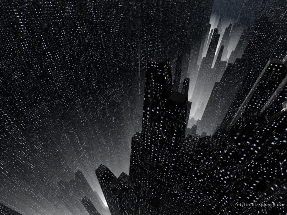
Gotham: Created 12/7/98 using Bryce 3D and Adobe
Photoshop.

Gotham: Created 12/7/98 using Bryce 3D and Adobe
Photoshop.
= Add to your a la carte shopping cart.
= No watermark version, for Plus members only. NOTE: On this page, this icon is a link by itself.
Emily Terra
[Lifetime]
After all this time this is still one of my favorites from DB, adding my voice in that I would love to get a 1080p version of this exact work if possible.
Anon [basicmember]
There are many early works here that are compositionally fascinating but look dated and would require a reworking/overhaul with a refined technique and artistic vision to be made relevant again. This one, however, would require no such reworking. It still looks very much good in its original state – just way too small. If there were ever to be more works added to the “bucephalus revisions” series, I think Gotham (1998) should definitely be among them.
Julian M [basicmember]
I used this one often on my old Packard Bell, a lot of late nights on there with this on the background. Even then it had a sense of depth that made you feel like you were just on edge. It is one I would LOVE to see as a 1080 render.
Eduardo [liferplus]
I’ve seen the update, but what I’d *really* want is this exact version, only in higher resolution and in 16:9 (if that’s possible)
Alex
Ryan: if updating it is a lot of work, would it at least be possible to make a higher resolution render of the same picture?
I’d absolutely love to have something I can print..
Alex
This is the picture that brought me to digitalblasphemy.com. It’s hard to describe how impressed I was when I first saw it.
I really very much hope that there will be an update for it!
Eduardo
What makes this picture my favorite is the use of perspective. The camera angle enhances the feeling of depth and vertigo, making the city feel gargantuan, forbidden, and mysterious. The sparse use of color enhances the effect even further. The many lights that can be seen in the buildings give the viewer an idea of the multitude that inhabits even a small portion of the city, and the fact that you can’t see the street below due to the haze makes you wonder how high those buildings go.
I love it, and I hope that I see an update in the future.
Ryan
I’ve been working on-and-off on an update for the past year or so.
Henrik J.
First time I saw this wallpaper was in ’99 on a friend’s computer. Something back then made me remember it and wonder where it originated from and who made it?!
When I was introduced to DB in ’01 I stumbled across it again. It has been my wallpaper(on and off) sinceâ¦
An all-time personal favourite. Still waiting for a remake in 3840 x 1080.
Romarch
This one is still one of my all-time favorites. I first saw those towers in ’98, the year I was introduced to your site, and I wondered: Wouldn’t they sway in the wind? And that line of thought brought me to a place, far above the land, where the buildings did indeed sway…looking and behaving, at that distance, just like the blades of grass they must have replaced, how many millenia ago.
Thank you for inspiring that thought!
Justin B.
This is a great wallpaper (all the Gotham ones are great), especially when you look at most other wallpapers from 1998. This is far and away the best of ’98.