Description
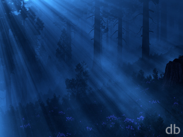
Wanted to create a night version of “Halcyon” with glowing blooms. I changed the blooms to red because, quite frankly, there’s been a bit too much purple in my gallery recently.
The volumetric fog made this one a 65hr render rather than a 3 hour render so let me know if it was worth it!



 Halcyon (Glow): halcyonglow0

Holly [basicmember]
Amazing! The render time would have killed me, but it pays off here.
docster [basicmember]
The 3840×1080 looks superfine, Ryan. Thanks much!
lorwynd [nonmonthly]
I like Halcyon very much, but I like this one even better…and the night/dusk version is exquisite. Beautiful and foreboding.
Kirrus [liferplus]
The fog does look awesome, it’s definitely worth the extra render time
ZUL [lifer]
I love the deep red in this one. The fog looks fantastic as well. It gives it a bit of an eerie feel.
Amanda [nonmonthly]
I like the slightly muted colours of this version, the pj one is lovely, but slightly overwhelming on my monitor. This is super.
Rowan [basicmember]
Looks really good, any idea when there will be a triple monitor version of this? (5760×1200)
Marlowe [plusmemberlifer]
Really love the colors and the fog!
Ozaawaagos [nonmonthly]
Absolutely Stunning, my friend it reminds me of places, we stay at in South America. Not glowing of course, but that would be so awesome if it did, LOL Great Work
Richard H. [liferplus]
Just to be awkward⦠I prefer the version without the fog. It isn’t that I don’t like the foggy version (I do), but I just prefer the other one. To me, the fog (a) obscures too much detail in the distance and (b) has too much of an effect on the colour scheme. It sort of pollutes the red with a greenish tinge that makes it more orange. I like the red colour of the PJ picture better, and also the extra clarity of the water, so that you can see more reflections and distance detail. The fog makes all that a bit of a mush.
Brian J. [liferplus]
Will we see a resolution that fits the 12.9″ iPad Pro? 2732×2048…
AceofHearts [nonmonthly]
I absolutely love the intensity of the red. It was the definitely worth the hours!
Mario Carini [basicmember]
Who wouldn’t want to have glowing blooms to light up the backyard every night. Nice composition.
Hawk [lifer]
Yup, the fog was worth the wait. Very nice.
Liz [nonmonthly]
yay!! thank you for another gorgeous background.
betsey [lifer]
perfection…
Caitlin [lifer]
I love this. It almost has me looking for the wires for the LEDs, it’s magical and dreamy and gives me a feeling of peace to look at it. 🙂
Ixias [lifer]
Like the fog. Of course, that might be because it’s foggy where I live.
Greg [lifer]
I like both, but the fog is (IMHO) much nicer; gives it an “early morning” feel…
Zach [lifer]
I think that the fog in the gallery version is excellent! Though the colours seem a bit more natural in the gallery version, I somewhat prefer the vivid hues in the PJ version.