Description
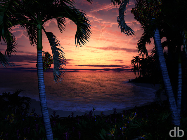
It occured to me that the best way to learn how to light these new cloud models is to make a few different versions of “Hideaway”. I know some folks thought the first version was a little too dim so hopefully this will work better.
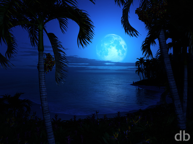
I will probably also do a night version next before moving on 🙂


Eric [liferplus]
Saweet! TY
Ryan
Pointing out that the split was in the clouds helped. I found it and I’ve posted new multiscreens.
Anon [basicmember]
Yo, I see the split too. It’s on both the dualscreen and triscreen versions. It’s on the left half, right to the left of the first set of trees towards the center of the wallpaper. It’s only with the clouds too, so it must be an issue with the cloud layer of the master file (if I had to guess)
Eric [liferplus]
Okay, I think I’m getting the new one, hideawaysunrise12x3840.jpg, because the split has moved to 912. Most noticeable at 912,292 – 912,660
I also tried it in, another previously unused browser, Chrome. FF is my go to.
Also sorry, I got my H&V crossed
Ryan
Ah I see it there. I’ve uploaded a new one.
Eric [liferplus]
On https://digitalblasphemy.com/content/jpgs/3x/hideawaysunrise15k3x.jpg the split shows up at 5579, 0-1800
I’m using MS Paint (don’t judge) 😉
Eric [liferplus]
Same for me. Vertical mismatch at horizontal 946 on the 3840×1200, from vertical 0 down to about 804, after refreshing image page (CTRL-SHIFT-R) https://digitalblasphemy.com/content/jpgs/2x/hideawaysunrise12x3840.jpg as of this post.
I’m also seeing it on other multi screen images.
Ryan
All I can say is that I did fix them and I can’t find the errors when I look at the files any more. I suspect you are still fetching the old cached files from my server for some reason.I’ve turned off the Cloudflare caching for the next few hours so maybe try to download them again (CTRL-SHIFT-R will do a full reload).
Nathan Zachary [lifer]
Hi Ryan,
I’m personally using the 3840×1200, but it appears to be present in all of the multiscreen renders.
Ryan
Which resolution are you looking at??
Nathan Zachary [lifer]
Hi Ryan,
I still see that the multiscreen renders have the misalignment / tearing that I mentioned in a previous comment. I hope that you’ll have time to fix it, because (like almost everything you make), this is a beautiful piece.
Nathan Zachary [lifer]
I don’t have any caching enabled, but unfortunately, it still seems to show the same problem as of today.
Ryan
Make certain you aren’t downloading a cached version again.
Nathan Zachary [lifer]
Unfortunately not, I still see that it is still offset. Sorry to be a pest.
Ryan
Ah lol, I see what you mean. Try it now…
Nathan Zachary [lifer]
3840×1200. Thanks again for looking into it!
Ryan
Which resolution are you using Nathan?
Nathan Zachary [lifer]
Unfortunately, it looks like the offset is still there, though not quite as dramatically obvious as it was previously.
Nathan Zachary [lifer]
Thanks a lot for fixing that problem; really a nice image!
Ryan
Apologies about the multiscreen glitch. It should be fixed now but you may need to do a hard reload of the image in your browser to get the new version.
Ken F [basicmember]
I’ve noted the same issue on all the multi-screen renders. The image is offset.
Nathan Zachary [lifer]
Hi Ryan,
This is really nice, but it looks like there’s a glitch in the multi-screen renders (at least in the 3840×1200). To the left of the last tall palm, it seems to have a straight vertical line that splits it from the rest of the image. Hopefully that’s an easy fix. 🙂
Cheers,
Nathan Zachary
Ozaawaagosh [plusmember]
Awesome
eyalh [lifer]
Thanks!
eyalh [lifer]
Personally, I like this one better than the original. Looks more real to me
(In the home page it appears as if there are multi-screen renders, but I don’t see them here…)
Omar Calderon [basicmember]
There?s got to be a night version
Afya [lifer]
Still very nice, but much less interesting and unique than the original, to my eye.
Jenanne [liferplus]
Awesome! I like this one better than the original. Love the light reflected in the water.
Susan [basicmember]
The sunset colours are lovely