Description
I received many requests for different color variations of “Hypogeum” so I spent the weekend playing around the scene. I did some simple color shifts using Photoshop but they didn’t really excite me (but I will add one or two of those to the Pickle Jar at a later date). It wasn’t until I added some color contrast by changing the lighting and re-rendering that I felt the scene was actually improved. Let me know how you feel this new render compares to the original!
Which version of "Hypogeum" should I feature in the gallery?
The poll has expired!


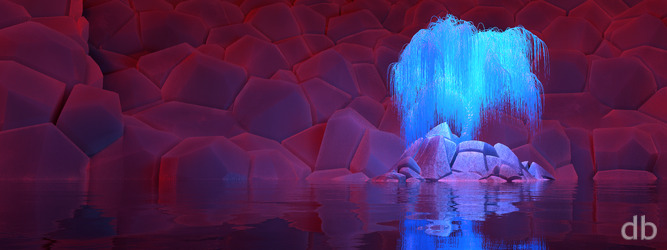

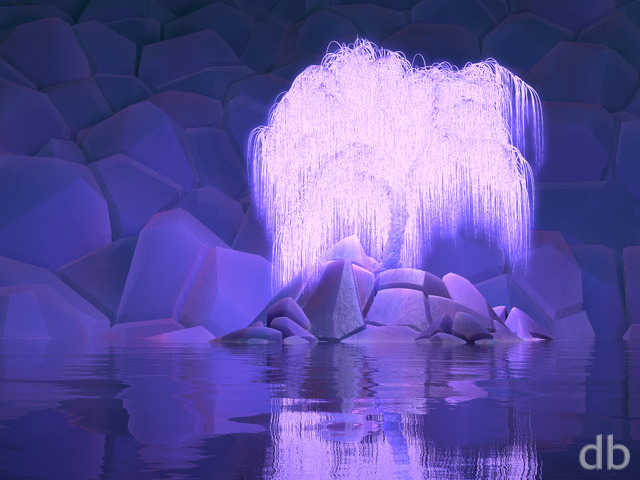 Hypogeum
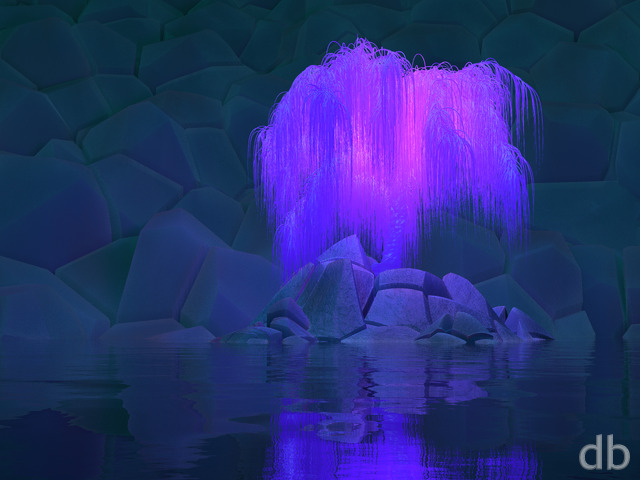 Hypogeum (Violet)



Tim Porter
[Plus]
Another classic, love it. Reminds me of a film set.
Nathan Zachary
[Plus, Lifetime]
Hi Ryan, though this version of Hypogeum (red/blue) is still my favourite, I noticed that it seems to be stretched wider (noticeable primarily in the tree) in the triple-screen versions than either of the other two colour variants. Is this by design or a rendering difference?
Ryan
[Owner]
Hmmmm. There shouldn’t be any difference. The geometry and camera settings for all the scenes are the same.
Christopher Spera
[Lifetime]
I have always loved your work. This, like all your others is wonderful!
I know I need to get back to actively contributing and not relying so much on my grandfathered Lifetime Membership; but times is hard right now. I would love to see a holiday version of this, either in the standard Holiday red and green or in a rainbow pattern, like the other Christmas/holiday exterior pic you did with the one tree.
Todd Rubel
[Lifetime]
Looks great, you should send it to the producers of Avatar. Looks like the next tree of life
Nathan Zachary
[Plus, Lifetime]
Wow, such a cool colour variant, and I like that it’s not as monochromatic as the original. Really great work, Ryan! Thank you, as always, for sharing it with us.
Nick Tyrrell
[Plus, Lifetime]
Oooh… stunning.
Great job.
Stephen Hedge
[Basic]
Lovely variation on Hypogeum!