


Description
Here is some more experimentation using Cinema4D’s cloth simulation toolset. This scene uses similar techniques that I employed in “Rhapsody” and “Passel” but I used different forces to create a more complex folding.
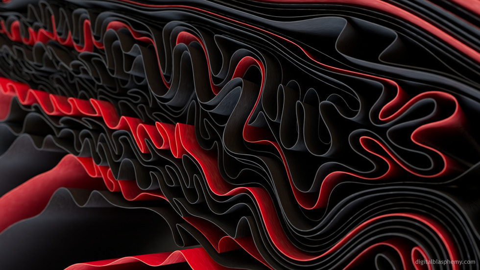
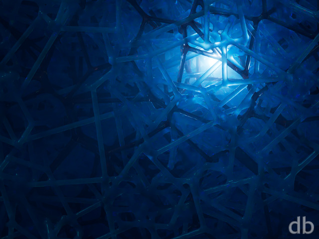
Here is some more experimentation using Cinema4D’s cloth simulation toolset. This scene uses similar techniques that I employed in “Rhapsody” and “Passel” but I used different forces to create a more complex folding.
= Add to your a la carte shopping cart.
This feature is disabled temporarily. You can still add a la carte items via the "Downloads" tab on any wallpaper, including this page.
Dual
Triple
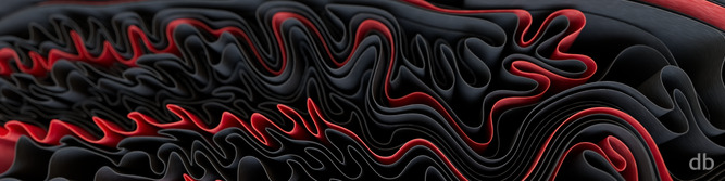
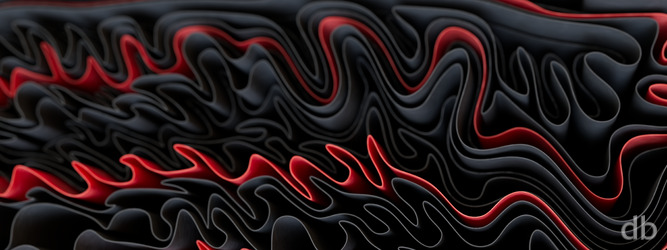
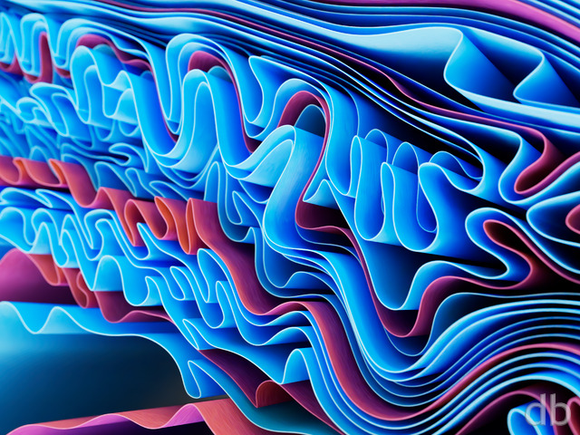 Interfold (All Blue)
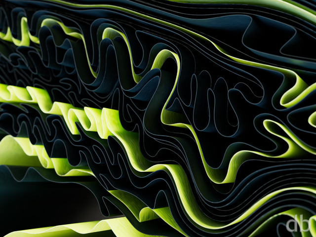 Interfold (Green)
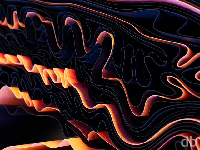 Interfold (Orange)
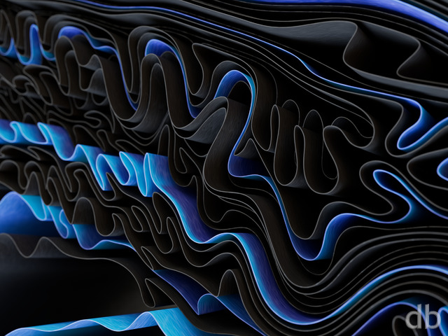 Inferfold (Blue)
Edward Harkins
[Plus]
Beautifully detailed! The All Blue pickle jar version looks great on my iPad Pro 11-inch M4. Love it! Thx!!!
Kazz
[Plus]
I have a sudden craving for ribbon candy.
Gian Luigi
[Basic]
very good work
Stephen Hedge
[Basic]
Love your abstracts! Two in a row isn’t a problem for me :-)! Can we possibly have some colour variants please?
Robert Lanktree
[Lifetime]
After criticizing the last one, I got nothing like that here. This is excellent.
Nick Bencsik
[Patron, Lifetime Plus]
Looks great on my phone!
It probably goes without saying, but is there a blue version in the works by any chance…?
Joseph Bernard
[Lifetime Plus]
Keep bringing the abstracts!!
Christopher Spera
[Lifetime]
5 Stars!
This would be really good with some different color variations for the red ribbon. Perhaps something in a vibrant yellow, green or bright blue..?
I’ve always loved your abstracts. It would be really great to see some color variations for the pickle jar, though.
jahanson
[Plus]
Along with Flow State and Primodium, these are my favorite!
Annalisa Sapone
[Plus]
Really nice! Looks like the bottom of a ruffle dress, so pretty….would be nice to see other color combinations, as others have said.
Scott Wilkins
[Lifetime]
Nice. Looks like a Windows background image. Needs more color though.
Phillip Paradis
[Lifetime Supporter, Lifetime]
I like it. Would love to see color variations, but this fits quite well with my current dark mode setup.
Graham Robinson
[Lifetime Supporter, Lifetime]
Having downloaded it. The ultra widescreen versions don’t look like they are the same image as the 16:9 version. I know they are normally a crop, but they look out of focus more than the image shown at the top of the page.
Ryan
[Owner]
Sometimes I have to reframe things for the multiscreen versions because expanding the single screen frame just doesn’t work.
Graham Robinson
[Lifetime Supporter, Lifetime]
Really like this. Great opportunity for a bunch of picklejar colour versions
Nathan Zachary
[Plus, Lifetime]
Another neat abstract! The depth of field on this one seems a bit shallow to me, and I find it distracting on the multi-screen renders. Some colour variants would also be fun.