Description
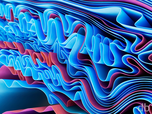
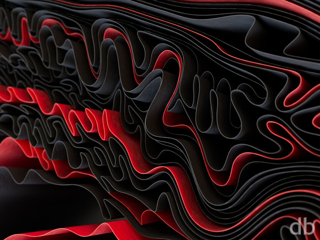
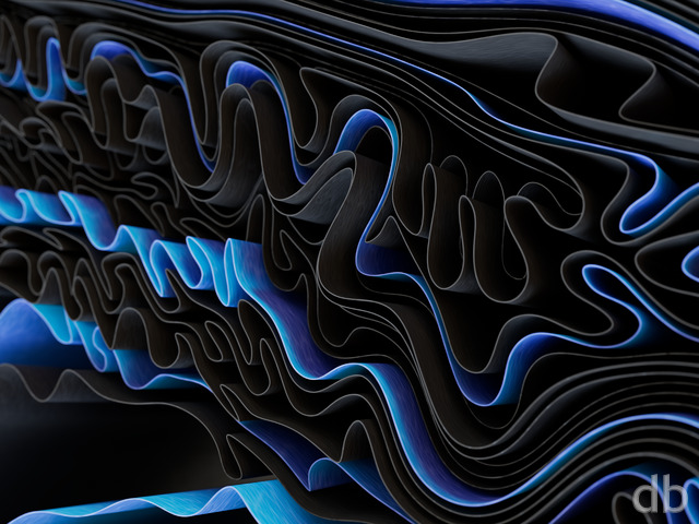
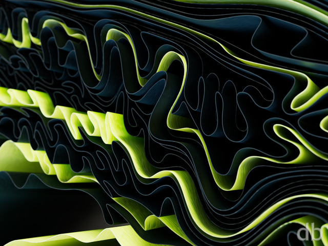
Another project that started out on my MacBook Pro while waiting for a render to complete on my main box. This one is a study of interconnected opposition (or yin yang), a theme I have been pondering quite a bit lately.
The “final” version (above) is actually a Photoshop composite of a couple of different renders. Each had elements that I wanted to keep so I combined them (sort of in keeping with the theme of the piece I thought). Not sure how I will accomplish the multiscreen though…

 Interopposite: interopposite2
Davin [nonmonthly]
This theme seems to be so prevalent with these color choices that there must be something to it. Look at the Star Wars: The Force Awakens poster; this happens to be the same color scheme. I also have seen it in the Cirque du Soleil: KÃ poster that came out in 2014 (or so). Great choice and seems to have been a trend setter.
Josh
This is my favorite dual-screen arrangement so far. My two monitors are on separate computers, and the split works out so one side gets almost fully red, the other blue. Either side is interesting enough to stand alone, yet they complement each other nicely.
Jason
This might be my new favorite DB image. Amazing!
Karl
I was wondering what method you used to create the strands in this piece.
Fumigator
Oh wow, yes, that is a big improvement. Though, it looks like the 3360×1050 version still contains the noise. I noticed this only because this is the size I download and resize for my 2880×900 setup. When I downloaded and resized the 3840×1200 size, the noise was gone.
Ryan
Must be a problem with the Photoshop action I use to resize and crop the images. I’ve reuploaded “Interopposite”, “Riverbend”, and “Red Harbinger” at 5120 x 1600. Thanks for the heads up!
Peter
5120×1600 points to 5120×1440…….:(
Ryan
I’m curious whether the multiscreen update corrects the noise issue.
ThinGeek
I’ve always liked your abstracts, and Interopposite is no exception. I have it on my single-screen laptop and love it. As Max stated though, the noise is too distracting to put it on my dual-screen setup.
Fumigator
I rather like the noise, it looks kinda cool. Maybe I’ll change my mind though once I see a render without it.
Ryan
Thanks for the feedback! The noise is caused by the depth-of-field in this one so I will try a render without it to see if it looks better. It will render faster without it anyway…
scott wray
but i agree with the noise.. theres no clarity to the image. single screen looks nice and crisp.. multiscreen looks blurry. sorry ryan!
Nathan
I agree, there does seem to be quite a bit of “noise” in the dual screen render I am using. Very grainy using the 2560×1024 version.
Max
The multiscreen render has too much noise. It’s distracting.
Jason
Love the image, but is it just me or is there an excessive amount of noise in the multiscreen render?
RA
Nice work Ryan. I like this, though I am not a fan of very distinct bright spots on the screen this image has become one of my favorites rapidly. It is on my xoom and my desktops too. Keep up the great work and put that new rocket to good use 🙂
RA
Nice work Ryan. I like this, though I am not a fan of very distinct bright spots on the screen this image has become one of my favorites rapidly. It is on my xoom and my desktops too. Keep up the great work and put that new rocket to good use 🙂
Ryan
I’ve been working a bit too much on new projects and neglecting my multiscreen renders lately. My apologies!
0beron
It would be a real shame not to have a multi-screen render of such a great abstract.
Fumigator
I’m sad it seems the dual-monitor version got skipped on this one. Me likey.
Ninhalem
Somehow reminds me of the commercial right now of LTE and the Droid combining, in a good way.
Eric
Love this one.
Khyren
I would love to see this in a triple screen render.
madtyger
Thanks for the suggestions. Found out that the Xperia Play’s resolution is 480×854, so I was able to adjust the wallpaper to fit.
Lidia
I usually love your abstracts, but I don’t like this one very much at all. I’m not a big fan of bright lights that sort of blind me when compared to the rest of the scene.
Jeremy M.
D’oh!!! guess I submitted that a couple of times too many. Had “mad click” disease this moring… lol…
Jeremy M.
Looks great… think it’d be awesome with some other color variations too!
Jeremy M.
Looks great… think it’d be awesome with some other color variations too!
Jeremy M.
Looks great… think it’d be awesome with some other color variations too!
Paul M.
I love the look & Colours!
Paul M.
Interesting…
Ryan
I would try the 1024 x 600 (Netbook) images). Does your device allow you to size the image to fit your screen?
horcruxhp
Depending on the type and model of the smart phone you have, just pick the resolution that best fits your screen. That’s what I do. I have an iPhone 3GS and I use the iPhone 4 screens.
madtyger
Love this one and would like to use it on my phone. Anyone know what size to use?
kellzilla
The Pickle Jar link will only be there if there ARE other versions of an image. Not all images will have a PJ link.
kellzilla
Under the downloads links, above the comment box. Pickle Jar Versions are alternate versions, sometimes different colors, sometimes different angles, and also when a piece goes through various upgrades, the old ones are usually still available. All these are in the Pickle Jar.
Arrrion
What is pickle jar?
Anton
This really is an image that inspires duality on the basest levels, as well as the most intellectual, bravo!
Mark J.
You’re still at the top of your game.
Ryan
Thanks! I am going to do one more single-screen version before I concentrate on the multi-screen. I’m hoping to have it up before the end of the week though!
horcruxhp
I really like this new render. I can hardly wait for the dual screen version to put on my desktop!
Ryan
Thank you for supporting my work!
Ross H
Very cool! I’ll be making this my new wallpaper!
GeneralB
I’m getting a very cybernetic feel from this. Maybe a hint toward AI sapience, their first struggle with their own morality. Either way, it’s a really nice jump from your realistic renders.
macindean
I love the dark background with contrasting colors. Looks great on my screen! thanks again ryan
fandeboris
This one kind of ‘grows’ on you. The more I look at this the more I see in it and the more I like it.
fandeboris
This one kind of ‘grows’ on you. The more I look at this the more I see in it and the more I like it.
Walo
Another hit!
0beron
Another awesome looking abstract – can’t wait for the multi screen version!
On another note, is it possible to make a render with vertical size of 1680 pixels? I run a multi-monitor config with some 22 inch wide screens in portrait mode. I usually use the largest dual 16:10 as it is the closest in aspect ratio, but it either has to be resampled or letterboxed. I know these renders take a long time, and so an odd sized render in such a large size might not be possible.
Mp
I love the scenes you create that depict these lovely vibrant details. Please to admire and makes my imagination wonder.
Xorothian
I love this wallpaper. It reminds me, in a way, of particles colliding.
Kristin
I love it when you create! Your images never fail in leaving me gob-smacked and wanting more. I do love all of your images, thought abstracts have a bit bigger piece of my hear. Can’t wait to see what the new system will bring!
James
Still psyched about the final Riverbend.
This new abstract makes for a fantastic background on my Storm. Thank you!
Jenanne
I love your abstracts in general, and this one in particular. Great, great work, Ryan!
littlemom
It’s ok but not my favorite, but as with all your renders I’ll add it to my collection.
Vincente
Very great. I am so looking forward a dual screen version.
Andrew
With all those workstations you should definitely try to set up a render farm and have all those machines work together!
Scott
Could use some polish, but a nice visual nonetheless. I was reminded of Greg Martin’s work too.
Geep
I have to admit, normally the abstracts don’t make it to my desktop as I prefer the landscapes, but this one definitely made it. I love the polar opposite colors of red and blue.
And it kinda reminds me of Avatar: The Last Airbender (the show, not the movie). There is an episode where two characters are firebending, and one has blue fire, and the other red. 🙂 Very nice work!
Mat
You never fail too impress, Ryan. This is another great abstract. My only complaint would be that it looks a bit flat. It lacks the depth that made your other abstracts so great. But this is still more than enjoyable.
charrion
I had foolishly allowed my membership to expire some time ago but this image has inspired me to renew.
Like Greg in CA, I love the abstracts.
Greg in CA
The abstracts are always my favorites and this one doesn’t disappoint!
T3chn0g33k
This beats out Greg Martin’s Glacial Inferno!
The Guru
First of all, love it. Definitely one of my favourite abstracts. For the multi-screen, why not o back in time and show the two opposing elements while still on a collision course? I’m not sure of how you would occupy the middle or anything, but it would allow you to spread it out more horizontally.
matthew
very nice work been wanting to become a member for a while just now did.
Andrew
One of my favourite this year, nice job! I wish I had your new PC, it’s a beast! 😛
kellzilla
Do I detect a familiar name? There are surely a lot of Jeremys with the last name starting with M, but few of them would sign their name as such.
If not, ignore me! 🙂