Description
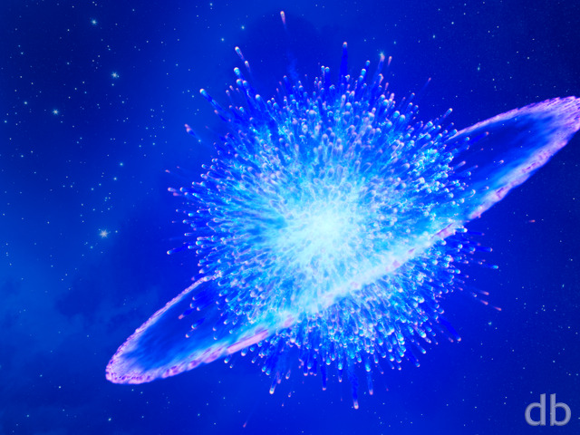
I started playing around with this model on Asfaloth while waiting for “Cronus Rising” to render on Bucephalus. My goal was to create a believable galaxy in Lightwave using the new instancing tools (and no Hypervoxels).
This one rendered in around 90 minutes at 4800 x 3000 with 24 anti-aliasing passes. That certainly beats the 24 hours that a similar Hypervoxel render would take. I’m still learning all the tricks to the new instancing system so this is just the beginning.
Let me know what you think!


 Island in the Void: island2k142
 Island in the Void: island2k141

Romarch
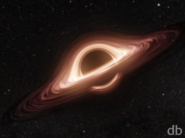
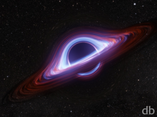
Ryan, I really-ultra-super-supremely believe the “Overseer” version merits its own space in the Main Gallery! In my eye it’s the closest you’ve come yet to actually capturing the feel of an older favorite while, as you like to say, “amping it up to 11”. It’s even got a certain symbolic value; the fact that the Overseer is looking out on a galaxy instead of a planet could just as well serve as a metaphor for how far you’ve come with what you’ve been doing here since 1997.
For me, v2 looks better by itself, but v1 makes the most spectacular wallpaper. Pick the one you like best; I love them both!
Zach
Any chance of getting this version in multis?
Joe
Nice job Ryan; love the colours on this one. I actually prefer the first version to 2 or 3. The focus is more on the centre which lets me have icons on the sides without hurting my eyes. Version 2 is nice too but the third is a little busy for my tastes — all that detail is tough to look at. V1 also reminds me of “Singularity” and its more modern revision.
Deanna
Nope, not the only one. I vote V1, even though it was a tough choice. This is because Island in the Void (2014) has become my absolute, all time favorite DB image. But, I have to say that between these two Overseer versions, V1 has a more dramatic, epic depth to it. I love the subtlety of the figure and golden beauty of the galaxy behind it. I believe it needs itâs very own spot in your gallery.
Jenanne
Well, I can only speak for myself; I prefer V2. It’s more colorful, the center isn’t as overwhelmingly bright, and I like the way space and the star field show at the sides of the widescreen resolutions. Only IMHO, of course; see what others say. Admittedly, V1 seems like it would work better for multiscreen resolutions and you’ve already rendered them. 🙂
Ryan
Am I the only one who prefers v1?
Tyler
Forget the @ symbol. I’m so OCD!
Tyler
Agree 1000% overseerisland2 is worthy to leave the pickle jar. In fact I want multi as this would go on my desktop right now.
Jenanne
Fantastic render, Ryan! See what others think, but IMO this belongs in the main gallery.
apierdominici
This picture is the reason I signed up for the membership be my g/f loves it so much. Would love on be of these if they are still available.
Thanks for the awesome pictures!
-Anthony
Glenn
This last batch of starscape’s are absolutely stunning! I’m wiping the drool off my keyboard every day. Keep up the stellar work!
Zach
Not really my thing, but the colouration is very cool. I also greatly appreciate how quickly the multi-screen renders have been coming out; thank you!
Ryan
I’ve posted a minor update this morning which fixed some issues I had with the smallest stars. The changes are so minor that I’ve just overwritten v.3.The multiscreen (rendering now) is based on this new version and should be available soon!
Ali
PNG files missing. Thanks!
nithilher
Will there be triple screen renders?
Mayelianna
You did great on this one, it draws the eye once again to the front, but you don’t get cross-eyed anymore since you can focus on the pixels in the front ;P GREAT job!
Jessica
This is one of my absolute favorites of all time.
Deanna
Love the beautiful color and detail. This latest v.3 is my favorite and went straight to my desktop (I like the 1st one, also). You could hear the wind whistling as it went straight to my desktop! Also, thank you for linking the extremely cool space images that inspired you. I love to see that.
Thanks for a beautiful piece, Ryan. You continue to amaze.
Ryan
I’ve replaced the tilt-shifted version of its in-focus counterpart. I guess the macro look was a little too weird. It was inspired by these images which I saw earlier in the year. Thanks for the feedback everyone!!
JacobKlein
I’d say “too much blur up front”. I like blur, when it is happening in the distance. But I hate blur, when it is happening in the foreground. Thank you very much for creating a blur-less pickle jar variation!
Ryan
Yes, I was going for the macro look here. I thought it would be an interesting juxtaposition. Perhaps it is too jarring though…
Brian
I agree with Mark B, the “Bokeh” make this one appear to be shot in macro, as though it were infinitely small.
On that note, perhaps a zero plane view for the multimonitor?
Great work, as always, Ryan.
Mark B
Agree with nithilher, the depth of field “bokeh” is impossible unless this is a miniature galaxy!
Jenanne
Why are you working on this holiday weekend, Ryan? Go enjoy yourself! 🙂
Jenanne
I like the V.2 non-DOF version much better than V.2 DOF, but still prefer V.1. The graininess doesn’t bother me in any of the renders, however. Overall, this is a terrific update/remake/do-over of the 2001 version.
nithilher
A full few of a galaxy is, imho, still one of the most beautiful views one can have. I definitely prefer the version without depth of field, as this it the only one physically possible. Simply, the dimensions involved are way too vast for any imaginable optical system to produce the slightest amount of depth of field. The blurred version leaves me with the wrong sense of scale. The non-dof gets a 9/10 from me.
Ryan
Veering into abstract territory with this second render. I wanted to see what it would look like zoomed in but the number of stars became somewhat overwhelming. It was suggested that maybe some blur would help and I thought it might look interesting to tilt-shift a galaxy.The non-DOF version is available in the Pickle Jar. Let me know what you prefer. There isn’t really a way to combat the graininess though, it’s a galaxy and is full of stars (and grains of dust) after all.
Jenanne
…but really don’t like the second. Sorry, Ryan.
Nathan
Simply breathtaking!
Yokhannan
I really love this one. The simplicity of it. Yeah, its grainy as littlemom said, but good… sometimes everything being ‘sharp’ is just not the best way to go.
Littlemom
Love the colors in this render but the galaxy seems a little grainy to me