


Description
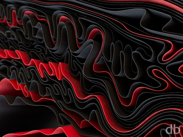
I know lots of folks prefer darker images for their wallpapers so when I create something bright and colorful I almost always create a more subdued variant. As promised here is the “night version” of “Isometer“. The palette took a bit of experimentation but I hope you enjoy the mix of colors.


mrobertsrcs
[Guardian]
Well done.
Dirk Lankens
[Plus]
I really like the abstracts (no fan of the nature renderings, how good they may be). This is awesome and easy on my eyes, so I made it my background on both my pc and laptop, replacing “Starbirth”)
Darren Bruno
[Basic]
Generally, I’m not in to the abstracts as much as the landscapes, but this one is really great.
Tim Porter
[Plus]
Love the darker version
Matthew Dinslage
Thank you for this. Any chance we can get a pickle jar version that is a grey variant. Similar to this color scheme
https://suwalls.com/3d/white-honeycombs
digitalblasphemy.lpo21
[Plus]
This one is fantastic!
Chuck Douglas
[Plus]
I love it.. I like the blur.. as a hobbyist photographer, I like the depth of field aspect the blur gives. Keep up your amazing work!!
Nathan Zachary
[Plus, Lifetime]
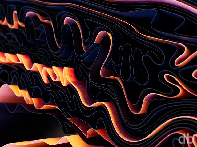
Both this one and the original Isometer (with brighter colours) are fantastic abstract wallpapers. I truly hope that you will consider Pickle Jar versions of each that have a much larger depth of focus to shift away from so much blur. Such great abstracts, though.
Ryan
[Owner]
I’m glad you like the scene but sorry you don’t like the DOF. I played with the settings quite a bit and found that with more of the scene in focus the sense of depth was lost and it was very noisy.