


Description
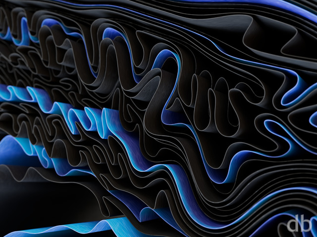
Another version of “Jovian” with a different atmospheric scattering model.

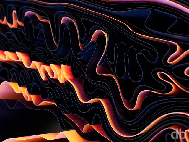
Another version of “Jovian” with a different atmospheric scattering model.
= Add to your a la carte shopping cart.
This feature is disabled temporarily. You can still add a la carte items via the "Downloads" tab on any wallpaper, including this page.
Dual

Triple

Parent:
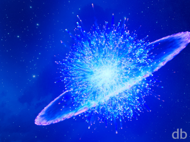
 Jovian
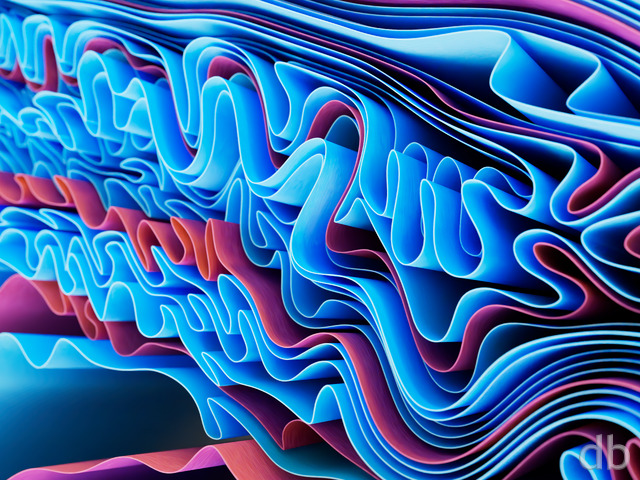
Cathy Warren
[Lifetime]
Ok so I thought this one might be better as you gave it a more reddish purple hue, but when I compared the two, I actually prefer the color of the first one better as it’s color hue is more on the blueish side.
Nick Bencsik
[Patron, Lifetime Plus]
I like both. In fact, I use the second version as my phone lock screen and the original as my home screen. Makes for a nice transition!
Patrick Biggs
[Plus, Lifetime]
Yes, I agree that V2 has a slightly more “planetary” look to it, I would go with that, but they are both a nice departure back to space.
Tor
[Basic]
I think both look like clouds but the original has a different sun, perhaps a blue giant, which changes the colors. My preference for that kind of render is to have more vibrant colors so I prefer the original.
Rick Raborn
[Lifetime]
Hello Ryan! I think it look great. I prefer the second pass. I’ve been doing a lot of CG work myself the past year with Daz and am slowly improving. One suggestion I’d make which I think always looks good is getting a backlight set in some of the clouds. When you can get a halo effect going around the edges of some of the clouds, it really makes things pop. Not sure how easy that is for you with what you are using, but I’ve done it on some of my work and I really like it. Keep it up! You’re a master at it.
webworx
[Lifetime Plus]
I really do like this higher contrast version better. Clouds are a fascinating topic and you have some excellent ones.
Suzanne Wyble
[Lifetime]
I like the first version. The second is too dark. The layers of clouds don’t show as well.
Kevin McClain
[Lifetime Supporter, Lifetime]
I think I like this one better. Something feels a little more realistic about this one. 🙂