Description
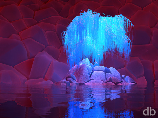
Used the same Plant Factory technique here that I developed for Oddball, Boardwalk, and Park Place to update one of my favorite renders from 1998. The main goal here was to keep the minimal look of the original but also look like it was created in the 21st century.


 Lotus: lotus2k20orange
 Lotus: lotus2k20red
 Lotus: lotus2k20purple
 Lotus: lotus2k20blue


Anon [basicmember]
I made a pink render of this with GIMP by adjusting the hue and lowering the saturation. It looks surprisingly good. I recommend it. [I’m wondering if my mind is creating a link between the pink fog/black cables aesthetic here and those goo-filled pods in the Matrix.]
I think green and pink are my favorite versions of this work.
The nice thing about monochromatic abstract art is that it’s effortless to create alternative and equally good renditions.
Ozaawaagosh [plusmember]
Love the colours, and the design, these are fantástico! Thank you Ryan
Oscar [basicmember]
I love the design and colors you picked. I also love the little man meditating in the middle. Having dual screens for these colors would be the bomb!
Patrick [liferplus]
Hey Ryan, can we get some dual screen pickle jar versions please. Maybe a quick poll to choose a colour, and then go with blue if that’s not the winner!!!!! Did I indicate my preference there?
Ryan
Sorry about that! The dual 5K should be there now.
Richard H. [liferplus]
@Ryan: Could you please add the missing 10240×2880 dual-screen resolution? (The triple-screen version is there, so I assume it’s a simple oversight.) Thanks.
Todd [basicmember]
One more request? Maybe Multiscreens with the color variations also
dwatson [basicmember]
Can you make this in red? Or blue? Various colors like how you used to do. Like how you did with the bioluminescent mushroom one forever ago
Joshua [lifer]
Reminds me of the Original Xbox startup screen/animation.
Littlemom [liferplus]
Love the color selection
Disturbed0Angel [lifer]
Love the Purple so much! And thank you for getting the Triple monitor version up!
D. C. Sessions [lifer]
OK, they’re all good. But the orange for some reason stands out.
El Pablo of the Americas [donormember]
Can I rate this 11? Love the 1998 original too!
Ryan
Good idea! I’ve added a couple but might try a few more…
Ryan R. [lifer]
While this is a solid abstract work, I wonder if an alternate color other than green would be better. Classic colors like red and blue could be tried, but maybe something darker would be better. That’s the vibe I get from this.
Keep up the good work, Mr. Bliss!
D. C. Sessions [lifer]
It goes on my admin desktop with all the others that have no discernable connection to reality.
Or it will as soon as there’s a 7680×2160 version.
Littlemom [liferplus]
I actually prefer the original over this one. But I do get where you were going with this one.I guess it’s just to abstract for my tastes, but of course it’s still going in my DB collection.
Xetal [liferplus]
Just my cup of lotus tea!
Jason [basicmember]
I’ve been hoping a long time for a remake of Lotus, so I’m thrilled to see this. Fantastic work! I kind of miss the smooth polished metal appearance of the original, but the new spin on it adds a lot of depth and just looks awesome.
Tom [lifer]
This one is a good one ryan, my artistic tastes are more inline with styles like this, been awhile and welcome this, thanks.
jmpond [liferplus]
All it takes is one word: Awesome!! Love the green tones.
Mike G. [basicmember]
Ryan, your abstracts have always been my favorite for desktop backgrounds. I absolutely love this one! Multi-screen versions are needed for this masterpiece! Agree with others on some color variations as well.
The “photos” and scenes that you create are amazing as well and usually trick some people into thinking it’s a photo. I love the abstracts because there’s no preconceived notion of what is supposed to be there.
Jim B. [lifer]
I’ve been away for awhile, but when I went through my email and saw this I had to take a closer look. I remember downloading the original Lotus back in 1999 when I first signed up. This new rendering is amazing. Keep up.tje amazing work!!
Todd [basicmember]
I hate asking for requests because I don’t know how long something like that takes to render. But this would be a great one with a bunch of different color options for the pickle jar.
BigD [basicmember]
Cool! Also love the alternate colors