Description
It was recently suggested to me that it has been a long time
since
I’ve done an astronomical wallpaper. Time to remedy that!
Here’s one for the astronomy geeks out there. As I am sure
they
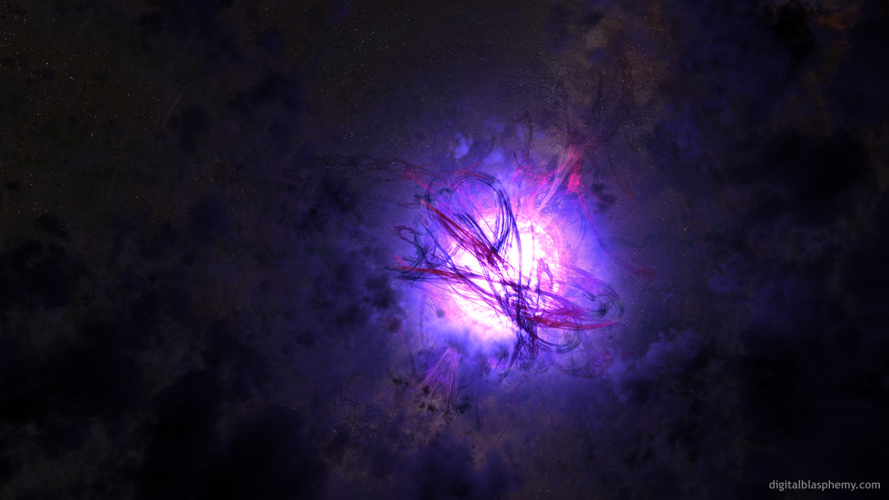
already know, a “Magnetar” is a
special type of neutron star with
an extremely powerful magnetic field. My representation is a
bit
on the fanciful side, but I hope I mananged capture the
violence
and dark energy of such a body.
I modeled most of this using a new program called “Incendia”.
I
hope you like the results!


 Magnetar: magnetar1


Hal [lifer]
Wow, another masterful astronomical canvas. Very good work Ryan. It’s work like this that reminds me that I need a lifetime membership. Oh wait…I already have one…
😀
JohnWilson [nonmonthly]
I have my Win8 laptop set to cycle through a folder full of DB images at random. This popped up on my desktop today and I was stunned at how beautiful it is!
Joel
Any chance for a pickle jar green version? Enjoyed this one for several weeks.
Laura
I love this and the picklejar version too. Thank you so much!
Ryan
That’s what I get for uploading before my morning coffee has fully taken effect. The missing resolutions should be there now.
Tazz
The triple 1080p (5760X1080) seems to be missing
Chris
Loving the colours, perfect wallpaper!
RC Davison
Although it’s probably too late, the European Space Agency posted a video animation of a magnetar that I thought you might find interesting: http://www.esa.int/esaSC/SEMUZHMXL4H_index_0.html
Ryan
Just wanted everyone to know that I am still tweaking this one so that is why I haven’t produced the multiscreen yet.
TinaG
Bonus that it’s blue/purple! 🙂
Fumigator
Love it.
John N.
I don’t know if this is the best way to describe this rendering, but this is the best ‘space’ scene with a bit of abstract art mixed in. If I could rate it higher than a 10 I would! Very well done!
Angelique
I saw this page this evening and first thing I thought of was whether this would work with any of your wallpapers:
http://www.partystandups.com/catalog/Custom-Wall-Graphics-c-71.html
they’re printed on self-adhesive type of fabric and so you wouldn’t need a frame and could just stick it right to the wall.
Nelson
Woow, that’s exactly what I was hoping for! Thank you so much for your efforts!
Tazz
The second render reigns supreme in my eyes. The depth of the cloud and various debris make the picture unique and a lot deeper than the first render which almost used a generic star/space backdrop.
Justin B
Considering I don’t have the faintest clue what a Magnetar would look like, I have to say the 2nd version feels more “natural”. The original version seemed like it was a render slapped on top of a field of stars. It didn’t really feel like a complete image. The 2nd version, on the other hand, feels much more complete. There’s more depth to the image as a whole, which I’m sure you were going for.
Then again, since I’m not one to nitpick on how “real” an astronomical work is, I like the overall shape and colors of the original version!
Matt
I really like both versions in their own ways. They are two of my favorite.
JS
Ryan,
Once again another great piece. Quite captivating. My only critique is that it feels a bit unbalanced by the “void” on the left.
Greg in CA
Completely and totally awesome.
Ryan
I’ve posted a new version of “Magnetar” this morning. The first render (available henceforth in the Pickle Jar) was my first wallpaper developed and rendered completely on a laptop (Asfaloth). For this new version I employed my main workstation (Bucephalus).I rendered the background and nebula first in Vue d’Esprit, then used that for the background for my magnetar in Lightwave. I then brought that render back into Vue to add foreground dust.Now if only I could figure out how to make more “ropy” looking clouds in Vue…I hope you like the update. Let me know what you think!!
Joe
Ryan, I love this one. It reminds me somehow of my all-time DB favourite, ‘Something Blue’. It now graces the screen of my phone.
Hoverwolf1
I like it. Artistically, it’s pleasing (I prefer the space scenes); Scientifically, it seems acurate: a magnetic field strong enough to bend atoms and tear X-ray photons will produce a very well ordered image, not the feathered lines others have complained about wanting. As for the planets, the first exoplanets discovered were in orbit around a neutron star, so I see no reason not to add them, if you want. I also like having the magnetar in the center, as it works better as a background image, and the colors aren’t distracting. They’re actually kind of serene for such a violent and extreme object. Love it so far. Can’t wait to see the finished image!
Tom
After reading up on magnetars and looking at other artist’s conceptions of magnetars, I have one more comment to make: This is an incredibly complicated subject matter to attempt to illustrate. And only an artist as fearless as Ryan would attempt such a thing. What a courageous self-challenge!
jmpond
Explosive yet peaceful. I like the ying/yang effect. Very cool work!
Max_Power
Ryan,
Thank you for this current piece. In fact thank you for all your work. That is why I am a lifetime member. You keep my desktop and phone the center of attention wherever I go. Thank you and good blessings to you and your family!
Max_Power
Greg in CA
What I meant by that comment is that it has sort of an ‘amateur’ feel to it. I’m a member of DB because of the exceptional quality of Ryan’s work, and IMO, this one (at least in it’s current form) is not exceptional. Nothing personal to Ryan or any other artists…
Tim
This one is just incredible – it became my new favorite (and my current wallpaper) as soon as I saw it.
Amazing work! (and it’s not even done yet? :O 😀 )
Gregor
“It almost looks like something someone submitted for the user gallery…” and we all agree the images in the user gallery are nothing one would like to see here, right?! O_o Thank you for showing so little appreciation for other artists!
Medicsmurf
I wouldn’t say it is missing something, I would more say it needs to more off center to give a falling away feeling.
I adore the spacescapes and always approve of more of them!
Daniel B
Not a physicist, but I think one thing that’s missing is a Nebula. Neutron Stars (and therefore Magnetar’s) are made from Supernovas, so shouldn’t there be a supernova remnant a la the Crab Nebula that this is inside?
Bruceam
Ryan,
Magnetar is an outstanding piece. I think it would make a fantastic animated background. The motion would highlight the “Strangeness” of this phenomenon the way nothing else could.
Keep up the Great Work
Matt
I actually really like this one! It is nice and clean. Maybe I am just a huge sucker for your dark wallpapers with blue overtones (I am). There may be room for a couple tweaks, but don’t change it too much!
James
If you want to add planetesimals, you could always rationalize that the magnetar passed through a Magellanic Cloud or some such entity. Anyways, I love these wallpapers and this is perfect for my Iphone. Thanks!
anna_writr
I like the painty-ness of the magnetar itself. Maybe you should go one way or the other. Put more details to make it look more like a painting in or go all the way to ‘realistic’.
I do like the color scheme.
FlareHeart
I really like the colors and patterns in this one, but the magnetic field representations seem a little too sharp and crisp. Maybe a little more transparency and feathered edges would make the fields look more ethereal.
Thanks for all of your great work Ryan!
Ryan
I usually try to add planets, rocks, or something in the foreground of these space pictures but this is a tough one. A magnetar is a relatively tiny object left behind after a supernova so all the nearby solid matter will have been vaporized.Yes, this one is quite unfinished and I am happy for the feedback!
Amaryllis
I feel differently from the others – I love the painterly effect of the flares. I’ve been reading about alchemy lately, and this image really resonates with what I’ve been reading. (For me the issue lies with the starfield on the left. I would prefer it if the object filled the whole screen.)But of course, you can’t please everyone and I do think, in the final analysis, the artist must please him or herself (even if money is involved!)
Nico
always loved the space stuff. The gasses going out from the star doesn’t seem quite right has an unreal visual to it needs a different texture? I love where you are going with it.
Ben
I love it…but I too feel that it is incomplete…missing something. Great work none the less. Keep up the great work 😀
Eyal
It is very nice (my favorites too have always been space scenes), but something about it feels a bit too artificial…
Tom
It’s very difficult for me to criticize such a gifted artist. Artists seldom ask for opinions. Thomas Hart Benton never asked because he hated his critics. Jackson Pollock just got drunk and kept on painting. But since you care, Ryan, I feel I must honestly concur with the others. It does seem somewhat unfinished. Some of the fine lines look like a scan of a colored pencil drawing. It actually hurts me to criticize you after all of the great works you’ve produced for us, so I will shut up now.
Karl
The fractals do not look quite right. I think their edges are too sharp, if you feathered them they would fit the scene better.
Greg in CA
Something about this one seems unfinished. Maybe not enough detail? It almost looks like something someone submitted for the user gallery…
Maggie
I know you’re not in charge of making the animated wallpapers for PS3, but this image would be AWESOME when animated. I really love this image!
Nelson
Well, I thought the same when looking at it: the edges of that “flux” are too sharp. Elso, it looks really promising 😉
@anna_writr:
I think both ways don’t have to contradict each other. A real scene normally has many details, so adding them should result in a more realistic view anyway.
Psyclone
I freaking love this.
The colors are PERFECT. You often work best in blue, but this is perfectly balanced as is.
This one is going to be the iPad lock screen for a long long time….