Description
I discovered that when I removed the ridges from “Rolling Ridges“, the result is a pretty cool cloudscape all on its own. Perhaps it should go in the Pickle Jar, but I thought it looked nice enough to feature in the gallery. What do you think?


Martin Bynion [basicmember]
First ever comment….but I have to say that this is just another great example of Your Unique work. You are truly an Icon, Ryan.
Chris [liferplus]
Perfect piece to add to the bedroom – signed, of course. Won’t get as much attention from visitors, but we’ll get to appreciate it every night!
Ryan
Thanks for the note Ian. To be honest with you I generally enjoy creating triscreens more than dualscreens precisely because I know there won’t be a monitor bezel bisecting my scene down the middle. The triscreens allow me to simply widen my scene without moving the main part off-center. This is more than just an aesthetic choice too because the way the 3D camera works, pixels get “stretched” the further they are from the center. A planet, for example, will look like a circle at the center of the frame but like an oval when the camera is rotated.Hope this helps explain the issue!
Ian [lifer]
I really enjoy your work, and this one has been on my work computer for about a week now. During the last week, I moved desks and plugged my monitors in out of order, moving the left screen all the way to the right. I thought it looked neat, and was wondering if you had ever thought about putting the focal point of a TriScreen so it would be on the left or right screens rather than the center. I do most of my work on my center screen and hate covering the main part of your artwork.
Brandi U. [liferplus]
I have a thing for clouds, so one already has a leg up in my book. Love the lighting and feel. Could picture being on a plane, mesmerized watching this outside my window.
Rick Mozil [basicmember]
This creation takes one beyond the boundaries of reality to the realms of imagination. Nice work.
docster [basicmember]
“Please return your trays to the upright position and fasten your seatbelts. We’re now in our final approach to Neverland International…”
Davin [basicmember]
If this makes it to the Pickle Jar, I would still look for it. This would be a great image for a lost boy and his companions, if you know what I mean.
Mike [lifer]
I really like how this looks! Very nice job!
Todd [lifer]
One of my top 5 favorites.
tecbuddy1 [plusmember]
I love this one
Matthew Patrick [lifer]
I like it a lot! (in my best Forrest Gump voice)
Jill Ferris [lifer]
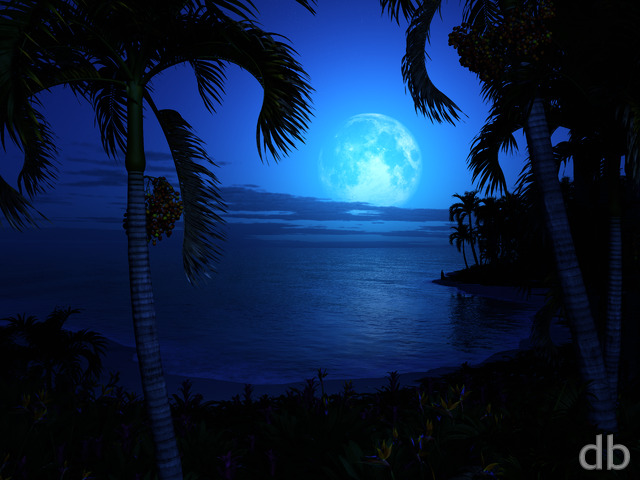
While I agree with the others – my very minor quibble is with the moon….it’s too bright and not much visible detail. I’m not saying it should be our moon, I’m just pointing out I’m used to seeing other worldly details that make it spark the imagination more. Other than that, I’m grabbing a dual screen copy for my home setup and one for my phone. I love your work – keep it up! 🙂
Mangoman [liferplus]
This is the sky I see in my dreams when my dreams are heavenly and good. This is such a gorgeous rendering; so simple, yet it says so much without having to utter a single word. Very nice, Mr. Bliss. You are God’s Best!
Meg [lifer]
Gorgeous! My favourite of this series so I’m eagerly awaiting the dual screen version.
Hoverwolf1 [lifer]
Beautiful
JMK in CT [liferplus]
If I were a pilot I think this scene would be very familiar to me(assuming I was on a planet with a huge moon!).
Doc [liferplus]
Love it.
Shao Lang [lifer]
I just abosolutely LOVE this. I think it depicts the PERFECT version of a Full moon surrounded by rolling groups of clouds. I am just blown away at how beautiful this render is. Ryan, your stuff is, as always AWESOME. You out-do yourself every time.
Kelton [nonmonthly]
Just like the view over the wings…
Big Dave [nonmonthly]
I think I almost like this even better than Rolling Ridges and I like Rolling Ridges!
Mark A. [liferplus]
Ryan, you’re like butter… you’re on a roll. I love the “rolling” series you’re doing right now.
Xetal [liferplus]
How about some more exotic bodies in the sky?
Joel [liferplus]
Definitely belongs in the gallery in its own right.
Amanda Tyson [basicmember]
Wow, beautiful colours, amazing effects, a real winner! Love it!
Don McCullough [liferplus]
I love this one… it has a mellow vibe!
I would vote for it as a permanent addition to the Gallery!
SethEden [liferplus]
I love this one especially good, but it just leaves me wanting more! Not just multi-screen. I’d like to see something like this with red thunderheads on both sides and lighting, and 4 moons in the sky…basically a Jovian cloud-scape! Or massive rings and storms like a Saturn cloud-scape. 😀
Ozaawaagosh [basicmember]
I love it, it’s perfect blend of Moon light with the Clouds. Awesome Render. Thankyou
aslan [nonmonthly]
Side by side on dual screens Rolling Ridges and Moonbeam Seas both look wonderful.
However, I’d agree Bastian, to be truly perfect, the moon needs a little more definition between the light and the darker grey Lunar Seas.
Telaria [nonmonthly]
I really really like this!! Thanks for another great render, Ryan!!
Bastian [lifer]
I love it – but to be perfect, I think the Moon should have a bit more texture – I love the moon in Rolling Ridges
John [plusmember]
It reminded me of when I would be walking home, on winter nights, after high school basketball games. The moon would be turning the snow that cool shade of blue and the clouds would appear to have a silver lining then. This is what I enjoyed about those walks.
Susan [nonmonthly]
Very peaceful and calm and I must admit that I like it much better than Rolling Ridges. The lighting is spot on. I can feel myself floating.
More like this please.
Mario [basicmember]
Have to love those midnight clouds and the lighting of this piece. Well done!
dferstat [plusmember]
“Thereâs nothing out there, Ford! Like, no ground! Some catâs taken the ground away!”
The view from the Cup, perhaps? 🙂
Theora [liferplus]
Always love your moonlight images and this one is right up there with your best. A perfect 10 from me.
Jacob Klein [lifer]
I love what you’ve done here, especially that the gradients don’t have much banding. The lighting bouncing off the far clouds, is amazing. The contrast of shadow and highlights is superb. The scene, though, is what makes the shot epic. You were right to remove the range – simplicity is gorgeous! Thank you!
L [lifer]
It’s so beautiful. I can definitely see this as a framed art in my future apartment. This might be my favorite wallpaper yet 😀
Bez [liferplus]
This is everything I hoped it would be when I read the title. Gorgeous!
K [liferplus]
This is a great example of a piece that would be a bit too minimal as a standalone artwork but is really wonderful as a background. It’s got just the right amount of detail and uses a really minimal palette that works well on a transparent desktop but hints at more depth and detail.
Ken D [basicmember]
Beautiful, simply beautiful. It makes me think of the Van Morrison song Moondance.
JDD [lifer]
perfect amount of moonlight
Saranna [liferplus]
Wow.. that’s about all this one evokes. It’s so pretty.
Littlemom [liferplus]
You hit another one out of the park on this one Ryan. Great Job!!!
renrie [nonmonthly]
I totally agree with Big Dave below. Ryan, you’re surpassing yourself 😉
Saranna [liferplus]
It has been a little while since you made this and I have to say, it’s definitely still one of my favourites. It has been my background on my mobile device since you made it.