= Add to your a la carte shopping cart.
Single Screen
- Lossless Master plus
- 1024x768 (4:3)
- 1152x864 (4:3)
- 1280x1024 (5:4)
- 1280x800 (16:10)
- 1366x768 (16:9)
- 1440x900 (16:10)
- 1600x1200 (4:3)
- 1600x900 (16:9)
- 1680x1050 (16:10)
- 1920x1200 (16:10)
- 1920x1080 (16:9)
- 2160x1440 (3:2)
- 2560x1440 (16:9)
- 2560x1600 (16:10)
- 2880x1800 (16:10)
- 3456x2234 (MBP)
- 3840x1600 (21:9)
- 3840x2160 (16:9)
- 4096x2304 (16:9)
- 5120x2880 (5K)


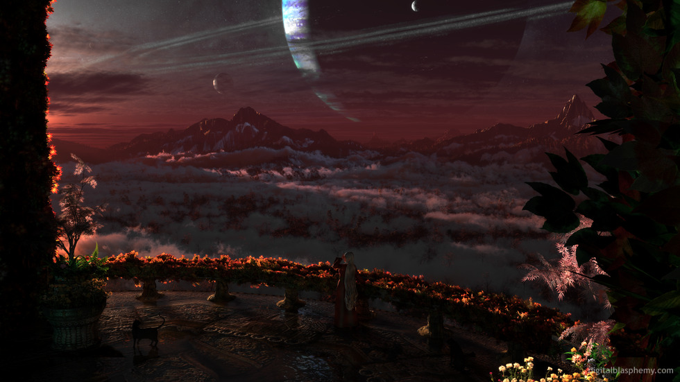
 Morning Glory: morningglory2k131


Bella [nonmonthly]
I’ve always been a fan of Morning Glory and am happy to see that it continues to be update. Love the cat element!
Price
Awesome. I love seeing how far you’ve come as an artist when older layouts are revisited. Personally, coloration issues pointed out in other comments seems a non-issue; we are looking at fantastic scenes and there’s no reason the figures living there would adhere to our expected hues.
There’s still something “stilted” around the woman, and I can’t figure out why I have that impression. Maybe my eyes are playing tricks on me with the dark dress and shadowed banister. The cat is obviously fluid and graceful, and the whole has come along lightyears since the last rendering.
Keep it up, and thank you for the awesome work over the years.
Russ J
something special about this piece. I have it across three total 2 23″ and a 17″
George
Great dual screen version! Impressed with how much you took advantage of the breadth with that one.
Not a huge fan of the person, but that’s just personal preference.
teddeler
Beautiful! I love the detailing on the floor.
Chris
Morning glory and Idyllic have always been my 2 absolute favorite wallpapers. I love that this isn’t a refresh of the original. It seems more like a return after all these years. The girl has filled in a little more and gone grey. Her cat has its own family now. The gardens have been trained into place along the railings and columns. Her flowers are beautiful too.
An excellent job with a true classic.
Jenanne
I agree with the comments about the lady’s hair in version two; it’s an odd color — silverish or silver-gray — and looks artificial, like she’s wearing a wig. I prefer the hair color and length from version one.
Ryan
I like, it, but I don’t like the lady, I could take or leave the cats.
Kyle
I like the single screen. A little dark and not enough of a view of the planet (which seems a bit too dark as well).
Love the kitty!
Kelton
I do like it she is definitely a spinster with all the cats. What’s with the light coming from under the dress? (or is that another piece of clothing?)
Paul
You got the scale of the human correct, congratulations!! 😉 And I like having her there. “Watching someone watching the scene” is perfectly fine, sometimes. Nicely adds some flavor to this one.
0beron
I prefer the camera angle in the single screen version – the line of sunlight through the clouds in the middle distance was the unique feature of the image for me, and with the lower camera angle in the multiscreens, this is obscured. I’d love a multiscreen with those cloud shadows visible.
ZUL
Great scene. Thanks for the dual screen. It’s just a little too dark. It’s a bit hard to see the lady, otherwise good work.
Midnight
I really like the dual and tri-screen versions.
I’m not a fan of the lady though. Someone else said it best: “I don’t feel like I’m there looking at this amazing scene, rather I feel like I’m looking at someone else looking at this amazing scene.”
Also, on the tri-screen version, the leftmost column (left edge) seems unnecessary. It’s really close to a large support column already.
betsey
dunno why…actually I do…moves focal point(for me at least) to the column!!!
Nelson
I like the left part of the triple screen renders so much that I created a single screen cutout from it. 🙂 Lightning of the pillars is also better there than in single screen (not too dark).
Still not very comfortable about the lady, though. Compared to the scene, she looks too “artificial”. Generally, it seems to me that the rendering quality of nature/objects is way higher than for persons in most of your works. The complexity of landscapes increases continually while that of persons tends to stay on roughly the same level for years, at least in my eyes. Maybe because of the programs you use?
Bottomline: Please make a version without the lady! This would definitely be a 10 for me, as the rest is awesome.
Laura
The multiscreen is great! I think it’s better than the single screen. Nice update to the flowers, they look more part of the scene. 🙂
Ryan
I hope you guys like the multiscreen version! Let me know what you think of the new composition!
jabbmann
Can not wait for multi-screen version! I feel the darkened view adds to the piece
Corbey
Comments on the new version:
1. Glad you got rid of those white flowers that looked like dahlias or zinnias.
2. I liked her hair better in the first render.
3. Please lighten up the pillar on the left side of the screen even a little more.
Thanks!
Ockyin
…the original pieces are a celebration of your lady wife? Really enjoy the updates as well as the originals.
Thank you for the joy you bring with your art. 🙂
Nightwynd
Hope to see more color in the near future. Last several walls have been dull blues and reds.
halletl
I just think this is beautiful…but then again, all of your work is gorgeous.
Brian
I said the lighting was going to be key for this one, and you nailed it in this 2nd render. *just* above the balcony. Nice. Fixed the flowers in the right bottom corner too.
Figures never bother me, but this one is distracting for some reason. Too big? To defined? Usually they are more subdued I think.
Jenanne
I actually like the lady in this one, although I’m not a fan of people in the renders. But I’d love a PJ version without her. I agree she’s not needed for perspective. I guess that means the cats will have to go, too, although I wouldn’t mind you replacing the lady with five or six additional felines. 😉
Scott
Without the lady, I feel like I’m looking out the balcony at a fantastic view. With her, I feel like I’m looking at a lady looking out a balcony at a fantastic view.
Suffice it to say she draws too much attention in this one. The focus isn’t on the landscape, but on her, and given the rest of the scenery there’s no need to provide her for scale.
Slackweed
Remove the girl. Render some dual screens.
Firestar
I agree with others, need pickjar versions without the people. I’ll switch out my desktop as soon as there is one.
Aaron
Thank you for re-visiting this piece. The original along with Gazebo are associated with great moments in my past. So, seeing this again makes me feel great! You’ve made a veteran very happy this Veterans day 😀 Thank you!
David Wats
not a fan of people in your work. the piece looks more realistic and striking with just the scenery. please make pickle jar versions of every piece you make without people. Id really appreciate it.
Littlemom
This render is just to busy for my liking. It might be fine if the planets weren’t there. It looks like you took a bunch of different previous renders and threw them all together. This will be the first of your renders that I don’t add to my DB collection.
Jenanne
Only one extra cat? Yikes, I didn’t even see the second one until you mentioned it. Yes, the lady has aged well, but she’s dyed her hair twice, and (at least since the 2005 version) she’s let it grow out. Her wardrobe is vastly different, and we can see her bosom much better in this second render. 🙂
Stargazer
Love the use of light. The light hitting the leaves putting a tint of orange on them and lining the left edge. Nice. Also love the etched floorwork. it’s beautiful. One of my favorites.
Romarch
The lady has aged well. Makes me feel not so old m’self, for having downloaded the first version right when it first came out…and, like me, she’s got an extra cat. 🙂
To the newbies: The original was the exterior view of a piece called “Sanctuary”, my first DB wallpaper and still one of my all-time favorites. In that one, you could just see the lady and her balcony at the very top of a flight of stairs… I loved the glowing pool, and the way the torches contrasted with the overall purple-blue lighting. I wonder what an update of the interior of the sanctuary itself would look like?
lorwynd
This is my new favorite.
Amaryllis
… reminds me of things I’ve seen while reading Iain M Banks – his death a great loss to science fiction. The detail, the sense of space, a moment in a story captured – love it.
Brandi U.
V2…Like the lighting changes. Not sure about the extra fog/clouds, prefer the levels from V1.
This is a beautiful piece. One of your best.
Momcat
This is beautiful, almost mystical. I would like it better without the flowers on the railing (too busy), and without the planets and woman (personal preferences) and the cat should be a little smaller, IMNSHO.
Nonetheless, it still spoke to me — as so many of your images do — and I await the Pickle Jar versions.
MN
Je voudrai y vivre ! Incroyable, émerveillant, sublime…
Peter N.
Stunning and breathtaking as always with your spacescapes.
I especially love the way the light comes in from somewhere unseen to the viewer and how it’s glow brings the landscape and the balcony to life. It really peeks the imagination of not being able to gaze into the sunrise directly and bask in that morning glory as the woman does.But only being able to observe the glowing effect it has on her surroundings is just as breathtaking I can imagine.
Ruth
Definitely my favorite of the Morning Glory versions. Can’t quite put my finger on it, but something about the lighting perspective… my brain keeps looking for a second light source? Love the colors, tones, field of trees/clouds, woman and cat are much better in this one. Interesting for the floor to be covered with water.
Brian J.
Love the feel of this piece. The planet in the distance looks great.
I had one question though: your website seems to automatically detect the user’s screen resolution. I like to download the 1440p resolution images. Is there a way that it could cache my preference for default resolution?
Jenanne
I like the subdued colors of this one. And while I usually dislike people in your renders, I like the addition of the woman very much. Don’t really know why, but perhaps it’s because she’s large enough to see individual characteristics.
David M.
Ryan – very nice image. I like the light along the edges of the pillars and terrace railing. Personally, I would remove the large planet and replace it with a slightly smaller celestial object. Perhaps a shooting star? Overall very nice.
Mike W.
Love it when you keep them dark!
violet
I love that the light is off stage, I love the cat, I love the framing effect of the pillars.
darkdragon
I like how the pillars frame the view. It gives me a nice place to put my icons without really obstructing the image.
Littlemom
Way to busy for my taste and don’t like the planet. yet it will still go in my DB collection
cmmnoble
Beautiful. The colors are amazing. This may be the best sky in all your works. I love the way the sunset and the planet work together. And you kept the cat! Yay!
Pete
Someday, I want to write a story about all of these awesome and beautiful moons around this gas giant that you use. Once again, your artwork just blows me away with the intricacy and realism (even when it’s totally unrealistic!) Beautiful work, Ryan. Truly stunning.
Slackweed
Widescreen!
Mike
Stunning. And I like that the person and cat are subdued and subtly blend into the scene. In fact I might prefer a variant with them removed altogether.
Eric
Awesome piece, really like it. I do agree to many leaves on the entry columns. And one other nit-pik … The ladies hand is palm out to toward the sun with her index finger, which is now down, above her eyebrow. This should cast a shadow on her forehead. Instead the shadow is on her face. Perhaps her hand should be out in front of her face and a little down.
Maybe for example (you Ryan) face the sun and put your hand where the ladies is (almost against your head). You’ll see my point (and the sun). Then move your hand to shade your eyes. Now you’ll know where her hand should go. And where the shadow will be.
Just my overly critical two cents. 🙂
Cheers!
Hoverwolf1
Love it, but it is a little dark; I almost didn’t see the cat. Looking forward to the new version.
Midnight
Awesome. I must see the dual and tri-screen versions 😀
Ryan
Thanks for all the feedback! I have a new version rendering right now. It isn’t too radically different from the first version. I’ve upgraded the textures in the foreground and added a bit of offscreen light to break up the shadows. I’ve added some more variety to the trees and I may change up the terrain a bit in the next version.Hope to have it ready tomorrow!
Jenanne
Lovely. This has an autumn ambiance that’s very beautiful. I love the cat; realistic appearance and body posture, but a lighter color might show up better against the paving. Perhaps brown or gray.
Deanna
LOVE the leaves on both sides, but especially the right side. Don’t change them! 🙂
Nelson
Haven’t noticed at first that this is a remake 🙂 Really nice setting, good athmosphere! The almost black part to the left looks as if the picture has been cut off there, though.
Chris
Very nice rendition. I thought if you removed the pillar from the far left it might look a little better; the visual balance seems off in some way. Otherwise a very good piece.
Brian
Many things to like about this picture. For me I would love to see a version without the woman and the cat. The leaves along the ride side seem a major detractor, a pillar as on the left side or even a continuation of the skyline would be wonderful.
Nightwynd
Very beautiful. However…what’s up with the dull colors lately? Last couple images, this one included, seem to be dull reds and blues.
Nightwynd
Very beautiful. However…what’s up with the dull colors lately? Last couple images, this one included, seem to be dull reds and blues.
Jase
I prefer the valley and sky over anything else in this piece. I’d love to see this with just the valley and sky.
Deanna
*typos* grrr 😉 It is framed beautifully, rather!
Deanna
This is amazing. It is framed beautiful with a holiday feel and glow to it, and detail in all the right places, especially on the pretty lady. I want to be in this picture. I love THE CAT!
Kyle
My knee-jerk reaction here was on the negative side, but on reflection I find this a piece of great subtle beauty – not as flashy as most of what you do but with a lovely depth to it.
Slackweed
Whoa
Jonathan A
Fantastic imagery. The planetscape of this one seems almost more interdimensional rather than far out in space somewhere. It has good vibes.
Nathan
Very nice, I love these fantasy works of your as they seem to tell whole stories in them.
Alec
I think this is your best remake so far, breathtaking.
Ixias
Wonderful picture. I love that you can make up a story about the lady and the cat.