Description
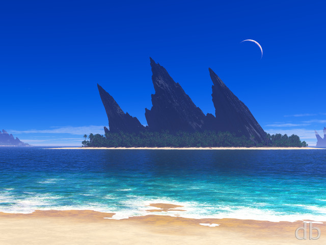
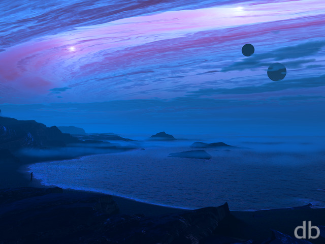
It wasn’t long after I posted my “Atoll” update that the requests for a night
version started coming in. It sounded like a great idea to me,
but unfortunately my first version took far too long to render
for me to considered doing even a multiscreen.
In the end I decided to tear down the slow-rendering version and
figure out how to process it quicker. I finally found the
answer (NO PROCEDURAL TERRAINS!) and was able to produce a well-
received multiscreen version as well as this night render.
I’m not sure this is going to be the final version of the night
scene, but I thought it looked nice enough to share. Let me
know what you think!


 Atoll (Nightfall): nightatoll2


Nicroy52 [basicmember]
Loving this one! Great colors and shadows!
Jenanne
Thank you, Ryan, for bringing back the PJ version!
Jenanne
The Picklejar versions of “Atoll” seem to have vanished somehow. Any way to bring them back? Thanks!
Jon Wayne
This one is epic…
Peter J
Dresses up my unity desktop!
Redfoxiii
Very Pandora
Paul
I love these jovian moon images
Ryan
I will be releasing my retina MBP images before the end of the week. “Gotham” has my first 2880 x 1800 test.
Craig
Would you happen to have 2880×1800 version of this for my retina It would be much appreciated. Thanks.
Drewski
Btw, why is this one not showing up in the Top 10 List?
Drewski
My favorite of the year. Love it!
Ryan
The revision needs one more vote to get to 50 (the cutoff for being included in the top 10).
Joel
I have to say that I prefer the darker single screen render but the lighter dual screen render. They both have a very different beauty about them. Thank you Ryan for doing both.
Matt
Even though I don’t check in as often as I should, scenes like this remind me I need to. The 5760×1200 is my new background, and it looks beautiful. The world is better for having you in it mate.
Matt.
Joseph
WOW another Amazing piece of Art
from the LEGENDARY DB Jedi Master of art, Ryan
^_^
Zach
@Chris B,
Indeed, you are correct! I didn’t realise that they were labelled with the number of screens ‘x’ the resolutions. Thank you for the pointer!
Cheers,
Zach
Chris B
I’m not real sure which i like better as usual. The darker version is amazing, and the lighter version is nice to see some of the color of the tropical forest. Thanks for the options!
Zach, if you click on the pickle jar version, there is a link that says “all resolutions” it takes you to an index list where you can pick any of the sizes.
Zach
I have to agree with BobC about the darker version of Atoll. Though I like the new render, the mystery of the darker one is more appealing to me. Anyway, Ryan, do you get rid of the multiscreen versions that go into the pickle jar?
Ryan
I’ve updated the multiscreen (and the free Facebook cover) with the new brighter version of this render. Thanks so much for all the feedback!
BobC
I think I understand why some people prefer the detail of second version, and it is itself one of the top DB images of all time. I, however, actually like the darkness of the first. The impenetrable darkness of the island makes the scene even more mysterious and I really, really like the way almost all the light in the scene is so clearly coming just from the gigantic planet. Though very different from his paintings, it somehow hearkens back to Bonestell….
Angelique
I LOVE this – I put it up as soon as I saw it! It’s so beautiful 😀
Bill
I really liked the first version but this one is much improved!
JCDU
The second version is a good improvement.
… but then again, I think every version you make is good LOL.
Brandi U.
It’s subtle, but the improved lighting brings out enough extra detail to make this one as perfect as it gets.
Ryan
Yes, the multiscreen will get an update as well. Thanks!
Kyle
I like the newer lighter version – there is a lot more visual interest on close inspection. Will you propagate the changes to multi-screen renders?
Ryan
I rendered a version for print and decided it would probably work better as a wallpaper too. I’ve added a bit of light on the foreground but it’s still mostly silhouette. I’ve also added a few more high altitude clouds and brightened the stars in the upper right.What do you think?
Gregor
I think it resembles “Moonlit Oasis” too much. Personally, I would prefer a dawn or dusk version, similar to the Fisherman… but then you’d have a resemblance as well! 😉 I’ll just stick with the day version.
Lawrence H
Great Job Ryan. I love the gas giant in the background. It puts me in mind of Neptune. Very stunning. Keep it up.
Valentina
Is it only me or is the lower part really dark? It could use a bit more light
NikB
…could there be a little more light detail on the shoreline? Not a huge amount but I would think the light coming from the planet would reflect more in the water and allow you to pick out details of the trees etc. a bit more. On my monitor at least it looks a little too dark.
Alberich
Landscape, planetscape, and fractalscape, hmm … you mean like this? http://digitalblasphemy.com/preview.shtml?i=phraxismoon2
Nelson
A big thumbs-up for this from me, too! Looks awesome.
Gina J.
I love it! A perfect touch of light and deep shadow. Makes it feel like it’s real late or real early. Breath taking!
kellzilla
This is the first time I’ve rated an image in several years…I HAD to put in my “10” though. This is absolutely phenomenal. One of the best you’ve EVER done.
Tom
Look at those member ratings, Ryan! Right now the judges are holding up a card that says “9.31”. You’ve done it again!
Zach
Wow, Ryan; just wow! I wasn’t all that crazy about the daytime version, but this render is incredible! I love how smooth everything on the shoreline is, and the mist/steam only adds to the mystery. I also really enjoy the reflection on the water. Lastly, I agree with the idea of keeping the island uninhabited; it adds to the seclusion and mysterious nature of the scene.
Wonderful work, as usual!
Cheers,
Zach
Will
Love this render.
Mello
You never cease to amaze us Ryan! This one is right up there. The trees are spot on, the darkness in the front of the trees seems right. But then you see the light hitting the water and I just love the sky (err planet sky) LOL.
Foz
A beautiful landscape and a superb planetscape.
Do you think you can combine a landscape, planetscape and a fractalscape in your next endeavour? 😉
Timmo
Beautiful and mysterious. Thank you Ryan.
docsensi
Love this version!
BobC
It was these blue night scenes that initially attracted me to DB. This is the creme de la creme! The uninhabited island, rolling fog, and the way the gas giant is partially visible and lit, give the scene an aura of mystery and awe that is just wonderful.
Chris
I agree with everyone else; this looks really good. I love the emphasis you put on the Jupiter-looking planet, to make it look like the planet we’re on actually rotated during the day. Also the gases on the planet in the sky look really nice. I don’t really have any criticisms of this one.
Randall
Thanks for this–this is a very lovely, peacefull scene. Keep up the good work!
Dave T
That’s what I said when I saw this wallpaper 🙂 Looks fantastic. Going on my desktop right now. Away with you, Microsoft Saplings theme!
Tim H
I thought the day version was ok but man oh man, the night version is fantastic. Well done.
Lidia
Now that I re-read my previous comment, I realize that my second sentence might not be very clear. I meant that I felt frustrated along with you as in empathizing with you, not frustrated at you.
Lidia
Very nice!
I’m so glad you found out the culprit for the long render time of the day version. I felt frustrated with you. Vue should really document which of their features carry the risk of greatly increasing render times.
Ryan
5760 x 1200 should be available now. Sorry about that!
Nixiyo
I do really like this one, although I think just a teensy bit more detail would be nice – perhaps a ‘Twilight’ version?
tekrican
And that’s all I have to say about that.
Daniel B
That has been a standard size for your images(triple 16:10 1920×1200 monitors) but I don’t see that on the list.
Can we get that added again?
brad
Ryan,
I’m not even that big a fan of the tropic scenes, but this one has found it’s way to being one of my favorites. This is probably my favorite of your tropic backgrounds.
Ryan
I seriously thought about adding a campfire on the beach, but decided instead to leave the scene “uninhabited”. I thought the scene would look a bit too much like “Tropic of Thetis” if I added bio-luminescent vegetation.In the end I was happy with the silhouetted palms and mist against the gas giant. Sometimes less is more I guess…
Andrew S.
I really like where this one is going. In your opinion, would it detract too much from the scene to put a campfire on the beach roughly 1/3rd in from the left side of the image? The contrasting reflections on the water between the warm light from the fire and the cool light from the planet might make for some fun and interesting results, and the curvature of the planet makes a great leading line pointing down to the fire.
Betsey
after all the nit-picking about the daytime version–this is refreshing–DON”t touch it!!!!
Josh P
Great work, it seems like the giant is based on jupiter, am I right? I wouldn’t add lights to the shoreline unless its like lightning bugs or something sparse, don’t want to make it too similar to tropic of thetis’ night scene [another great one].
Seraphim
I simply love it.
Granpuff
Awesom!
MarkB
Love it! I was thinking about asking you to make a night version… for me, sometimes the day time versions are just too bright for a wallpaper.
Khyren
Looking good so far but needs a little night life to seem complete. Not much. But just enough.
Lars
Phantastic, maybe your best picture this year. (So far…;-)
Thomas
Looking forward to having this on my dual screen! 😉
Another great work of art!
KRingg
Wow, you’re really cranking these renders out quick!
Apparently procedural terrains are something to be avoided?
Glad to know your render problems weren’t actually Vue as a whole, but rather one (admittedly very complex) feature that shouldn’t really be needed for the sort of work you do.
Truthfully, there aren’t any good alternatives for extremely involved nature scenes other than maybe Terragen 2 & Bryce. But the former doesn’t have nearly the flora power that Vue has, and the latter hasn’t really evolved since the mid-nineties (and it’s output reflects that).
Oh yeah, and I especially like this image… good work!
Trav
Love this wallpaper, maybe my favorite since “Reverie” waaaay back when. I get a strong (good thing) Pandora vibe from this picture with the blue gas giant hanging in the background and the multiple moons. Gorgeous work.
Ville
This is wonderful.. I like it better than the daytime version of Atoll! I generally prefer the darker images for desktop backgrounds as they’re mysterious and also calmer to look all day long :).
Please release the tri-screen versions of this!! (Perhaps they’re still being rendered..? 🙂
Tazz
This makes me think of a lot of your later dark landscapes. This is perfect, better than the original Atoll.
tekrican
Just some lighting in the trees. Perhaps bio-luminescence in the water, which then is reflected lightly in the trees. 😀
(I think that’s a good idea!)
Shelly K
Your night pieces are always great. 🙂
Chris B
Don’t change a thing! 🙂 a perfect deserted beach at night. love the fog in the distant palms.
There are stars out, but with a “moon” the size of a gas giant I doubt you’d see many more, if even that many.
JCDU
Seriously I just love that colour arrangement and the hazy blue that accompanies the clouds. I saw on your facebook post though, some guy mentioned that the scene could be improved if you added a small trace of light onto the tips of brushery/foliage, or something. I kind of agree with him, the trees look a little dark. Loving the blue though!
Nico
can you get some glow in the tree line or fireflies? Don,t think lava will work here. Thanks!
Ross H.
I really love it, even in this first version. It reminds me of the first DB image I ever saw (courtesy of my high school astronomy teacher): Tropical Moon of Thetis. Seriously, all of your images are magical, but to me, the night-time versions are the best.
Afya
That’s officially gorgeous. Love the silhouetted trees and the magical reflections in the water.
Quidproquo
I like it!!
Chris J
Theres no stars out?
donut
Wow, I really like this one.
Figgy
Ok it look way better in the night!!!!!
Littlemom
Wow this is an amazing render great job. It’s perfect.
Afya
Re “moon the size of a gas giant”: I kind of have the feeling that that’s the planet, and we are ON a moon.