Description
The Bliss family is
big into PopCap games and no game
gets more play than “Plants vs Zombies“.
My kids (especially Jason) love it so much that I thought it
would be a good way to show them “what Daddy does for a
living“.
They watched me model the plants, position, shade and
render them. Of course they wanted me to add more and more
different plants, but I think I we will save those for future
scenes.
Since this isn’t a 100% Ryan Bliss original, I have
decided to post a (lower res) free version
here. DB
Members can find all
of the available resolutions here.
I hope the folks over at PopCap enjoy my homage. The
title is a line from the “Zombies on your Lawn” theme song. Thanks for
all the fun!


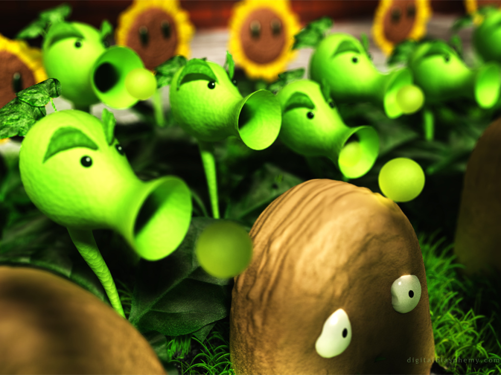
 We Don't Like Zombies: nozombies1
Enoctis
I agree with Robert, I’d love a mushroom garden! And Chomper. I love Chomper! Adorable render, fits well with the game, I think… and the ages of the junior artists 😉
Macson1982
Plants VS Zombies!!! huge fan of the game and the wallpaper
Anna
I love this wallpaper – and the game!!! Been playing it a while now.
Robert
Love the game, start playing it as soon as a saw the wallpaper, As the title say`s, love to see a version of the mushroom garden from you.
Kind regards
Robert
Jim
Can we get this in multi-monitor view?
Larawen
I know your type: tall, dark and dead. You want to bite all the petals off my head.
Please, please, please make more of these, this is both unexpected, and amazing.
Will
I love that game! I had it on iPhone and on PC. I think you hit the nail on the head on its execution. Not one of my DB favorites or anything, but very cool!
spazzium
Hey this is a nice breakout piece for you. If you have any other games you like I’d love to see your take on them!
Firefly
This was a pleasant surprise to see today. I immediately called my boyfriend whom i recently got addicted to the game. He was thrilled too. I would love if you could do a dual screen! Please?!
Fumigator
Let’s just say… I can’t wait for the next awe-inspiring abstract.
cmfbear16
unfamiliar with subject matter, but looks very cartoonish. which it is, i suppose.
Greg in CA
I haven’t rated this image, but the reason I don’t care for it is the execution. While I have no idea what goes into making an image like this, it just LOOKS like fan art to me. It looks too simple and cartoon-y. Sorry…
V–Z
It never showed me it submitted after I logged in again. Really sorry, all, for the post spam.
[embarassed]
V–Z
As someone who started EVE 3 years ago, Ryan – RUN AWAY!! My own artistic efforts have suffered horribly. It’s rare to never that I work on a scene anymore =( Something I’ve been trying to get myself back into again.
So – yes, confirming your fear of being lost to MMORPGs is not unfounded. 😉
btw – your script still seems to never really log me in when I log in…
V–Z
As someone who started EVE 3 years ago, Ryan – RUN AWAY!! My own artistic efforts have suffered horribly. It’s rare to never that I work on a scene anymore =( Something I’ve been trying to get myself back into again.
So – yes, confirming your fear of being lost to MMORPGs is not unfounded. 😉
V–Z
As someone who started EVE 3 years ago, Ryan – RUN AWAY!! My own artistic efforts have suffered horribly. It’s rare to never that I work on a scene anymore =( Something I’ve been trying to get myself back into again.
So – yes, confirming your fear of being lost to MMORPGs is not unfounded. 😉
btw – your script still seems to never really log me in when I log in…
Eric
I love this, but I wish there was a deeper focus so that more than just part of 1 pea shooter was in focus.
The Guru
I like the new version much better. Are you going to try some versions with zombies in them? I think that would be pretty cool.
MARS
its heavy on the eyes but mainly becuase its not a “Ryan Bliss original”. either way it looks nice but i wouldn’t put it as my wallpaper…:(
DukeofAnkh
I like the colours more, but I’m not fond of how the pea shooters look more low-res now.
kellzilla
Those aren’t potatoes! Those are wall-nuts! :p
kellzilla
This looks so much better than the last version. The repeaters don’t look washed out anymore, and actually have a shape!
The focus is still a little odd, in that very little is actually IN FOCUS (is there a way to make it a longer DOF? so that more is in focus?)
Romarch
Yes, I’m a little older…I only found out about Plants vs Zombies from reading your comment. But when I first laid eyes on this, I thought: “Bellsprout from Pokémon!” The Nintendo-conditioned eye might also see Diglett in the potatoes, and Sunflora (a second-generation Pokémon) in the flowers. But oh, those Bellsprouts–!
Lidia
Nice improvement! And I’m so excited about you getting the new release of Vue d’Esprit!
RG
PURE AWESOMENESS!!!
Cylar
I love this. What strikes me as rather funny, though, is that the potatoes look strangely like McNuggets. Or maybe I’m just hungry. Not a complaint by any means, just an amusing observation. 🙂
Mirage
I love the update, the look of the repeaters is definitely better than the previous version, they now have the depth that I thought was missing from the initial one you posted here 🙂 I think this will grace my desktop for quite a while (looking forward to a dual screen if you make one!)
Eric
and was just playing it today for the first time in a long time. nice idea! 🙂
a little feedback – you might be able to do a better job with the sunflowers – the petals around the rim specifically… and the areas of focus look wrong, like the back of the head of the lead repeater is in focus, and then the lead walnut, but everything in-between is not…
Peter
This is awesome Ryan. Awaiting Dual Screen renders for my setup 🙂
phil
I really like the content. Nice to see very different inspirations for your work.
The older version on Facebook do look better on my screen in regards to the repeaters. Current version shows no appearance of 3 dimension or texture on them… looks over-contrasted.
revolut10n
My SO will LOVE this! Looking forward to seeing future renditions.
FYI – the plant/nuts eyes need to be a bit bigger
Ryan
I wonder if the people giving this low ratings are put off by the subject matter or the execution (or both).
Christy
I definitely like this one… I know it might be a few more days worth of work but if you do a dual or triple screen of this one, can there be zombies in it? (Meaning like in the game when they are walking to your house from the yard?) Even the silhouettes would be cool too….
Hunter
Seriously. It is awesome.
Simon
Yeah, this was kinda unexpected! xD
But, as a big fan of PvZ, I got to say that this is really awesome!
James
There is a wink at the plants vs zombies in WoW as well. A small quest strand provides you with a mini game very relatable to PvZ. After completing it, you recieve a Smiley Sunflower companion pet. =)
Great Work as usual!
Jerad
I’ve been a huge fan of this game for a while – this totally made my morning! Excellent work!
sigmaman
this is most intriguing wall paper you’ve done ryan. I like it.
MARS
nice use of the the color lime green!!
David
definitely unexpected. I much prefer your masterpieces. no offence.
Sarkis
woozles? I love it. I guess Im not too hip since I didnt catch the plants vs zombies reference…
John
This is one of the first pieces of “fanart” that I would actually consider “art” 🙂 as a huge fan of both PopCap Games and yourself, this is an awesome surprise.
Lidia
Interesting indeed and certainly unexpected. I love to read about how you get your kids involved in your work; always makes for interesting pieces. I’ve never played the game but I’ve read about it… now I’m a little more curious to play it…
kellzilla
That should be head/leaves, not head-leaves.
kellzilla
The focus seems to be on the head-leaves of the nearest repeater, and on the left eyeball of the wall. Everything else is blurry. The repeaters are very washed out. Sorry, Ryan…miss. Not a fan of this one. Liked the version posted on Facebook better.
Sebastian
Played it for many hours… great to see you’re a big fan too! 😀
Next for the mushroom/night version! 😀 please?! 😀
Brandi
LOVE this! I play Plants vs. Zombies regularly. Such a fun game.
Dunk
I used to play football!
Road cones protect my head!
I have a screen door shield!
We are the undead!
Josh
You might as well make mine Marvel!
Ryan
Between that first version on Facebok and this one I have added Vue’s “translucency” to the repeaters (in an effort for them to look more “plant-like” and less like plastic). I’ve done a number of renders with different lighting schemes and this is the one that looked best on my screen. On others I am see the the Repeaters looking a bit blown-out and this might be causing the “flatness”.
Mirage
A great wallpaper, but I think I agree with Guru, the repeaters do look a little flat (they looked better on the initial render you had posted to your facebook back on March 4th, they had a bit more depth and texture to them which I liked). Either way, though, I’m looking forward to a dual screen render 🙂
jmpond
I love it! So NOT like you yet, it fits like a glove in your art scheme. Keep it up man, you never fail to impress!
The Guru
I love that game! I can’t say I was expecting to see a Plants vs. Zombies wallpaper on your site this morning so kudos to you for keeping me on my toes. If I could suggest one thing, the repeaters look a little flat due to a lack of contrast in their shading. I don’t know how easy that would be to take care of, but I would still like the wallpaper if you left it as is.
Nate F
Too funny, really cool though. Fun game too
Walo
There’s no iPhone 4 resolution.