Description
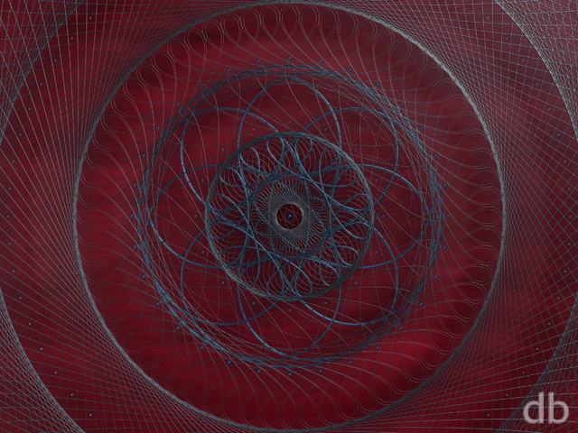
Someone wrote me a recently wanting to license “Null” for their book cover. I agreed but I only had a low resolution file to offer because it was so old. Yesterday he asked if I had a higher resolution file so I booted up the oldest version of Lightwave I had and tried to re-render the file larger. Unfortunately the file was so old that I couldn’t exactly re-create the original. My experiments however (on Bucephalus) lead me in some interesting new directions so I played around with it for a few more hours. I hope you enjoy the new version.


Susan [basicmember]
I like th ecolours and I feel like I am being sucked into the middle
Ozaawaagosh [plusmember]
Love the colour and detail of this one, it looks as if almost alive, as if your looking a a black hole in space, maybe this is what it looks like, if you were able to get close? Lol Love it.
nanonic [lifer]
Damn autocorrect. This is “now” the new awesome for my desktop /sigh.
nanonic [lifer]
Time to rotate my DB wallpaper. This is not the new awesome. Thanks R.
Michael S [lifer]
I noticed that on the Wallpapers > New page, many of the images have the wrong title attribute (aka hover text). Null says it is The Ride, Passing Through is Season of Light, Pantheon is Sundered Mountain, Island Time is A Moonlit Night in Paradise, The Oddball is Water is Life, Fireborn is Two Jack O’Lanterns, A Rare Alignment is Sundered Mountain, Numbus (Moonlight) is just Nimbus, etc.
Ryan
I loved “The Black Hole” as a kid. I’m sure it inspired my work in many ways 😀
ChrisW [basicmember]
It’s…an odd one. It was a Disney movie, their foray into science fiction after “Star Wars: A New Hope” came out in ’77. Back then, scientists thought that this was what a black hole would look like; a whirlpool in space, sucking everything down into…well, nobody really knew.
It stuck with me. Now, every time I see a whirlpool, I think of that movie. Thanks, Ryan.
BTW, if you’re curious about seeing the movie, the best way I can describe it is as the bizarre spawn of “The Love Bug” and “Event Horizon.”
…No, I’m not kidding. If you’ve seen it, you’ll understand. If you haven’t, don’t say you haven’t been warned…
Moondog [lifer]
This is one of my favorites. Outstanding!
Dragonwings35 [plusmember]
Oh man, I love this update so much! 🙂 Love the smoothing out of the colours.
3schnauzers [basicmember]
NULL: I like the new version AND the old one!
ROCHALLOR: With those specs, you could probably render the entire Western Hemisphere in a day!
Littlemom [liferplus]
I like the original but this update is great. You did really good on this one.
Todd [basicmember]
I too used to love this background but quit using it for the same reason resolution wasn’t the greatest. Now it looks amazing on 3 screens.
flowkclab [basicmember]
Null and Singularity are my all time favorites! This hi-res version is great!!!
Cheli in TX [lifer]
I love this… it has my favorite blue and purple tones. It has sort of a chalk or maybe watercolor “art” (haha) look to it too… just LOVELY! I put it as my background the minute I saw it. Thanks, Ryan!
cmmnoble [plusmember]
Yes! Yes! Yes! Yes! Yes! Yes! Yes! This is one of my all time favorites–and now there is a high resolution version! Hooray! 🙂
D. C. Sessions [lifer]
$HERSELF has suggested that you should do cover art, given that (for whatever reason) the cover artist often makes more than the author. She is happy to hear that this is a thing.
And, yes, we like this one. A bit more subtle shading than many of the other space variants. I trust it’s in the queue with the others for widescreen.
Cody [basicmember]
As much as I love your all your work, I’m always drawn to the simpler space scenes. Less is more for me. I think the simple ones capture the emptiness of space for me. I still use the original singularity, newborn a lot. Love it!