Description
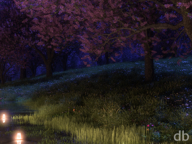
Created on my Shadowfax workstation while another project rendered on Rochallor. My goal here was to update my Oasis theme (started in 1999, updated in 2009) using Gaea and new plant models. I tried to keep the composition as similar as possible to the earlier versions but hopefully it feels new.


 Oasis (Blue Moon)


Anthony Leonard
[Lifetime]
One of my instant favorites. The blue is good but that near monochrome loses to the warmth and richness of the color palette of this moonlight render.
Joe Demmer
[Basic]
ryan..this is my all time favorite render going back to 1999. however is the night blue version. is there anyway we could get an updated oasis in night blue?
pvaz869
Eric Stell
[Basic]
Nathan Zachary
[Plus, Lifetime]
Though it’s not personally my favourite, I like how much I’m able to explore the details in the image. On the triple-screen render, though, there are some strange problems. For instance, on the left screen, at the right corner of the orange-ish rock, there is a random dark square.
Seadragonlady
[Lifetime Supporter, Lifetime]
Another great image and it is straight on to my my PC screen. Thanks for all your hard work.
Tatiana Taylor
[Lifetime]
I love the texture on the palm trees. Makes them look more real.
Donald Shipp
[Basic]
Like so many other pictures, the fine details in the foliage add fascination. I find that subdued lighting appeals to me. It’s Oasis’ turn to be on my desktop. A suggestion: Be careful about having stars showing in the foreground as well as too many stars overall. Other than that, it’s great.
Edward Adamczyk
[Basic]
It looks like a very nice place to be.
webworx
[Lifetime Plus]
I have seen this type of palm many, many times and I love the feel of it. Thanks for an outstanding pic. One of my favorites!
Cathy Warren
[Lifetime]
There’s something about this that just doesn’t look right. I’m not sure but the palm trees just look off somehow. Sorry Ryan not really a favorite for me, but I look forward to the render you have for us.
Robert de Forest
[Donor, Lifetime]
Calm, cozy, peaceful. I dig it. I particularly like what you did with the warm colors in the distance and cool colors in the foreground.