Description
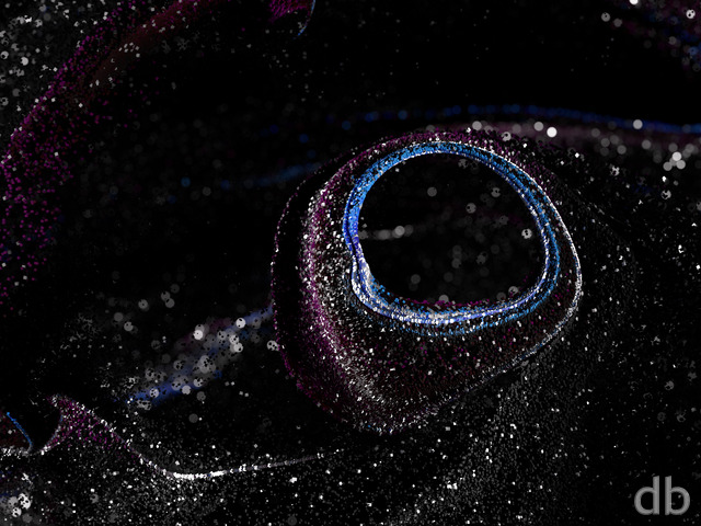
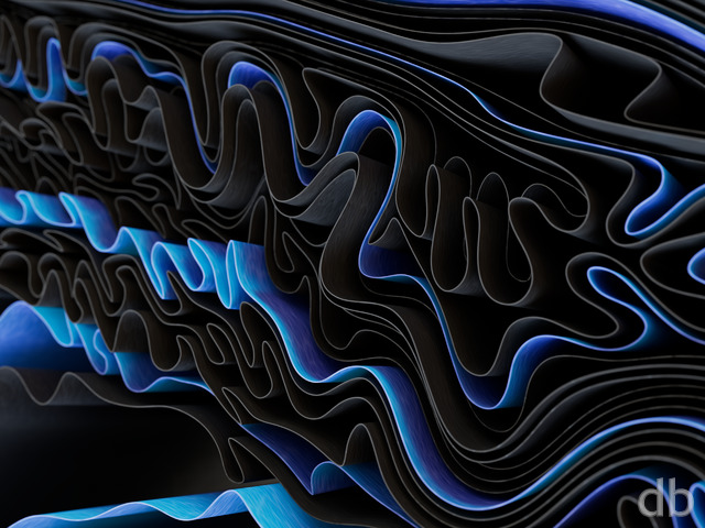
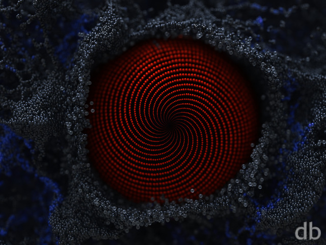
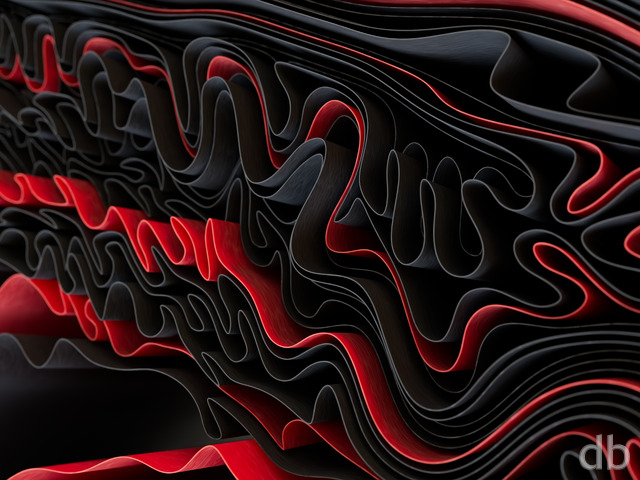
Experimenting here with shading in Octane render within Cinema4D. C4D’s “Redshift” renderer is built-in and that has lead me to favor it but Octane is very fast and capable of some really interesting effects. I pay extra for it so I thought it was time I use it and take advantage of its features. The geometry here is pretty simple but I think it shows off the shader pretty well and is interesting to look at. I hope you enjoy it!


Sarah Paland
[Lifetime]
Awesome!!
Jill Ferris
[Lifetime]
This one definitely is a keeper. Thank you!
Matthew Matticussimuss
[Basic]
This one is very cool, Ryan -as is its icy version
Jeremy Milam
[Lifetime]
This is awesome! I’d LOVE to see some other color variants in the pickle jar! Green, blue, etc…
Tallis Koons
[Lifetime Supporter, Lifetime]
Very unique and refreshing design
Robert Caldwell
[Lifetime]
These “realistic abstracts” have always been my favorite types of images. My brain wants to interpret these as real blocks of unknown material, of unknown purpose, with no reference for scale- then for just a brief second, flips back to seeing it as an abstract design. Really inspired and fun.
Jen Helgren
[Lifetime Supporter, Lifetime]
I love this SO much! Fabulous work, Ryan!
Tim Porter
[Plus]
I love this, thansk Ryan.
Nathan Zachary
[Plus, Lifetime]
Really cool conceptually! However, the highlights on the multiscreen renders (especially the left screen, but also some on the right) are really blown and a bit distracting as a desktop background. As an image in and of itself, though, really neat!
Ryan
[Owner]
I did notice that when the render finished this morning and decided to go ahead and post it anyway. I’m going to try a version with some DOF that, hopefully, will soften some of that.
Doug Bowman
[Lifetime]
What a nice lead-in to the weekend!
Cindy Noble
[Plus]
I love your abstracts. This one is fantastic! Thank you!