Description
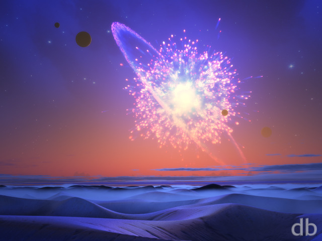
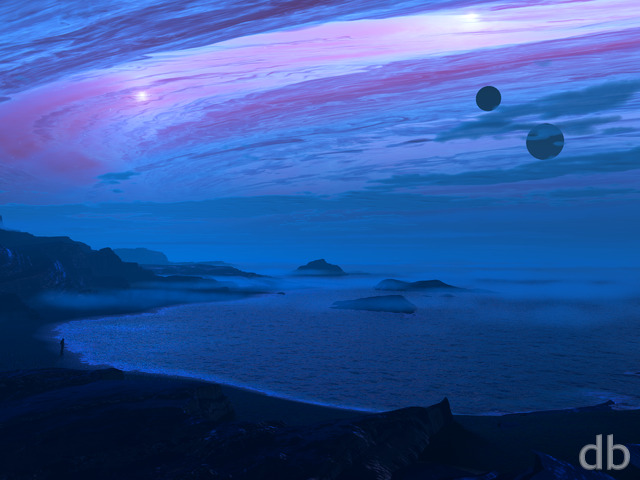
What can I say? Sometimes I’m happy to make a nice forest with bluebells and sometimes I feel the need to create a cosmic phenomenon dominating the sky over an alien sea. Hopefully if you’ve been following my work for a few years you’ve come to expect that the next wallpaper will rarely be similar to the last.
I’m continuing my exploration of using Plant Factory to model non-plant objects here. The “opening” was created using PF and rendered using Lightwave. The foreground apparatus was also modeled in PF.


 The Opening: opening2


Daemonyx [basicmember]
Browsing along, muttering about how nice each image is and then BAM! This pops up and I say “OH WOW!” Nice job on this one Ryan, it’s one of my new favorites! 😀
Michael Schmitt [lifer]
The Newest Wallpapers page says that The Opening was first posted March 11th.
Phil C. [basicmember]
Delightful, absolutely delightful. I love cool-hued images and blue is one of my favorites. Just lovely.
Christian [basicmember]
I absolutely Love this image. The many shades of blue with the pop of orange/yellow really give a sense of depth. Personally I love the dark globes in the foreground which just reflect the light of the anomaly.
Ozaawaagosh [plusmember]
Love both versions, Portals to another world or time, love the colours and lighting, Great Renders Ryan, Awesome
Seadragonlady [liferplus]
Let’s do the time warp again. Love it.
Cutterman [basicmember]
Huxley on LSD. Really like this one!
Martin [basicmember]
Another work of brilliance. Love it. The colors, textures and darkness are truly inspirational. It will make a great addition to my wallpaper gallery.
Todd [basicmember]
Another great work of cosmic brilliance. So well done. Colors. Textures. Innovative and imaginative. Thank you.
James C. [lifer]
Love this one. Reminds me of a warp tunnel or stargate. Love the colors and darkness of this one. I’m into your dark wallpapers lately so this is going on my screen today! Excellent work!
Jason [lifer]
Really love this one! Fantastic!
Travis [lifer]
I love your alien planetscapes, and abstract work, so this is going straight into my backgrounds collection!
Ryan
I really wanted a round enclosure for the reflection so the symmetry is intentional. I thought the asymmetry in the sky would balance things out 🙂
Thanasimos [lifer]
Love the sky work. My only issue with it echoes what others have said. The foreground scene looks almost obviously mirrored, and the instant I saw that, I lost much of my interest in the scene. Very cool, but maybe more iteration on the foreground would help?
GothyStitch [basicmember]
While your “alien/sci-fi” landscapes are some of my favorites, the mirrored aspect of the foreground is too consistent, which throws off the whole image for me. It’s like a mirror is being used to split the image in half. The color scheme is amazing, and ignoring the foreground, I love the image.
Halo [basicmember]
Your work moves me most when you are mentally off on one of your cosmic journeys…like this one. My mind wants to see those globes turn into cosmic travelers preparing to leap into the worm hole…
Littlemom [liferplus]
The foreground on this is great but the opening looks like something that comes out of a cartoon, and I don’t know if that’s the look you are going for here. If it is I still am not fond of it. Only a 7 for me on this one.
Simon [lifer]
I kind of like this, but i’m distracted at the obvious left/right symmetry in the foreground, which stops me being drawn into the image as it feels artificial. Seems surprising, as you don’t usually use symmetry like this, do you Ryan?
Aslan [liferplus]
Straight to the screens with that one.
Looks simply awesome…
TVM.
Richard H. [liferplus]
This is a GREAT one!
Theo [lifer]
These sort of colorful space-scapes combined with water/terrain are exactly why I started following DB so many years ago. This is really beautiful and I’m so excited to have it. I love the variety of work you do, but please keep making these gorgeous, surreal views. 🙂
redfoxiii [basicmember]
It just occurred to me that a cool pickle jar of this would be to render the ‘opening’ distorted in all the glass orbs w/ lensing effects
redfoxiii [basicmember]
I love the single perspective depth of this render.
Are you planning on doing a multi-screen version? I use your art at work w/ two screens, so I’m always happy to see them, but I wonder if this will work as well off center in a dual…
Marc Grondin [plusmember]
What can I say. This is simply lovely.