Description
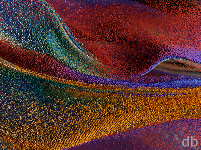
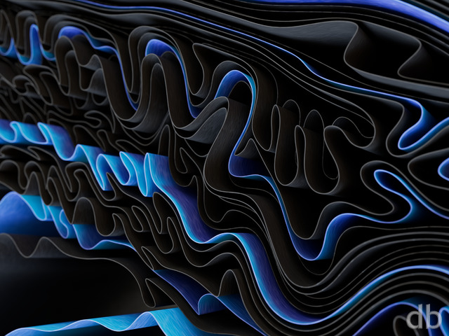
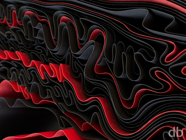
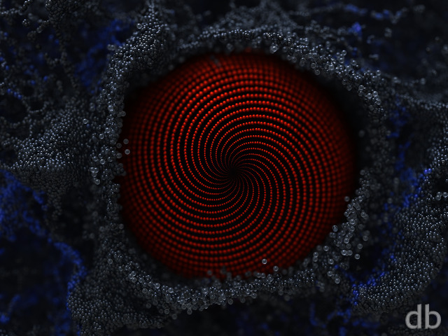
I’ve been spending the past few days learning how to use another 3D Fractal program called Mandelbulber. I’ve created quite a few different renders so far but this is the first one I think has been worthy of my gallery. The goal here was to create a fractal that doesn’t necessarily look like one. I’m also looking to avoid triggering anyone’s trypophobia like my last attempt. Hope you enjoy it!


 Origami: metalorigami1
 Origami: metalorigami11920


Zorz [basicmember]
I think this one is way better than the original.. make this one the main one and the orange one the alternate!
Ozaawaagosh [plusmember]
I love both versions, the colours and shapes are too cool, awesome renders Ryan
Daemonyx [basicmember]
The shapes and colors make this abstract are truly breathtaking, and your use of shadows and light is very creative. But I LOVE the metallic look of the pickle jar, I may even like that one more than the original! 😀
Tyler [lifer]
Like others I’m a huge fan of the iridescent version and place my vote for the main gallery. The featured one is also amazing but has not grabbed me like the PJ has.
Patrick [liferplus]
I am sorry Ryan, this iridescent version might be one of the best abstracts you have ever done, and the colour one was sitting on my phone background within a minute of seeing it as that is marvellous.
Promote it to the main gallery please, and then we can have all the versions for all our devices.
Incredible work.
Puritania [lifer]
This is a really neat alternative to the original! The iridescence is remarkable, and the way it plays off the darkness of the metal is so ridiculously catchy, super awesome stuff. Will there be a dual-screen variant of this by chance, or is it more suited to single-screen? Whatever the case, this is just grand and glorious. Very well done!!
Eric [lifer]
The colors and textures on this are fantastic. In some ways, it’s a spiritual successor to my beloved Automata (2013) that I’ve been using for 6 years now. It’s time to mix in another Blisspaper to the rotation. 🙂