Description
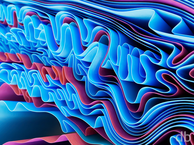
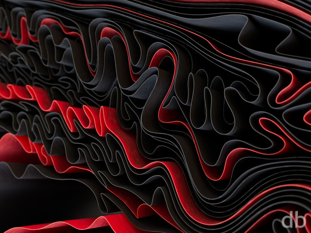
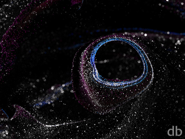
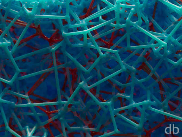
Here’s something colorful if you are getting tired of winter greys. This render is the result of my experimenting with Plant Factory to create interesting floral patterns. I rendered the scene using Vue but I think I might try a version with Lightwave so I can have a bit more control over the geometry. Let me know what you think!


 Phyllotaxis: phyllotaxisnight2
 Phyllotaxis: phyllotaxisnight1


Camille [plusmember]
A briliant splash of color, so nice for a winter day. The center looks like it is made of fine yarn. Wonderful detail.
Jenanne [liferplus]
Love the pickle jar versions, Ryan. Thanks!
Ozaawaagosh [basicmember]
Love the Awesome Pickle Jar varitions of Phyllotaxis, the colour and detail are AWESOME, really great renders my friend
Zach [lifer]
Wow, the perspective shift and DoF change on the multiscreen versions are quite interesting! Feel like a more surreal version of many of the floral macro shots that I take.
Rick (Horseman) [basicmember]
The color and detail in this creation are amazingly beautiful. An amazing creation by Ryan with an underlying message, ‘We the human race share space on this planet with creations, all the species of earth. We are linked no matter the color.’
Timhogs [liferplus]
I can see where the worm-like structures in the middle may be disturbing to some folks, but overall I like it.
Doug [liferplus]
Great colors, and the texture in the center is mesmerizing. Nice one!
Gene [lifer]
To me, this piece is a near-perfect example of the digital art distinction between substance and technical execution. The subject of this one leaves me pretty well unmoved. On the other hand, I am very much intrigued by the colors, how they interact and so forth. I enjoy the execution of the colors and the shapes and shadows, etc., and hardly notice that they are meant to be parts of a flower.
A perfect example of the opposite effect is Once Upon a Time (twilight ver) from 2003. I can (and sometimes do…) look into that one for minutes at a time, just enjoying the subject. It’s a powerful enough image for me that I easily overlook the relatively simplistic execution.
I guess the key is bringing the two together at the same time — compelling subject matter and execution so good that it is hardly noticed, if at all, by the viewer. Fortunately Ryan, most of your work falls neatly into this category! Keep up the good and inspiring work.
Littlemom [liferplus]
Although colorful it still seems a bit flat to me
Rodewaryer [basicmember]
Nicely done, a few things about it distract the wandering eye but overall it’s pretty pleasing.
Tom [basicmember]
I think you need to get back some really nice basic landscapes now and then. Just looking at this made me nauseous. Sorry, Just being truthful.
Ozaawaagosh [basicmember]
I simply love the colours, of this one and the texture is stuning, Great Render, Ryan
DougB [lifer]
Different, somewhat reminiscent of “Sunburst Daisy”, but more pastel than neon-colored.
Susan [nonmonthly]
The way you have done the pattern in the centre is really good as is the colour scheme, but although I like the execution of it, I don’t really like the subject matter – just doesn’t do anything for me.