Description
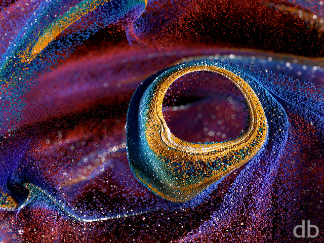
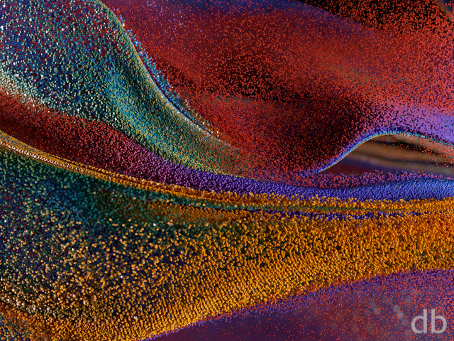
I created this rather simple (but dense) abstract using Lightwave 11 in order to assess the feasibility of creating my images in a 48:9 aspect ratio from the start (as opposed to starting with a 16:9 frame). I chose “platonic solids” after watching an excellent NOVA special called “The Great Math Mystery” recently.

 Platonics: platonics2
 Platonics: platonics1
Allen [lifer]
There’s a slight glitch in the 3840×1200 multiscreen version: the “digitalblasphemy.com” logo in the corner is half missing.
Jenanne
I like all three of these, but version three is my favorite. The soft colors look great on my screen. Well done, as always.
BTW, the 7680 x 1440 size appears to be corrupted.
HÃ¥var
I love this one. Would it be possible to get a 1920×1200 version ?
Mangoman
Yeah, that’s what they are — marbles with edges. Pretty far out, I think. What’s cool is how some are cubes, some have pentagram-shaped faces, others triangles, still others will have hexagonally shaped surfaces; you name it, they’re there. Nice colors, too. Great job, sir. Thank you.
James
It also looks like some druse quartz I’ve dug up. This will be added to the rotation for sure. It would also be nice to have a newer version of “Geode” made or have the 2004 one done in triple screen if possible.
Richard H.
I actually like the Pickle Jar version 2 image best myself (i.e. the dully coloured one, not the blues and red) because it looks so authentically crystalline. At thumbnail size it’s nothing particularly special, but viewed in full detail (at 5K, in my case) it looks terrific.
Terry
Looks like amethyst – very cool
Zach
I *love* that you’ve included multiscreen renders of the Pickle Jar variations! That’s awesome!! Thank you, Ryan.
Tyler
Excellent color choices. To me this translates as multiple nano bots assembling into a Gundam Wing Mobile Suit. Adjust the DOF as you will and the concept still rocks.
Carl242
Would love to see split file dual 1600h files though. Anyone with a macbook retina 13 and an external monitor would appreciate that format 🙂
ChrisW
Don’t you hate it when your Legos spill all over the floor? Or just hang in midair for no reason at all?
BobC
I tend to like this type of “realistic abstract ” piece, however I also find the depth of field thing problematic. For me, the composition is fighting with the DOF setting such that it is hard to tell what the arrangement of the thing is supposed to be, given that it is a whole bunch of Platonic solids.
Matthew
The foreground blurry patches on the far ends of the image look like lens smudges as opposed to some depth of field artifact. I’m not a fan. I’d also like a little more depth of field so that more of the prisms are in focus. Overall, I’m a fan and it will become my new wallpaper if it’s tweaked.
Scott M.
Ryan, I would have to agree with you on this change. I really like having more detail in my backdrops… like this one! Thanks.
Kyle
Evoking fond memories of D&D here… 🙂
Brian J.
Ryan, the work, as always is fantastic. I like the new technique, designing in the 48:9 AR, instead of a single screen view. I have a 3840×1080 setup, but I find that I almost always prefer the single screen cut of the image, since the multi monitor images seem to cut out detail on the top and bottom or skew the field of view giving a wide-angle look.
This image looks like it was meant to be a multi monitor, rather than a single screen adapted to multi. Well done!
Hernani
Loved this because they remind me of polyhedron dice from when I used to play Advanced Dungeons and Dragons with the lads in high school– very nostalgic.
I especially appreciate the way you manipulate focus in this and all of your work; please keep it coming! 😀