Description
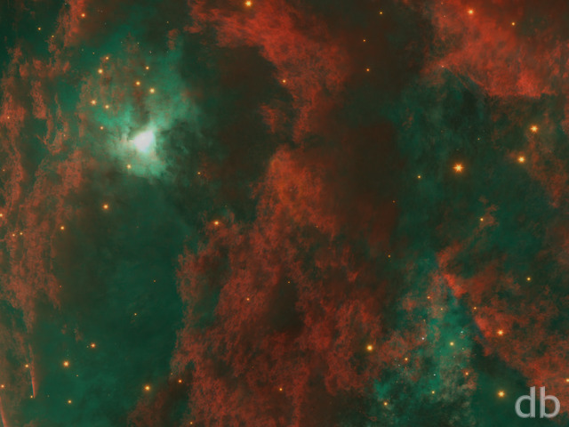
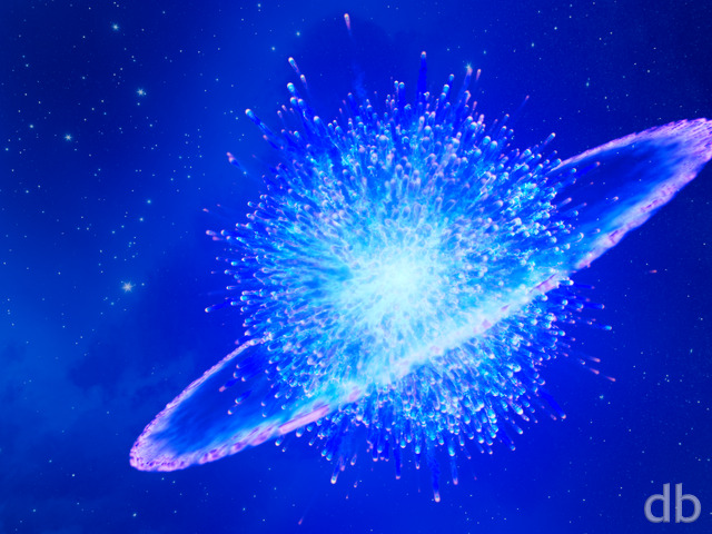
My second space image created using Apophysis fractals on 2D “plates” in Lightwave. By varying the luminosity and transparency of the different places and moving some in front of others it is possible to create the illusion of darker dust obscuring brighter plasma. Because the plates are 2D they are relatively fast to render.
Next I would like to try mixing the 2D fractals with 3D volumetrics. . .


 Pulsar: pulsar2k101


qmong [lifer]
Uh, now I see it. Space Face is kinda scaring me now…
MattW
Any chance we can get a 2880×1800 of this?
sigmaman
I reckon there is a face in there.
mischa
is it just me or does anyone else see a face in the middle of the pulsar? looks kinda like an old man, with big lips and heavy brows…
Jeff R.E.
Definitely my favorite… so far.
Ryan
Try it now D.
D
The 2560 x 1600 version of pulsar2k101 is corrupt.
http://digitalblasphemy.com/content/picklejar/pulsar2k102/pulsar2k1012560.jpg
Ryan
This “new” version is actually a previous edit that I wasn’t able to save due to a file error (I accidentally overwrote my work). I tried to recreate the file I had lost but was unsuccessful. The multiscreens are based off of the old gallery version. Wow, I got confused just trying to explain that. Long story short, I only have a single screen version of this render. The multiscreens will stay as they are.
Daniel
The DS link still goes to the previous version…
kellzilla
…maybe because it was originally posted in May? 😉
Thomas
I like it.
But I feel like I have already seen this same wallpaper a time or three.
Bran
Awesome! I love this version. The original was a fave of mine, but when you put this in the pickle jar, I forgot about the previous version. 🙂
Scott Wray
Alright, this is what will be going over my bed!
just placed an order for the HUGE bronze matte on this bad boy =P.
I have highland spring huge, shansuhi large, the florence triple, and now pulsar huge. =)
Ryan
Enough people seemed to prefer Pickle Jar version (posted on 9/2/10) that I’ve decided to swap it with the gallery version. I’ve added a poster option the my Zazzle gallery as well. Thanks for the feedback!
Matt
This is definitely the better verison.
Simon
In my oppinion the PJ is the absolute best. Those spirals just gives it a wilder look, especially the one passing just below the planet. It shows how small the planet really is, in comparison to this “cosmic power”!
Barreto
i would have to say the pickle jar version is better than the version you currently have posted in the members gallery. it took me a few times to notice the difference, but the pickle jar version has those blue spirals that just give it that better edge.
Jenanne
Although I like both, I agree the PJ version is superior.
Tyler
Absolutely agree the PJ is superior. Chalk up another vote Mr. Bliss thanks.
Walo
The one in the pickle jar looks “wilder” than the official one, it gets my vote.
Brimmer
Pickle Jar version gets my vote as well
Eric
Nuff said!
Josh
I much prefer the pickle jar version, personally. I think the planets give a much better sense of scale.
Daniel
I’d have to say I like the pickle jar version slightly better. Definitely would like to see a 3840×1200 dualscreen version of it.
E_man
Always was looking for an excuse to become a member, popped in, saw this on the front page, and joined on the spot, it’s amazing!
[TT]Baxter
Absolutely Beautiful on Triple 30 Inch…
Duffman420
At first glance I thought, “Oh, another spacescape”, then I put it up as wallpaper, and, holey cow…the detail is incredible. Some of the swirls almost look fractal-based…in any case, it is awesome.
Foz
That version of the dual screen doesn’t look like the other dual screens – it looks like a truncated triple…
Ian
Sweet, Downloading them now. Only one thing left to do once I get them on there, and that’s to figure out how to get your animated wallpapers onto the Evo to use as the “Live Wallpaper” It’s a cool feature on the phone, and would be totally awesome if I can get it to work.
Ryan
I’ve added 960 x 800 files for the Evo this morning. You can find the zip file here.
Ryan
The 480 x 800 files are mistakenly labeled. The screen is 480 x 800 but the OS requires a larger file. Until I get the 960 x 800 files available (they’ll be Members only) could you try the 960 x 854 Droid files?
Ian
480×800 is not an exact fit, it still needs to be cropped to fit the screen.
Ian
480×800 is not an exact fit, it still needs to be cropped to fit the screen.
kellzilla
HTC Evo uses 480×800, listed here as Touch2/Nokia N900.
Ian
Have you considered developing an app for the Android network? It is kind of a pain navigating your site from my cell. An app that could be downloaded to a phone would make much easier to get your wonderful artwork onto a cellphone. Another option would be to make a “mobile” site.
Another problem I’m having is that I can’t figure out what size I need to use for my HTC Evo.
anna_writr
I really liked the notes for each image. Thanks for taking the time to do them again.
Ben
Chalk me up as another spacescapes fan. The one looks gorgeous on my 27″.
Phillip D
Great idea to have notes…I always wondered in the past images how you make things…I like this render, even though I am not familiar with Lightwave, but it seems to have a very good render engine, very smooth.
BTW I just upgraded to Vue Esprit 8 the other day….neat terrain sculpting…..
celmendo
Really wasn’t feeling the reg. version but I love the dual screen with it flipped horizontal. That made all the difference for me. 🙂
Aerospeck
Keep the Space / Sci-fi scenes coming 🙂
I’ve been a super fan for these images for a very long time!
Angel
By far one of the coolest I’ve seen. Been a fan for a long time, keep it up Ryan!!
Ben
I love the space ones, and I particularly love this one. Will be front and center for a while!
Max
Oh, okay. I just wasn’t sure since some of the dual screens had it centered and some to the side. Thanks for the reply, I’ll do just that 🙂
Ryan
I actually chose to center the dual-screen version rather than crop one side or the other from the triscreen. You are welcome to take the triscreen image and crop a version that works with your setup though.
Max
Several of the dual screen files aren’t as they should be (assuming 2560×1024, 3200×1200, 3840×1080 and 5120×1440 are how it was actually meant to render). As is, all the dual screen renders w/ an aspect ratio of 6:10 are rendered w/ the pulsar in dead center.
Collossus
It comes out looking fine But I believe it is the same as the tri-screen format. don’t know if this was intended as the moniters crop of the third portion anyway.
Michael
Just curious… Do you plan to have the ‘turned star’ rendered into the single-screen offering? Maybe that is going to be one of the pickle-jars… ?
Chris B
The Pulsar in this one looks amazing. can’t wait to check out the pickle jar versions too… and droll over the multi screens that I can’t use yet lol
Brad
Beautiful work!
Chuck
Very nice. Space is cool and then there is the version you create. Always a pleasure to view your new work.
Eric
Really cool one Ryan. Thanks!
Brandi
Lovely. I do love your space scenes. 1280×1024 works fine now, btw.
Miguell026
Great work Ryan!
a bit dark on the sides…
but colorfull in the middle!
Will
the pulsar looks almost electric, love it
Kevin
just awesome.
Chris
What a beautiful image! I’d love to see this in green as well!
Frank
I’m using the Single Screen but NEEEEED some dual screen goodness!
GREAT JOB!
Dan
This is another reason why your space/planetary images are my favorite! They always make me think and dream.
Natlum
I just love your space images!
FlareHeart
Thanks for this awesome wallpaper! I was eagerly awaiting a new space scene and I was hoping for some sort of nebulous form. Luvs It!
Micalo
Can’t wait for the Dual Screen!
Jenanne
I love your spacescapes and this render is no exception. This is terrific, wonderful, fantastic, tremendous — and all those other adjectives that mean GREAT. Thank you, thank you….
Andy
Good ol space scene. Nice. Still lookin foward to your next planetscape!
Mike
This render is not available. Any reason? I can get other resolutions fine, but not 1280×1024.
T3chn0g33k
Until we ACTUALLY encounter one up close. Pictures like these will have to do.
hEADcRASH
…the subject says it all. 🙂
Brent
still wanting and waiting for forest citadel triscreen!!! Pulsar is sweet, nice job!
littlemom
Ryan you’ve done it yet again it’s beautiful. I love the pinwheel effect as it gives it a softer touch. I think the way you blend science and art through DB is amazing. Have a great trip.
Micha
Pictures like this one are the reason why I’m a DB member 😉
Dean
Love it Ryan, great work!
Ryan
Try it now. I did the file resizing on the laptop too and there were a few irregularities.
Walo
Amazing as always, it would be cool to add the electromagnetic beams as well.
JK
The netbook wallpaper has white pillar bars. It’s actually 1024×600 but its the square 4:3 image with white pillar bars on each side.
Wraith
I run XP in bootcamp on my MacBook, and tap to click with the trackpad is way too sensitive to the point where I just turned it off. If I were you, I’d pick up a mouse with plenty of buttons so you could map them to exposé in OS X if you wished, and didn’t have to deal with shoddy trackpad software in Windows.
Oh and great wallpaper, I love space renders. 🙂
Walo
I missed the post part about the electromagnetic beams being done like a pinwheel, I thought it was an accretion disc.
Magneto
Absolutely fantastic.
Tim H
This is great work and I like it but as a longtime fan I would love to see some new posers. I know you stopped doing them a while back and briefly revisited with Chamelea in 2007 but I would very much like you to do another. I emailed you a few months back with the idea of doing a updated version of frio in sand and another thought would be for you to attempt a futuristic terminator style poser. With your talent I’m sure either would look amazing and possibly even present a new challenge to you. Thanks in advance.
Andrew
Ryan, you can set your trackpad to accept taps instead of full clicks in System Preferences -> Trackpad -> Tap to Click
Very nice wallpaper!
Overdrive
Sure you didn’t pick this one from Hubble?
9*
Ryan
It’s a sweet laptop. . .for running OSX. I’ve heard that the MacBook can’t switch between graphics chips when running Windows so it ends up running a lot hotter. It does get wicked hot while rendering, though I think this would happen no matter what OS I run. There’s only one vent that I can find! It sure is a great looking machine though ;)There’s also some issues with power management that don’t seem to work properly under windows (for instance it doesn’t go to sleep when I close the lid).I also don’t like that I have to actually “click” the trackpad where on Windows laptops I can just tap it.I need every cycle so I can’t be running a VM. I’ll just hope that these little issues get fixed with an update and go from there.
Mairead
This is extraordinary, I love the colours and how you’ve made everything just WORK!
Scott
These are always my favorite ones.
Scot
So did it work well? did you like it? Are you going to stick with boot camp or go on to parallels or fusion?
dejerdejer
Well………… ……………..I think I just found my new background for the next few weeks. Great as always! Thanks!
Terry B
This is stunning!
I’ve been wondering what it would look like if there were visible patterns of life on both those planets… (like on the “Phraxis” design) two opposite civilizations with this pulsar smack in the middle
I’m so looking forward to that triple screen render!!!!
SML
Love it love it love it love it…………..
JK
The netbook wallpaper has white pillar bars.
Maelin
This looks gorgeous, but I think the 1024×600 version is botched, it looks like it resized to fit the whole 3:4 image when it should have resized to fill the screen.
Nelson
Thank you, Ryan, this is really beautiful. I still like your planet / space arts the most (and abstracts also). This is where you can fully show your imagination. Here, it’s not so important to have perfect photorealistic views, but to create something which cameras can’t make.
WHAT
<3 the space scapes
Geep
I’m not really a huge fan of space scenes, and this one falls right in that alley. However, the colors mixing and swirling as they do are quite stunning.
Best of luck with the speaking (tomorrow?) and enjoy yourself! 🙂
Ryan
Oversight on the Droid file. Sorry about that. It’s there now.
MR
Did you stop doing Droid-sized renders deliberately, or is it just an oversight?
Kris G
Very nice.
Could you make a render for the droid? Thanks!
Great work!
Psyclone
I wish I had a larger screen…. the detail in this one looks utterly phenomenal. Your space scenes are really getting spectacular. The last few you’ve done have been stunning.
Ryan
Looks like there was an upload error for the 1440 x 900. I’ve reposted the file and it should work for you now. Thanks for the heads up!
robk64
Ryan, is your 1440 x 900 image a little off? It looks like it copied onto itself on the bottom. Looked at it in a few different browsers and downloaded to confirm I wasn’t having an antacid flashback.
Greg in CA
Don’t get the wrong idea, because this is cool as is, but what about some color variations?
Mike
Awesome! There is some really cool stuff going on in the middle when you zoom in. Thanks Ryan!
DiaMare
Love it Ryan! Once again you capture the beauty of space within the limits of your imagination. Creativity at its best!
Tyler
Thank God! It felt like I was in a perpetual loop of the spring season. Nothing like a wicked planetscape to break the pattern. These and abstracts are really why I joined. I couldn’t be more pleased with this release. Mad props Ryan sir.
Pat
I couldn’t help saying “WOW” when I saw this one….I’m a sucker for awesome space scenes like this…Truly Breathtaking….
Pat
Absolutely fantastic!! Love it! And agreed with Andrew on the trackpad comment ;P
Kris G
Thank you Ryan. No problem at all. Thanks for the fast response. That’s why I keep coming back.
Ryan
Thanks for the tip Andrew. That’s really cool! Happen to be using OS X at the moment but I’ll be interested to see if I can get it to work while running Windows.
Reuben
I like the original version better than the other one, would like a dual screed version with 3 spokes? spinning rather than just the binary.
Chris Mc
The pickle jar version left nothing more to be desired.