Description
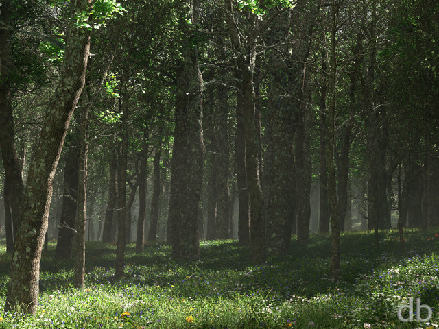
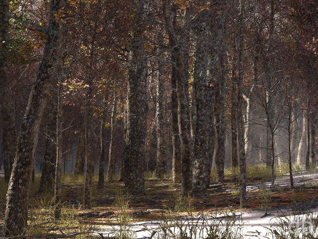
I was inspired to create this scene after seeing a cover photo on
one of my Facebook fan’s profile page. Once I got into putting
things together, however, it ended up looking very little like the
original scene. I still have an issue or two with this one to
resolve, but it took over 27 hours to render so I thought I would
share it as is while I continue working.


 Redfern Forest: earlyredfern1
 Redfern Forest: redfern2
 Redfern Forest: redfern1
Bill Wall [plusmember]
Rhis is one of my fav’s also
Joe Nobody
One of my favorites.
Jenanne
This is such a great render, Ryan. Perhaps a fall version for the upcoming season change?
Jared
Hey Ryan got my membership back and am blown away by what you have done in the last few months! Great job
LiQuiD FeA
This has got to be the best triple monitor wallpaper of 2012 if not, the best of 2010, 2011, and 2012. Great colors here. I dislike how the trees on the outside monitors all have tilted trunks. With the majority of your renders the triple monitor versions all have that same problem.
MJ
I change the wallpaper about once a month at work and everyone loves this one 🙂
Thanks for all of your hard work Ryan!
Topher
Have you considered putting up a kickstarter project to have gather support for your new second machine? I’ll bet you’d get a fair bit of help.
Ryan
I set this the multiscreen to render on my alternate workstation (so I could start work on a new project) and the last bit is taking quite a long time to finish. I hope to have it up within the next day or two though.
Derek Brow
Looks great. When are you going to make it for Dual/Triple screens? Can’t wait!
Lidia
I agree with Jenanne that earlyredfern1’s foliage is better than the other renders.
Justin B.
Photorealistic or not (can’t please everyone I suppose), I love this image. The color shift from red to blue to green, the atmosphere… it has kind of an ethereal feel to it. Can’t wait for the multi-screen render so I can update my work PC!
The Guru
It could be a matter of taste. I really don’t like this one. I find that the green of the leaves and the red of the ferns compete for attention rather than complement each other. The mist doesn’t seem like it belongs on the ground and the tree trunks look, well, computer generated. I’m not asking for a complete redo on it, since that would likely take a lot of time. I look forward to your next wallpaper.
Christopher
I liked what you did with the bark, adding texture, shading, and moss. The color balancing between blue/red and green is just right.
I have a problem with the tree trunks’ edges. The trunks’ sides are too straight and uniform. I’m used to seeing bark create bumps, curves, and ridges for light to fall unevenly along edge. What I see in the current version looks as if a textured polygon was drawn, with the texture fading to black around the edges. The light does not seem to vary from left, where the light source is, to right, no matter how far up in a tree you trace with your eyes.
(By the way, the name text box in this form is too short.)
Brandi U.
I’ve loved the ground (ferns) in this image, but not liked the trees until now. Excellent change.
Labanimal
The gap in the trees really beats the others hands down! would love to see this adapted with the tree detail work you’ve done!
Gregor
This one definitely replaces version two. Just perfect!
Jenanne
for the two posts. It didn’t seem to appear as usual.
Jenanne
I really like this picklejar version, early though it may be. The tree foliage, in particular, is better than that in the later renders, IMHO.
Jenanne
I really like this version, early though it may be. The tree foliage, in particular, is better than that in the later renders, IMHO.
Lidia
Darkening the trees was a great improvement! I also like that there’s more fog in the bottom.
Foz
Darkening the trees and increasing the god rays has done the trick! It’s subtle but I love it!
Ryan
Thanks for the heads up! I’ve posted a new version which should fix the issue.
suab
great job again
Ryan
I’m starting the multiscreen render right now. The Facebook cover pics are sourced from my dualscreens so it will be up with the multiscreens.
Timmargh
Any chance, please?
Ryan
I design it as a single screen first for a couple of reasons. First, the design window is much larger and easy to use in 16:10 mode than 48:10 mode. Second, I feel I have more control over the composition with the smaller frame.I do understand that it’s a pain to wait for the multiscreen though. I’m sorry!
Labanimal
Ryan, not sure if you’ve answered this one before, but why not design it as a triple, and then chop it up, might save some time (not sure about revisions)… ?
Ryan
I’ve added my third (and most likely final) version this morning. I’ve darkened the tree bark considerably and scaled back the displacement mapping on the tree trunks. They should look less jagged but still retain some texture. I also dialed back the atmosphere quality a bit so it would render quicker.I haven’t really changed anything with the composition.It’s not perfect but I’m ready to move on. Multiscreen render next!
Byrel
The way you broke up the outlines on the trees in this version really made them look real. Another one for the background switcher!
0beron
I think the darkening has really improved it, makes the whole forest look deeper. I think it’s because the sunbeams make the trees further away a lighter colour, but since they start of darker the effect is more noticeable.
In V3 in the widescreen renders there is an odd horizontal line in the blue fog as it meets the base of the foreground tree on the far left?
Josh
Not too bad, but some things to consider: Since ‘sunbeams’ usually happen when its cloudy, why not have the furthest of backgrounds as darkest instead of bright white, but only where its most white. This might make the trees darker but hopefully not by much. I say this because you have lots of leaves, and that should create shade, yet this picture seems unnaturally bright for a very tree-y scene. Ferns are lovely and spotted with blue flowers is a nice touch as it blends well with red ferns yet still stands out. Also, and maybe what’s making the leaves seem unnatural, too, is that since this is viewed from below the treetops, only top sides of the leaves should be brighter than on the bottom; again because light is coming from above, darker shades are created below. This may help fight some other comments you may have that I’ve been seeing about it looking more lifelike, natural, etc.
-Good luck and as always: This is only one person’s opinion.
Jenanne
I really like the multicolored ferns and pale flowers at the bottom, the sunbeams, and the tree trunks — they are much improved. The only room for improvement that I can see is the tree foliage — it still seems a bit — something. Blurry, artificial? I don’t know. But I don’t find this render bland. And I see no need for birds, unicorns, or any other animals, real or mythical.
Ryan
I generally render one single-screen version (at high resolution) and then use it to create all of the smaller versions. Since the original is a 16:10 file I have to crop a bit out for the 16:9 versions.
Covert
I like where this one is headed.
One questions I have that seems to apply to all of your wallpapers: when I compare the 1920×1080 to the 2560×1440 versions, the “camera” is always positioned higher in the 2560×1440 version (i.e. you lose more of the foreground). For instance, in this image you miss out on a lot of the red fern. Why is that?
Foz
The trees texture helps with the sterile look, but the tree trunks draw most of the attention, and the gaps between, and due to the composition, you get a tree-space-tree-space-tree and then it reminds me of a barcode.
It needs something else – something sprinkled around to lessen the tree-space-tree impact – perhaps something like floating shining motes, or smaller trees dotted around.
David
Definite improvement over the first version, although the light beam noise is still present and I think is really obvious since it is cumulative as you get deeper into the scene, culminating in things deep in the background lacking detail completely.
cruzor
I love each version except for the trees, the bark is in long rows and twisted. The trees draw my eyes and it feels like the picture is twisted. It will not keep me from using either version.
Angelique
I really like this and the arrangement of colors but it feels like it needs something to dress it up a bit, like an animal of some kind to give it that extra little touch – anything really like a bird or deer, unicorn, something
Gregor
I liked the combination of colors in the first render already, but the graininess kept me from saving it to my wallpapers folder. After switching the two images (old and new) in tabs for reasons of comparison, I have to say that imho that aspect has improved a lot. The new tree outline looks a little too rough for me in some spots… they’re shaped like a saw. Nevertheless, I’ll save this one since the unfamiliar shapes somehow represent digitalblasphemy for computer generated art that doesn’t have to show sceneries on earth all alone.
Amaryllis
To be honest, I think it’s the leaves I have a small problem with. I like the bark, the detail of the ferns and flowers are wonderful, sunbeams and mist are beautiful. I just wish the tree leaves were lusher, more ‘real’ looking and less ‘bitty’. Of course, you can’t ever please everyone and shouldn’t try!
Lidia
I like the improvements. 58 hrs is not that bad (I know you’ve had much worse). Maybe you’re getting antsy about render times ever since Hydra died and you lost it as an alternative renderer?
Katie
My favorites are always the natural scenery. I agree with Pete, however, that it still looks a little artificial.
Ryan
I’ve added a second version of “Redfern Forest” to the Members Gallery this morning. The main difference with this version is that I increased the “atmosphere quality” settings to mitigate the noise in the sunbeams and I also added displacement mapping to the trees to give them some more texture.I think the light beams are a lot smoother in this version but there is still some work to be done with the trees. This version took 58hrs to render vs 27hrs for the 1st but I think the final version will be somewhere in the middle. Your thoughts?
Nick R
however, I think what is out of place with it is the trees. If they looked older, I would be willing to give it a 10. It’s still very good though.
Pete
It’s a good scene, and I like it for the most part. The re-render definitely helps a lot. There’s still just something off that I can’t quite put my finger on, but it gives it a somewhat artificial feel. My favorite pieces of yours are the ones that are so photorealistic that I’ve had students asking me where you took the picture.
Neil
Firstly I really like this. I love the atmosphere and the colouring. What I think some people are picking up on is the tree bark looks very “rough” which SHOULD lead to an irregular outline, but the trees outlines are smooth – hence the “fake” look. If the bark textures smoother it might look better/more real.
LOVE the work – you’re prolific.
Dustin
This render reminds me of your earlier work 🙁 The tree trunks and branches look too artificial. Maybe I’ve just gotten in the habit of loving your abstract works as of late 😉
Linda K.
I currently have this one set as my wallpaper. Love the colors. Nice touch with the blue flowers.
David
I freaking love it, great job as always.
Littlemom
I agree with Chris I think this is a great start, but to me it has a cartoon feel to it. Don’t ask me why, cause I can’t put my finger on why. Maybe it’s the sun rays just not sure. I think the red ferns could be taller as well, so we see more of them since that is the title to the render. Like I say great start, just needs a little more tweeking.
Michelle
I just love how the colors work for this. Green, blue and red…it’s so warm and vibrant. Definitely one of my favorite works you’ve done in awhile. I do hope that you can figure out how to get that graininess/noise with Vue fixed. It does detract from it some for me, but not a whole lot. I still love it.
Chris
I like this alot, and it seem to have a lot of character. This could go quite a bit further but there are a few things that could be changed. As stated by several people, the fog and bark could be tweaked a bit to make it more flat looking, perhaps more saturated. The other thing I wanted to add was that maybe the leaf color of the trees could be changed so they are darker. They also seem a bit too sharp/bright. Other than that I really like where this is going. You’re inspiration is unstoppable.
Amaryllis
… to seeing the final version. Thanks for sharing this ‘work in progres’, as you say in your notes. I’m really enjoying the anticipation of waiting for the refined version. What I love about much of your work is that I can totally leave the ‘real’ world and enter into another one, and I know this latest is one of those pieces. I can already leave the room I’m sitting in and wander among those trees.
Aeronaho
Hi Ryan, I love this one. The colors are perfect. I’ve been a fan of yours for many many years =)
-Aero
Terry
Hi Ryan, really liking the colours on this – the fact you’ve re-opened the user gallery is making me think I want to create 🙂
Shane T
I recently showed an early prototype to some coworkers and received feedback in a similar vein to what I’m reading here. It aggravated me people couldn’t see past the apparent flaws to give useful feedback. So I’ll hold off until you get another version up. I trust your intuition and artist’s eye way more than my critique from 10 seconds of casual looking to improve the scene.
Tom
I like the fog, the detail in the fern and the leaves of the trees. All together this one is just not grabbing me, the trees to my eyes look rather odd.
suab
A great picture as always. Personally, I don’t mind the “grain”, but the trees do look a little weird in this first version.
I love the color composition 😀
Michael
I like the color contrast here. The Redfern, skyblue flowers, and low hanging fog on the plant life looks perfect to me. I know you have a couple of things to hammer out but would like the forest floor to remain the same. I look forward in seeing your revision.
All great things take time, cant expect perfection over night.
Skynet
Always diffent and renewing
Ryan
I started a new render this afternoon with higher atmosphere quality settings (+7 instead of +2) and added some displacement mapping to the trees to give them a little more texture. I can reuse my global illumination solution from my first render so that should save quite a few hours.
wazalord
Ryan, all of the best artists in history have had their detractors. I would take it as a compliment, because you are one of the best digital artists in the world. Love all your work, so awesome.
Lidia
I really, really like the concept, but as others have mentioned, the graininess in certain areas does detract. I wouldn’t mind waiting a little longer for it to render with less noise.
Luke
Ryan, as someone else below has said, the noise from the sunbeams is quite a detractor. The mist near the ground level looks excellent, but the graininess of the sunbeams really ruins it for me – it looks great in preview, but I couldn’t really see making it my wallpaper 🙁
Maybe you could remove the fog effects altogether if it can’t be rendered without appearing grainy? The fog issue aside, I love the colour gradient as you look from the ground to the treetops.
General B
I really like what you’ve done with the forest floor, but the textures/shape of the tree trunks and the uniform bright green leaves look definitely off to me.
The low-lying vegetation looks cool and otherworldly, but the trees seem odd.
Alex H
But obviously unfinished. The trees look a tad plastic. But I like where it’s going
Foz
I don’t know what it is about this picture – maybe it’s the bare tree trunks… but it looks… bland or something is missing…
Jenanne
When you finish revising this one, it’s going to be one of my favorites this year!(So far, anyway.) You are on a roll, Ryan. I’m amazed at how fast you are churning out all this terrific work.
Ryan
I do appreciate your feedback but forgive me if it sounds familiar. Let me see…A comment from “At Worlds Edge”:I don’t know…this one just doesn’t do anything for me. It reminds me of a painting I’d find in my grandmas house or out in Amish Country.This is strictly my opinion, but I think you should stick to the pieces you have been doing…glowing mushrooms, distant planets, worm holes in space, sorcerers congering up mystical glowing orbs from the deep, dragons, etc.All great designers hit a clunker once in a while, I feel this is your clunker.A comment on “Highland Spring”:The rocks on the left seem almost as if they’re made of wet clay rather than rock. I think it’s the texture. Also, the small and numerous trees on the right seem a little… repetative.A comment on “Elegy”:The rocks on the left seem almost as if they’re made of wet clay rather than rock. I think it’s the texture. Also, the small and numerous trees on the right seem a little… repetative.I’m not going to tell you that this piece is anywhere near those in terms of quality. As I mentioned in my original post, there are still some issues to work out.Perhaps it would help if you could tell me specifically the areas that you would like to see improved. I am always open to constructive criticism.
David
If your software can easily partition the render have you considered using EC2? You could request a bunch of spot instances and render something massively in parallel at a reasonable price.
Scar
I see the comments below have identified the “source” of the problem – that being the rendering engine causing a bit of “noise”. However, I’m not so technical, but what I see is your images declining in quality. The idea is there – as always. But going from beautifully rendered images like “elegy”, “highland spring”, and “at world edge” – where they almost look real – to these N64 graphic-like images of late has been a bit disappointing. I watched your work improve in great leaps… I hate to see it go back down due to poor software/rendering capabilities/whatever it is. Because you’re an artistic genius… and we need to REALLY see your vision.
KRingg
I assume (hope) you’re using custom render settings in Vue 10. The stock presets generally rather suck. I’ve been working on an animation benchmark that sweeps relevant parameters and collects render times for the various outputs. It’s been really eye-opening as to what settings have drastic effects on render-time and what settings dramatically increase quality / reduce noise (not always related!). You might consider taking the time to do something similar for still images.
Mike
I support this idea. I would gladly offer processor time to this endeavor. Of course, it would require the software vendor (or one really good hacker) to create some mass distrubuted rendering environment, which they probably will not do.
rdeforest
I know it’s not technically feasible at the moment, but how cool would it be if DB members could run some kind of “DB@home” client to do rendering for you? I would be proud to be a part of your render farm. With enough nodes you could maximize the quality settings and the only bottleneck would be your bandwidth. I would rather have my machine render DB images than fold proteins or decode alien messages. 🙂
Ryan
I’m starting to think it is a “feature” of Vue. I was disappointed in the noise in the render as well but I’m not sure how to get rid of it other then rendering for a week at the highest atmosphere quality settings.
0beron
The sun beams filtering through the slight mist feature that same graininess/noise artefacts that have cropped up in many of your recent works, (the green lights in the water in the twilight floating garden, the trees in the widescreen winter elegy, in the midtones of interopposite).
I guess this is a feature of the rendering engine and how it does scattering of light? I’d prefer a smoother appearance, otherwise it looks like an underexposed photo in places.
I like the vertical colour variation from green though blue to red 🙂
Mike
Very, very cool, Ryan.