Description
I’ve posted the latest update to this on on 5/28. It’s mostly where I want it, but only because it was so hard to work with this scene on my old workstation. I may yet have a tweak or two to make. I’ve tweaked the waterline for the first versions and changed a few colors here and there.
Thanks for the great feedback!
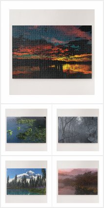


 Riverbend: riverbend1
Anne
I love this view, it is calming in the middle of a whirlwind day,
Duncan
After viewing Elegy (2001) I wondered if there is still a possibility of doing an autumn version of this one?
llminthorn
Love it! It is a perfect foil to the hot summer weather that we have been experiencing here in Central Texas. I can almost feel the soft breeze created by the movement of the water. Good job, Ryan!
Peter
the Dual screen 5120×1600 links to 5120×1440……:(
Nelson
There seems to be a strange texture accumulation on the far left of the triple version. The lower tree part looks a bit 2D. Generally, the tree trunks on the left and right sides are too linear and egdy for me. Maybe that’s what you meant with “not easy to adapt”?
But as I don’t have a triple screen setup and the rest of the picture is nice, this doesn’t bother me very much. Just wanted to mention it. 😉
Ryan
Don’t know why I always seem to miss that one. Sorry!
john
The 3360×1050 dual screen is missing.
susan fran
this is truly beautiful, i love the way the sun plays on the scene the greens are very beautiful
DrBlade
I like the pickle jar version, with the painting-like view a lot. It’s the one I use.
Big Dave
I really like this wallpaper and sure hope it will receive some multi-monitor love soon!
Labanimal
Hi Ryan, Any news on this render? I’m quite looking forward to seeing how much of a change this will look like with the settings all the way up on Bucephalus!
Rob
Ryan, if I remember correctly, the main character “Alexander” in a Isaac Asimov short story named his super computer “Bucephalus”. Is it coincidental that your new machine has the same name?
Just wondering!
TNaylor
That PC sounds like the Death Star for sure!!! Your work continues to be wonderful Ryan!! Ive enjoyed it for over 10 yrs now.
John B.
The detail is beautiful. The new Beast is working for you!
Walo
The riverbanks are really well done in this update.
Terry
Title says it all really, nicely done!
Paul
Ryan,
I loved the original Riverbend but the updated version is even better!… WOW!
I am looking foward to your next picture. Keep up the good work.
GeneralB
If you look closely, he made several flowers blue. You can take the blasphemy out of the blue, but you can’t keep the blue out of the blasphemy. 😛
Jenanne
I agree with Duncan and Cindy — this would make a great seasonal series, particularly Autumn. And I can’t wait to see new work from your new monster machine Bucephalus, although, of course, it’s just a tool for your genius artistry! Bucephalus was Alexander the Great’s horse, wasn’t he? Great name for the machine of a great artist!
OMeyers
Didn’t think the render could get any better, but being the true artist you are, you’ve proven me wrong! Keep up the great work!
Shanghai D
I name all my hardware after Greek and Roman mythological figures; Bucephalus is a great name 😉
madtyger
Looks great, definitely like that it doesn’t use any blue in it as well. Don’t have a problem with blue but it seems like a lot of pieces use it.
Brandi
I’m really liking the edits! Great improvement over the first version.
Jonathan L
Looking good 😀
Can’t wait to see your future tweaks. Perhaps this would be a good job to put on your new machine to see the time difference in rendering. 😉
Mars
lets bring this one to “HD” quality
Duncan
Nice…I can see this a potential candidate for a seasonal wallpaper.
cindy56
Agree with Duncan. This would make a great seasonal subject.
James
I have this as my current background mainly because I want to remember to check here for the updated version. The current one still seems pixelated to me where the sunbeams cross the trees. Once this is cleaned up, I think it’s going to be beautiful and one of your best spring/summer pieces.
Katie
I definitely like the sunbeams a lot better in this version. I didn’t think the river looked like a path at all until I read someone else’s comment. I actually think the water looks natural, reflecting the color of the surrounding landscape. I also appreciate the subtle highlighting of different trees and flowers, just as sunlight naturally falls unevenly on nature. This is beautiful.
RoninStorm
Consider this a second request for something to send off the Space Shuttle. Endeavour’s last flight is in progress now, which’ll just leave Atlantis in service. She’ll do her last flight sometime in July.
Walo
I see, I guess I’ll wait until Nvidia optimizes the drivers for the card. I’m looking forward for the update. On an unrelated random thought, it would be great to do a render based on the space shuttle since it will be retired soon.
Valwit
I’m do not commenty often, but this is just fantastic. the last one i liked so much was the summer version of Canopy Creek. I hope there will be versions for triple screens 🙂 AWESOME!
Ryan
Thanks Walo. I have an update rendering right now but since I increased some of the quality settings it is taking a bit longer. As for the GTX 590, I am a bit disappointed with Vue’s performance with this card. Vue only lets you use 1024 MB of a card’s video RAM right now (the card has over 3 GB) so that is one area of frustration. Besides that it just seems like the drivers aren’t ready…
Walo
I like how this image is going. On another note how’s the GTX 590 working for you? I’m thinking about getting that card but I’m not sure yet.
Paul m.
Ryan, I have read through some of the comments and all I can say is that I really do like this picture…I love the colors, the shades, and all of the detail. I could tell that it was a river even before I read the title. It reminds me of what I might see in a fine arts studio. I would not change anything.
Lynxm
Really nice start. Beautiful verdant landscape. Hard to tell that the river is actually a river; looks more like a running path through the woods.
Angelique
Breathtaking! I really love your nature scenery 🙂
Zero_Cool
The violent waves compared to the idyllic grass and trees does an outstanding job of conveying a spring time flood. When I look at this image in full screen I honestly feel the danger and excitement of the real thing. Excellent work.
Ryan
I’ve been working the past couple of days on some new riverbanks for this scene. The render has been started and it looks to be done sometime this weekend (using more sophisticated render settings for this one. Thanks for the feedback!!
mischa
I actually quite this image… it looks somewhat like an old painting… a little bit grainy, not quite perfect… but perfectly lovely and romantic just the same 🙂
John N.
I hope this is not the final version of this rendering. As several other people have pointed out, this is very grainy looking and not what I consider “digitalblasphemy” quality. Don’t mind the lush greenery, but at least make it crisp and pop!
Mirek
Overall the scene looks quite good but I always found I’ve been less partial to a lot of the heavy foliage wallpapers like this one because they always seem really grainy.
I prefer the crystal clear digital vibrance I get from a lot of the other wallpapers. Perhaps it’s just preference or a consequence of the heavy rendering involved to produce the image…
John
I personally like the grain. It gives more of a painting vibe which is a change from your other wallpapers. And change once in a while is good 🙂
Only thing, I do agree with one of the other comments. The shoreline in the back needs to be differentiated a bit with the water.
Badbrainsg
sorry I forgot to close the bold tag and didn’t preview. I used the title “Spring Flood” since that describes the scene. “Riverbend” is good, though; I didn’t mean you should change it.
Badbrainsg
I really like this one, even though it is similar to some of your other stream-side scenes. The graininess –“painterly”– is fine with me. Not everyone recognizes that the stream is in flood. Perhaps adding some debris would help, but I recommend keeping it minimal and natural. Some leaves, a small branch or two. Anything human would change the feeling drastically. I’ve stood by streams this size in flood and seen small sheds, even an outhouse, carried by them.
bruceam
I like this image. Quite a bit actually. I have an observation though. Something just didn’t quite look right, then I figured it out. Its the banks, or more correctly, the lack thereof. Water always has a negative effect on topography, and you almost never see the dry land greenery extending all the way down to the water. There are usually a muddy, or sandy, or rocky banks that act as a “Transition Region” between the water and the vegetation, especially when the the land is fairly flat like is shown in the picture.
Its a great image. Thanks again for brightening up my Desktop.
David W
didnt mean to double up. delete this and the one before it please
David W
Im not finding 320×480 for my iphone 3g
David W
Im not finding 320×480 for my iphone 3g
Chris B
something to differentiate the water & land as it goes back, unless you’re going for the how flooded is it really. Maybe some debris, white caps, higher ripples, or a tree surrounded by water.
I like the grainyness, it makes it more like a painting, differentiating it from some of your other similar pieces. It would look amazing cleared up too, but I don’t think it needs it.
Chris
LOVE IT! I do agree with D below, the water is too green and could use a little blue, but whatever, still an amazing piece. Love the slight oil on canvas effect too. Great job all around.
D
Add some blue to the water, its too green which makes the entire image too green.
Nate F
Wow, what a difference from v1. Somewhat grainy though.
Ryan
I’ve posted an updated version on 5/9 so now this project is probably about 85% complete. I’ve toned down the sunbeams from the first version but I think the lighting could be tweaked further. I also would like to work a bit more on the shoreline. Thanks for the great feedback!
Amaryllis
I first discovered DB back in the late 90s when I fell in love with Gotham Gardens. 10 years later I remebered and searched for it again, and have finally become a member… one of the best gifts I could give myself.
Re:Riverbend: I love the choppy water. It adds a sense of drama which modifies the prettiness. And I don’t want things looking too realistic, otherwise I could use a photo. What I love about your landscapes (although the planetscapes are my fav) is that they have an element of fantasy about them. It’s an idealised landscape where anything is possible.
Terry
I like it, there is some grain in the rays which I understand comes from the trade-off with rendering times. Could they not be created in post-production with Photoshop?
OMeyers
I like the sense of motion that the water gives to the image. Also think that the sunlight rocks! Thank you for all the quality renderings.
Ryan
I actually set the Atmosphere quality to -1 for this simply because it seemed to add 48 hours of rendering for every upward “quality unit”. I would rather folks have something new to look at while I sort out Vue’s exponential “quality-setting to render-time” function. I also did a preview render to generate the indirect lighting and then re-used that for the “final” render. This saved me a 3 day “pre-pass” stage.So instead of taking a week or more to render at my normal (“Final”) quality settings I was able to render this in just under 48 hours using a few hacks. The question is whether the trade-off in quality was worth it. Some folks are fine with the grain and others hate it.
PHillip D
First of all good render, good idea, secondly, I think you need to increase the quality boost on Volumetric light settings to eliminate the grainess in the rays (which the slider goes all the way to 4.0 but if you type it in like 6.0 or 8.0, it actually renders that quality) BUT the result is longer rendering times which I know you make extra large size wallpapers so may not be worth it.. and I always try to use “global radiosity” lighting model in the atmosphere editor when I can for more realism (either that or increase to more sunlight than ambient light) and it is too “green” meaning probably need to decrease the saturation colors a little bit…to make it more natural…ok those are the critics…other than that wow amazing work, very pretty….
jlpilkin
If you are in the middle of rendering a scene with the rapid water right now, I think a “pickle jar” version with smooth water in the near future would be nice. My vote also goes against the grainy/painted look.
Hopefully with this new workstation coming, we can all see these different variations.
Keep up the good work!
Bob
I like the sun rays. I know you metioned toning them down. Don’t! They look awesome. I would say the water would look better if calmer.
Max
Even in your picture, the water is very smooth on the top. Even though the creek is clearly flooded, the eddy currents are the only sign of unrest in the water. The waves make the creek seem estranged from the rest of the scene to me. That’s just the outdoors boy in me speaking though.
Max
I think the waves are far to choppy for a creek of this size. I definitely think it would look less out of place if the water was more placid.
Florian
The imitated painting style – I don’t like it, and I don’t like the grain either. I guess it would be one of the nicest of your works in ‘natural’ render style…
Simon
Like other said, the water is a bit choppy, but I actually kinda like the grains! It makes it look more like a painting, than a photo. Also, giving the flowers in the right side a bit more powerful blue would be awesome, as they are hardly noticed as it is. The green kinda overpower the blue color. Also, the clouds/fog at the top of the pictures is also a bit too gray.
Besides from that, I can’t wait for the final render. I just hope you make the water less choppy. That is, in my opinion, the most important thing in the image. If you decide to remove the grain, could you upload a version in the pickle jar, which actually have the grainy look?
Paul M.
Ryan, Riverbend Is amazing… I have always loved pictures depicting the wilderness. This one will rate in my top ten favorites alongside 2002’s The Rite of Spring. Well Done! I look foward to your next wallpaper!
Nick
I really like this one. As others have mentioned, the lighting and water might need some tweaks and I look forward to the final design.
As for the grainy look to it, I really like it and hope it makes it to the final image. At least to me, the grainy image makes it feel a little more like an actual painting than a digital render. I think that if I were to get another print made (the first was Highland Spring) that I would get this one.
Wraith
…but as others have said, it’s grainy and I think the sun’s rays could be toned down a bit. Can’t wait to see the final version! 😀
Mike
Don’t get me wrong, I think this is another wonderfully done piece on its own, but even when you tone down the sun rays, I think I’ll have a hard time seeing any significant difference between this one, Untouched, and Canopy Creek (Summer).
Not that you probably need new ideas, but in the same vein as this one, where you were inspired by a flooded creek, what about a heavy rapids scene? I could imagine the camera angle from low looking up a small waterfall just gushing with rapids. Sort of the intense area that you would go white water rafting on. The water almost splashing over the camera’s view. Just an idea I had.
Kana
I agree, the sunbeams are a bit strong for this particular picture, but overall a very nice start 🙂
@Wraithslay – LOL yes, yes it does look a lot like that spot in WoW, although much greener than that particular stretch. The flowers are on the wrong side, too, if it were elwynn and duskwood. nice catch.
Wraithslay
(For some reason, the name field won’t let me add the “er” to the end of my name.)
This piece actually reminds me of a place in World of Warcraft, specifically the river between Elwynn Forest and Duskwood. (Except that Duskwood is darker and has a real creepy vibe going on in it.) It’s very nice, though. 🙂
Ryan
Thanks for the feedback! I was going for a flooded look (to imply Spring) and had the original idea looking at the flooded creek that runs near my home…The version I am rendering now tones down the sunbeams considerably so you can see more of the background rocks. I still need to tweak the shorline a bit.Thanks again and stay tuned for updates.
Chuck
I like this idea, but a couple things:
Distance is difficult to gauge due to the lighting effects. Because of this the birds seem a bit off to me.
Water seems to rough for this picture. I would recommend either calming it down some of adding in some elements to make it rough (Rocks, deadfall in water).
Light in water and on the left bank looks cool, but based on the angle it seems the furthest outcrop on the right hand banks edge should be getting some light. Again for my this could be nothing more then a lighting effect and how I am perceiving it.
The Guru
First of all, love the concept. As many others seem to be thinking, it does need some tweaks. I think an important one would be the edges of the river. I don’t know if this river is supposed to be in the middle of a flood season, but most rivers in this sort of setting have undercut their grassy banks. I don’t know how easy it is to make it that way, but I hope you’ll consider it. Cheers man. Keep up the good work.
Loremaster
I actually really like this one as is, I hope you will leave this version in the pickle jar when you update it!
Also, are you considering having seasonal versions of this one? I think this would lend itself well to them.
Mike
Wow, I *really* like this one. The only unfinished parts I see are the odd “tube leaves” on the left tree in the upper center, and the water looks a bit too turbulent. Also, a water line (some white splashies or something) would help alongside the riverbank.
Even being a work in progress, this is my favorite render in a couple of months. Thanks Ryan!
Sara
Thanks for the mom’s day gift!
littlemom
I agree with the others who have posted on here. It’s pretty, but does look unfinished. Can’t wait to see the finished product. 🙂
Kristin
I agree that this needs a bit more work. Definitely looks flat and for some reason the trees feel slightly off. Looking forward to this one’s progression though!
Labanimal
This looks like a tweaked and bland version of “Solace” – this really doesn’t offer anything new or that different! Too similar, same angle, same rays… Brighter, greener, instead of a pond we have a river… Trees are almost the same…
Looking forward to another, better design. This one is not for me. 3/10
Richard
A bit speckly right now (I expect that’ll be fixed on the final render). Also the leaves at the top, slightly to the left, look a bit odd – like a 2D leaf sheet wrapped around an invisible tube.
dujeon
This is totally fantastic, thank you so much Ryan you continue to deliver artwork that take my breath away and I just have to sit back and go ‘wow’
Thunderbol
one the one side its not bad to see something different, a more grainy picture. but on the other one, Imho the grainy look fits better to more realistic kind of pics and not really to those of digitalblasphemy which are almost all a little supernatural. in those cases, the cleaner digital look is preferable
Geep
I always like the unfinished pieces that you post Ryan. The elements of imperfections for some reason really stand out to me. While I do like the finished pictures when everything is perfectly in place, I always come back to the first ones. 🙂
I think one thing I’d love to see in Riverbend though is a more defined shore. The grass goes right to the water and it looks just a bit odd. But other than that one minor qualm, I love it. 🙂
Tyler
Nuff said.
Daniel B
Ryan, are you using this system just to do the renders? Or for design as well?
If its just being used for renders, then you could put the system further away (different room?) and use RDP or VNC to log in and kick off the renders.
Depending on the the temps on the components, you may be able to get away with just switching out the fans with more efficient ones.
SPCR has a fair number of resources on fan noise:
http://www.silentpcreview.com/
I’m not completely obsessed about noise, but I do appreciate keeping my system fairly quiet. Their reviews seem more rigorous than most.
I ussually grab fans from http://www.svc.com/, although the fact they’re close enough to my office to pick up anything I need during lunch helps.
And +1 vote for the shuttle inspired image… a Launch (with matching night render) would be amazing. Although I would like to see a tribute to the crews of Challenger and Columbia included somewhere.