Description
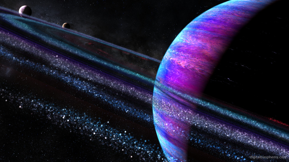
Lightwave 11’s excellent new instancing tools put me in the mind
to update one of my favorite space scenes, “Roche Limit“. I last updated
it in 2004 and I’ve been meaning to update it sooner.
I hope you enjoy the update. Don’t be surprised if I do a
few different renders of this particular system.


 Roche Limit: roche2k13horz1


Ryan
In a lot of cases I use the multiscreen versions of the images to produce the “ultrawide” renders. I am often forced to change the camera view of the single-screen version to create the multiscreen and that leads to the ultrawide looking different than the other single-screen renders.If it really bothers you you might try downloading the 3840 x 2160 and trying that (don’t let your monitor stretch the image though). Sorry!
Xyverz [liferplus]
I really like the color in the main version of this image, but the 3440 version is so different that it leaves me disappointed.
Aaediwen [basicmember]
I have my work desktop cycleing through a directory of DB images. Things have been rough for me lately, but I just looked up from my work and saw this wallpaper. It has given me some peace when I desperately need it. Thank You.
Sean O
Great picture … with the recent storm image raging on Saturn maybe had a storm to the plant ?
Joe
This is one of the best dual screen images you have made, if not the best. Thanks for this one.
Speedy J
Greeting from Miami!
I love the face that you placed some Pink in this wallpaper. It makes it original. Keep up the good work Rayan ! 🙂
Alex H
Brilliant reworking of the previous version. I’d appreciate it heaps if you could do a picklejar render with the planet slanting on the other diagonal, just like it was in the green roche limit.
Shannon
Cause I asked Ryan for some space themed renders a while ago and this is awesome. Now just waiting for some spacecraft and I’ll be smiling all day
Shelly K.
@Kyle Thank you. 🙂
Ryan
Thank you! Yes, I have received a few emails regarding the Ford My Touch system. I will see what I can do!
Henry V.
Love the latest version!
Have you received my email regarding MFT resolution sizes?
Derek
I find this one visually pleasing to the eye. I’m a big fan of the space themes anyway and this one tops them all in my opinion. Something peaceful about this one..
D
I really like this render, even the purple color. One flaw exists in the multiscreen versions though. In the lower left area there is an odd vertical line, faint but noticeable none the less. Is it possible to correct?
Dennis M.
I am hoping one of those moons is habitable, and someone is over there, taking a picture of some old ruins….
Tyler
Planetscapes are my absolute favorite from you and this one is on par with the best of them. That lush purple is hard to resist. Thanks Ryan for feeding us space guys’ cravings.
Jenanne
Thank you, Ryan!
bruceam
This image is gorgeous!!! The subject matter is something that has been near and dear to my heart for a long time. The colors are fantastic!, as is the composition. I have always loved your space images.
An image proposal if you don’t mind. It occurred to me that this image could be successfully combined with one of my other favorites, Thetis Moon (2007). I imagine the Thetis Moon in orbit around this ringed planet, shown close enough to make out the seas and the land masses shown in 2007 Thetis Moon image, but from outside it’s atmosphere with those gorgeous rings and the planet from Roche Limit 2013 in the background. It would be an interesting shift in perspective, don’t you think?!
suab
The picture is really good but honestly I hate the color shceme. Ryan, do you plan to make some color variations on this one?
Greg
Ryan, this is absolutely perfect for my Windows lock-screen!
Thanks for all your hard work!
Jenanne
Hi Ryan, have you eliminated the new 2560×1080 resolution? Neither Sakura Night nor Roche Limit is available in that size. Is this just a glitch, or do I need to go back to cutting down the 3840x1080s for my hubby’s monitor?
Brian
This is a great update, Ryan. I’ve always loved the original and this is simply building on an already great work of art.
Shelly K.
Why does the 3360×1050 res dualscreens always disappear when they go to the Pickle Jar?
Kyle
Under the list of resolutions in the Pickle Jar there is a link for All Resolutions. Click on that and you can find other resolutions not listed. I think Ryan only lists the most popular on the Pickle Jar pages to save space.
Anton
I absolutely love your outer space themed pictures and this one is no different, this is a really good remake of the 2004 version, I love it 😀
TheStewart
Props! The colours remind me of the CGA days of early IBM. Beautiful artwork as usual. Great job, Ryan.
Ali
Thanks! For a minute there I thought you were discontinuing the png version for those resolutions 😛
Ali
Still waiting for the png versions of the 1440 and 1600 resolutions. :
Josh
Love it! I had the 2004 version on but I’ll be using this one now. I’ve always been a fan of the space scenes.
Gary
I can not see one reason to change this at all… Simply fantastic!!! Keep up the great work!!!
Ryan
They should be showing up now Ali. They’ve been uploaded for a couple of days now but for some reason my database was not updating.
Cougz
Simply gorgeous !
Melissa
LOVE THIS!!
Gene
Another great one. I’d have given it a ten, but in my eyes, it does not have the emotional warmth that images like the recent Sakura has. But that’s just me.
Ali
..and the 2560*1600 png?
Ali
Where is the 1440p png version?
Alex H
YES.
Corbey
Spectacular.
cmmnoble
Thanks for all you do. The original “Roche Limit” is still one of my favorites. I love the planet and the moons and the background space in this update. But the ring particles look like glowing cotton balls instead of rocks and dust. Normally a lack of realism doesn’t bother me, but on this one I can’t get past it. Any chance of a pickle jar version without the rings?
Eric
Awesome concept. Can’t wait for the multi monitor versions. Your space ideas are amazing. They are by far my favorites. Not to say that your other is stuff is any less amazing. I just have a thing for your sci fi-ish stuff.
Jeremy
I LOVE Ryan’s space wallpapers. This one is awesome!
Dan
Your space and planetary images are one of the biggest reasons I became a member! This render is amazing, what else can I say but pure perfection and your talent at it’s finest.
Eric
W I C K E D !!!
L O V E I T !!!
Shane
I became a DB life member because of images like these. Awesome work Ryan!
Idoia
Love it!!
BeccaM
Oh thank you thank you thank you. The 2004 version was consistently one of my top favorites and has never left my Chronowall rotation.
Can’t wait for whatever other renders you come up with, Ryan. The only downside I have now is I have to wait for the dual-screen version.
Angelique
Epic! You’ve been making a lot of really great stuff these past couple weeks 🙂
K.
Makes you want to be there!
L.
Love it, can’t wait to see the variations.
Jim
Put me in the mind of “Niflheim” when I first saw it (one of my all-time favorites), and I really like the new colors.
RC
This is one of the best, if not the best, space piece I have seen from you. And given your normal excellent quality, that’s saying a lot!
John
Loving this, and completely disagree with Chris below. I’m loving the colors on this.
Chris
Its cool but I’m leaving “Jelly” as my wallpaper for now. This one could stand to have the purple hue toned down a bit.
Cat
it would be nice to see some pickle jar variations on the color and if possible when were your flying by the planet looking out the windshield of a space ship would be cool…
Scot
only because, and i hope you’ll take this request into consideration, that i’d love to see this or your interpretation of what would happen once it passed the roche limit. maybe do one like a broken planed around a celestial body. like a black hole, a sun, or just a moon around a plant. kind of like they did for the moon in the 2002 movie The Time Machine. http://www.mastermarf.com/2009/10/declare-war-on-moon.html
Donut
Really like it
Jenanne
Roche Limit 2004 is one of my all-time favorites. But this is even better! I love the color scheme in this version.
Joe
Beautiful as always. A ‘from the ground’ view would almost certainly receive a 10/10. Love the details in the rings.
Doug B.
Outstanding!!! I can’t wait for a dual-screen version, this is an immediate favorite.
jamie
Beautiful. Excellent subtlety in colorization with perfect colour matching, a painstakingly gorgeous attention to detail and great perspective on light and shadow.