Description
Adapting an older scene in Vue 2014 didn’t seem to work out so
well so I thought I would create something completely new from
scratch. The render still took nearly 100 hours to complete at
4k and finally finished this morning.
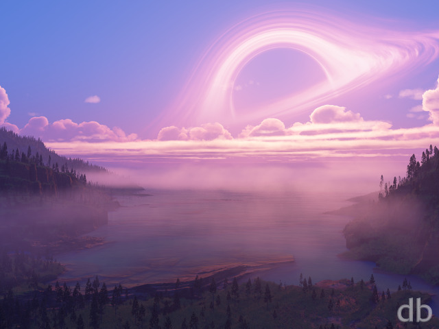
I call it “Rosy-Fingered Dawn” (yes, I was an English
major) and it was inspired by one of the pictures on a tropical
calendar I received for my birthday way back in Sept. I wonder
if anyone will recognize the place…
I still have much to learn about optimizing my Vue 2014 scenes
so they don’t take forever to render. This particular scene
could use a nip/tuck here and there but I thought it looked nice
enough to share while I make my adjustments. Let me know what
you think!


 Piton: rosyfingered1


Ryan H
I love the pink and teal with the palm trees, gives an 80’s pop vibe. Love that. But it seems like the clouds are unnaturally flowing upwards? Growth on the mountain seems thin and scaled oddly. But, as an overall piece, it all works together nicely. Great work.
OJ
Ryan,I have always enjoyed your natural with futuristic enhancement works. The artistic enhancement of “Rosefingered” allows color contrasts to flow and seem realistic until you take a second look. As with all of your work, it is far beyond well done. Bravo!
Sniper
I really like this image. I just wish the single-screen version had the same elements of the dawn in it as the triscreen one does. Is there any way it could be adapted for single-screen?
Either way, great work.
Zach
I really like the colours in this image. I just returned a couple days ago from a trip to southern Thailand, and am already missing the tropical climate. This image reminds me of much of the terrain there.
I noticed, though, that the piece is called Rosefingered, but the files are all ‘rosyfingered’. Is that intentional?
pendrag
At first I was not drawn to this image, then after looking at the dual screen on my hi-res setup I changed my mind.
The cloud coloring contrasting the blue sky reminded me of some sunsets I have seen.
Laura
The dual and tri screen versions make me wish I had a larger setup. They look better than the original.
Charles
It is nice, relaxing and pleasant to look at. The lackluster foreground prevents me from rating this higher. The triple screen is the best frame for this scene, whereas the single is better for something like Shrouded Desert.
Jenanne
I agree with Jen. Love the format of the duals and triples. Thanks and WELCOME BACK!
Jen
The dual screen of this with the sunrise to the right is AWESOME. Nicely done!
Paul
It’s imbalanced with all the trees leaning so hard to the right. The curves of the palm tress also don’t look natural, to me.
Tommy
I really the picture, i do! But i think there are to many palm trees. If you remowed the on in the middle it might help opening up the picture. The name on the other hand needs to be changed. Rosy – Fingered seriously? 🙂
Overdrive
I rarely give a 10, but this new version is worth it! I did like the 1st version too (9/10), but now it’s an instant classic i.m.o.. Beautiful!
anna_writr
Agreed with Christina. They are both awesome for different reasons. I love the early morning view with the sun behind the mountain, and also the later (direction shifted?) view with more details.
Christina
When I saw the thumbnail for the second I thought you had just the tip of the mountain highlighted with dawn light – then realized the entire scene was lite up and was slightly disappointed. I really liked the deep pre-dawn colors of the first, but I also like the definition given to the mountain in the second.
John A
v2 is awesome 🙂
10/10!
Ryan
Try the 1920 x 1200 file now. It must have been corrupted during the upload.
Eel River
Have a great time at RUSTYCON 31, Ryan.
Eel River
The 1920 x 1200 widescreen version of the new “Rosy-Fingered (2014)” file (a.k.a. “rosyfingered21920.jpg”) is a corrupted file. Please replace it with a file that is not corrupted. Thank you.
Laura
Much better!
Drew
Epic. Another gem, thanks!
Ryan
I’ve added a new version tonight which should address some of the problems with the first attempt. This one has actual dawn ;-)I’m still not 100% happy with the foreground but it will have to wait until I get back from Rustycon!I hope you like the changes!
John A
I really love this piece and would give it a 10, but… On the right side of the mountain the cloud stops suddenly in a very straight line, and it can’t figure out why. I’m going to hang back on rating this one in case some future updates are made and then rate the final version. Really beautiful pic apart from that though.
Pete
I’m an English teacher. 10/10 for the reference (combined with a really awesome scene.) 🙂 Seems like there should be a ship in there, though 😉
Littlemom
To flat and one dimensional for me
Littlemom
To flat and one dimensional for me
Overdrive
Besides ‘the’ cloud, a succesfull render so far. Light conditions are very realistic, i love the barely visible details in the shadows. Seems Vue 2014 has a lot of potential for another step towards 100% realism.
Bez
I like it! except for where the cloud is cut off randomly above the mountain – almost in the direct center. Looks like there used to be an object there? Otherwise I love it!
Nelson
The featureless ground makes this to kind of a haunted place in my eyes. Nice, but I don’t know if it was intended like this.
I agree on the cut off cloud. This was the first thing I noticed – and I’m not a graphics artist 😉 The clouds in general look quite complex, but could need a little rework here and there, I think.
Overall, cool scene! Good luck with the render settings.
ChopBam
Looks good! Nice framing.
Something that threw me off slightly was how the cloud just to the right of the mountain cuts off at its point closest to the mountain, almost as if there was another mountain behind it. However, if there was another mountain there, it is the same color as the sky. This is just from one graphics artist to another, though, so it’s probably nitpicky. Great job overall!
Richard
… Reminds me of Diamond Head, in Hawaii.
I really like this, and it’s certainly my new wallpaper for the next foreseeable future. Nice work as always Ryan.
Constructive criticism, the ground looks a little bit featureless. A little bit of light patch grass or rocks here and there would look amazing. Nothing too “overgrown” though, it is a beach after all 🙂