Description
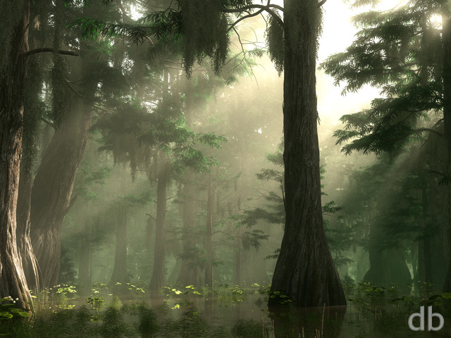
Hard to believe it has been 10 years since I rendered the original “Satori” using World Builder 3. The company that made World Builder went out of business unfortunately and I haven’t been able to use the software since 2005.
This update was created and rendered using Vue d’Esprit 11 Infinite. There are (as always) some things I would still like to tweak. You can find the original “Satori” in the Free Gallery here for comparison.
Let me know what you think of the update!


 Satori: satori2k132
 Satori: satori2k131


Rick (Horseman) [basicmember]
“Satori.” The “Japanese Buddhist term for awakening, [comprehension and understanding].” This creation brings to mind the “Tree of Life” (Avatar). Trees in the natural world are critical to the biosphere and the survival of the species. Spring is our Mother’s season for rebirth, rejuvenation, and new beginnings. Sadly the totality of comprehension and understanding of our Mother’s awakening falls on deaf ears and blind eyes. – Eagle from the North 2018
aimee
quiet, serene, calming, good place to sit and just be.
dawn
love the colors and detail, This one stops just short of being too much and stays in the realm of holding my attention…I keep seeing new bits. Every time I have one of your images on my desktop I get compliments. Thank you!!
Ryan
When you hold your finger on the image (after it has loaded) to “Save” the file, it should go to your Photos. Is it only DB images you are having a problem with?
Melissa
When I download pics from DB from my iPad 3, they do not show up in either “photos” or “iPhoto’s”. Where are the downloading to?
[email protected]
Stevie M.
Every time I come back , you have something that just takes my breath away. I MUST share your link with my friends and family. I am lucky enough to have two very tallented artists in the family and I know they would love to join just to SEE the beauty and creativity you offer. Thanks Kiddo!
Ryan
Oops! I misnamed the zip file when I uploaded it (one less “3” than I needed). It should load properly now. Thanks for the heads up!
ScottG
Cool work. The file for tri-screen split are missing. Are you planning to post them?
Phil
Just put this on the work laptop, almost makes work bearable 🙂 Beautiful piece, quite delicate and intricate and you spot something different every time you look. Thanks as always, keep up the good work.
chris
off topic.
Will you be creating a collection for the BB Z10?
768×1280
you have a few that are close..
Christine
Absolutely gorgeous! Such a serene image.
Fumigator
My rating is my honest and frank opinion. I’m sorry it doesn’t agree with yours, but that’s what I believe Ryan wants in the ratings– honesty.
Dave T
I like the concept a lot — I love big tree images — but something about the way the light hits the bark on the tree trunk still just looks off to me. Maybe it’s not shadowy enough or something; I don’t know. Just my two cents 😛
Ryan
Thanks for the comment. Things tend to get weird in 3D space when you widen the frame as severely as I do for the triple-screens. Objects tend to get appear stretched out on the sides of the frame. It is also difficult to keep the textures consistent across the whole frame.Mostly though it is just force of habit. This is how I have always done it. Perhaps I will give your way a shot in the near future though…
Liggs
Ryan,
Why do you not start with a much larger image that would work for a triple screen and then crop it down to dual and single screen images? I understand that the vast majority of your users are only using single screen versions so you want to cater to them first and foremost. But you could still keep the main focus of the image in one single screen area but start with an expanded view that shows more background/surrounding area. Just a thought. Love your work!
Janelle
Absolutely beautiful. I’ve changed my wallpaper to this on 2/12. What you’ve done with “Satori” is amazing. Thank you.
Tyler
If you follow Mr. Bliss’ work you would know that abstracts come in waves. He is obviously on a green kick right now. Personally my favorite are planetscapes but I’m not going to poorly rate what he’s doing now just because I don’t get those exclusively. You have to take the journey with him.
Littlemom
Very nice. Love the colors and the trees and vegetation all in all a very nice render.
Jenanne
I’d love to see a new abstract, too. The last part of 2012 was a little light on abstracts, although I realize they are not the most popular of Ryan’s compositions. However, that doesn’t make this render a five. 🙂
Kyle
While I can see some inspiration in this piece from the original Satori the feel is entirely different. As a work on its own I like this a lot, but the comparison with the original makes for a more nebulous feeling as to how to interpret it…
Kelton
It looks like a painting, an impressionist at that. Very nice work sir. I like the branches more than I do the ones in the pickle jars, but that, heck this opinion like any of the others you read is just personal…
Ben
I love this piece, but it reminds me more of the old man willow from Lord of the rings…Satori the original was simpler and more stark in its beauty…still a very good render.
John
I am a huge fan of southern and cajun culture. I love all the mystery surrounding the backwoods swamp lands of Louisiana and this reminds me of a little hidden oasis one might find in the middle of a swamp. Maybe even a view from a plantations back yard. Its amazing the places you can visit and the “trips” you can take with your art. I would absolutely LOVE a nighttime version of this, great work!
Granpuff
Can’t wait to be able to put it on my triple screen desktop!!!!!
Iank
I understand what JMK was alluding too. This piece has an entirely different feel than satori. satori had a open, clean, calming esssence, whereas this has a more wild, clustered, swamp-esque feel.
Satori (original) is a top 5 all-time for me. It’s beauty lied in it’s simplicity.
As always, your work overall is inspiring. Many thanks.
Fumigator
Come on everyone with me now: ab-stracts! ab-stracts! ab-stracts! ab-stracts! Pleeeeeez…. 2012 was a rough year for abstracts at the DB, hoping 2013 sees a resurgence…
(ab-stracts! ab-stracts! ab-stracts!ab-stracts!)
sundog
I love all the revisions so far, but they lack depth in the branches. All the roots and branches look like one big block of texture. I know it’s supposed to be a bunch of cylinders, but it looks flat. The flowers are great. I love the narrow depth of focus. The branches are indistinct.
Lidia
I am much closer to happy with it also.
What’s up with this new comment format, though? I’m not gonna comment on how I rated pieces, because I rarely do number ratings; too hard to put a number on my perception of art, so I prefer words only.
And I don’t like that now I have to log in before beginning to type in the comment, and after I log in it sends me to some other page so I have to then navigate back here to leave the comment.
Jenanne
Lovely! This is a keeper!
Ryan
Version 3 is up this morning and I am much closer to happy with it. I’ve cut back on the global illumination so the shadows are a bit deeper. I’ve also added some purple blooms in the tree to break up the green even more.
Rich A
It is a beautiful scene, without question, but rather than pile on the superlatives, I’ll only mention the one that does not jump into my mind when I see Satori 2013: evocative. That’s what made Satori 2003 great for me. There’s so much going on in this one that the forest seems lost in favor of the tree (metaphorically and literally).
Had Satori 2003 not been among my favorites, I’d have rated this a point higher, maybe two. Yes, it’s unfair, but the name invites the comparison. Perhaps its title should have been Kensho.
ladyphoeny
I like this, but the over-use of green makes it feel like an overgrown swamp to me rather than a beautiful representation of life and “spring time”. Part of the beauty of spring is all of the colors of the new flowers and different types of trees… I would like this a lot more if there was less green.
Tom
Not one of my favorites after the changes. Just too much green and not too “appealing”.
degel3030
Very nice. How hard would it be to have a night version?
Scarr
That is all.
Adamtrons
The first one had a kind of soft focus, glowing, pastel dream like quality to it which I feel is lost in the new render. Maybe if the quality setting was somewhere in the middle between these two extremes, it would be a nice compromise? Also, I canât help to notice the tree bark having a zebra skin like appearance. I wonder if instead of light-green/brown it could be light-brown/medium brown to look more natural? Overall, a beautiful work of art.
Anne Fletc
Simply it’s beauty. Your pictures inspire me.
Anne Fletc
Simply it’s beauty. Your pictures inspire me.
Jenanne
A vast improvement in quality and clarity. I was happy to see the return of the water lilies. The only thing I liked better in the first version were the tree branches. Originally they were clearly visible, but now they are mostly covered. IMHO, this takes away from the tree’s massive appearance. But overall, I love this one — it’s almost there.
Rob
It does feel like the foreground is much busier than the background, making it feel a bit flat (in the back). But I still love the picture, especially as I’m in the blizzard up in RI.
celmendo
Less is more but I like them both. The tree just needs some shadow detail so the roots look more natural and not like a big blob. That might be a rendering decision. Right now I’m voting for the first one overall. Still gonna use them both cuz I really like the scene. 🙂
dujeon
My personal opinion is that the first one is the best, by a long way, each is awesome, but the first one was beautiful, soft on the eyes it a more like a painting, the second one, to me is too cluttered, too busy but hay ho they are both great, but the first is better, for me. Excellent work again Ryan
Ryan
Thanks for the feedback! I’m curious though: Are you rating it based on how closely it resembles the 2003 “Satori” or on its own merits?
JMK in CT
To me the only connection it has with Satori is trees and lillies. It has a very different feeling to it. It seems to be from a totally different part of the world.
Nico
Thank You, I didn’t down load the last one due to the grain and overall unfocused vue. Now go to sleep! 12:30am is a little late to be up and about! lol
Rob E.
Uncanny! Reminds me of the work of Odilon Redon.
Marlowe
This is an amazing piece but it was actually more the part about the original being 10 years old. I have been a member for almost 6 years but I definitely had the original version of Satori on my desktop in highschool…. crazy!
Wishing you continued success and many more years Ryan!!!
brad
I think there’s just so much detail in this picture that it’s kind of distracting. I can see all the detail in every leaf on the bottom edge and every tiny crack in the bark and it’s just too much at once.
I’m sorry to give negative feedback. =
Kana
I agree with the others that it looks a lot more like a painting and not a photo. In that aspect, it looks pretty cool.
However, going for photo-quality, not good yet. I hope the next render cleans it up! 🙂
Ryan
I appreciate the feedback, even the negative kind. An updated version is rendering right now, but I’ve cranked up the “quality” settings a bit so it is taking longer than normal.Vue d’Esprit’s quality settings (and my manipulation of them) are mostly responsible for the grain. Vue makes it very easy to add whole DAYS to your render time but setting the quality too high so I have to be careful. I guess this time I was too conservative.This piece and “The Forgotten Way” are companions of course (a “phase” if you will). Usually I like to bop between different subjects/genres but I felt like sticking with the green this time.Stay tuned!
Gumboot
Impressionist art obviously makes more of an “impression” on some than others… 🙂
Zor
This is the second wallpaper in recent weeks that is REALLY heavy on the green. I like the look of it but the fern leaves definitely make it looks fuzzy.
Keep up the great work Ryan but can we get something next time with a little less green in it?
Tom
Very fuzzy. Not up yo your usual excellent quality. Sorry.
John S
If you think of this as a painting and not a picture, one’s perspective should change, and for the better in my opinion. I gave Satori a 10 because of this.
Eel River
My opinion does not matter. Jackson Pollock cared what the critics thought of his work and look what happened to him. I look forward to your next project.
Cougz
Oh dear… I’m not sure what to say Ryan. This certainly doesn’t feel DB gallery worthy. I hate saying that, but I miss seeing your crystal clear art. I am a lifetime member of your work, but I have hardly used any of your wallpapers for a while. I tend to go back 18months to 2 years ago and use those instead. I’m disappointed, but always look forward to the next one…
Joel
I don’t like the screenshot you’ve posted in 2013, the first version seem a draft… And the final quality of the work is below the normal standard of your gallery. I hope that this descending trend will finish soon
Jenanne
I am a fan of Ryan’s first drafts. It’s one of my favorite parts of being a DB member as it allows us time to give feedback if we choose. I feel, as I imagine others do, that we can contribute in this small way to the final product. I doubt I’d be as involved in the process or as invested in the result if Ryan just slapped up the final with a “Here it is, like it or not!” And while an artist shouldn’t care too much what critics (or fans) say about his work, forever keeping his eye on that inner vision, I know from personal experience that feedback is an invaluable tool in the creative process.
celmendo
I does need some tweaking, the tree most of all, but I know you’re doing it. It looks very nice already and I can’t wait to see what you do with it. I’m liking this a lot.
cmmnoble
I really like this one. After staring at it for about 30 seconds, it’s like my eyes learned the trick of it, and suddenly the depth popped out. Almost like it’s in 3D. There’s some crazy cool stuff going on across the lake beyond the tree. Is that a waterfall back there? 10/10. (P.S. I’ve never figured out how to make the ratings stick with my browser.)
Brandon
I really like the overall feel of this one; it looks like a storybook illustration. I love the depth-of-field that you get from the flowers and ferns in the foreground. Also, the hanging vines and water feel more lively than the original.
I definitely prefer this version; if it could just lose some of the graininess it would be perfect.
Drew
Grainy & unpolished. Seems like the attention to detail that is normal in the DB gallery is missing. The quality of work in general seems to be eroding of late. Not a fan of the rough drafts. I’d rather see posts that are touched up to standard. Won’t renew if this trend continues.
John
I like. It gives off the vibe that it is a painting not a photograph, which I like in this case.
Lidia
I like where this image is going; I can’t wait to see a less grainy version. I love that you’ve been on a green/vegetation spree.
Jenanne
I like this composition very much, particularly the hanging vines and the massive tree with its exposed roots and the apparent bromeliads and orchids on the branches. The original “Satori” wasn’t a particular favorite of mine (I did like the lilies and lily pads in the pond) so that may be part of my reaction. However, Ryan has largely or completely changed updated images before with popular results, so I’m not quite sure why this one is so criticized. I agree it needs tweaking, like most first renders, and it does bear a strong resemblance to the previous image; perhaps that’s a part of the reason. Anyway, I agree the tree trunk and roots need definition; perhaps the water lilies could make a comeback. 🙂
Tyler
Are we missing that this is a first draft? The concept is excellent and I trust Ryan will get it shaped up. Of course there’s an overdose of green this is a fantasy image. The idea is you would never see this in reality. Who wants to see reality? Anyway I look forward to the finished product.
James
I like this very much. It’s really colourful and the water looks extremely inviting. It feels far removed from the earlier image with the same so perhaps both images should be treated separately?
It has a fantastical, sparkly, twinkling feeling to it. The more I look at it, the more I find to enjoy.
Amanda
I have to agree with the majority here. Too much green for me. I love the original Satori and still use it today during the spring time on my desktop. This just seems overdone to me. Sorry, Ryan, but this is not your best work.
jlpilkin
I would absolutely love this picture if it wasn’t for the overly done bloom effect and grain – I was excited to see the finished product when looking at the thumbnail (which seems to smooth out the grain and lower the bloom effect a bit), until I opened it. I would still give it a 7/10 in it’s current state. I am enjoying your green images as of late – especially in the Winter.
icepyro
I can’t figure this out. I like the picture. It looks almost like a painted picture. It’s even rather pretty. However, if I didn’t find it on this website, I wouldn’t call it a db wallpaper. It’s even harder to say this is anything related to the other Satori. So, not sure where this is going, but I’m holding back to see.
Gary
Not sure I like the bark on that tree… I’m not sure what to say about it. It’s almost like those image you see that say stare at this image for while and you will see…
suab
I actually liked it quite a lot. It reminds me of the magic forest from movies Mononoke Hime… There are some things that could be perfected though (such as the flowers at the bottom which have some kind of weird blur). Btw I generally do not mind the grain at all (just so you know that not all of your users do:)
kellzilla
Out of curiosity, why do so many (maybe even all?) of your green images have so much graininess? The rest of your images don’t seem to have much grain at all, it’s just the green ones. It’s really, really weird!
Justin B
I like the composition of the image. It reminds me of a couple places in Guild Wars 2, which I’ve been playing heavily lately. I don’t know that it has the same feel as the original Satori, which has always been one of my favorites, but I like it in its own right.
I know you yourself fight the grain issues all the time, so I’m not going to blast that. The only constructive criticism I have is that the bark on the tree doesn’t look quite right. Some of the upper branches look just fine, not unlike some trees I’ve seen, but the texture makes the central trunk appear as one big blur. For reference, that’s looking at the 1920×1080 version.
Chris T
I hate to be a downer but I agree with the first two posts; this one could use some more work. Not only does it have a very grainy feel to it, but the color scheme is almost exactly the same as your last wallpaper. Some of the great things about your art are how varied all of them look, but this one kinda looks like the same thing as last time.
Laura
Usually I like updates, but this drastically changes the composition of the original. I still like the original Satori. The 2013 just doesn’t have the same feeling.
Deatherage
I Hate posting this rating, but it is so grainy. All the landscapes have been so grainy for the last year at least. This has got to be fixed, because there have been some cool looking renders behind all the grain. 🙁
Ryan
I’ve added a second version of “Satori” to the gallery this evening. I’ve tweaked the tree a bit and added some lilies to the pond. I’ve also cut back on the saturation a bit.Still a work in progress though. Thanks for the feedback!!
Ryan
I’ve been working on a night version of this scene for the past few days and I think it is finally close. Stay tuned!