= Add to your a la carte shopping cart.
Single Screen
- Lossless Master plus
- 1024x768 (4:3)
- 1152x864 (4:3)
- 1280x1024 (5:4)
- 1280x800 (16:10)
- 1366x768 (16:9)
- 1440x900 (16:10)
- 1600x900 (16:9)
- 1600x1200 (4:3)
- 1680x1050 (16:10)
- 1920x1200 (16:10)
- 1920x1080 (16:9)
- 2160x1440 (3:2)
- 2560x1440 (16:9)
- 2560x1600 (16:10)
- 2880x1800 (16:10)
- 3456x2234 (MBP)
- 3840x1600 (21:9)
- 3840x2160 (16:9)
- 4096x2304 (16:9)
- 5120x2880 (5K)


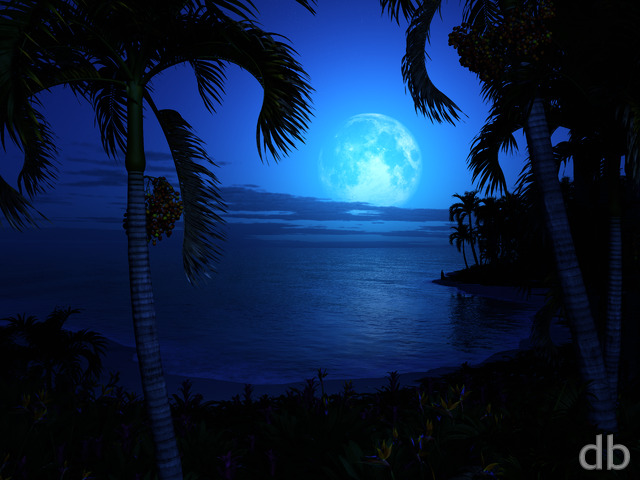
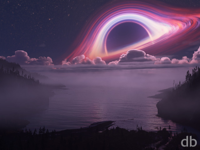
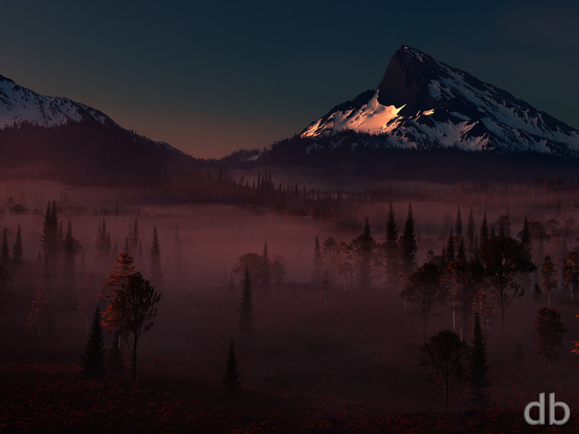
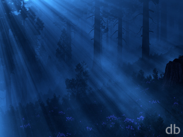
 Satori (Night): satoripond1
 Satori (Night): satorinight1


Amaryllis
This piece – though pickle jarred – is a Monet for our times. Beautiful.
Klagmar
There’s a game for the Wii called Xenoblade Chronicles, with an area known as “Satorl Marsh” that lights up with a beautiful blue shimmer at night. I couldn’t help but to think of that upon seeing this piece, as it captures the same serene majesty.
Melchior
OOOOhhh ^_^ O_O ^_^
Beautiful!! ^_^
lilladyj
Dear Ryan,
After having this on my devices now for a few days, I have to say that Satori has undoubtedly moved to the TOP on my list of FAVORITES. It’s a little slice of HEAVEN!!! You’re TRULY BLESSED with an INCREDIBLE GIFT!
A BRILLIANT ARTIST!!! Thank you for sharing it with all of us!
Lilladyj
I’d love to be leaning up against this tree, relaxing, taking it all in. Absolutely MAGICAL! “Satori, take me away!”
Andar
Love the floating leafs.. so tranquil.. Nice stuff!
Dan
Looking at the comments it seems like quite a few agree with me: my immediate first thought was that this looks like something out of Avatar.
DaveL
Been with you since the beginning. This is one of the best to date. Not a ten simply because knowing you there will be one even better 😀
david
Best work yet…Love it!!!!
kellzilla
Absolutely phenomenal. This is easily your best piece in the last several months. I am absolutely in love with it!!
Hawk
Astounding!!
LOVE IT!!!
This “Pandora” version is the best of all of them.
anna_writr
Awesome image, but a little TOO bright. Yeah, I know. Can’t please everbody!
Nick
Easily one of the best ever.
Ruminator
Wonderful! The folks who say this reminds them of Avatar are right. It’s now my wallpaper on all my devices. 🙂 Thank you!
Dan
This picture just keeps getting better and better!
Nic
Absolute, stone cold brilliance
Eliott
Ok, this is awesome! I love your night renders, this one and “starlight grotto” are two of my absolute favourites. Keep up the great work!
brad
Good work!
As a side note, Please don’t be afraid of the dark. The night is supposed to be dark. Some of your best pictures are quite dark. ^_^
While some people seem to complain, I actually really like the occasional redo of older pictures from long ago. It feels oddly like… Revisiting a place you grew up as a child and seeing how it had changed (and in some ways stayed the same.) Please keep doing these once and a while. 🙂
Halfwolf19
The Satori Night Alien 5760×1080 is beautiful on triple monitors! Thank you so much!
I find it to be the best of the series. I always like the darker, more mysterious renders.
Zach
Guess I was checking the site right as the Pandora version was being uploaded, because here it is. 🙂
James
I love this new ‘Pandora’ variation. Brilliant work.
Brian
I love this one.
Debrah
Yes, I agree. The Pandora version is really neat!
Candy
Let me add my vore for the “Pandora” version too! I absolutely love it!
Mike
I definitely like the Pandora version better. I think the additional lighting from the phosphorescent plants helps lighten the scene, too. And that “natural, yet unworldly” effect that you do so well really shines here.
Lidia
Oh, this is very nice! The regular night version still has its charm, but I think I like this one a little more.
Tyler
Yes, yes, yes.
JMK in CT
Love the colors.
Tyson
Cant wait for the multi screen!!
Halfwolf19
I know it is a pain on render time, but this needs to be a triple. Some of your best items are in the pickle jar with no triple monitor. This piece is another of those cases.
The reason I bought a lifetime membership was specifically for your 5760×1080 resolutions.
Ryan
Yes, I am starting the multiscreen render right now. Hopefully it will be ready by tomorrow morning or late this evening.Thanks!!
unclegumby
Previous post was meant for the Pandora version…
unclegumby
Any chance this going to done in dual-screens? This looks great!
Chris C
Pandora version should definitely be in the main gallery. The additional color makes it so much better!
Jenanne
Wonderful colors! Yes, put this in the main gallery.
Ryan
Brain-freeze. Thanks for the heads up!
MIB4u
Why is this called Tharsis in the members’ gallery …?
Scarr
Full Pandora is something you should absolutely go for with this one… but keep this version in the pickle jar.
In the depths of Summerwood, a mystical tree grows with all the spirit of the forest within her bark… this is that tree. It brings the magic and wonder to the forest..
It also makes for a nice dual screen coupled with summerwood. It almost tells a story… I think shakespeare would agree. “I’ll met by moonlight, proud Titania”. Right here.
Ryan
There will be purple glowy things for sure. Fortunately there are some good candidates for “glowification” already in the scene…
Logan
I was originally thinking Lothlorien at night but with the lighting and lack of structures it could easily be Pandora too.
If you want to go full throttle on the Pandora render I say go for it. What would you change? I suspect it would need some purple glowy thingies, (excuse my technical language) and if you could make the hanging tree branches luminescent it would resemble the tree of voices.
Maybe I’ll just shut up and let you use your artistic ability which is infinitely better than mine.
John
I’m really starting to love this piece. Only gripe is that the right side looks washed out compared to the left which is distracting. I realize this is probably suppose to be the moonlight but it just doesn’t come across well.
Seamus
It’s a good scene for nighttime-type lighting; I like the silhouette-look, maybe even better than the daytime.
Go for it! “Pandora or bust!” 🙂
Ryan
Given all of the “Avatar” comparisons perhaps I should do one more render and go “Full Pandora”. What do you think?
anna_writr
Ads we have to see that are related to DB are just fine. Especially if they don’t blink. I hadn’t even noticed until I read the article.
Rob L
I really like both versions (day/night), and maybe it’s just my computer, but the moonlight seems weird to me. Almost like it’s “washed out”. Otherwise I think it’s great, I’ve never actually had one I disliked at all. Not saying I dislike this one either 🙂
Nemo1024
@Jeff: (Satori (Night) 2013 = Pandora (Avatar) !!)
That was the thought the crossed my mind as well, when I first saw this image!
A serene picture. Thank you, Ryan.
Speedy J
I love it because it’s an idyllic setting….so relaxing.
Great work!
fandeboris
Is it just me or do I see a sort of mask or a face with hollow eyes. A little creepy, I like the effect. Something out of a haunted forest. A keeper
nikigunn
Since my favorite of you wallpapers is Summerwood, of course I liked this.
Jeff
Sartori (Night) 2013 = Pandora (Avatar) !!
Violet
I had switched to satori(day) and was enjoying its dreamy tree quality, but I love night scenes even more.
Ryan
I tweaked the heck out of it before I posted (this time). The multiscreen is rendering now and then onto new frontiers…
The Guru
I guess I’m the only one here who thinks this one deserves a ten. I would be perfectly happy with no tweaking. This is definitely one of my favourites. Good job!
BenC
I didn’t bother to put the day time version on my desktop as I didn’t really rate it. This night time version makes the cut however. Nice job.
Jenanne
I was hoping for a night version of this render! My only comment is that the right side of the tree seems lighter than the left side. It would be a perfect 10 if both areas were evenly dark, with perhaps another firefly high in the tree on the right. But overall, Great!
anna_writr
I love night views for wall paper. The day view is just a little too lush and busy for my desktop.
Brian
Is it just me or does this remind anyone else of Avatar?
Kyle
I like the Summerwood callback, and the lighted lilies are a neat touch.
Littlemom
I gave this a 9 because It’s so pretty. I love the twinkle lights and the blue tones in this render. Great Job Ryan!!!