Description
I was recently asked how I spent my birthday. I told her I spent
the day working and she looked at me sideways as if to say
“That’s Too Bad”. Actually I can’t think of a better way to spend
my birthday.
I spent that day creating the pieces for this scene in LightWave 3D and then I
assembled them using Vue
d’Esprit. The scene has been rattling around in my head for a
long while after seeing a random photograph online.
This piece is dedicated to Jessie’s Mom and
Dad. We visited them recently and were blown away by their incredible hanging
garden. Seeing their handbuilt creation inspired me to
finally create the geometry.
I hope you enjoy it!!


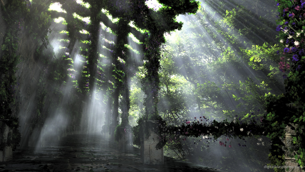
 The Shaded Path: shadedpath1lavender
 The Shaded Path: shadedpath0
Darlene Y. [nonmonthly]
To be able to come out of my home and wander down such a lovely, calm and peaceful path as this would be a dream.
Your use of colors are amazing.
Stephanie
I think also this one the best pieces you’ve ever done.
Really ‘Wowww’, this heaven.
Alexis
I think this is one of the best pieces you’ve ever done. =)
awyeah
love the added foliage.. but I don’t like the blur on the right side at all, a 10 otherwise.
Zach
Thank you, Ryan! I really like it so much more with the foliage on the rail!
Ryan
I’ve updated the multiscreens with the new rail. Thanks you guys like the new render!
Zach
Will the multiscreens be re-rendered with the ivy on the rail?
ZUL
Great work Ryan, another perfect render. I love the beams of light piercing through the mist. I can see this as being a real world or fantasy setting, there’s just something about it that you can take it both ways.
Ryan
Autumn version rendering now….
Nicola
I think this is beautiful in single screen, but on a dual screen the right hand side is just railing and people have asked if my monitor is broken!
Kenny
Magnificent. One of my all-time favorite DB pieces. And I just worked out how I’m going to use this in my next round of custom framing, at 24 by 15 inches.
You actually hadn’t done much I was really in love with for a long time, and now out of nowhere, 2 in a row. *Squee!*
David G
As others have said, this image works poorly on a dual screen.
John B
I want my house to be at the end of this path. When i grow old i want to take daily walks down it and sit on the ancient bench it obviously has(its down there, just out of view) and then reminiscence about the great life i had lived and all the beautiful things i had seen.
Amazing job Ryan. This is a perfect example of why we love the work you create. It helps us escape our mundane lives explore worlds we wished we lived in.
Joe
The most becalming image I’ve seen in quite some time. Those shafts of ghostly light remind me of Ocarina of Time’s Forest Temple.
Marlowe
So amazing! You feel like you can just step through the scree and continue walking down the path.
Marlowe
So amazing! You feel like you can just step through the scree and continue walking down the path.
Frank M
The shades and mist effects are very well done. The greenery ‘crawling’ along the stone structures is also well configured and organic. The whole thing appears as if it’s from a 100% comparable site in the world. BTW Happy belated birthday!
Jenanne
I hear you. I wondered why the last time a render surpassed Highland Spring, and then dropped to #2. “Spring” is a terrific render, but so are many others. But I don’t think it’s a conspiracy, and I can’t see Ryan putting his finger on the scale. I think the reason it’s so hard to exceed “Spring” for any length of time is the sheer number of high votes it’s received. “Spring” has 968 votes and 529 of those are 10s. It also has three 1s, one 3, a handful of 4s, etc., but with so many high ratings it hardly matters mathematically. A lot of people really love that render. Even one 1 matters a lot more for “Path” with its 167 votes. It’s now #3; “Sakura Night” is in second place.
Kyle
Sometimes I wonder if there isn’t a conspiracy to keep that at the top… whenever another piece hits number one it starts mysteriously getting ratings in the 1-5 range… Who on earth would honestly rate this a 1?
Jenanne
The Shaded Path was the number one rated image for a few short weeks, but Highland Spring has taken back the number one slot (9.246/10 rating for “Spring” versus 9.224/10 rating for “Path”.) In case anyone is interested. 🙂
Russ
To Ryan: “You’re a good man Charlie Brown”!
Stargazer
Wow. I really should keep my comments to myself until I’m able to view your renders on my computer screen opposed to my iphone. This is so so so much better than I had thought, upon seeing it on such a small screen. It’s really beautiful. A place I would love to visit. Peaceful!
Marco
I felt a feeling of joy and refreshment.
I love the effect of the light coming thought from above…
Lovely wallpaper Rayan….
Ryan
Please see the Work-In-Progress preview render that I’ve just uploaded.
Sina
There has been a recent lack of “space/ fantasy world” themed wallpapers 🙁
OMeyers
Serene
Scott
Ok – this is absolutely beautiful – it immediately became my desktop on both monitors and my iPad – wow 🙂
As an aside, with iOS 7 hitting tomorrow, have you had any thoughts about doing the sizes needed for the new parallax wallpapers? from what I’ve read:
Hereâs how to make your own parallax wallpapers.
Now, all you need to do is add an extra 200 pixels on each side of the wallpaper. Using your image processing app, increase the image size to one of the following, depending on the device youâre targeting:
iPad 2 and iPad mini: 1,424 x 1,424
iPad 3 and iPad 4: 2,448 x 2,448
iPhone 4S: 1,360 x 1,040
iPhone 5: 1,536 x 1,040
Read more at http://www.cultofmac.com/245738/get-ready-for-ios-7-make-your-own-parallax-wallpapers-ios-7-tips/#vxeXKpKsFowfvJEO.99
Ben
Great realism, dark colors for less distraction, beautiful.
robk64
A magician never reveals his tricks, but it doesn’t hurt to ask: How did you do it? I’m a Vue novice (for the last 8 years), Poser Pro and Lightwave user, so I speak some of the language. Just wondering how you put it all together. The only thing I may have tweaked would be weathering the columns by chipping away the perfect corners/edges. You did a step-by-step several years ago, explaining (teaching) how you did the scene with the Saturn-like planet in the background, on the horizon, iceberg-like rock formations in the foreground… it was a great how-to guide that prompted me to try similar images. Always interested in learning new techniques, especially with software advancements.
robk64
Excellent work! Been waiting for a realistic render, and this works great. Well done, sir.
Dale
My first reaction when I saw this on the main page was “Whoa, Cool!” Then after drinking it in for a few moments, I started thinking about that History Channel show called “Life After People.”
Fantastic piece!
Ryan
Here is your proof 😉
0beron
I’ve complained in the past about grain and noise in your images (especially the natural scenes with light rays through mist). Whatever you did with this one has fixed it – all the light rays are nice and smooth!
Ninhalem
Most of my coworkers thought someone had taken a photo in England. They thought I was bullsh*tting them when I said it was digitally created. Awesome job.
Weissherz
Absolutly breathtaking!
i usually prefer you ‘space’ or ‘abstract’ art but this one is just… WOW!
milamber
Absolutely stunning, I love this piece! Definitely one of my favourites along with the Highland series and Sierra Autumn. Can’t wait to see the fall version!
Littlemom
I love this!!! Love the lighting and everything. Absolutely amazing!!!
Drew
Stunning. Another gem from DB. Thanks for this.
Drew
Stunning. Another gem from DB. Thanks for this.
amateria
It’s ridiculously amazing. It evokes the senses … I am pulled into the image when I look at it, so in addition to knowing what it looks like, I immediately feel like I know what it must smell and feel like to be on that path as well. I’m additionally having fun determining the sounds that might be heard there. 🙂
Hodge
The single screen is great – the dual screen, not so much – the second screen is just railing… this could be so much better as a dual screen, please consider re-visiting it!
Steve K
I’m going to go there and say that this is THE BEST natural scene you’ve ever created!! I just stared at it for about 5 minutes… I WANT TO BE THERE!! Love it 🙂
Nate F
To be honest, way too much railing on the multi screen. I love the left screen, but my entire right monitor consists of a tree and a railing. Another post for the second monitor (and I assume the same for three) would really make things more interesting.
Blamblazer
Thank you. That’s just the world I needed to live on, for a few moments, to stay sane today. Both renders are real in their own way. Again, thank you!
live4space
Ryan, Welcome back! This is why I am a lifetime member.
Mark
Whoa. WHOA. Not much else to be said.
Jason
One of my fav non-abstract pieces in quite awhile! Awesome job Ryan!
Gene
Homerun… Someone else made the comparison to Satori (2003). I could see it, but not name it. Anyway, very nice. Thanks again Ryan!
0beron
The last 4 wallpapers were stunning stuff, and this one knocks it out of the park again! Just beautiful!
Whatts
This reminds me of a holiday in Spain where we visited the González Byass bodega. Looks stunning…
Ruth
A new favorite!! Have you thought about doing it in fall and spring, too? You do such fabulous fall colors; it would be awesome! Thanks for all your hard work; you give me something new to look forward all the time! <3
Sanalith
Absolutely amazing! The lighting and shadow effects just blow my mind!
Brandi U.
WOW! New favorite of all time. Just stunning.
Nelson
Great work! It reminds me of Star Wars. This could be part of an old Jedi Temple on Yavin 4.
Ryan
Definitely 😉
Terry
Remember what you did last christmas with those lights, it was like a grotto… could that be done to this for a christmas wallpaper?
Ryan
It should show up now. Thanks!!
Xeavn
Really like this piece, would love to see a 3840×1200 version.
Hunter
The “Highland Spring” of 2013!
This is amazing Ryan, Nice work.
RO
My spontanous reaction to this one was WOW!
The atmosphere it captures is incredible.
Pete
Your work is always amazing, but this is one of the best I have ever seen. Absolutely beautiful. I would love to see this as a night scene, as well. Your work with glowing flowers always blows me away, and I could see this one also being truly stunning with that as well. Certainly a 10/10 either way, though.
doug
Already one of my favorites!
Tatiana
This is gorgeous, and my only complaint is the out-of-focus pillar on the right because it just looks fake to me. I don’t know if that’s because of the blurriness or not.
Maryann
So beautiful. How about a rain shower? I actually first thought it was a rain fall, not sun streams, and I would love to see this with a rain element.
Anton
This picture actually made we start tearing up when I saw it on the front of your page, it is amazing, I love it so much!
rdeforest
I’m drawn in by the juxtaposition of color and gray, light and dark, natural and unnatural. Most of your outdoor scenes have a way of suggesting things that are hidden and stories about them, but this one dials that all the way up. What must the rest of the building look like? What does the rest of the forest look like? Is the building abandoned or neglected, or did the caretakers intend for the building and forest to intertwine like that? As soon as the questions occur to me my brain starts permuting all the possible answers it can think of. I find it creatively inspiring.
Shelly K.
I like this. Both with and without the flowers like in the WIP version.:)
Nick
Love this piece. If I could ask for one thing… it would be slightly less light on the path, so that the vines and stones are a little more visible. Still though, breathtaking. I renewed my membership because of this one. The abstracts don’t really do it for me. This stuff does.
Jenanne
Tranquil, harmonious feeling to this one. Can’t wait for the final version.
Afya
Really lovely scene. I look forward to the autumn version! I third the suggestion of an “after rain” version with soft light.
(I wonder what’s on the other side of that high wall…)
Deanna
Ryan, you never cease to amaze. It looks like we all received a gift for your birthday, as well! Love it, thank you.
Ryan
There will definitely be an Autumn version. I had that in mind from the start actually 😉
Kelton
definitely waiting for the multi screen treatment
Russ
Ryan I know you are going to do a fall version of this right? The foliage is gone from overhead, more light shines in, lights up the pathway and wall allowing for more detail. The trees just off to the right can carry some brilliant autumn colors. Just a sugestion 😉
Zach
This piece is beautiful, Ryan. As others have mentioned, it reminds me of some of your earlier works. I really enjoy the smoothness of the scene, and can’t wait to see the multiscreen renders. Also, I second Jonathan’s idea of a version right after a rain.
Thanks again for your outstanding artwork; keeps me going throughout the week.
Jonathan
I think a version just after a rain might look good too. Just a thought
Amadeus
Love this one, reminds me of a ruined garden I visited in Brazil once… I’ll be ordering a canvas as soon as it pops up on Zazzle!!
Alec
This is one of your best works so far, very reminiscent of your 2006-ish work. Amazing.
Justin B
Beautiful picture. Looks like it might be leading to or from some vine covered ruins.
Rich A
… and in the mind. This immediately made me think of Satori (the 2003 original). Same mood, just perfect.
(The 1600 x 900 render appears to be messed up, however.)
Randall
Love it–another great scene. It looks like it could be in Rivendell.
Jen
I would love to be walking down this path. It feels ancient and peaceful. Love it!
Chris B
I’ve gotten a lot of comments on this one at work, it’s always fun to tell them that it’s not a real place.
Ryan, are those watermelons hanging down in the pic you posted with Jason in it? I’ve seen people plant tomatoes from a hanging bucket but I never thought anything that heavy would hang so nicely.
Chris B
I honestly don’t see how anyone could give a 1 for anything in the gallery. Even the early renders from the late 90s have a charm to them that would keep them above a 1 lol. Whoever gave highland spring a 1 needs to have their head examined