Description
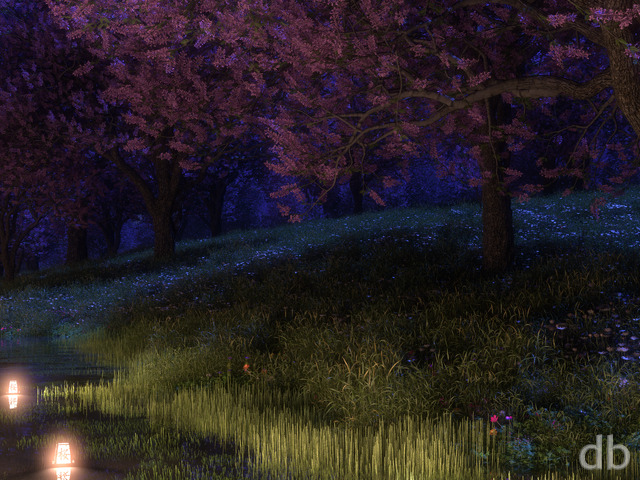
Of course I had always planned a night version of The Shard. It turned out to be a bit more complicated that I’d initially imagined but I think it came together when I turned the weirdness up a bit and changed the blue moonlight to blood red… Created and rendered on Rochallor.


Susan [basicmember]
The light colour of the shard against the dark green really stands out and there is such a lot of detail in it.
Kevin C [lifer]
Nuff said!
Ozaawaagosh [plusmember]
Love the way you play with lighting, really gives it that cool eerie-ness, as if some extraterrestrial is going to jump out at you, or if you venture to close, you will be sucked in to some portal and find yourself light years away from home, this would be a great book or theme cover art for a great SyFy story. I Love it, Great render my friend.
BobC [lifer]
I agree that this is the most interesting version of the shard. The shard has (for me) gone from a giant, half finished spearpoint to something mysterious to something totally alien and spooky. I love the strange lighting and I love this image!
Zorz [basicmember]
I dig it! Thanks Ryan!
Andrew [donormember]
I admit I did not like the original Shard, but the second one (day) was so cool. This one, however, is spectacular.
BigD [basicmember]
It’s great 🙂
theageless [basicmember]
This looks fantastic, well done. Though could we have a 3440×1440 crop please? Thanks!
BigD [basicmember]
Don’t forget to show us some ultra widescreen love!
Xetal [liferplus]
there is scope for more colors when time permits – please 🙂
Kris [liferplus]
I love the bright contrast, a zoomed out view where the horizon could be seem possibly would make a great shot for this as well.
Brandi U. [liferplus]
I really love how the lighting of the landscape comes from the shard. Beautiful.
ChrisW [basicmember]
Very nice effect! I imagine this could be seen for miles in every direction, like a lighthouse! Also love the way the blue-white light contrasts against the dark green landscape.