Description
A Member recently wrote…
“Would it be possible to do an abstract at some point that is
more minimalist? Generally I love the incredible amount of detail
that is everywhere in your work, but for some types of wallpapers
(mobile mostly) I prefer things which are towards the minimalist
side, and abstracts seem like the perfect place for that.”
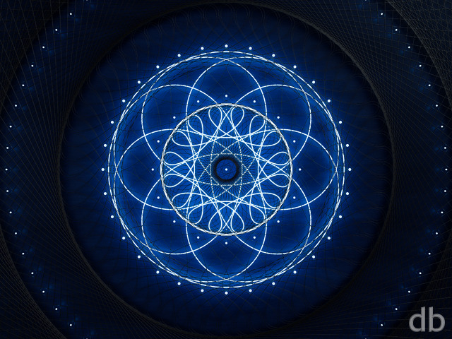
I decided to try it out so I put together something very quickly,
very “minimally”, in Lightwave. I only used Lightwave’s
“Textured Environment” for this piece, no geometry at all, and I
previewed it for my Members a couple of days ago. The feedback
was generally positive so I kept tinkering.
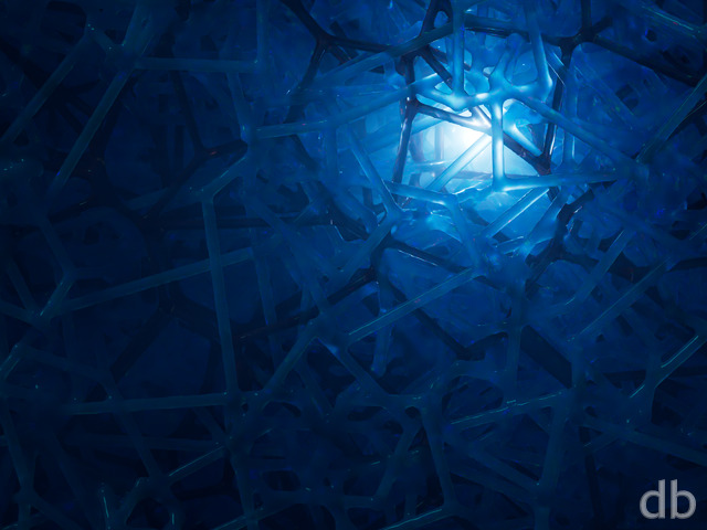
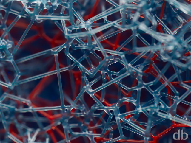
This “finished” version is a bit more complex
than I had originally intended but the construction is still
fairly minimalist. I added a single 2D plane and some
volumetric lights so it is technically a “3D wallpaper”.
All in all it was a fun exercise and nice to render something
that only takes 30 min instead of 30 hours. I will try to have
a multiscreen up shortly along with some of the early versions.
Hope you enjoy it!!

 Simplexity: simplexity1b
 Simplexity: simplexity1a
Neil [basicmember]
Simplexity is such an awesome word. In this one word, it illustrates how complexity can emerge from simplicity.
Rick (Horseman) [basicmember]
Our spirits and energy are linked as one with the universe. When there is a disconnection, fragmentation, and chaos replaces purity of soul.
Brian
It really pops on my tablet and phone.
Ryan
The iPad HD link should be working now. Thanks!!
Scott
I like the piece, and the minimal quality, but as mentioned earlier it does remind me more of my window with bullet holes in it 🙂 not a bad thing, but detracts a little in my head at least! 🙂
Also -no iPad HD render? (2048×2048)
thanks as always for all your hard work!
Jenanne
Well, that’s the fastest multiscreen render I’ve ever seen. 🙂 I love H20 Weave, too. It’s one of my all-time favorites, and I was sorry when my screen outgrew it. I’d love to see that one as a remake, or just some larger sizes. If you have the time for additional requests — I’m sure everyone has some image they’d like bigger, or brighter, or darker, or in different colors…. 🙂
jlpilkin
Hmm… :/
I think it’s just the style that was chosen that I dislike, regardless of the amount of effort that was put into this piece.
For a simplistic image, I would rather have something less “spidery”, like many of your early abstracts (“Flamedesk” and “H20 Weave” are good “simplistic” examples of what I like – though this is just my opinion).
Sorry that I had to give you a 1, but it is my honest opinion. Looking forward to your next masterpiece!
Lidia
I really don’t like this one, and not because it is “minimalist”. I honestly think you could pull off a much more appealing minimalist image.
Jenanne
What a great name for this piece! I love the names you come up with, particularly for your abstract renders. I, too, think it looks like bullet holes in glass, but I like the effect very much. It has sort of a edgy feel to it, which is enhanced by the simplicity of the image. Terrific!
Ryan
Those are artifacts of the noise function applied to the individual “blasts”. Echoes would be a good word for them. Sorry they are distracting!
Chase
It’s missing something…not sure what. But it does remind me that I need to get my windshield fixed. This is what it looks like at night when hit by oncoming headlights.
JMK in CT
Nice but for some reason it reminds me of bullet holes in a piece of glass.
cat
whats up with the writing in the picture like the “xj” or the “70s” in the medium blue color. it draws a way too much from the main image
Hoverwolf1
Not a fan of minimalist,(or abstract, for that matter) but this is still cool. I don’t know what sort of mobile the aforementioned member was complaining about, however. I prefer the details. Example, I have a Samsung Galaxy S2 with Phraxis (planet view) as the background. I don’t have any issues with it cluttering up the screen. Maybe some of us are just better at sorting through “clutter”. As far as this piece is concerned, I like the color juxtapostition. Although, I might suggest using a medium or dark green instead of red to oppose the blue. That way, they would complement eachother rather than contrast. But, that’s just me spitballing. Maybe it would work; maybe not. I still think this one is cool, though.
Sean
Really liked this one. Probably one of my favorite abstracts in a while, actually.
John
This is currently my phone background. Its different than the vague idea I had in mind, but I like it a lot. Above and beyond that, it is incredible to me, and was an incredible experience for me, to be able to post a comment on a site with 18,000 current members and have the artist not only respond but actually create something along those lines. I am blown away and deeply gratified. Thank you.