Description
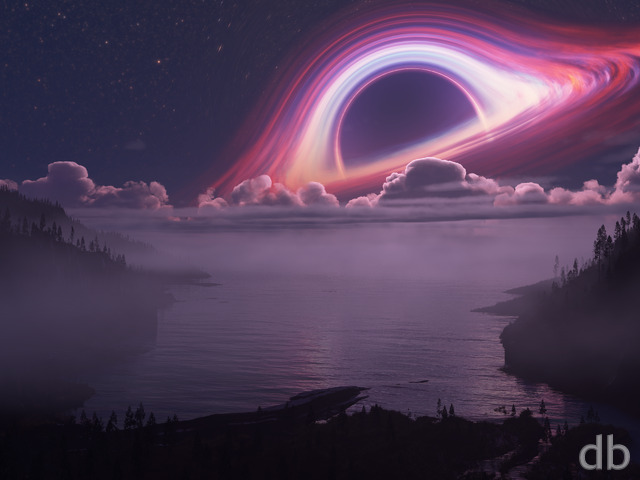
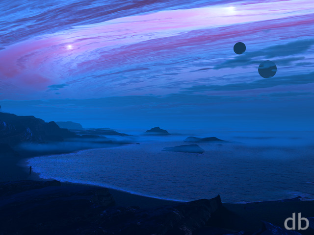
A number of folks were perplexed by the planets that I added to
my 2013 “Singularity”
update. The original did fine without them, but I
added them to this scene because I wanted to try a “from the
ground” render.
That render took Vue a little longer than I had anticipated
(84 hrs!) but it is complete and now available to my Members. I’m calling this one “Singularity Rising” (for now) bit that
may change as I make some revisions.
I hope the issues that were pointed out for “Singularity” are
minimized in this planetary render. Perhaps I will go back and
render a version without the planets?


 Singularity Rising: singularityrising2


Challenger
Simple reason I’m giving it a perfect score is because I’m left in great perplexity looking at it. It’s mind-boggling for me, it truly truly truly is!
zb
Love this piece, but really really want dual and tri screen renders for my workstations! Please? I like all of the versions of this, but I love the stuff going on in the background of this one and really want it for my setup. Been waiting for an update for multi-screens since it came out.
Chris
I agree… My Work Laptop wants a dual-screen of this. Need to confuse my “normal” co-workers with your realistic sci-fi landscapes more! = )
matthew
way too much going on in it. just a simlpe galaxy would win me over.
BeggyPeggy
Could we have dual screen versions? Please?
Lidia
Can we please get version 1 with a little less brightness for the Singularity? I can’t use it on my desktop as-is because that really bright spot just blinds me.
Ryan
Decided to go back to V.1 for the gallery on this one.
Hoverwolf1
The ground views always seem a little busy (on the ground) to me, but I prefer V1 as the lighting seems a little unreal, which I would imagine is what it would be like to be near one of these things. Love it.
CE
I like the new version better because of the greater contrast… the pickle jar version to me looked a bit washed out. Personally I would increase the contrast/darken it a bit more to make it look a bit more like a night seen but I like the night scenes the best. Undecided if I agree about it being a bit cluttered… Maybe would consider decreasing the bioluminescence in the center, if it were me. Still really cool image no matter what.
Jenanne
It looks like the Picklejar version is quite a bit more popular overall (a 8.53 rating from 68 votes versus a 7.75 rating from 36 votes). I like the brighter treatment of the singularity, but I do agree that the new version seems a bit cluttered. The bioluminescence from the blue plants, in particular, is a little distracting. Perhaps the PJ version should get the multiscreens, if you’re going to do them?
Simrin
I love the image itself but its a bit to dark, even though I get it being a black hole I wish we could have played with the colors a bit more to give some brightness to it. Its always hard to put a really dark background on anything unless it has a nice bright focal point and this one doesn’t really have it.
0beron
I’m aware it took a huge amount of time to render, but I really prefer the lighter coloured variation with the clouds (singularityrising1), and hope there might be a multiscreen version.
watcher
I think if the singularity and the planets are scaled down so it looks like they are a bit further away and the sky a bit darker it looked better to me, it`s a little bit crowded now
Chris
Trippy and yet enjoyable.
Waiting for the dual screen so I can have my co-workers marvel at it when they come by my cube. B-)
Lidia
This one is much better due to the singularity being less overwhelmingly bright, but I miss the clouds and plants from the first version. I also think it would be better without the ringed planet.
celmendo
I really like both equally. I like that this has more color and I like the heavier shadows but I liked the other one just as much because of it being washed out and seemingly more like a dying planet being that close to a singularity.
Ryan
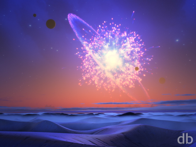
I’ve added a new render of “Singularity” Rising” to the Members Gallery this afternoon. The first version did seem a bit washed out to me so I have endeavored to add some more color his time around. I nixed most of the clouds in this version. It was a tough call to make but it brought the render time down from 85 hours to around 13.Let me know what you think of the changes!
robk64
Inspired by Waking Mars?
Phil
This one looks great! Keep up the good work! What would be even better would be an urban view of this from the planet. So scrap all the plants etc and replace them with a city. Now that would be cool,a city about to be swallowed whole
Greg
At first I agreed it seemed a little ‘washed out’, but actually it could be argued that atmosphere/climate are the cause of that. After all, human eyes are optimized for Earth’s atmosphere.
This works GREAT as a Windows 7 lock screen for my 1080p monitor!
I can’t stop using ‘The End 2012’ as my main dualscreen paper though. 🙂
0beron
This looks epic – I don’t mind the pastel colours compared to the space render, gives it a sense of looking through a misty / foggy atmosphere on the planet we’re stood on.
LBates
I really like this…is very pretty. I think a “day” version of just the alien planet could be interesting without the singularity.
Dan
I prefer the space one but this one is pretty good. I just like your space images the best overall so I’m usually happy with them.
Sundogvet
I love the sense of alien ecology. I love it when you do that. I’m talking myself into the limited color choices being a good idea, in light of the proximal explosion.
Heh. Unintentional puns are the best kind.
Bob
For some reason, the image seems to be “washed out” to me, like there something wrong with the contrast. And I’d have to agree with Doug B. on its busyness.
Chris B
way better than the space one IMO. The Foreground really makes this one. As others have said, it is washed out which I like on one hand, but the other hand wants to see it in all it’s splendor.
And I don’t expect it, but it would be cool to see it ripping the other planets apart 😉
Alex H
The Washed out-ness is freaking awesome imo. I don’t rate many pics 10, but everythign about this one is so beautiful. The other version is less washed out, and that looks awesome too, but the colours in this one are just perfect
Dan
I agree with D that it looks a bit washed out. Were it more bold especially in the sky object and a cooler palette overall it’d be an easy 10.
Nixiyo
I prefer this version, which is wonderfully ‘alien’. Would quite like to see a version either with the ringed planet much smaller or without it altogether.
D
The landscape is really cool but the colors of the singularity are just too washed out in this version.
Nelson
Wow, the planetscape looks gorgeous!! I can’t find one single detail I could complain about 🙂 It has a sense of “normality” inmidst this unrealistic setting which I think has made many of your former works so stunning. Don’t know how you achieved it here, but I don’t care, it’s just great!
Oh, and this “washed-out” look fits very well as the light is being dispersed in the clouds and atmosphere. It also makes the outer singularity parts look less oily.
Ryan
The loss-less files should be showing now. Thanks!
Ali
Where are the 1440p and 1600 lossless versions?
Seraphim
Aesthetically it is amazingly pleasing. I just have one question: Aren’t singularities supposed to have such a strong gravitational pull at their center that not even light can escape? The physics doesn’t seem right… Otherwise, perfect!
Doug B.
This one just seems too “busy” to me
Doug
I always like your alien landscapes with interesting skies, but how exactly is this solar system set up? How are there three planets in the sky large enough not to just be point sources. One makes sense if you’re on a moon orbiting it, but what are the other two doing? Yeah, it’s kind of a literal nitpick, but a wallpaper is something you stare at a lot and this sort of thing bugs me. So I would definitely approve of a version with fewer plants. Otherwise I love it.
Jenanne
Wonderful! I love the foreground, and for some reason I like the background much better now. Terrific render!
John
This looks really really washed out. Especially if you compare it to Singularity 2013.
Brian
So the “alien” plants in on the rock outcroppings really remind me of a perennial flower native to my area called a Spider Lily (Lycoris radiata). See the picture on Wikimedia: http://commons.wikimedia.org/wiki/File:Red_spider_lily_October_2007_Osaka_Japan.jpg
Lidia
I really like the foreground on this one, but really don’t like how the background came out. I really dislike how the black hole came out so much brighter than in the planetscape, and I don’t really like the planet with the rings. I would really like to have this foreground with a better background, though.
The Guru
I don’t know how you did it, but everything that was wrong with the last rendition was fixed with the ground view. I love the alien nature of this planet and how it blends seamlessly with the sky. Definitely one of my favourites. Good job!
Tyler
I’m a different Tyler than the other poster. I like to think I’m the original one =) Anyway I LOVE this piece and feel that it has one of the most intense ‘otherworldly’ feels I’ve ever seen from Ryan. It absolutely screams extraterrestrial and I would travel there in a heartbeat. The lighting is also perfect in revealing all of the various planetary details that make this so amazing. Planetscapes are why I joined so forgive my rant.
watcher
i like the darkness of the Singularity 2013
I think this one is to bright
George
I like it. The scale of the planets and the angle of this view of space does take away from the on-the-ground perspective though.. Perhaps it would be better served without the planets?
Hunter
I prefer it from this view, it’s actually as near perfect as you can get! No noise on it, the water looks realistic, the planets look amazing, etc. etc.
Nice work.
Tyler
Your planetscapes are what first entranced me when stumbling upon your work and this one is no different. Whenever I see these images my mind travels elsewhere, creating stories behind what is seen. With the added fog and high plants, I think this piece of art captures the scale just as well as your older stuff even without the little person standing somewhere to signify it. Regarding the planets being in it, either way they’re all doomed.
Daron
Brilliant. Love the truly unique and alien vegetation.
cmmnoble
Sorry for the double comment. I was so excited by the picture, I only just now read the whole news post that went with it. Please leave the planets in! IMO they’re totally awesome in the “ground view” version of this. 🙂
cmmnoble
So. Very. Cool!!!!!!!!!
Ziethriel
Love it, as always, however the gamma seems to be too high… It looks washed out a bit, like the colors are under-saturated. I like the planets though, keep em in 😀