Description
It’s been a few months since I’ve done a “BIG” landscape and some of you have been requesting them. My recent scenes have been more on the intimate side. To be honest I’ve gotten myself into a bit of trouble using Vue lately in that the scenes I’ve been dreaming up have been taking far too long to render.
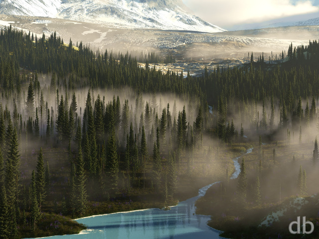
For this scene I wanted to concentrate on keeping the render time manageable (on Bucephalus even) while still keeping the WOW factor. I hope you think I’ve succeeded with “Strathwood”.


 Strathwood: strathwood1


Zorz [basicmember]
wow, just wow
Dan [liferplus]
Definitely improved upon the first version. You really bring the sense of grandeur when looking out over an awesome landscape.
Rodewaryer [basicmember]
I would expect Elven clans to be in those forests, nicely done. Landscapes are the most satisfying from these pages.
Tromador [basicmember]
Always love your forest vistas, this is no exception.
Russ [donormember]
Both are excellent Ryan! How about one more pickle jar version and make the rock arch bald? The solitary, uncovered rock in the first version, helped the balance between life and barren. Its difficult to balance between the art you want to come out and keeping your fans happy…but you do a heck of a job at it!!
Ozaawaagosh [basicmember]
I really love this one too!, awesome version
Gene [lifer]
Great save! Vast improvement over original.
BobC [lifer]
The addition of the fantastic, improbable arch makes the image immediately recognizable as one of yours. I like it a lot.
Littlemom [liferplus]
Absolutely amazing!!! even better than the first render!!!
Duane H. [liferplus]
Love this Render and the new version. Ryan, It almost feels as if Cloud Kingdom could have been a view from within this valley towards the view from this angle!
Richard H. [liferplus]
Amusement over certain features aside, I think version 2 is a BIG improvement over version 1. Thanks, Ryan.
Although the scene is relatively under-coloured compared with most of your work, I think the enhanced lighting in V2 does a lot to counteract the dullness of the original. For what it’s worth, I don’t think over-saturation would have been the answer; there’s nothing wrong with having a naturalistic approach to colour. It was more a matter of the content of the image being relatively colourless. Anyway, the new version’s a lot better, and I very much appreciate the improved lighting on the hills in the distance, which makes them immeasurably more valuable simply because they contribute more interest to the scene.
The new, central feature is certainly more attention-grabbing now that it takes the form of an arch that you can see through. Also, I appreciate the extra detail work at the left of the image, which counteracts the very flat foreground of the original.
So yes, I think this is a good improvement in every way.
Richard H. [liferplus]
I’m amused to see that (a) my Nipple Hill moniker caught on, and (b) Ryan has taken steps to remove the offending feature. He’s replaced Nipple Hill with⦠Pierced Nipple Hill! Ha-ha!
NikB [liferplus]
I thought the original was great but this is even better!
Jenanne [liferplus]
Really like version 2. The central arch is a vast improvement, and I also like the increased lighting on the mountains in the background.
Luke [basicmember]
I try to keep my 10 ratings to a minimum, but this is one of the few to earn it. Well done!
Brian J. [liferplus]
Ryan, I like the changes to the focal rock into a more interesting shape. And I agree with some of the others that a night scene, with some firelight, would look awesome.
However, I like the mystique of the lighting in the original version. So maybe move the light source halfway in between?
I also like to see a little more sky in your renders, especially because I have a triple monitor setup.
Ryan
I’ve posted a revised version this afternoon. The sun angle is different (to illuminate the background hills) and I’ve changed the foreground rock to something (hopefully) a little more interesting to look at. The first version will remain available in the Pickle Jar for comparison. Let me know what you think of the changes!
LanceX [basicmember]
Hi Ryan! Great render.
I agree with some of the comments. While it does have some of your classic characteristics, it does tend to get a little uniform overall. The “Nipple Hill” does centralize the attention of the viewer, but I’d like to see some parts of a landscape like this one give it a unique and memorable element. I like the foreground and clouds that give it depth.
As always though, awesome work!
jimbo [basicmember]
his is a nice image. It’s a scene with a lot of conifers, so you’re not going to see very varied colours.
I don’t know how the pictures are made up – but I can imagine this valley in a later stage of its existence being flooded by the sea or perhaps by its rivers being blocked by a natural dam, such as a big landslip. A narrow band of water, possibly just under the far wall of the valley might work.
Thanks again for the picture, which will be in my Wallpaper carousel very soon.
Jenanne [liferplus]
I like this render; it’s peaceful and serene. A twilight and/or night version would rock.
Darn you, Richard H! Now I can’t see that central rock as anything but nipple-like. 😉
Rob [basicmember]
I love the mountain/valley scenes. This will be great across dual monitors.
Littlemom [liferplus]
This one is nice. I don’t think this is to drab at all. However that said can you give us a pickle jar version where the saturation is a bit more colorful?
Brett [basicmember]
I have this on my ipad and laptop, can’t wait for the multiscreen to have it on my desktop too!
Ryan
Thanks for the feedback!! I can see where some might find this one a bit drab. I debated boosting the saturation a bit to make things more colorful but decided not to go too far in that direction. The landscape is intentionally without too many “details” however, as I’ve noticed a creeping “busyness” to my work lately (details for detail’s sake) that I wanted to step back from here. I wanted to stay away from the more high-resolution Plant Factory models that I have come to rely upon in an effort to keep the render time reasonable.
Rick (Horseman) [basicmember]
Howdy. “Strathwood” from the 2018 gallery (Ryan, Digital Blasphemy). When the veil lifted on this artwork, my first thought was this is a snap shot of many memories of our early morning (at the break of dawn) hikes, mountain-side meditation, adventures and residency in our mountain valley (Bow Valley AB CA). That being said this landscape work and the other landscapes as Ryan said is a time-consuming commitment. As an artist of many colors and medians when time permits , and hobby photographer, I learned and do not box myself into a timeline or time frame. The great historical artists for example, Michaelangelo took years and years with pain-staking detail to create his masterpieces. I learned in my art studies at my university from some of the best, and learned, ‘a piece is ready when the artist says the piece is ready’. In the modernist culture of demand for fast, instant and now, I think we need to remember, an artist in mind and body is not a piece of IT hardware.
Ryan R. [basicmember]
I love valleys, they are my favorite landscape feature and this is another one. I really like it, its not choked with clouds and can clearly see the details of the landmasses and trees. Good Job Ryan!
Ozaawaagosh [basicmember]
Love this Amazing landscape, love the out croping of rocks, ancient mesa’s in the vally below, really amazing render. Makes me wish I was there, I’d be exploring all over this vally.
Richard H. [liferplus]
Sorry, but I tend to agree with Tom in that I find this one rather boring. The single central rock (‘Nipple Hill’!) ought to be an interesting feature, but somehow it doesn’t manage to be; maybe it’s too far away, or overshadowed by the distant mountains.
My primary objection is that the scene is so colourless. The distant mountains are so dark that they look dull rather than majestic, all the trees in the foreground look dense and the same, giving the impression of an untended garden, and the main problem is the lack of colour. There’s nothing much to catch the eye, and insufficient contrast to make the scene ‘moody’ if that was the aim of the near-monochrome colouring.
Overall I think it could be improved a lot by (a) making it an autumnal scene and having a lot of varied reds and oranges in the trees around Nipple Hill and (b) lighting the mountains in the distance so that they don’t seem so featureless and over-dominant.
Sorry. I hope the feedback seems constructive rather than just negative.
NikB [liferplus]
Nice job, Ryan! I really like these expansive landscapes.
By the way, I know you get asked about various images sizes and you can’t do them all, but is there a chance of adding a new mobile size of 1440 x 2960, please? This would match my Samsung Galaxy S8 with its non-standard 18.5:9 ratio.
Travis [basicmember]
This is AMAZING. It absolutely blew me away when I first saw it. I can’t wait for the multi-screen versions!
Tom [basicmember]
Not one of my favorites. Some of your older ones had much more detail. I find this one kind off boring. Sorry.
Brandi U. [liferplus]
Simply love the look and feel.
Kelsi [liferplus]
The thing I love most about your wallpapers is their ability to pull me in and make me want to see these places in person. Strathwood looks so peaceful!