Description
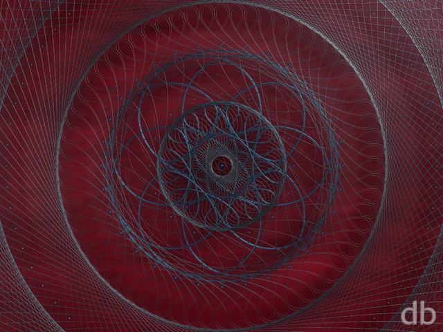
I was watching TV a few nights ago and had the good fortune to catch “NOVA: Hunting the Hidden Dimension“. I was floored! Now I already knew a great deal about fractals but this documentary really brought home how essential they are to my work. Of course I immediately fired up my copy of Apophysis. This is the result. My first fractal render since 2008…


 String Theory: stringtheoryblue1
 String Theory: stringtheory1


Scott Wray
Hey Ryan,
I wanted to toss this up on my timeline but the image sized for the timeline looks different than the actual background. Like its over saturated or too bright. Do you agree or am i just tripping =P
Jenanne
The two Pickle Jar 5120×1600 resolutions are still 5120×1440.
Alex H
Cheers Ryan!
Ryan
I figured out the problem and the first version is now listed in the Pickle Jar. Sorry for the confusion!
Alex H
It’s not in the picklejar. (and I thought it was the gallery version anyway)
Ryan
It looks like somehow my PS Actions (that I use to slice up and create the different files from the original) somehow has become corrupted. Unfortunately they are hard to fix so I may just have to redo them all. Sorry for the hassle!
Peter
5120×1600 links to wrong size.
I run into this all the time Ryan. Whats up with the renders?
Peter
Chris B
If you know how Ryan has them labeled you can just type it in the address bar.
EG: Gallery Versions:
http://digitalblasphemy.com/content/jpgs/1080p/stringtheory1080p.jpg
EG Pickle Jar versions have /picklejar/NameOfGalleryVersion/VersionName after content. Git rid of everything after it and put.jpg
So the blue version is:
http://digitalblasphemy.com/content/picklejar/stringtheory2/stringtheoryblue11080p.jpg
The Red iphone is:
http://digitalblasphemy.com/content/jpgs/640×960/stringtheory2640x960.jpg
so the iphone 4 blue one is at:
http://digitalblasphemy.com/content/picklejar/stringtheory2/stringtheoryblue1640x960.jpg
For the Ipad, follow the same path, just put in the resolution it uses.
It’s not finding the Gold/Yellow one, but it’s there if you follow Ryan’s link below, you can get to any of them that way too, just change the name of the image at the end.
Tim H
Hey Ryan could you add the resolution for iPad and iPhone 4 please. I love the blue version but couldn’t find apple resolutions in the pickle jar. Thanks !
Jonathan
Hi, this is beautiful. I like the yellow version a lot but the link to the pickle jar for that one goes to the blue version. Could you put the yellow version accessible?
Thanks
Dan
Wow – LOVE this one!
Just a heads up: 2x/stringtheory22x5120.jpg is listed as 5120×1600 but is actually 1440 high?
Ryan
Yes, the first version is still available in the Pickle Jar. For some reason my script is not finding it. Investigating now! You can find them all in this directory for now.
Theo
Clicking on the yellow version in the pickle jar takes us to the blue version. Is Yellow still available?
Lidia
Aaaawwwww, seriously? I can’t believe so many voted for the latter version… I did not think it was better than the first; the first is by far the best in my opinion…
James
Can we get links to the yellow ones again?
Ryan
Thanks for the heads up. Here it is…
Daanoz
Hi Ryan,
It looks great! I like second theory the most as well :). But I seem to be missing my resolution (3840×1200), is it me?
— Cheers
Ryan
The overwhelming consensus seemed to be that String Theory 2 was the superior version so I’ve swapped out the first version. Thanks so much for the feedback!!
Scott
Hi Ryan, there doesn’t appear to be any dual screen downloads available for any of the “String Theory (2011)” versions? I’m also having the same issue as Chris P below. Thanks. (PS. Fantastic work as ever!)
Daanoz
Thanks, it looks great!
Chris P
Why can’t I get the yellow one featured on the main page? It keep redirecting me and it’s not in the Pickle Jar
Chris B
The more I look at them the more they draw you in. The Blue something going on deep underwater, the yellow looks more like something going on in a star, and the red one looks like something inside of a living organism. or maybe that’s just me 🙂
Jenanne
String Theory 2 is my favorite of the three. Great work, Ryan!
PHiL
I agree with the others.. this is the best variant. Thanks for continuing to tweak. I would vote for this one should make prime time and move the others to the jar.
Dan
I really like this variant! It reminds me of the CBS show, “Big Bang Theory”. Actually all of them do but this one the most. This is my favorite of all the variants.
drow
there was a mighty duel… it ranged all over. they were both jedi masters. and someone left the shutter on this camera open.
Myles
These would look great on my iPhone & iPad… HINT HINT HINT… Sorry, subtlety isn’t one of my stronger characteristics… I tend to throw bricks!
Myles
Ryan… these are FREAKING AWESOME!!! I’m thinking we need green, red, and orange versions!!!
Khyren
This is the best one so far. Please give this one the full range of size renders.
oldsailor
I didn’t have a choice about this one. My wife loved it!
Carlos S.
This by far is the best version (at least to me). An instant favorite for me. Thanks for the wonderful work. If we could all see through your eyes. 🙂
Carlos
This by far is the best version (at least to me). An instant favorite for me. Thanks for the wonderful work. If we could all see through your eyes. 🙂
Lidia
Thanks for the extra color variant! The green one remains my favorite but this one is nice too.
Tyler
Best version by a mile. I’m sure anyone could toggle the colors in Photoshop but why bother with this winning combination? The blue/red contrast has always worked for you before so it’s no surpise here. Top hat Mr. Bliss, top hat.
Kristin
I believe that I like the last one the best! All of them look fantastic and I can spend hours staring at them, but the last one really speaks to me. It would be interesting to see this one in multiple tones, like “Cobalt Daisy” or “Azula”
Keep up the awesome work as always! 🙂
Ryan
Happy Friday!I’ve added a new “String Theory” color variant to the Pickle Jar. I’ve also added a print version (rendered at 7680 x 4800) to my Zazzle collection.
cmmnoble
This one is great in both colors. 🙂 Your fractal abstracts are some of my favorites. Any way you could noodle with some more of these on the side, since they render quickly?
0beron
Love the blue multiscreen versions, thanks for these, but the 5120×1680 image is still the wrong size at 5120×1440 instead.
Chris B
Ryan, thanks for making both. I’ve had them both up switching them throughout the day and I still can’t decide which i like better, the blue has the more detailed center and my tower has blue LEDs which always look good with the blue, but the other has warmer multi-colors giving it more energy if you want to call it that.
Very nice, and love the render time!
Ryan
The 3X 16:10 (5040 x 1050) Blue String Theory can be found here.
Khyren
Darn. No 16:10 (1050) size. I really liked this one too.
Miguell026
awesome Ryan! love the blue version of this one!
and the string theory?
is one of my favorites theory.. amazing..
awesome job!
Lidia
I feel the need to mention that I like the gallery version much more than the blue version. There’s too many people saying they like the blue, so I need to add to those few voices who liked the gallery version better. I feel that it is important that you know that some of us really appreciate the color variety. Nothing against blue, but it does tire after a while (and for this particular wallpaper, it’s just not the best in my opinion).
Harry
Are the Blue and ‘Yellow’ versions supposed to be identical in their structure or do they each use a different fractal in some way. Only the focal instances seem to show close similarities, the rest seem different in placement and structure.
As always both versions look amazing and even though I’m a ‘blue’ fan cant decide which I prefer.
(Side note: I recently got my hands on a newer better monitor with 2D to 3D conversion and by far the best images for this are yours, even better than my and others “artistic” snaps of the real world. I have no idea how it does it but so many of your scenes are utterly incredible in 3D, Highland Spring where you feel like flying off down the valley. It just shows the amazing level of detail, accuracy and precision you have always put into your images, thanks.)
Ryan
Thanks for noticing! I will see what I can do about adding the 480 x 640 size. Did you know that the “Zoom” detail images I post are 480 x 640? Here’s a link to the detail file for “String Theory”. These might make interesting wallpapers on their own.
Brandi U.
First, love this fractal. The way it shows the same pattern over and over, no matter what size, really demonstrates the true beauty of fractals (I watched the documentary, too).
Can you add a 480×640 to the mobile wallpapers. I have the new Blackberry Torch 9810 and the screen is 480×640. Would love to see that size as an option in either Members or the free area.
Big Dave
Thanks for the blue multi-screen. If it is only a few hours to render, have you considered a red or green version? I like rotating through different renders of the same scene such as seasons or colors. Just a thought. As always, I love your work!
Michelle
Unfortunately, this will be a rare occasion when a new DB work isn’t added to my wallpaper collection. The blue is too blue for my tastes. I’d much rather it have a bit more color it, but colors of the gallery version are ugly to me and I find the pattern very uninteresting and too derivative of some of your earlier works without a twist to make it more interesting.
Big Dave
I really like this render and can’t wait for the blue multi-screen versions. You rock!
Myles
Any chance of this particular blue version in an iPhone 4 size?
Nightwynd
Hey, Ryan. I’ve been a loyal follower for several years now. Your original stuff never ceases to amaze me. However, I’ve noticed a rather disturbing trend lately. Instead of completely original stuff, you are re-hashing older pics. A few teaks here and there, and that’s it. When are we going to see brand new original stuff of the imaginative quality we are used to? Just saying, hon. No offense meant.
0beron
Very nice, haven’t seen a fractal one for ages and this one is beautiful. I like both the colour options shown so far.
Btw, the 5120×1600 image seems to be only 1440 pixels high?
JBumgarner
I know most everyone got a little tired of the blue scenes a while back, but I much prefer the blue version. Can we get a dual screen of the blue one?
Nephelyn
If the bands are supposed to be strings from string theory, what are the the sunlike objects ? Light can be, among other things, a quantum particle. So if we’re on a lot smaller scale then the quantum realm here (which I suppose we are), what are the light emitting objects supposed to be ?
Regards, Nephelyn.
anna_writr
I love the blue version! It’s a little more restful on the eyes for actual screen background.
Scott
I always prefer “cool” colors so it’s the blue one for me, but they are both very nice!
Avery
The great detail and depth, the unique color spectrum, the dramatic variations in brightness and clarity… A most exquisite work of art, Ryan!
Scott
Watched that same episode and thought of you when they discussed the use of fractals in digital art (your mountains . I’m thrilled to see this.
celmendo
thanks, as always, for the choice
Tatiana
There’s a cutoff in the upper left corner. (I know, I know, I’m far too picky. =P)
Nico
I really like this one. Great job! Worth every penny!
Lidia
Nice! I really like it! I’m not too hot about the pickle jar variation, though.
Autumn wallpapers already? I don’t want to have to think about the fact that it’s going to get cold again here soon… not yet…
Lucas
Grand! Love it!
Daniel B
Nice. Definitely prefer the blue version in the pickle jar and would love to see triple screen versions of that.
Littlemom
I like this render a lot. Great job!!!!
Wraith
…pretty. 🙂
Chris H
Excellent work! I had been hoping for a new abstract. It’s as if you read my mind. It has a very fluid feel to it. Glad I popped in just before i head off to work. Love it!
Also, it is never too early for Autumn renders. Or any seasonal render for that matter.
Kris
You never cease to amaze.. I love your abstract work. Great job!
Tyler
Planetscapes and abstracts Ryan, planetscapes and abstracts. You excel in both like no other style IMHO. Anyway this is amazing and I would love to see more like this more often.
Ryan
Sorry! Maybe I will get it done sooner.It’s only $9.95 to renew for another year you know…
Alex
Nooo not the end of the week, my membership expires in 3 days!
Alex
Nooo not the end of the week, my membership expires in 3 days!
Brandi U.
I didn’t know that! Ooooo, I might just download all those onto my phone! But, I still want you to add a 480×640 version. 😉
Bill
I really like the newest one!! The blue render seems fuzzy or noisy to me.
Hook us up with all the sizes for theory 2?
Thank You again for all your continued work Ryan!
Wombat
You can never go wrong with abstracts in my book. +â