Description
You may have noticed the Da Vinci quote at the top of my Works-In-Progress page which reads “Art is
never finished, only abandoned”. Here is another render which
proves this axiom.
I opened up my “Cobalt Daisy” scene
file (created using Lightwave 7 back in 2002)in Lightwave 11 with
the intention of rendering out the original in separate layers
for an upcoming mobile project. When I had finished with that,
however, I couldn’t resist the temptation to tweak some of my
textures. A few hours later this was the result…
I posted it on my Facebook Page
last night and asked folks what I should do with it. The
majority said I should post it in the gallery so here it is.
Dedicated to my wife Jessica. October 12, 2012 is our 10
year wedding anniversary and this piece was originally created 10
years ago. Te amo!

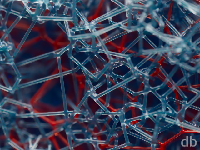
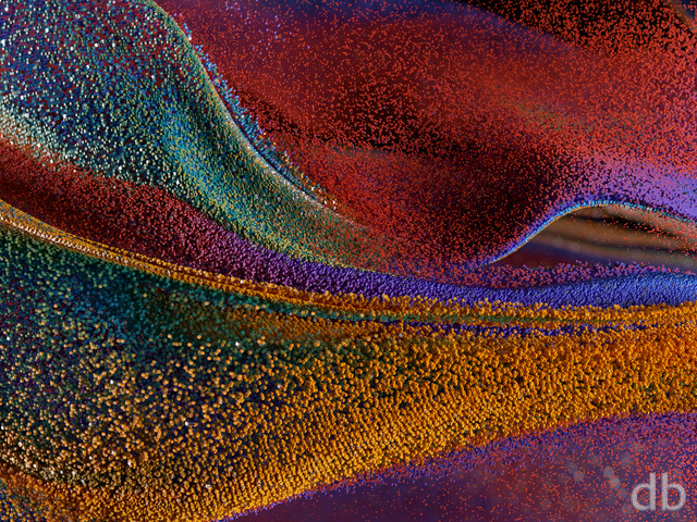
 Sunburst Daisy: charcoaldaisy1muted
 Sunburst Daisy: charcoaldaisy1red
 Sunburst Daisy: sunburstdaisyinverted1
 Sunburst Daisy: charcoaldaisy1
JonE
I tend to like black and white photography, expecially artistic (human forms) and scenery (like mountains and streams, but I don’t care for this one very much, but that’s personal taste.
Mordred
You asked which ones you should black out next … Dracul — Happy Halloween 2011 and dodenfell … I think the BW versions would add to the eeriness of each.
Rob
Great Job, these backgrounds are fantastic and will look perfect on my phone! People keep bugging me for the website I found that one on.
Patrick
Whilst not strictly monochrome, these new versions are wonderful and I love the crispness of the glass look. But then I have always been a fan of Ansel Adams. Composition and structure of the image is the key, and here it is used to great effect.
CASSANDRA
Wonderful and uplifting
Charlie
I like the glass look and the brilliant colors. It is the rare whimsical piece that catches my eye.
Zhar
This is an awesome wall paper.
I use the triple screen version at work and everyone who walks by my desk comments on how nice it looks.
Keep up the good work!
kchiki
I’m a suckered for bright colors and I love this Daisy!
LillyO
Ryan, all of your stuff is amazing, but this one is absolutely mind blowing! I can’t quit staring at it. The translucence and the depth of color. Holy Sh**balls! ;oD
Krystle
I love the colors in this. There aren’t a whole lot of pictures that have pink in them so when they do I fall in love instantly. These colors are so vibrant!
MJ
I was in Seattle on a family vacation this summer. Near the space needle was a glass museum; unfortunately not enough time to go in, but we did look through many windows and through the outside garden. “Sunuburst Daisy” reminds me a lot of the beautiful pieces I saw this summer. Thanks for sharing your creativity Ryan, and your dedication of this piece to Jessica is very touching and sweet 🙂
Skyweir
This work truly stands up to “Fluorescence”. The solar prominence-like petals at 3 and 8 o’clock make for a strong Sunburst correlation, and the glassine petals are STUNNING! Well done, Ryan!
Tom
Happy Anniversary, Ryan and Jessica!
H King
If its available of course.
H King
I think that the inverted version in the pickle jar is incredible. I think that I might have to make it my second ever purchased print this Christmas. It just so colourful and bright but with a strong contrast.
Keep it up.
Ryan
The 2880 x 1800 version is here.
Mike
Could we have a 2880×1800 version please!!!
Randy
I set the 2048 x 2048 version as the Lock Screen on my new iPad and it looks fantastic. Thanks, dude for being a digital artistic genius!
Randy
I set the 2048 x 2048 version as the Lock Screen on my new iPad and it looks fantastic. Thanks, dude for being a digital artistic genius!
Eric
Like this one but I love the blue version in the pickle jar more. If possible can we get that one as a multi-screen.
Zero Gravi
I really love this and the original Cobalt Daisy. Do you think you are willing to do a new render of the Cobalt Daisy in all resolutions as well?
Erik
Love the re-texture/render, as mentioned below a wider shot with some of the violet and black would look better IMO. Regardless, very nice!
Zach
Hey Ryan,
Is there any way to get a picklejar version of the dual screen which is zoomed out? I would love to see more of the flower. If not, no big deal; thanks again for your work!
Cheers,
Zach
Ryan
I chose to feature a section of the daisy rather than try to capture the whole thing in the widened frame. If I hadn’t zoomed in there would be huge empty black spaces on the left and right.
Zach
Love the single-screen, but too many of the beautiful colours are missing from the dual-screen. Wish the camera could have just zoomed out for the dual. Anyway, great work, as always!
CPinTX
I really like this one. Even though it’s not blue. Even better than the pickle jar version–which is blue. :o)
Jim Wilson
These darker colors are FANTASTIC Its got the look of 3-D!!!
Roo
I’m a big fan of the daisies – cobalt being a solid 10 for me but this one, just made me smile when I saw it. I subtracted a point because the center seems more stuck on than part of the flower. The petals are wonderfully done.
Melissa
Aww the colors!! Fabulous!!
Lidia
Happy Anniversary! Go do something fun.
Nelson
I love the glossy and colorful style of the petals, too! What disturbs me a bit is the orange middle part. It looks too much like a sphere and is a bit too perfect, I think.
Having no background is OK for me. Many of your abstracts don’t have a background and they don’t need one. Maybe it would even be distractive.
LBates
I’m usually more of a landscape person, but this is absolutely beautiful. Definitely a 10!
Amanda
This is gorgeous! I love flowers and bright colors, and now I have both at the same time!
Oh, and Happy Anniversary 🙂
Ann Reynol
its soooooo beautiful, thanks
Jason
I love how the petals nearest the seeds seem almost transparent… nearly glass-like. I knocked it down a point simply because I don’t personally like that much yellow. I knocked it down another point because there’s nothing in the background. I understand that the flower is the subject and focus of the piece, but a bit of barely-discernable plant life in the background would move this from “look at a flower” to “look at this miracle that was found out there in the wild”. 2¢
horcruxhp
This one takes my breath away!
anna_writr
Beautiful! I don’t usually like the flowers and abstracts, but the liquid/reflective qualities of the flower are so amazing.
Cee
Absolutely gorgeous! Brings back memories of some of my favorites from the early days!
Eel River
A Ten for a Tenth Anniversary! Nothing says “Te Amo” like a beautiful flower! Happy Anniversary! And many more to come.
Jo Jo
WOW!
Big Dave
Love it, Ryan. As always, great work!
Michael
I really love this one, the brightness of the yellow, almost makes my eyes burn. Great work Ryan.
Joe S.
ABSOLUTELY GORGEOUS!
I love this one most of all. It’s fantastic. Give us more.
Michael
Absolutely beautiful. This is why you’ve been monopolizing my desktop for 14 years.
Nico
This”pops” out great! To me it as if I am looking at the sun clearly! and the other colors are great but Sunburst Daisy is my fav! Thanks!
Wraithslay
My wife and I celebrated our 12th anniversary earlier this year. Congrats to you and your wife.
Side note: The “Name” field here only allows 9 characters. My username is 11. 🙁
JMK in CT
Cant stop looking at it. The glow just grabs you and wont let go. Awesome.
Gayle
This is just glorious, Ryan, and makes me very happy just to see it on my screen. Not just the glassy texture of the petals (thanks, Chris B) but the way they erupt and unfold, grow and fade.
Thank you, Ryan. And as always, thanks to Jessie for her continuing inspiration.
Mike D
This is awesome! Definitely one of the best you have done!!! Can’t wait to see more of this clarity especially on my larger monitor! WOW!!!
Teresa
Ryan! Holy shiz-monkey!! I honestly never thought I would come acroos one of your creations that my husband & I would want on our living room wall, but you have thankfully proved me wrong. Thanks for sharing with the world.
Chris B
Wow Ryan, I posted that before i looked at the full rez version. The glass texture on it looks amazing. Both versions look great! The gallery version looks more like a flower, but the pickle jar looks really good as a “more” abstract piece.
Chris B
now you just have to sneak it on her laptop 🙂
Littlemom
I absolutely love this render, the blue tones are nice too but Love the yellow. Great job!!!!
Ryan
You may have noticed the Da Vinci quote at the top of my Works-In-Progress page which reads “Art is never finished, only abandoned”. Here is another render which proves this axiom.I opened up my “Cobalt Daisy” scene file (created using Lightwave 7 back in 2002)in Lightwave 11 with the intention o rendering out the original in separate layers for an upcoming mobile project. When I had finished with that, however, I couldn’t resist the temptation to tweak some of my textures. A few hours later this was the result… I posted it on my Facebook Page last night and asked folks what I should do with it. The majority said I should post it in the gallery so here it is.Dedicated to my wife Jessica. October 12, 2012 is our 10 year wedding anniversary and this piece was originally created 10 years ago. Te amo!
Jen
Cobalt Daisy is the image that led to me spending the last ten years looking at your work. I literally used it for *years* before I found something that I liked as much. Thank you so much for revisiting it!!
Granpuff
Where did the bottom half go????
Granpuff
Where did the bottom half go????
Granpuff
Where did the bottom half go?????????????