Description
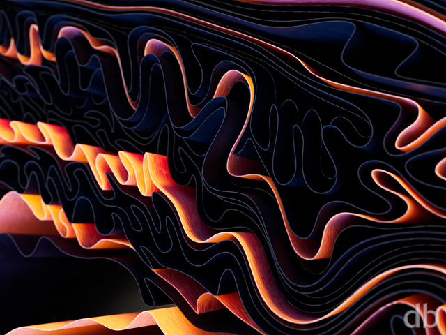
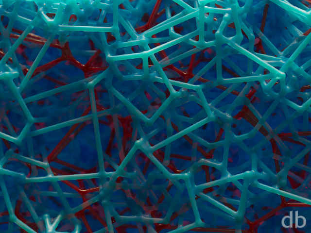
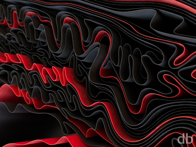
My first render using objects modeled with “Structure
Synth“. I roughed out these objects on my laptop while
watching my Ian’s tennis practice and then imported them into
Lightwave 11 for rendering. It’s a cool program and I can think
of some interesting uses for objects such as these…

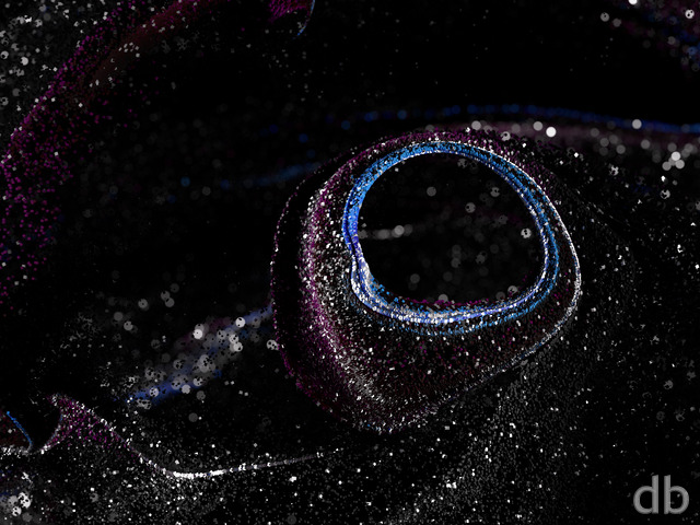
 Synthestructure III: synthestructure1
 Synthestructure III: synthestructure2
Ben K
I really prefer the color scheme of synthestructure 1 (the dark green and rusty red colors). Just wanted to leave that feedback. I wish there to be a multiscreen of that version 🙂 Either way though, it’s awesome.
koopy
I thought this was spilling upward towards new forms. Incredible how…
Dave Sp
When I first saw this, I thought the foreground coils were sinking into a background of molten iron. Could be an interesting study in contrasts, or just me seeing too many documentaries. 🙂
Alex H
I give 9s to pics you produce for which I have no complaint. 10s are reserved for my absolute favourites. All the variations on display here are worth 9. The original is the best imo.
Ryan
I stopped the render yesterday after watching it spend 2 whole days grinding at 66% complete. Extremely frustrating! I reset some of the render quality settings and started to render just the remaining 34% (the bottom) but I am rendering this “to disk” (rather than to the screen)to further optimize. So far it seems to be going faster but I don’t have any visual feedback to tell if the render quality is on par with what has already been processed.
Greg in CA
Just checking…
Justin
I think Google should make this one of their “Google Doodles” in honor of your amazing work over the years. You can almost see their name in it, I think. Different looking picture. Very creative. Looks nice.
Greg in CA
How does one find flaws in an original piece of abstract art…?
Ryan
the watermark in the 2x1080p is in a weird place. it’s just a little off center at the bottom of the right-hand screen.
Ryan
Thanks for your comment. I wish there was a perfect way to stretch these scenes out over 3 monitors. It’s hard to do. As for the focus, I could have easily had the whole image in focus but then it would have looked very flat and busy.What other flaws are you seeing?
Chris J
I think images using software like this should be rendered at a high resolution like 100000px by 100000px. The tri-screen should be a 5760×1080 crop of a focused part. To me that would look nicer. I see all the flaws in the tri-screen collection and its a plague.
RDL
And there are the pickle jar versions I was hoping for. 8) I’m not sure if my comment had any effect on the outcome, but I like the new fiery/B&W versions.
Andy
It looks like metal shavings of some kind. Well, thats what it reminds me of. Looks good
Ben
Love the way the pic shows up on your site – dislike the wallpaper. If it were crisp and had less noise it would take a lot to get me to change my wallpaper for a while!
0beron
I think I prefer the 2nd version, the fine filigree is sharper /crisper looking.
Khyren
I hope you didn’t abort and discard the tri-screens of V1. I’d love to have one of each.
teds2049
I picked up a poster of Endless Blue. I hope it will be light enough that Zazzle’s dark printing process doesn’t cause trouble. I hope it helps you get that new workstation!
Don’t wait specifically for Ivy Bridge-E. The OEMs won’t put up with Intel making them requalify their platforms for Ivy this soon after SB-E, so it would be a decent wait despite Ivy cpus coming out now for single-proc desktops. You could save a few bucks by dropping down to a slightly lower speed grade of SB-E. Intel is really charging for the the fastest ones compared to last generation.
Chris B
i like the best, the metal textures are much improved. Though the apparent multi colored metals in the 1st one are cool too.
Chris
I like the third one because the coloration and reflections on the metal were smoothed, but I think maybe I like the second one best. Only problem is you didn’t post the 1680 x 1050 version of it!
Ryan
Here’s my final update to “Synthestructure”. I’ve tweaked the metal textures a bit so hopefully they now have a bit more “luster”. The multiscreen should follow soon!
Scarr
Microscopic metallic flakes.
Chuck J
This reminds me of curled metal shavings after using a metal lathe. Nice!
Lidia
Very interesting second version; I like it. The metallic theme is certainly stronger. I really like the gold and silver colors. I don’t know if I like this one better than version 1; I think I like them both the same but for different reasons.
Chris
I like this alot better than the first one. The first one felt crowded and it was a little hard to tell what I was looking at. I also really do like the metallic look. You don’t have alot of work like this and I’m always glad to see you trying to take things in a new direction.
Greg in CA
So we have to fill in the comment field to post now…?
ChrisSpera
As an “organic” abstract, this didn’t work. As an artificial or [more] metalic abstract, this works much better. I really like this version. Good job!
Chris Spera
Ryan
A number of you suggested that the first version looked metallic so I ran with that theme for Synthestructure II. I’ve zoomed in a bit (to better accommodate the future multiscreen version) and inserted some little “filigree” items for contrast.
Fumigator
I mean, it’s not beautiful, in a traditional sense of the word, but it’s certainly interesting and I find myself just looking at all the different details. That’s art, man. Really cool.
But now– I’m on to you, Ryan!– you’re in cahoots with Google– look at those curlies, they spell GOOGLE!! Haha… subliminal but it’s there… sorta… anyway this is a fun background to have.
I wonder what other color variants might do to/for the piece.
Aaron
Heh, just read an article the other day and from the title thought it had something to do with Synthetic DNA (http://arstechnica.com/science/news/2012/04/synthetic-dna-substitute-gets-its-own-enzymes-undergoes-evolution.ars). Sorta looks like it could be a strangely coiled/uncoiled segments of a synthetic DNA.
Mike
I love this one.
Francesco
I do not find the wallpaper in the ipad resolution in 1024×1024 as usual. Will you still publish it? Thanks a lot!
Anton
I must say, you never cease to amaze Mr. Bliss, just when I think I have you figured out you come up with something completely out of left field and show me that you are still an artist. I absolutely love how your mind works and I hope you continue to entertain and inspire the world with your work!
Figgy
Im not sure what the process was in making this picture because im a little confused. What the heck!. but still cool colors.
RDL
I have this as my wallpaper, but in gray scale (ctrl+g in Irfanview). It looks more metallic and seems to increase the contrast. I’m looking forward to pickle jar versions.
Alex H
I love your abstracts the most.
Lidia
This one looks metallic to me. I like it. It’s just what I’m in the mood for right now during this end-of-semester rush. The tropical scene will be a good fit for when that is over.
julie G
It makes me think of DNA wrapped around histones and coiled up into chromosomes. A beautiful representation of our hereditary matter. If only I saw that in my Honors Biology textbook thirty years ago, it might have helped me visualize mitosis!
I wonder if a physicist would see this as string theory??
Thunderbol
reminds me for some reason of earthworn jim, lol.
Greg
Very cool effect, I like the sharpness of the foreground while blurring the background, it gives the image an interesting contrast with itself.
Rams Fan
I knew it was going to happen some day, disappointment.
Rams Fan
I knew it was going to happen some day, disappointment.
Hoverwolf1
If this is I is there a II planned? I don’t especially care for abstracts as artworks themselves, but, as a tool for future use, this looks very promising. Personally, I can’t wait to see what you can do with the new program.
Ryan
…coming soon
Mars
looks HD but not my cup of tea ill stick with
http://interfacelift.com/wallpaper/D609abb5/02912_salmoncreek_1920x1080.jpg
for now 🙂
Lucas
This is now my desktop and it’s epic! 😀 I love this! Please continue!
Nico
Guess spring is here like the texture! Thanks
Nico
Guess spring is here like the texture! Thanks