= Add to your a la carte shopping cart.
= No watermark version, for Plus members only. NOTE: On this page, this icon is a link by itself.

= Add to your a la carte shopping cart.
= No watermark version, for Plus members only. NOTE: On this page, this icon is a link by itself.
Robert [basicmember]
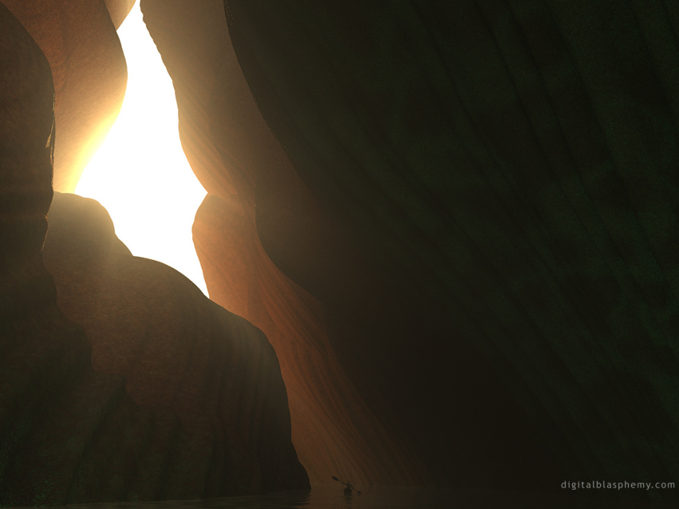
I think the original perspective is best with the water and the kayak guy in the frame. The 16:9 cuts off the bottom instead of the top, which I find kind of odd. Still a great background, just not how I would have done it.
Gilboron
I wonder… could this be part of the same cave as the one of the 2003 wallpaper ‘Cathedral’?
Getwired
…from David Helpling and Jon Jenkins. Feels MASSIVE and I can only dream of the huge “echo” you might feel if you were really there. I love the darkness and the warm tones together – very mysterious and somehow inviting. More on the new CD @ http://www.deepexile.com. I’ve always liked this one – great work Ryan!
Maria
Again, very ethereal. I love it.
Noah
This is still one of my favorites. I almost regret starting up all my apps when I’ve got this as my background, as then I can’t see much of it. It’d be magnificent to paddle through there.
Matt R
This image reminds me quite bit of a stop on my vacation this past summer. The Narrows, in Zion National Park; a six hour hike knee-to-chest deep in 20 foot wide river, with hundred foot cliffs on either side. This image captures the sense of isolation very well.
Masada
I really like this piece for it use of bright light balanced by heavy stone. The small figure doesn’t immediately grab your attention and thus provides a nice “hey, there’s a boat” reaction even when you’ve looked at the picture for awhile. I like pictures that have more detail to discover in them.
Tril
I love the use of perspective and lighting in this picture, and so rated it highly. It’s kind of a case of “what might have been”, though…I don’t use it as a wallpaper much because it’s just too monotonous. I wish the water and the boat were not identically hued with the cavern walls, realistic though it may be. Even a small splash of contrasting color would liven things up immensely.
Steven
I like the idea of this picture (it will not be one of my favorites because i love the night pictures with a nice sky full of stars).
One thing did bug me – the boat seems to be too low. If you have the taskbar on the bottom you can not see enough of the waterline.
What do you think?