Description
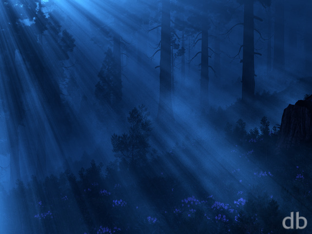
This is a sequel of sorts to Enshrouded which I have put together to test
out
Vue d’Esprit 10’s “Advanced Cloud Modulation” techniques.
Basically it allows me to contour the cloud layer to the
curve
of the terrain, so they appear to drape naturally over the
landscape. It’s a tricky procedure which I hope will be made
simpler in future versions of Vue (so I don’t have to height
maps
in Photoshop hopefully). It is a powerful tool however, and one
which I hope will bear more fruits in the future.
Your thoughts?


Bill [plusmember]
This reminds me of Montana mornings in the mountains!
Barbs
This looks SO real. It’s just amazing! You’re skills are awesome!
Hellsbells
After just a quick view i think this will find its way into my favorites, it really is WOW!
Adam
That’s literally what came out of my mouth when I saw this… “WOW”. Great workas always!
Ryan
Thanks for being patient. It is rendering slowly on my alternate box while I use Bucephalus to finish up “The Floating Garden”. It reports under 40 hours left so we’ll see…
Rob C.
Waiting patiently for dual screen version.
Ryan
The dualscreen should be finished rendered in a day or two.
Dustin
Love the fog renders. Any change of a dual-screen rendering in the near future? 🙂
Chris B
As others have said, this is a nice relaxing Image that your eyes just skim over back and forth especially with the sunset colors reflecting off the clouds. It’s missing that WOW! Focal point that you have in so many of your images.
I like it though.
Nick
Reminds me of the forests in the movie Avatar. Love this one.
Tom
Needs some more color…just to “spruce” it up.
Ryan
The dual and triple screens are rendering now on my alternate box while I use Bucephalus work on a new project. The multiscreen should look pret nice tough when it finishes. I zoomed the camera in pretty severely for the single-screen so there should be much in the way of barrel distortion in the wide version.
Karl
Need dual and tri screens versions otherwise this is awesome 🙂
Eric
In my stressful work environment; this one gives me a brief, but needed second of peace. This is absolutely a great followup to enshrouded. I cannot wait to get the multi-screens so I can use at home. Please keep up the amazing work!
Travis
…and that’s a good thing. When clouds contour the landscape, it should be a subtle hint, not sticking out in an obvious manner. This is a fantastic, subtle image with great contrast and great dark tones.
Ruminator
This wallpaper has the right combination of dark and light for my old eyes. It’s dark enough that I’m not blinded but the contrast provides interest without distraction. Thank you.
Gorgeous
The clouds don’t follow the terrain like a roller coaster because the landscape isn’t that steep. I think it’s subtle but wonderful on the gently rolling hills.
Zero
It’s realy beautifull… And I love the hint you get from it stating that it’s morning. You have several simular one, but they all seem to hint at a sunset… Also in oposite to the Enshrouded, this one doesn’t seem to be hiding something in the mist. From your Enshrouded I got that hint, thinking of the King Kong movie or others… But this is lighter and more relaxing… (Can be just me of course)
I also have to second Liquid, some threes seem to be a bit out of place. Particular the line on the upper left corner.
Terry
Like this a lot Ryan, I really like Enshrouded for the epic feel it had and this has the same effect, I have no idea how you do what you do and would love to learn. If you got time could you do some kind of article that shows how you put something together, how landscapes are built etc. Even if very general it would be interesting to see how it all works.
Keep up the good work!
Christian
I’ll second Skrit’s comments. The colours are lovely, the trees contrast brilliantly against the golden highlights and purple shadows. A few of the trees in the middle third of the depth look a little haphazard, maybe throw a few more in or take them away?
Excellent stuff, as always. Looking forward to the wide multiscreen.
Chris
I think its pretty nice, but it also seems very empty. It just isn’t quite as captivating as alot of your usual work. I’m not sure if it needs more trees, more light, or what, but it definitely needs something more. Perhaps some sort of rocky outcropping poking out of the clouds, or an old stone ruin of a cottage or a farmhouse would really add some character in my opinion.
Justin
I really like this one. The clouds and light sunlight on the right side makes it look beautiful. I can also see my icons on my desktop easily with this background! haha
LiQuiD
I think it would looke better with Alaskan rain forest trees rather then bright greens. Some tree placement looks great while other trees seem out of place. Please assist
Jase
In the preview image, you can see the top of the hill with sky in the distance. When you download the image, the hill and sky in the distance are cut off. Seems to occur with wide screen ratios. For me, the light you see in that area adds a lot of mood.
Beautiful though…just amazing.
Tyler
Nuff said
Littlemom
I’m not sure if I like the pink tones in this one, I however love the trees. Although it is a little busy for my liking. But as with any of your renders I will add it to my collection. I love how you evolve some your renders and keep all of them to show progressions. Thanks for the beautiful artwork Ryan.
Dan
I really love the new clouds! It really makes it look more realistic as you’d see it with the naked eye. Combined with the sunlight shining through and the trees… that looks like a photo!
Jen
The fog hovering the ground is very subtle but it is perfect for this and the colors are amazing. Your nature pics keep getting better and better. I cannot wait to see the dual screen on this one. They always have a greater sense of depth. Nicely done.
dmackoy
Think its great. Like the colors here vs the original.
Skrit
I really love your color choices, the purple looks great against the green base and yellow highlights.
I can appreciate the difficulty with ground-cover type clouds (having worked with some of that software myself in the past), and think that it’s beautifully done in this piece. I think it shows off the cloud contour capability far better than Enshrouded did (which I also liked).
Justin
Ryan – as always an amazing nature creation. This is why I signed up for a lifetime membership!
Looking forward to the dual screen ones so I can add it to my rotation with Chronowall (great program for your work by the way)!
Philip
Another fantastic one. I especially like how the fog disappears in sunlit areas. Definitely looking forward to the multi-screen renders.
Joker2632
I had it up on my screen at work and a co-worker saw it and asked if this was from my vacation. When I told him it was a rendering he was completely amazed.
Afya
One of my favourites, just stunning. I can almost hear the sounds of the forest waking up, softened by the fog.
What would make it perfect for me is if that eagle from Enshrouded found her way into a sunlit spot on this one.