Description
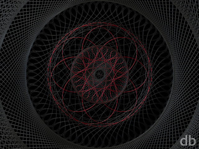
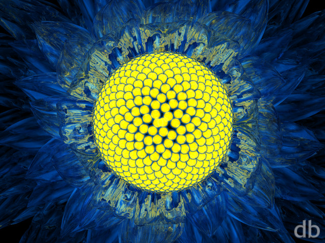
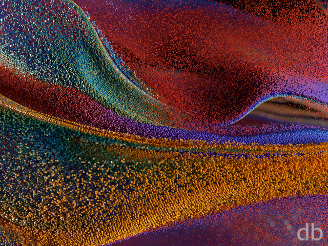
For a while now folks have been asking that I rework one of my earliest abstracts. That one is particularly tough to recreate though because it’s actually not a 3D render at all. It was one of my first attempts at visual artwork on the computer and I used a set of 2D filters in an early version of Photoshop. This was before I had a copy of Bryce and knew anything about 3D rendering.
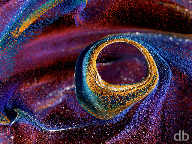
The first step to creating a new 3D version was for me to learn how to create a convincing “woven” mesh. Fortunately I found a method using Blender that produces pretty excellent results. This particular render is my practice with that method.
Obviously I need a lot more practice but this method can be used to create lots of interesting effects 🙂


 Fabrica: fabricagreenmarble
 Fabrica: fabricaredmetal
 Fabrica: fabricaredmarble
Len [donormember]
Ryan, the metallic look of the mesh is brilliant, and the different colors on the marble(?) are a nice contrast. No further tinkering needed!
Jenanne [liferplus]
Me too. I’d love to see a purple version.
Shawn [basicmember]
Title says it all, I like the pickle jars images as well but I never see this res available.
CS [lifer]
Very nice render. Would like to request additional colors if at all possible. Thanks
Seth R [liferplus]
I have been a fan of your wallpapers almost since you started as an online digital artist, and this has displaced a long time favorite as as my absolute favorite; I have set it as my startup screen on my PC.
Tim [plusmember]
I love this render. It’s stunning. Thankyou
Ozaawaagosh [plusmember]
The best Renders so far, they are breathtaking beautiful, so realistic, I love looking at these, they are my favorite wallpapers now on me iPad. Thank you so much Ryan
Brandon [lifer]
I have fond memories of all those relatively simple Bryce rendered wallpapers made of metal, glass, and shine that were all over the internet in the early 2000s, and this reminds me of those. I love it!
Tim Mason [basicmember]
How do you come up with these??? Instant desktop background choice….at least until next update!
itsamenow [basicmember]
I’ve been using your wallpapers for many years now and I have to say that this is probably the most beautiful screen I’ve ever seen. I literally have to stop myself from staring at it. Again…WOW!
Lisa [lifer]
I love this SOOOO MUCH!!! It immediately went onto my desktop!! I adore the elegant simplicity of this and the realism and colors of the sphere. I’d love to see pickle jar versions of different sphere color combos too! <3
Fonkin [lifer]
The 5760×1200 compared to the 3840×1200 is blurry. The marble and the mesh are crystal clear in the smaller size. Hopefully Ryan can fix this. Really a great render. Thanks.
Billy D [basicmember]
I’m not an artist, but I am particular about what I find visually pleasing, and this is absolutely on the mark. The subtle colors around the ball, the way the light reflections are rendered, and the waves of the surface are all mesmerizing. I could stare at this image for quite some time!
Eric [liferplus]
What a throw-back! H20 Weave was one of my favorite backgrounds way back when. Fabrica is an incredible transformation from then to now. What an incredible example of using technology to make us stop and think of the simplest, least-technical things in life. Bravo, Ryan!
Gene [lifer]
I’ll readily admit that in the past, I wasn’t a huge fan of the DB “semi-abstracts” (my awkward term) like this. I didn’t dislike any of them; they just never struck a chord with me. This one is different — very different. The technical execution is simply stunning. And an order of magnitude beyond that is the quality of what’s portrayed – and here my words fail. I could just sit and stare at this image for an hour – just for the sheer enjoyment of staring at it.
And a little side note to ponder: in “real” photography, capturing an image of a spherical reflective object (even only partially reflective) always seems to reveal a photographer (or the photographer’s clever attempts to hide). In this one, the total lack of any sign of a photographer just adds more to the magic of the image. It’s a 10!
Jeff [liferplus]
While I enjoy some of your rich, complex pieces, it’s the simplicity of this one that really makes it beautiful! A new favorite, I think.
webworx [liferplus]
Thanks for a very thoughtful remake! The work you went through to accomplish this work is much appreciated!
Scott Wilkins [lifer]
My eyes see a slight movement effect in this image, like the darkness is closing in on the marble. Very neat.
Scott [lifer]
My eyes see a slight movement effect in this image, like the darkness is closing in on the marble. Very neat.
Telaria [basicmember]
GREAT job, Ryan – LOVE this!! Thanks!!
Jenanne [liferplus]
I confess, I was one of those folks who kept asking for a remake of H2O Weave. I can’t thank you enough. I just love this!
Steve [lifer]
I agree with your son — these simpler designs make better backgrounds. It’s like the way that “chamber music” is meant to be listened to while you’re dining with the king: it needs to blend into the background even as it needs to bear up under scrutiny.
Just one thought — we work with the background centered in our screen as single-screen users, and so having the design element in the center of the screen doesn’t work so well. You get that in the multi-screen renders. This is like the advice that simpler is better. Off-center is better, too.
Tansen [nonmonthly]
The work itself is amazing but the lighting kind of looks like it is fading in and out. Which I find is awesome. even if this is not the intention, still pretty cool. 🙂
Anton [liferplus]
Just wow, the simplicity mixed with color. This is just abstract by definition, this is art.
Taki [lifer]
I’d like to add my voice to the chorus requesting other colours, specifically a transparent version in purple or violet.