


Description
I set out to update “The Comb” but took a detour somewhere and came up with this. The revision goes even further away from “The Comb”, with the addition of some vertical columns.
The basic theme was very much inspired by “Giant’s Causeway“. I would like to do a natural version someday…
 Hexaline: hexaline1
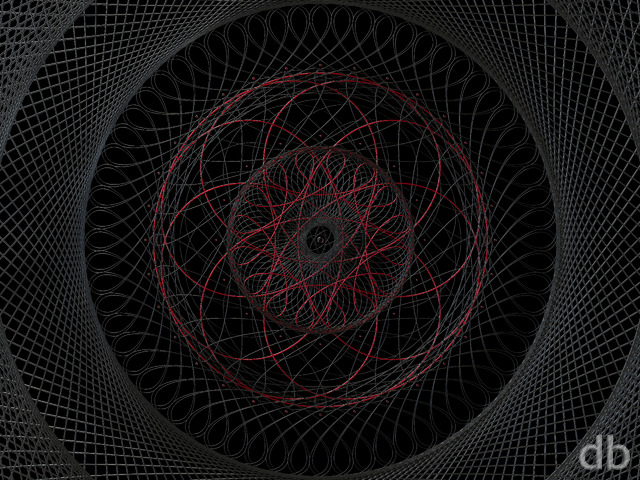

nickaix
I used to prefer the abstracts (a few years ago, when I first began seeing walls from this site on friends computers), but with your ever-increasing skills, the realistic scenes have become amazing and my new faves. But the best is when you somehow combine the two, e.g., Phraxis, which has been on my TV for over a month now.
Sam
I prefer the abstracts. Not to say the others aren’t really good, but I am here for the abstracts and wish you did more of them.
Sam
I prefer the abstracts. Not to say the others aren’t really good, but I am here for the abstracts and wish you did more of them.
Kempeth
It’s a tough call to make. One of my absolute long time favorites is Containment but there are so many more images in the realistic categories that it’s much simpler to find some I really like.
In the end I’d probably have to “vote” for the realistic ones but I would really miss it if there weren’t any more abstracts…
cMac
I joined for the scenes that take me to places I can’t experience in the office. But it is the abstracts that open the mind and introduce a color scheme you will never be able to encounter in life.
Granpuff
I like them all but the abstracts look absolutely amazing on my dual 1920 X 1200 24 Inch monitors! The space where the two monitors butt up against each other isn’t as noticeable as with the realistics, especially when the “main focus” of the art is on the left monitor. I only wish ALL of the abstracts were converted to dual screen! I just renewed for anther year! Keep up the great work and my condolences on the passing of your grandfather…
N
I like the landscapes the best but variety is the spice of life – your abstracts are brilliant too so please keep doing whatever you want to.
celmendo
I like this better than the last three you’ve done by a mile. I don’t know that I like abstracts more than the realist efforts but any real margin. I just know when you do it right it jumps out at you no matter the subject. This one was right for me.
Terry
Art is a highly personal and often intimate process, culminating is some sort of end product, whatever that is. Nonetheless, all art is ultimately created for an audience of one – the artist himself. If others happen to garner meaning from it, then that’s their perspective. When you start making art for the masses, for the accolades of others, then it ceases to be art.
Thus, follow your process wherever it may lead you. If it comes realistic, abstract or incomprehensible, then thatâs what it is. Let others deal with it in their own way; whether they love it or hate it is their own problem.
Mike Barbe
Abstract and Nature Scenery are my two favorites.
Sovereign
I like both, honestly. Part of the reason I subscribed here (lifetime FTW) is because there’s a good mix of both abstracts and realistic renderings. Sometimes I want realism (winter wallpapers) but sometimes I’m feeling “sci-fi” and want something else. Etc.
Will
I tend to like the landscapes the best, but this one is pretty neat. I feel like I am looking at a cross section of some fiber optic cable. Great job.
Miguell026
i like the colors!
great abstract!
Dan
I think it’s safe to say that whatever you decide to make will be fantastic. I personally love the realistic renders, but abstracts are just so refreshing – especially one as complex and ‘heavy’ as this one is. Just make whichever one you are inspired to make, I guarantee that we’ll all be happy with it regardless.
Ben
On the abstract v. realistic question, I still really hope for an update of H20 Weave. I’d eat the colors in this one, and it’s the one that I first fell in love with here.
http://digitalblasphemy.com/preview.shtml?i=h20_weave
Ben
Also, this is one of my all time maybe 10 favorites. 2010 has been a helluva year for you I think, and this will absolutely be on my desk in heavy rotation.
Ben
Add this data point — I (and I suspect others) tend to compliment and rate the realistic works, because we have a reference point to say “WOW!” However, the abstract ones are in the heaviest rotation on my desktops both at home and the office, and the ones I keep going back to. At the end of the day, it’s your sense of color and balance that makes these work, and that comes out most clearly in the abstracts, as much as I tend to heap praise on the realistic stuff.
Chris
I rarely, like I mean RARELY, use your abstracts as wallpapers. They’re always great, but I’m a much bigger fan of your scenery pieces. This one, however, is amazing. One of your best (if not THE best) abstracts yet.
Scott
I love your abstracts–“Circular Logic” is on my widescreen monitor right now and it’s amazing–but this latest one just doesn’t do anything for me. Too busy with no real focal point maybe. As far as the realistic scenes go, your space images are my favorites, especially the nebulous ones like “Starbirth,” “Firmament,” etc.
Wraith
I luuuurve Nature & Space wallpapers. The occasional abstract is good too. I love like 999/1000 things on this site, so whatever you feel like doing, do it. 🙂
phealy
I tend to prefer your abstracts and space images, though a few realistic ones have caught my eye (Green/Red and Gold, Haiku, At World’s Edge).
Jim
While I like your “realistic” images, particularly the space images, more in general, there are abstracts that really grab my attention, such as this one.
It’s your brain, Ryan, and whatever needs to be “let out” at that point is what’s going to come out and, chances are, most of us here are going to like it any way…
Brian
Most of my personal fav’s are realistic daytime scenes (Dome of the Blue Seeress, Highland Spring). But there are some abstracts that I really like (Dispersion, and now Hexaline). So I vote to keep the abstacts, just not to the exclusion of your other fine work.
Josh
I like both, but I am not a particular fan of your “gas-cloud” abstracts like “Ephemera,” “Resonance,” and “Aurulence.” I love some of the other ones, like this one, or Cerulean, and I’m a big fan of your realist images. Niflheim is one of my all-time favorites.
littlemom
I personally perfer realist, but understand about clearing out the cobwebs. Keep doing what you are doing Ryan, no matter what your work is awesome
littlemom
I personally perfer realist, but understand about clearing out the cobwebs. Keep doing what you are doing Ryan, no matter what your work is awesome
Ryan
Thanks for the feedback everyone. Good point Piano Man. I hadn’t considered that aspect before.
Becca
My favorites, Ryan, are neither abstract nor realist, but your deep space artwork. For sure, nearly everything you do ends up on my desktop for a little while…but the space art is what stays for weeks at a time. Right now, I’m featuring Roche Limit on both my desktop and my ‘Droid phone.
Piano Man
I, personally, like the more abstract stuff. Other windows cover most of my desktop anyway, so I mostly only see the edges of the images. The abstract ones generally have more interesting colors throughout, whereas the realistic ones tend to have the subject matter nearer to the center.
Michael
A good mix of abstracts and realistic wallpapers is very important.
Jordan
I really like both types of work. I switch up my wallpaper fairly often, and generally like your new work. I guess I sometimes like the colors of the abstracts more than the realists.
Shahea
I like the abstracts once in a while. I like the realistic ones as well, but I actually thinkthe abstracts can be a lot of fun. You can see in them different things. I’d personally love to see you start something with a fractal and let it bloom from there.
Ted
Actually, I think it’s the variety that keeps things fresh. Specializing too much will just lead to creative burnout. So what if I like some themes more or less than others… I want to still be enjoying your new creations 10 years from now.
mnarayana
Although I favor the realistic images, its good to see a new abstract work once in a while. Adds more variety. Keep them both going! 🙂
Scarr
As most people are saying, both are necessary, and both are wonderful.
Gabacho
I like your abstracts best.
GMaster7
Ryan – I love both, but I really prefer the abstracts. My policy is to always have your latest wallpaper applied as my background, so I get to see and enjoy all of your work, but I’ve always preferred the abstracts. You had a run around 2005 of stuff that I still revisit from time to time – I love the techy, colorful stuff. My favorites are Sublimation, Circular Logic, Episteme (you can sort of see a pattern) – love your space stuff, too! Keep it varied and I’ll stay happy!
anna_writr
Well, the answer is that it depends. Your Mandelbroht-like abstracts are favorites of mine, but other than that I prefer the more realistic, landscape type wallpapers.
adam
The Hexaline dual screens are awesome. I like abstracts.
Dan
Ying and Yang, light and dark – all require balance. I love both which isn’t a very helpful answer mayhaps. Either would saturate the visual palette even if you say you hate the other it serves to balance and provide a new appreciation for whichever your preference. Ultimately, you’re the artist and doing what you feel like attracted all of us thus far so …
Michelle
As others have said I really enjoy both the realistic ones and abstracts. I’d love to see you do a bit more variety. Abstracts are more hit or miss than the realistic types rating wise, but Digital Blasphemy wouldn’t be the same without them. This is one occasion where I wouldn’t get fixated on the rating. I also think for things like Decagirl, abstracts would work particularly well.
Lidia
I love both for different reasons. I love that there’s variety. I agree with those who said it’d be nice if it were more 50/50 between realistics and abstracts. You’ve created some really awesome work with abstracts, so don’t pay too much attention to those who say “it’s not my cup of tea”, because for every one of those there’s one of us who’s really enjoying that cup of tea. I know comments and reviews can be helpful, but don’t get too caught up with them; you’re the artist.
AriW
I love the abstract images you produce. They often have a sci-fi or scientific feel to them, and to me they look cool. They’re a great break from landscapes and space scenes, and some of my favorite wallpapers are abstract.
Michael R
+1 for preferring the abstracts. I wouldn’t want all abstracts all the time — variety is still the spice of life — but new abstracts grab my attention and hold it much longer than the realistic scenes.
Adam S.
I love your abstracts. I think they are more creative and interesting than the realistic stuff.
Adam S.
I love your abstracts. I think they are more creative and interesting than the realistic stuff.
Brandon
I joined for your abstracts but love the last year or so of realistics. I would like to see more abstracts since that is my first love for backgrounds (that and space scenes), but like Larawen said I think a 33% Realistic, 33% Space, & 33% Realistic would be a better mix (Or does space go in Realistic catagory?) =)
Larawen
I love both, but I would prefer to see more of a 50/50 mix. When you consider how long it takes to render realistic views if you did one, then the other you could delay the release of the abstract so that it felt like there was more of a even flow of art being released.
Jenanne
I like both, but I’d love to see more abstracts. I prefer them to realistic scenes, and I have noticed that you’ve rendered fewer abstracts in the last year or two. Thank you for asking!
Nefrubyr
I recently got moved to a 27″ iMac at work, and I thought I noticed a steady increase in the number of wallpapers at 2560×1440. Ryan, you’re an absolute champion!
b0bb1ns
I love the realistic/scenic images, but I think the abstracts are a great addition and I prefer many of them to some of the realistic scenes.
Looking at my current selection of your images on my wallpaper slideshow I use about 1 abstract for every 3 realistic scenes
Jonathan L
I’m all for realistic. 🙂
But, I have no complaints about your abstracts either… I like seeing the variety that you deliver. It doesn’t matter if I like it or not, use it or not, etc.
Tim
Ryan, I love your work, both abstract & realistic. I have a mild preference for the space scenes.
Heather
Keep being creative.
Doctor D
I’ve always enjoyed the space scenes, and they hang around on my desktops for long periods of time. The next favorite is the abstract, but I appreciate the work and creativity that go into the realistic scenes.
Amusingly most of my desktops at the moment are realistic scenes.
Luc J
Just follow your intuition.
Forget about fan comments. Thats when your creativity flows and that’s when we eventually get your best artwork. One thing that’s good about some comments is when users spot a pattern in your work, then they can warn you about your work starting to repeat too much. But trying to please some fans (you know the type) can lead to a creative desert and an insane amount of repetition. My only advice is too take risks, try new stuff and use everything you can lay your eyes on as a source of inspiration.
Jonathan
The realistic wallpapers are my preference, especially outdoor scenery and space. Still, I think the abstract pictures are crucial and some of my favorite DB wallpapers are abstracts as well (like Spark, Containment, and Axiomatic).
Jonathan
The realistic wallpapers are my preference, especially outdoor scenery and space. Still, I think the abstract pictures are crucial and some of my favorite DB wallpapers are abstracts as well.
Mike
Realist tends to inspire more, especially those with scale and spectrum.
kellzilla
I’d prefer you do what you want to do, and not what your comment-makers want. We may be paying customers, but we’re not your boss.
Greg in CA
I think I like abstracts just a LITTLE better.
Reuben
I would really love to see this wallpaper to become a persona, if it does i’ll actually replace corona (my current one). In terms of abstracts vs realistic, I really like the amount of both you are doing, because everytime you do an abstract, they are awesome. For example this and cerulean. I enjoy both keep up the good work.
Cheers
mpyne
I’ve always preferred the abstracts, although the recent realistic art has been very well done as well.
James H.
…although I also enjoy abstracts. For me, your realist images inspire awe due to their scale and detail. However, abstracts are a great break for our world and can inspire just as much awe (take Hexaline for example, and it’s endless pillars on the left). In the end, I think you should do whatever you want, just as long as you keep making them as awesome!
Paul
I love the abstracts. Some of my favorites are the non-circular abstracts. I particularly like Dispersion and Azula. This one isn’t as spectacular for me (I think) because I don’t get enough detail on my mobile phone. There just aren’t enough pixels there for all the detail in this.
But I’d say the abstracts are necessary for some of your fans too. I think they make some of the best desktops.
Seoman
While I really enjoy your “realistic” works, especially the planet/space-scapes, your abstract work is some of the most interesting, especially if they play with your sense of dimension or space, or suggest something that could almost be real. The only abstracts I’m not particularly fond of are the more “flat” ones (like the ones based on fractals and such).
cthulhu
I think instead of listening to every ones opinions you should just create what you create. Not everyone will like it so what. Do the art for yourself and if someone whines too much about it they don’t belong here. Based on some of the comments it looks like people feel that if they buy a membership you are their employee. To hell with comments and ratings. Please don’t create based on that.
Dave T
I love them both, actually, and my favorites might be abstract-influenced realistics, but I really love your abstract stuff. Especially on my laptop. PLEASE keep ’em coming!
And, dude, Mars — phrase your feedback nicely.
Joel
I like both, but I find that I can admire a “realist” art work for much longer. Which leads me to ask – how do they compare in terms of time to create?
Isaac
i prefer abstract. am sad that there are fewer lately which i had noticed but the art is awesome too so i have no complaints
Mars
Not feeling or enjoying this one…. i guess you have to drop a few crappy ones to make the good ones like “Solace” to bloom.
Torrey
I’ve always felt that the best art is the stuff that you desire to make. More desire means more thought and theoretically a better picture – So keep giving us whatever pops into your amazing brain!!
Chris B
I do like it when you throw some abstracts in the mix. It seems like you can do more of them quicker because they don’t have to render nearly as long because they don’t have to be as realistic (at least I think) and it’s always a refreshing change to the scenes. Gives my computer a new look!
Jesse
I’m usually not an abstract fan but every now and then one appeals to me. This is one I really like. I think the hues are what sealed the deal for me on it.
Jon
Love all your work, just as long as you release it in dual screens!
Dan
Excellent render! I agree with the previous comments regarding abstracts. They may be a specialized taste, but for those of us who have said taste – it’s exquisite. Keep the abstracts coming!
littlemom
Much better. I looked at the Giants Causeway that this was inspired by and now understand this abstract. I think a Natural version of it would be awesome if you ever feel inspired to create it. Thanks Ryan for your beautiful artwork.
cjsdelray
This is impressive – and the depth and detail of the image is just incredible. Nice work
0beron
I love the composition of this one, I’m one of the fans of your abstracts, but the last several images (hexaline, subarctic, sanshui and solace) have all looked too dark for my liking.
spaceyjase
Not so keen on this one. There are too many ‘broken’ columns and there’s a darker area around the centre of the image compared to the original. Still a great picture though!
Kristin
Absolutely love this abstract!!! Lots of depth and I could sit and stare at this for hours and always find a new perspective to look at! Both versions have this. J’adore!
RCD
Great job on the revision and thanks for the link to the “Giant’s Causeway”, it helped put the image into perspective!
John
How can anyone find fault with this one? AWESOME Love it Ryan. Thanks again for all the work.
Duncan
Now this would make a great theme for Chrome…hint…
Rick W
This one reminds me of supermans home planet Krypton witch was destroyed by supernova explosion.
Chris B
after a bunch of scenery, an abstract is awesome to see. I like both renders very much, makes me wonder just what is making it so red on the left hand side…
Brian
My monitors can’t wait for the dual screen render… 🙂
Tyler
I joined for the abstracts & planetscapes, so obviously I’m completely sold on this. I love the pickle jar but lean towards the revision. The update has more balance between red & blue, and makes for a gratifying wallpaper. Thank you Ryan for appealing to the DB minority this time 🙂
dmackoy
the new changes have really added some amazing depth to the scene. The scale, colors, and organization really pull this one together. thanks for the update, Love it!
Gummy
Wasn’t completely sold on the first version (though I did like it) but this one is great.
Yes, we know – some of you don’t like abstracts. Some of us love them though and we’re glad when Ryan adds one to the collection.
John Munro
I think the left hand side of this wallpaper rotated until the pipes are vertical and using only one colour would be a really good wallpaper
E_man
Very nice! I actually prefer the origonal pickle jar, but both are great. Can’t wait for the 4800*1200!
DomP
My parents live about an hour away from the Causeway and I have been there many times. I think this is a brilliant representation of the rock formattions there.
Scott Wray
By adding more blue into the red section it gave the image much more contrast and made it flow easier with my eyes. nice update ryan!
Ryan
I know abstracts do not have universal appeal, but it is necessary for me to vary up my routine and shake out the cobwebs from time to time. It’s just like the human body needs regular sleep and dreams to function properly.
Ryan
I really like this one, though it took me a few moments of looking at it to figure out what i was seeing. at first glance, it reminded me of Indra (2002).
I would really like to see this from a few different angles, and perhaps with a little less intense red lighting – it seems like some of the back pylons lack definition.
Seth
Terrific depth and makes you want to examine it closer to wrap your mind around it. Love it.
littlemom
Wow not my favorite at all. I prefer your scenic renders. I don’t know what it is that I don’t like but this is definately not one I like too well. But I do understand youwanting to do something differnt.Just not my favorite
Dave T
I liked the first one, but I like this one even more!
John N.
I don’t care for this one at all.
lucifer
Don’t like it. Can’t figure it out
Lidia
This one does stand on its own, but do retry the “The Comb” update; I do love the abstracts; they’re some of my favorite images. Colorwheel is up on my screen right now.
Walo
Looks to me like a mix of Orthohedron with a little bit of Containment. Looks nice.
Slizbury
We visited Giant’s Causeway in Northern Ireland last year, which has naturally-formed hexagon-shaped rocks; this reminds me of being there, albeit in sort of a different-colored way! 🙂
Some pics of the Causeway:
http://www.google.com/images?hl=en&q=giant's%20causeway&um=1&ie=UTF-8&source=og&sa=N&tab=wi
Dave T
I always love your abstracts. This one is no exception.
zt99
No 1280×800 resolution for 13″ MacBooks and MacBook Pros?
Jonathan L
This is by far my favourite abstract of yours, Ryan!
Thank you! It’s so neat!
Jenanne
This is great! I love your abstracts in general, but this is really special. Thanks!
spaceyjase
I really like this piece. There’s the immediate draw of the larger red area but then the eye is pulled away by the blue area, starts to notice the shapes and how the picture is composed. Cool.
Walo
This update has better contrast and is more defined.
Kirk
I’ve set this image as my background, although I’m a bit confused at exactly what I’m looking at… looks cool though!
Ryan, do you think you could have a page that includes the current version of an image and all the Pickle Jar versions so it’s easier to see what you’ve changed?
Kody
hey ryan great add, little too much red for me in the left but abosolutely amazing 🙂
keep up the great work!! and i would love for this to be a persona if you get the chance!!!
Andy
Love this one Ryan. Something different for a change. 🙂
Tim
I like it, its cool, its different. Keep up the good work ryan !
Marco
Fantastic Wallpaper Rayan….Pure Chemestry.
It remind me of a video I’ve seen few weeks ago about Zooming inside Carbon Fiber.
http://www.youtube.com/watch?v=q0mQk1s4tKo&feature=player_embedded
Keep it up
SpeedyJ
Mike
Ryan, love this piece! But the iPhone 4 size is the old 320×480 size.
Greg in CA
Why not try updating some of your oldest pieces, like “Armada II”, or one of my favs from the old days “Don’t look into the light”? I know the anti-people contingent would disapprove, but what about a trilogy featuring “Creation”, “El Dios Del Fuego”, and “Frio”? Just some suggestions…
betsey
don’t have time to compare “the Comb” side by side with this–maybe tomorrow–but I do think it stands alone.
Timmo
Love it!
For some strange reason the lighting in the blue part reminds me of Doom 3!!!
dmackoy
I too love the abstracts but im having difficulty find the “wow” moment in this one. Maybe its the sheer chaos of the left side im just having issues with.
Duncan
I like Ben’s idea…maybe not the starship Enterprise but how about combining renders and add in Gaia Station (1998)
tremby
Hooray for new abstracts! But I would love to see the updated The Comb all the same — it’d be great if you finished updating it!
Greg in CA
Next to the space scenes, the abstracts are my favorites. This isn’t my absolute favorite, but I definitely like it!
JD
The Comb (in all its colors) is one of my favorites.
This one – not as much.
I like the hexagons and the shadows, but not the “whole thing”
JD
The Comb (in all its colors) is one of my favorites.
This one – not as much.
I like the hexagons and the shadows, but not the “whole thing”
Ben
… is to place the Enterprise somewhere by one of the hexagons and we can re-enact the first movie. VGer Lives!
I kid, the wallpaper is wonderfully put together. I’m not a fan of abstracts in general (personal preference, nothing to do with your skill, Ryan), but this one is great.
extstgleft
Kinda reminds me of huge ocean waves. Neat.
Will
Well done!
Nicholas
That is really cool!
Greg
Woah, thats gotta be high poly! but its pretty cool!
Truett
I have to say this is one of my favorite abstracts that I have seen in awhile. Great job (as always)!
Wombat
Abstracts remain my favorite Ryan. You’ll be pleased to know that this is now my desktop.
The Guru
I LOVE the new one. Talk about taking something from good to great with just a few small changes. I normally don’t give abstracts a ten, but this one gets one. Good work!
Oh, by the way, am I the only one who is reminded of the incinerator in Toy Story 3 when looking at this picture?
Doug R
I prefer the pictures of cool things that don’t exist, like views from other planets and giant castles. That’s the whole point of having rendered wallpapers as I see it; otherwise I might as well just get some photos of things. Abstracts are nice as well, although I’m not likely to actually use them for anything.
You haven’t done any large man-made thing lately, if I recall. I’d like to see more giant pillars and such with this generation of graphics
Russell
My preference lies with landscapes and planetscapes, but more along the lines of your earlier work before you started including the ‘realistic haze’ that one sees with a normal photo. I’ve always felt that infinite view that shows us detail that we just don’t see in real life is what made your work so special.
That said I don’t have anything against your current work, I just feel it would be that little bit more special/unique if it retained that quality of infinite view.