= Add to your a la carte shopping cart.
Single Screen
- Lossless Master plus
- 1024x768 (4:3)
- 1152x864 (4:3)
- 1280x800 (16:10)
- 1280x1024 (5:4)
- 1366x768 (16:9)
- 1440x900 (16:10)
- 1600x1200 (4:3)
- 1600x900 (16:9)
- 1680x1050 (16:10)
- 1920x1200 (16:10)
- 1920x1080 (16:9)
- 2160x1440 (3:2)
- 2560x1600 (16:10)
- 2560x1440 (16:9)
- 2880x1800 (16:10)
- 3456x2234 (MBP)
- 3840x2160 (16:9)
- 3840x1600 (21:9)
- 4096x2304 (16:9)
- 5120x2880 (5K)

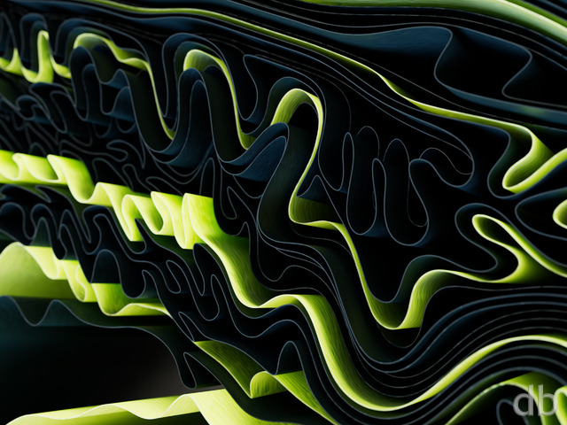
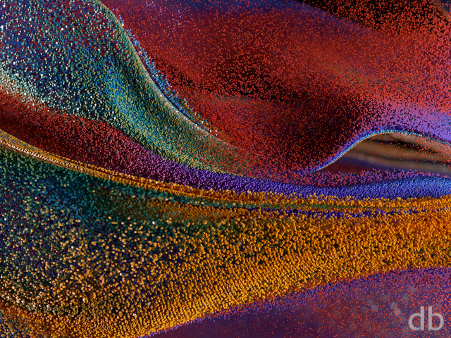
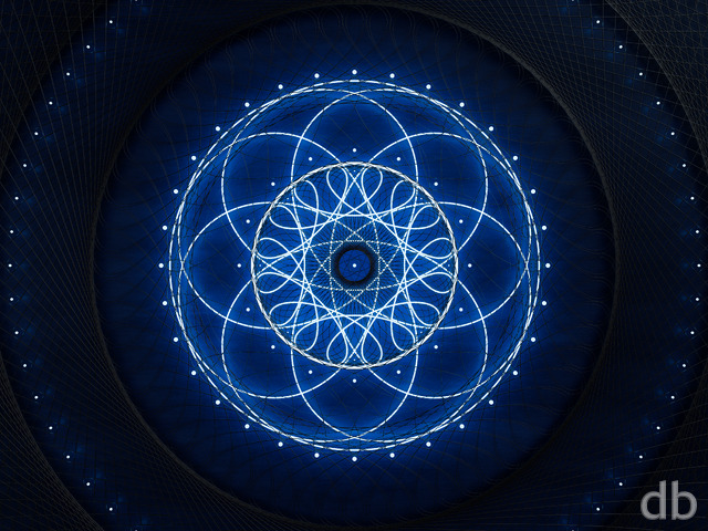
 Annuli: annuli2
 Annuli: annuligreen1
 Annuli: annulired1
 Annuli: annulibw1

CmdrBubble
i noticed that only the original render has a .png version, do the picke jar renders not get them generally? this is at 1440p if that makes a difference.
BluesBud
Sorry wrong resolutions if anybody is interested. The Sony music player uses 360×480
BluesBud
Sorry wrong resolutions if anybody is interested. The Sony music player uses 360×480
BluesBud
I’m loving these abstracts as Wallpaper for my Sony music player(in 360×460). Much better than what was provided with it when I got it. Keep’em comin’ Ryan!
West
i’m really glad you’re doing pickle jars for about everything now, these look great.
Fumigator
I like this abstract quite a lot, and while I understand you have moved on to other projects, I still can’t help but mention the dual-monitor version misses the mark as far as composition goes. The original has an interesting cone/spiral line which draws my eye in and up to the darker area, then back out again. Unfortunately the dual-monitor version has eliminated this, focusing on the lower half of the image and it results in nothing that really jumps out.
It kind of seems like the only real solution is to create an image originally for 2 monitors and then crop out of that image for the single monitor version. I’m fully aware how impractical this is so I guess I’m really just venting for no reason.
Maybe every once in a while you could design an abstract using a 2:1 ratio? Something chrome-y? :p
Ryan
Thank you! They are great memories but still painful at this stage.
Erielack
Thanks for sharing the great video clip. I am sure it brings back a lot of great memories not only of Ian as a little guy, but your dad as well. Take care. Brett
Ryan
I’ve uploaded a new 3840 x 1080 version with a corrected watermark. Thanks for bringing this to my attention!
SundogVet
I use 3840×1080 across two 1920×1080 monitors, with the right (patient’s left) being the main monitor. The watermark is in the middle of the lower part of the main screen now; it’s right where my eyes rest. Would you mind putting it back in the corner? You are due all manner of credit and respect, but it is disruptive.
(Pardon my lefts and rights. Never ask a physician for driving directions.)
Dustin
One of my new favorites, in addition to Archaea, Aurulence, Ephemera, and Helios. Would love to see more along these lines 😉
My coworkers always ask what the heck is on my desktop. It’s fun to guess what they could be… a bundle of zippers? red velvet frosting? Always interesting and soothing on the eyes. Keep it up!
Ryan
Which resolution are you using? It is possible the watermark was misplaced.
SundogVet
I’ve loved this site for 10 years, and I love the immersive feel of them. It’s like I could walk into the screen. There was a little “DigitalBlasphemy” tag in the lower left corner that I was proud to show people. Now it’s in the center of my main screen, and it’s aesthetically disruptive. I’m hoping the signature becomes subtle again soon.
Rob C.
Especially love all the pickle jar variations… hard trying to decide which one to add to the rotating list! Thanks for the multi-screen versions in the pickle jar, too!
Alex
You wouldn’t happen to be making any dual or triple-screen copies of the pickle jar versions, would you?
Branson
Heya .. this looks like someone pulled a dartboard apart.. great image!
Ryan
Thanks for the heads up. You will find the 3840 x 1200 version here.
Rob
Very nice but my usual desktop resolution is not available for download on this wallpaper. Dualscreen 3840×1200.
Michael T
I personally would love to see each flavor in Dual-screen as I rotate quite often can see using each of the variations on
my dual screen. Hint-hint 3360×1050 😉
Nick R
this one actually gets better the bigger the screen you put it on.
Ryan
The consensus seems to have formed that “Annuli3” is the superior wallpaper so it will now represent this fractal in my gallery. The rest will, of course,remain available in the pickle jar.I have a new landscape project going now so I doubt I will do any versions of this one. No ETA on the landscape but it is showing promise!
Lidia
The black & white fits this image quite nicely! But what would look even better is a black and white version with just a few small hints of color here and there…
Chris B
has a LOT of potential! I like it but it is missing something, like it is only Black & White rather than Metallic. It needs some shine or reflectiveness added to it. The other versions have some grey shading to enhance the image that the B&W doesn’t for obvious reasons. Not that I expect to work the whole image over to get those effects, just my observation on it.
Alex H
I love it when there are colour variations. And I especially love it when there are black and white colour variations
Littlemom
My personal preferences of this render are Annuli green1 and annuli3. Love both of those for sure, the rest really do nothing for me, but I prefer your space and landscape renders over the abstract ones. But you always do such great work, I have all the different renders of this in my collection. Thanks Ryan
Ryan
Sorry about that. Here’s the iPhone4 version.
KF
Couldn’t find the 640×960 render of the green version in the Pickle Jar. Am I missing it?
These look great btw.
Lidia
Thanks for the variations! I think I like the original focus and colors best. I’d be interested in seeing more color variations that include different colors like Annuli 1 & 3 (multiple colors work better for this one than a single color).
That’s a really sweet video of Ian with your dad. Times like those are certainly worth cross-country moves.
Chris B
Annuli 1 & 2 are my favorites especially if you are going for an inorganic look, more grey and metallic. I can’t decide if I like the closer ring to be in focus or the middle ring. The middle ring also hits the bulb at the top which is nice but the closer ring looks like it is coming out of the screen at you when it is in focus. It’s a toss up.
Always love the Abstracts.
The green one reminds me somewhat of the Borg. If there were some spines or something like Nanocyte ( http://digitalblasphemy.com/preview.shtml?i=nanocyte ) in each of the divots to make it more menacing.
Jeff K
I like both pickle jar variations. I like the colors of the first and the focus of the second. As mentioned previous, how about something in the middle?
Nicholas
The coloring and lighting looks better on the other version (the darker hues are gorgeous), but I do like being able to see the detail of the foremost ring. Happy medium somewhere?
Love this one, anyway. Definitely among your best abstract work!
Nick
It reminds me for some reason of the big face at the end of the third Matrix movie that Neo comes in contact with. Slightly.
John
I really like the detail I see in this wallpaper, along with the perspective that it’s been given (i.e. the closer strands). The color and the lighting are well done throughout the design. Well done, Ryan.
Lidia
Nice new abstract. I think you succeeded at nailing the “inorganic” feel.
I like the variety of your work.
Josh
I love it, but would love it even more if the closer strands were in focus 🙂
Thomas
Looking forward to the dual screens!!!
Another really great picture!
Jonathan A
this is freakin’ beast man.. I’ve found my new wallpaper.
Ryan
I run Mandelbulber in Wind7 but I’m sure it would work equally as well in MacOS. It is open source so there are quite a few different versions. The only editing I do in Photoshop is a little bit of playing with the levels and saturation. I render these very large so they look smooth when I scale them down (haven’t figured out anti-aliasing yet).
Gregor
Do you run Mandelbulber in Win, as well? I assumed it was especially for MacOS, but then a quick check turned out it’s “available” for windows, too. Or did I get something wrong there? Nevertheless, another great piece of art. I just hit the “render” button but came out with something resembling a fruit with a white to blue gradient background… needs some more tuning! 😉 Are your works with Mandelbulber being edited with Photoshop or anything like it after the render has finished?
Ryan
I actually run my MBP in Win7 most of the time (because I have had trouble accessing my network shares using MacOS). Another reason why the video card is wonky I’m sure…
Gregor
I loved this one from the moment I saw it. I’m especially intrigued since I installed Mandelbulber on my mbp after reading your comment about it being the only software that doesn’t crash in MacOS. I never really tried creating an image myself with it, but just to see the possibilities already makes me curious about it. Maybe one day I’ll come up with a stunning piece myself 😉
JDD
nice to get another abstract in the rotation.
Greg in CA
Thanks Ryan!
vaul
I like this, but I’d have to agree with Jeff that the closer strands need to be in focus.
Jeff K
Love it! The colors arent too overwhelming which is nice. It would be nicer however if the focus was much closer. I would love to see the detail on the foreground strands.
Alex H
The colours in this one are AMAZING. I love it. Personally I’m not too fussed about having the focus on the background. Still looks awesome. Although if you could find a way to bring everything into focus at once it’d be sick. (I’m guessing doing two renders from the same camera angle but with different focus and then merging somehow in post processing?)