Description
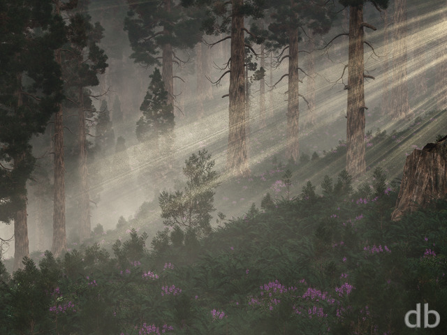
With this piece I am trying to picture what “Highland Spring might look like viewed from
below. The title comes from a scene I put together in 1999.
I may yet tweak a few things in this scene but I think it looks pretty nice for a first draft. Let me know what you think!


 Sierra: sierra2k121
Ryan
Probably not until I can build Project Shadowfax. This render took forever at only 3K!
Plasma
Would it be possible to get a 4K render of this Image? The “autumn” version is also available in 4K, but I like this one alot better 🙂
ScottG
Hey Ryan.
Your link to the split files of the tri-screen is broken. Can you fix that for us?
Thanks
Leee
I’ve been looking at this image for the past 15 minutes on my dual-screen 27″ monitors and I feel like I could almost walk right into the scene. I just love the lighting on this one, it’s dramatic and realistic at the same time. The almost over-exposed brights with the equally clear shadowy dark makes this scene just pop to life. Definitely one of my all time favorites! I’m going to have this on my desktop for a long time. Great job Ryan!
GrueTSC
Thanks much for pushing through the issues on this one – I’ve been waiting for it ever since I saw the initial single-screen.
Zach
Love the dual-screen version, Ryan; thanks for not giving up even after some crashes! I’m glad that you want to work on something autumnal now, and am keeping my fingers crossed for a new piece like “Autumn Cliffs” or “Autumn Fire.”
Cheers,
Zach
Nick
Two weeks ago you mentioned you are working on the dual screen? Is this still happening?
Jac Daniel
This is just simply too beautiful! Oh but for a little log house on the shore that I can live in and admire the view daily and wade in the waters! *sighs*
Ronnie
Far and away one of your greatest, Ryan. My only complaint is that the perspective for the rocks and branches under the water on the bottom right of the picture seems unnaturally skewed.
starman91
Love the image. One thing though, I live up in the Rocky Mountains and while the water appears blue at distance up close it very transparent much less blue and sort of a very pale green and brown.
Marlowe
This is right up there with highland spring. I feel like i’ve been to this place!
Ryan
I haven’t forgotten the multiscreens for Sierra or Nightfall. Working on them right now!
Shay
Is there a dual/tri screen version coming anytime? I see another new image was released…hope this wasn’t abandoned!
dujeon
This is certainly the best since highland spring – does it beat it? I think so, for me at least, its amazing, well done and thanks
Joe
This is a beautiful render. It reminds me of some of the lakes and rivers in Washington state.
Eel River
The new version is cleaner, but the original had more realistic lighting and contrast IMHO. Nevertheless, the empty pickle jar should stay empty until after the Labor Day weekend.
Covert
I also can’t access the pickle jar version.
This is one of your best. 🙂
Chris B
Because you nailed it. 🙂 You can see up the valley and it’s a lot clearer. Might tone down the over exposed area on the Left where the flowers are, but only if that didn’t change anything else.
Have you considered half points in your ratings? There are quite a few times that I’ve gone up or down. I like this one, but I probably would have given it a 9.5 rather than a 10 which I try to reserve for those like highland spring, flourescence, Haiku, and my other favorites 🙂 Probably a pain and will make the rating scale look messy.
Ryuzaki
I like this a great deal for the mere fact that it’s eloquent and simple.
Timhogs
For whatever reason, the Pickle Jar version seems to have slipped out of the jar. It just ain’t here.
Shay
Can’t wait to see the dual/tri screen!
Pete S
Simple. I want to go there.
Dave T
I like the angle on this second one better
Russ
Love it! My coworkers want to know where this picture was taken 😉
Zach
Love everything about the second draft, except that the water is grainy by comparison to the Pickle Jar. A combination of the smooth water render with all of the clean elements of the newer version would be perfect!
Pete
I loved the first draft, and this is even nicer. The additional depth in the scene and the less blown-out background look even more beautiful than before. Incredible work, Ryan. 11/10.
Hunter
There is something nicer about the water in the first version, and only now do i realise that it’s because it is far less “noisy” than in a lot of your work. As the water is the focus, I prefer the first version, but both are great, as always.
PS: Love the new blue colour for your name!
Booker
This is an astonishing site Mr. Bliss. Where else can one witness the artistic process in such an instantaneous capacity? On behalf of the members of Digital Blasphemy, please accept our most genuine thank you.
Now as far as “Sierra” is concerned, it is spectacular. The clarity in the second render draws one deep into the distance. Possibly one can even see the first hints of autumn back there, unless those are evergreen trees, or perhaps this piece is begging to have an autumn version, with all those trees ablaze with orange, red, and yellow, contrast against that blue of the waterâ¦Tremendous.
Tom Boynto
I love the picture but it would be awesome if you could make a dual screen version of this …
Jen
Looks absolutely stunning. Love the play of light and the detail in the water. Beautiful!
Littlemom
Definately one of your best renders both versions are so beautiful. Simply amazing!!!
Ryan
The Pickle Jar should be up in a few minutes. I guess they weren’t all uploaded yet.
Jeustace
I’m having a little trouble accessing the Pickle Jar version. Am I just jumping the gun?
Ryan
I’ve added my second render of “Sierra” this morning. I’ve tilted the camera up a bit to show off a bit more of the far shore and you will notice that I cut back on the haze/glare so you can see much farther back into the scene.The first version will remain in the Pickle Jar for anyone who is interested. Let me know which you prefer!
Thunderbol
btw. is that thing at the middle right of the picture, close to the water, meant to be a piece of wood with slight sun rays coming through? does also look a bit like the upper part of an elasmosaurus
Thunderbol
that is the water in the middle and especially the foreground. the water in the far back looks fine to me.
Thunderbol
I like most of the colours in this picture, but imho the blue of the water really looks too artificial. it might not meant to be that realistic anyway and the same might count for the rest of the picture, but for my taste it even falls off compared to the other stuff.
Kyle
I like this newer version much better. With the air clarity and angle you get a much better sense of perspective and it really fits in with the epic Highland Spring.
Trav
I think your new software makes things look almost as if they were painted. Your older stuff used to look so much more real! For example, Winder Solstice and Temple of the Leaf (night) have the most amazing light and color effects ever, and yet they also look very realistic. Nothing about them looks painted. They display the remarkable effects of being digital.
Chris H
The color pops in a very inviting way. You can see water this blue in some of the tropical island areas as well. Its one of those groovy nature things.
Only reason the sample shot is cloudy is it was a long exposure to give it that smooth effect.
Hoverwolf1
I want to go on vacation there, like right now.
Ryan
I was going for the sort of blue that you find in glacial pools (such as this). I made mine a little clearer than usual however.
Scot
Ryan, i was wondering if it were possible to make the water more photo realistic or did you mean to make it so blue in the foreground? I tried to draw water once and you always think of water as something blue but really it’s quite more see through than we all think and a lot more greens and browns from the rocks (or so my teacher pointed out to me which should have been obvious and made me kinda feel stupid haha)
Kevin
Ryan – I love all of your work. I was ecstatic to see something like this pop up – But the perspective is strange area and makes me feel dizzy looking at it, which is incredibly odd as that has never happened before.
David M.
Looks like the perfect place for a few salmon! Great picture.
Carsten
I would call it “Bright delight”. Just what I need in this not so sunny UK summer. Very nice work.
Russ
This is an artist interpretation and not a scientific illustration! I know we all have our vision of what we think it should be or what it might look like in a real world but c’mon?! Ryan has created some fantastic views and images for over dozen years. If you are senior and can “one up him” then do it. Otherwise reframe to a few nicely put critiques and let the artist show his work as he sees it. There are plenty of “not good” things and moments in life. His work brings lightness to my heart and at times I marvel at the beauty he can create. There are reviews on many of his works that range from accolades and praise to just plain snobbery. I am going to quote Bambi for you: “If you can’t say something nice, donât say nothin’ at all”.
Keep up the great work Ryan!!!
John S
I’m not going to analyze every single pixel and complain about it. I am not an artist. The picture is a work of art that says to me, “It’s a beautiful place. I wish I was there.” I love the picture. Don’t change a thing.
The Guru
My wife and I both love this one. The reason that it’s an eight, rather than a ten, are just a few small things. First, it’s a little grainy on the left where the shadows are. Not a big deal, but if you can fix it, great! Second, as others have noted, the water seems too blue in the shallows. It should be much clearer and only start to go blue as there’s more distance. Another little tweak I’d suggest is the tips of the pine branches sticking out of the water. They seem too rounded. As far as the bright light on the foliage to the right, I would like if if you left it exactly the way it is. I think it looks perfect! All in all, an excellent scene. I can’t wait to see the finished product!
Kana
Not bad! The sunlight could be toned down a bit on the foreground grass, definitely. The rocks are magnified because that’s how they sometimes look in crystal-clear water of cold mountain lakes… which is what I think he was going for. Of course, that depends on how high in altitude this lake is. If it’s fed by glaciers, it’d be pretty cold, hence not much vegetation, but since there’s lots of pines, it could use a rock bass or two and a bit more mud or sand in the rocks for a bit of foreground variety, as it’s probably a slightly warmer lake and therefore has some plant life.
Ok… scientist in me coming out. Doh!
Not bad for a not-quite-finished piece 🙂
TwoWolves
This could have been brilliant but there’s too much contrast/blow-out and its very grainy. Time for a pickle jar version I think.
Jenanne
It’s been a few days. That’s what I’d give it today, anyway. I love your nature scenes, and I particularly love scenes with pines. Please don’t give up on the planetscapes! BenC was being tongue-in-cheek, I think, but the variety of your renders is one of the things I like best. If you started producing only one kind of subject matter, your members would become quickly bored. Anyway, love the render, as usual! Looking forward to the “new and improved” version, too!
StephenH
I like the overall idea, but I think the sun is a bit too bright (I think all of your daytime scenes need to dim a bit). Also the rocks in the lower right corner almost look as though they are magnified… or forced I am not sure how to put it, they just look off.
BenC
Awesome work!
Ryan, I think it’s time you gave up on the planetscapes and just produced images from the Highland Spring valley! =P
Randall
One word for this one: gorgeous! I look forward to seeing the “new and improved” version!
0beron
This one looks amazing, I love how there is something different to look at at each layer of depth, all the way back up the valley in the distance. Will we see seasonal variations of this one as we did with the highland series?
Amanda
I tend to dislike nature/outdoors-y stuff. That much sunlight would burn me to a crisp in about ten minutes. And yet…looking at that picture, I have tears in my eyes and would just love to be there. That image is one of the most beautiful places I’ve ever seen.
Mello
I love the concept of having a ‘spin-off’ wallpaper from another! This one is really nice Ryan! I think the blurry effect of the water looking at the rocks below is so realistic. Also the rocks that run along the bank on the right and how the light hits them are possibly the most realistic you’ve done. Also the trees and water are all amazing. Good work on this one!
Jessica
Love this one!!!!!!!
Nick
Love it! The foliage in the upper right seems a bit washed out. Could it be a bit darker? But perhaps that is how a scene like that would really look in real life.
Love it though.
Katie
I liked this when I first saw it, but I liked it even more when I saw your explanation of how you’re trying to picture how Highland Spring might look when viewed from below. I love the Highland scenes, especially Highland Yule. The different perspective is a cool idea!
Logan
First, I agree that the highlights on the right are too blown out. The left could be a little brighter but not too much because my icons are on the left and if there’s too much clutter going on over there it’s hard to distinguish the icons.
Is it just me or do the underwater rocks seem stretched somehow?
The last thing – the underwater rocks in the foreground should not be so blue. When you look straight down in the water near you, it should be clear, or even slightly green in the foreground, and transitions to blue in the distance. Something to do with the refraction of sunlight, I think. I don’t know what the software limitations are but it seemed to work out all right in your “Endless Blue” from 2005. Perhaps the water in the distance could be more reflective as well?
Having said all that, I like this one a lot, it’s already on my desktop.
Kyle
This is so awesome Ryan! I love it. It reminds me of the Lakes in Nothern Michigan where I live. I acually had someone come upto my pc at work and from afar they thought it was a real pic and asked me where that picture was taken lol. They thought it was real. Kudos to you.
Just a thought. It might work as a pickle jar version but maybe a fall scene of this pic? Some leaves on the river would be awesome to see. Burnt oranges and reds. Keep up the good work!
Isaac
Wow oh wow, do those rocks distorted by the water refraction look amazing. I have however been finding that you have been using really bright sunshine at times to give an almost over saturation effect, such as what you are doing with the hill of trees in the background. Personally I feel that you need to work on this effect to both give the lighting effect that you are looking for without washing out the wonderful 3d feel that you have of the trees in the foreground. I find that the lighting shafts that you have used lately are very particle heavy which works well sometimes but often makes backgrounds seem flat. Just my two cents, carry on.
jmpond
Very serene, peaceful. I really like this one!
Zach
This piece is absolutely incredible! The Highland set has always been one of my favourites, and seeing it from this perspective makes it even more magical. I love the rays of light filtering in from the left, and the limb in the water. The only problem is that I want to be there. 🙂
Cheers,
Zach
Jaron
When I first saw the thumbnail of this wallpaper on my phone I thought the view was overlooking a futuristic city that I though was neat because it blended with nature amazingly, Kinda like your biodome images. The perfect combination of technology and nature. I think that would be a great idea for a pickle jar version.
All that aside, This image is very pretty and looks just like a different angle of Highland Spring, which is also gorgeous. My only complaint is that the rocks in the water look a little flat/fake. I’m sure that’s just how the renderer handles water though. Overall, very good job as always!
PaulXX
This is a really great one! I too have a hankering for more depth that a revised lighting scheme would give. Can those greens on the side and the mountains in the distance be brought out of the glare? The water is perfect. But it is still a 10! Thanks!
Eel River
I actually live, raft, and kayak in the Sierra Nevada mountains of California and I find your interpretation very convincing. And although I am unable to identify the species of trees and flowers, the landscape certainly resembles many I have seen and enjoyed here. Your use of light is very realistic (even if it is not optimal for the rest of the piece). The sun here can be very intense and scenery is best viewed through sunglasses.
Jenanne
This is a keeper! Yes, it could use a few tweaks, but those were already mentioned. Overall, it’s a great render. And I would love to see an autumn version, with red and orange leaves floating in the water.
Ryan
Thanks for the great feedback! I realize the sunlit parts of this scene are a bit blown out. I set the exposure and lightning to get the effect I wanted in the water but it does look too bright elsewhere.I need to find a better balance in the next version.
Teds
I like this piece, and the region that inspired it. If you do another render, perhaps it would be worth toning down the brightness in the grass in the upper right. It looks “over-exposed” to me.
Chris
I like this wallpaper alot, but kinda thought the background could use a little less light and the midground (specifically the left part) could use a little more light. Otherwise this piece is very nice and has alot of potential. I like it alot.
silence
can we get renders of this in fall and winter? also maybe a moon lit night?
Jim Wilson
This is a wonderful piece of work.It makes my life membership are really good value. Great work again. It gets no better then this.
Zebulin
Can’t wait to see the multi-screen for this one. The preview looks very nice!
Hunter
This is now my favourite, knocking Highland Spring off of the throne.
Ryan – you have excelled yourself here, really nice work.
If I had to give any bad feedback at all, it would be the fact the camera is pointed to the water a little too much… It feels like the top of the image has been cut off. Possibly a pickle jar variant?
Littlemom
Omgosh this render is so beautiful, one of your best for sure Ryan. Totally amazing!!!!
Shane
Is it possible to create a Windows Theme based on certain sets of your wallpapers, like a nature theme with this one? I’ll probably end up doing it myself but thought others might be interested as well.
Laura
It reminds me of Inlet (1998), the first DB wallpaper that caught my eye. 🙂
Ryan
I can appreciate that, however the water was the initial inspiration point for this piece. I tried to add some items of interest in the distance but I really didn’t want them to draw focus away from the pond. Perhaps another wallpaper…
Genj
Ryan,
I love where this image is going, but I feel like I want to look up and see that distant mountain rather than the tree in the water.
Theo
It’s absolutely beautiful. It’s where I’d want my cabin in the woods to be 🙂
Dan
one one the most natural looking pieces you’ve done. thx!
João Roxo
Absolutely beautiful.
I love the amount of detail in it, I could spend hours just looking at it.
One of your best creations of late.
Edwin
I love this picture. My only suggestion is that there’s too much blurring in the immediate foreground. It’s like I’m looking through frosted glass instead of clear, still mountain lake water.
Robert R.
What a wonderful place for fly fishing 😉 (With sunglasses too 😉 )
Brad
I love where this is going. Needs full quality render like interopposite did, but i /really/ like the direction this is taking.
Can’t wait for duel screen.
Ross H.
I like this image quite a bit, but I agree with the others that it still needs a little more work. It just seems a bit… hazy.
However, you’re the artist 😛
Randy
perhaps dialing down the brightness on the right and increasing on the left.
MarkB
Thank you Ryan!
Afya
I adore the foreground underwater detail and lighting, but I agree with earlier commenters that the light in the background is harsh. Makes me want to slap a big cloud up there to soften the light and have the water be the only place where we see direct sunlight.
Wraith
Literally, spontaneous :O face. Even the old version still has merit. Overall I think I like the contrast of the light, but it’s a bit overpowering, particularly on the right grassy area. Easily one of the best of the past few years.
Matt
This is already one of my favorite pieces of your work but I agree with Dylan, the light is a bit unevenly balanced.
dujeon
I always wanted to see an alternate look at highland spring from the bottom, this is brilliant, more detail would be awesome, but this is still a great piece
Rick
I like the use of quite saturated blue and green in this image. Not too keen on the hazy effect in the distance which you seem to use quite a bit nowadays. 🙂 It always gives the impression of murky air which seems to contradict clean nature scene.
Pete
This is absolutely beautiful, Ryan. I think it has taken over top spot as my all time favorite of yours. This is the kind of stuff that make me have to buy a lifetime subscription.
Will
I always felt the tree line in Highland Spring ended a bit abruptly at the water’s edge – now I see why.
Thanks for the great piece. 🙂
Rachael
Love it!
Dylan
This is a nice piece, but I feel like it has the potential to be much better. The textures in particular are great (especially in the water and alongside the riverbanks), but it looks like an overexposed photograph in that the light is a bit too harsh and washes out a lot of the detail I’d like to see, particularly the scenery in the distance and the flora on the right third of the image. Inversely, the foreground in the left half is a bit too dim and underexposed-looking, giving the overall image a jarring contrast. I think a re-render with more detail and evenly distributed light (and perhaps a bit less noise/grain and more translucent water) would be lovely.
I hope these comments don’t come across as harshly critical; you’re a talented artist and I’m in no position to judge your creations (or any other artist’s). However, I feel compelled to share my opinion and hope that my criticisms are constructive and helpful to you. As I said, I think this piece has a lot of potential.
DMC
This one is very cool. Can’t wait for the dual screen to use at work! Getting a copy for the iPad now.