Description
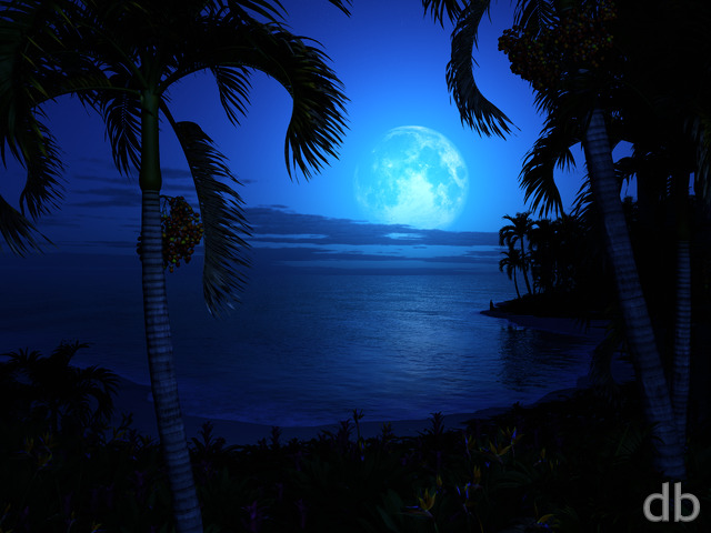
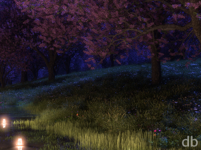
Since I used a pre-rendered cloud background for both the Spring and Autumn “Skygate” renders, I thought it might be interesting to use my “Moonbeam Sea” render as the background for a night version. I pretty much just wanted the foreground to be a silhouette here so the darkness is intentional 😉


Rick (Horseman) [basicmember]
A serene scene to focus on at the end of your day.
Maeio [nonmonthly]
Spooky! Just the night for witches and goblins.
Susan [nonmonthly]
I don’t usually like dark themes very much as I find them too hard to see anything, but I really like this one. The light from the moon is very effective
Rodewaryer [basicmember]
Brilliant rendering, it asks questions, makes us wonder not only what is out there but what is around behind the viewer as well. Love this.
Angelique [lifer]
I love this one! 🙂
Ozaawaagosh [basicmember]
Love the Peacefulness of the night version, simply beautiful. Great Job Ryan
Richard H. [liferplus]
@Zak: Gah. Blasted browser cache. Yes, you’re right, of course; sorry, Ryan.
However, the macOS archives still need updating, and they’re more important than the cached image previews.
Zak [liferplus]
… but the revised is much better.
Richard H: Clear your browser cache…
Richard H. [liferplus]
@Ryan: Many thanks for re-plotting the multiscreens; the new versions are a MASSIVE improvement over the originals. Not only is the moonlight hugely improved, but they seem crisper, too, more like the single-screen render.
Please note, though, that (a) the multiscreen previews on the web page are the old ones, and (b) the macOS archive also contain the old version as separate screens. (The 5K versions are the only sets I’ve checked.)
Ryan
By popular request I’ve updated the multiscreen, 21:9 and Facebook Cover version of “Skygate (Night)” with a new render this morning. The moon is no longer cut-off 🙂
SusanJ64 [liferplus]
Hi Ryan, I love the single screen version, but in the multiple screens you loose most of the moon.
Scott [lifer]
Absolutely beautiful!
I Iove it
Meg [lifer]
I have to agree with Richard. I thought the version that turned up in my email was amazing, and had great hopes of the multiscreen version. It’s nice enough but lacks the wow factor of the single screen. Would you be able to redo it without chopping off the top of the scene?
lilylavender [basicmember]
Ryan, ANOTHER beauty! I love trees, and this one set in the silence of the night with the clouds and moonlight filtering through is awesome!
Richard H. [liferplus]
I love the single-screen render. Very atmospheric, and I really like the branches silhouetted against the moonlight in the upper centre. My only problem with the single-screen render is a perceptual one, as its perspective slightly confuses me: I feel as though I’m looking up into the sky yet down from above onto the clouds at the same time, which makes the scene somehow feel a bit wrong. But I don’t know what to do about that, and in any case, in all other respects I like the image.
However, I’m sorry to say that I don’t think the multi-screen renders really work at all. On the one hand, the edges seem somehow mushy; the trees look less crisply defined than in the single-scree render. More importantly, the moon isn’t visible in the multi-screens; you get some light in the middle, but none of the effect that’s visible in the single-screen render, and that’s the best bit! The moon seems to have been lost off the top of the render in the multi-screens.
Phineas [basicmember]
Spooky colours!
Littlemom [liferplus]
Oh WOW!!! Ryan this is just stunning. It gives off such a peaceful and serene feeling. I absolutely love it!!!
Mark A. [liferplus]
I like this one. It has potential but it needs something. I definitely like where you’re going with this one. What if you removed just the middle tree that’s blocking the moon?